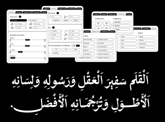
Arabic typography has evolved from traditional calligraphy to modern digital fonts. This article highlights early printing challenges, key technological breakthroughs, and envisions future Arabic fonts supported by advanced layout engines and a dedicated Arabic-specific typography user interface (UI).
29LT Idris: Multi-Style Typography
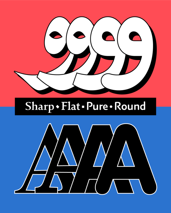
29LT Idris Pure and Round expand the Neo Naskh Idris type family, offering twenty versatile styles for diverse visual communication. Pure simplifies forms for minimal, legible text, while Round adds a friendly tone. Both preserve advanced Arabic typographic logic, bridging calligraphy with modern design technology for refined, adaptable type solutions.
アイデア idea 411 Interview
アイデア idea 411 2025.10 Written Form & Letter Design: Decoding the Visual Culture of Arabic Calligraphy and Typography. A special feature dedicated to the Arabic script is divided into two parts: chapter 1, Calligraphy, which delves into the origins and aesthetics of Arabic calligraphy, and chapter 2, Typography, which explores its contemporary developments and printing techniques. When read together, these chapters unveil the lineage of the visual culture that the Arabic script has established.
Tamara Bilingual Logo
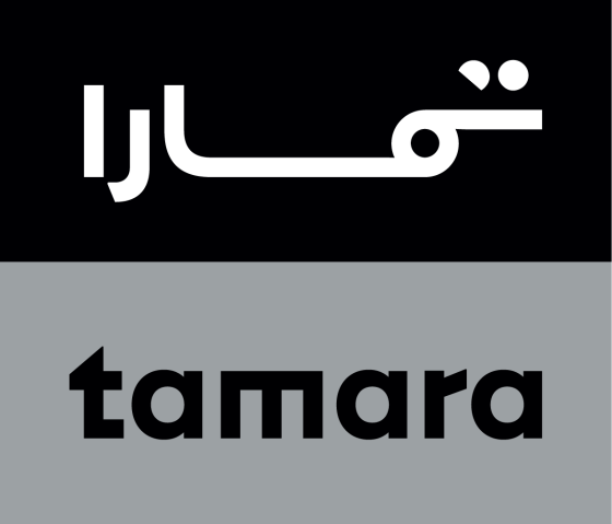
Rebranding Tamara Finance Company involved a meticulous redesign of its bilingual Arabic and English logotypes. Initially intended as a minor uplift, the project evolved into a complete reimagining to reflect the brand’s growth. The final designs emphasized minimalism and geometric forms, ensuring both logos harmonized for digital applications and customer engagement.
29LT Idris: A Naskh Type System
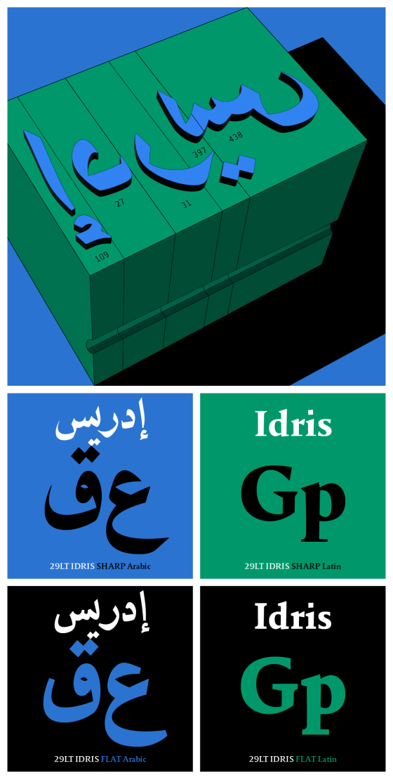
29LT Idris is a modern typeface blending Arabic Naskh with Serif Latin features, available in Sharp and Flat versions, each offering five weights. Its design, inspired by historical influences, has been enhanced using advanced technology, ensuring improved legibility for both body text and display use, with a significant focus on Arabic calligraphic standards.
Variable Fonts: Varied & Flexible
The evolution of typography in digital media highlights the shift from static to dynamic type solutions, where variable fonts allow for flexibility and adaptability. 29LT’s multi-script variable fonts combine traditional calligraphic styles with modern functionality, enabling users to manipulate design spaces and enhance web performance, while providing various aesthetic and functional applications.
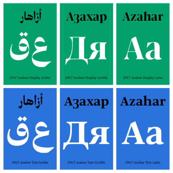
29LT Azahar Text + Display: A warm and graceful typeface
The 29LT Azahar type family includes Text and Display categories, each with five weights in both Latin and Cyrillic, and a Neo-Naskh/Neo-Thuluth hybrid Arabic style. The versatile variable font format allows extensive weight and optical size control, making it suitable for various design needs. The typeface reflects a blend of diverse cultures and a 29LT’s commitment to creating multi-script typefaces.
Design Space AlUla Logo & Custom Type
Design Space AlUla, located in the AlJadidah Arts District, is a hub for design professionals, students, and enthusiasts, aiming to promote and preserve AlUla’s cultural legacy. The logo, designed by Pascal Zoghbi, incorporates elements from AlUla’s heritage, including ancient inscriptions and modern architectural features.
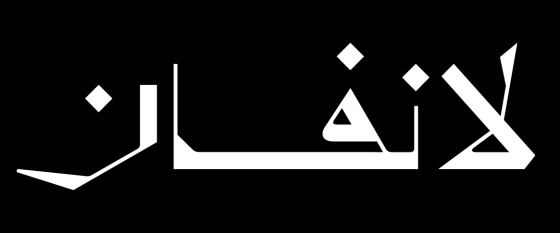
Lanvin Arabic Logo
The challenge of creating cohesive bi-scriptual wordmarks for brands in the Arab world, with both Arabic and Western names, requires careful consideration. The recent redesign of the Lanvin logotype in both Latin and Arabic scripts illustrates this complexity. Pascal Zoghbi explored Thuluth and Eastern Kufic calligraphic styles to harmonize with the new Latin typography, ensuring a professional and visually coherent result.
Majarra Insights Article
How my passion for Arabic letters turned into a global career in Arabic type design
afikra Logo
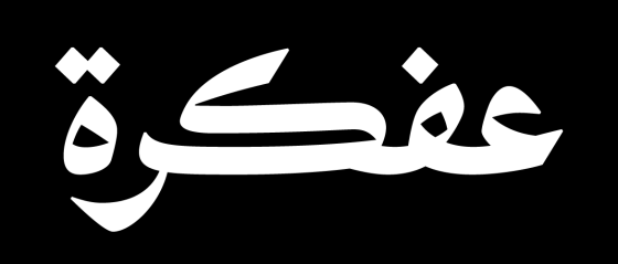
afikra | عفكرة is a global organization fostering intellectual curiosity about Arab culture and history. Celebrating its 10th anniversary, Pascal Zoghbi designed its new wordmark, reflecting its mission and Arab identity. The redesign follows a shift in Arab visual design, promoting original Arabic typography over “Latinised” versions, reflecting a resurgence of Arab culture appreciation.
29LT Zarid Sans Hanzi: A Chinese script match to Arabic
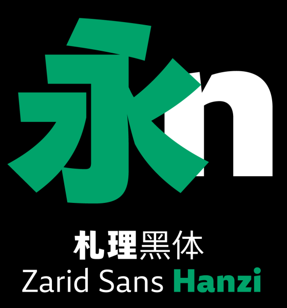
29LT Zarid Sans Hanzi is a sans-serif typeface (or Heiti for sans-serif Chinese typefaces) that draws inspiration from calligraphy, revisiting its roots with a modern twist.
Diptyk Magazine Article
“Graphic designers have a huge need for new Arabic typefaces”.
At a Master Class held at ESAV, typographer Pascal Zoghbi recently advocated for a diversification of Arabic fonts as a means to accompany the profound societal transformations occurring in the MENA region.
Balmain Arabic Logo
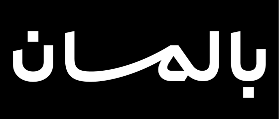
The creation of an Arabic logo for an existing Western brand brings challenges and questions that need exploring and assessing. The Arab designer must have a comprehensive knowledge of both Arabic and Latin scripts to achieve a professional result.
29LT Ada: A Ruqʿah Type System
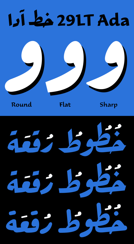
29LT Ada is a contemporary type design based on the Ruqʿah Arabic calligraphic style. It is a superfamily of Sharp, Flat, and Round typeface s, each in 6 weights, adding up to 18 styles. With all of its variants, Ada is the largest Ruqʿah-based type system to date. Challenging the boundaries of the style, it acts as a strong visual communication tool with different typographic voices.
Kingdom of Bahrain Pavilion / Expo 2020 Dubai
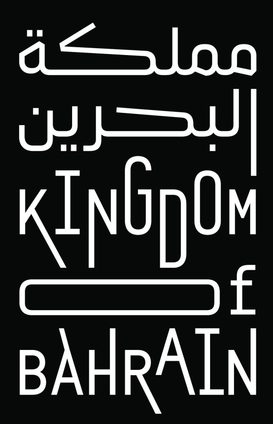
Concept and design solutions created for the visual identity of the Kingdom of Bahrain pavilion in Expo 2020 Dubai.
29LT Zarid Sans Devanagari: A Robust Auxiliary
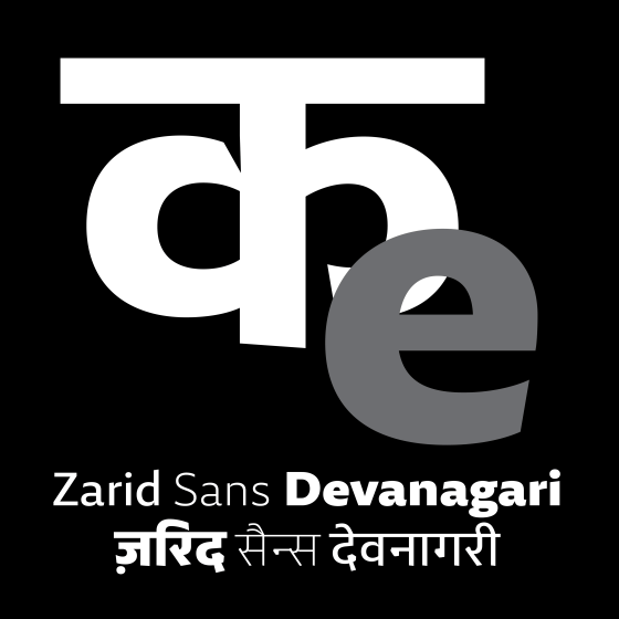
Zarid Sans is a fresh, clean, contemporary design. Its robust outlines stem from calligraphic structures. Its letterforms are open, and friendly yet precise. This understanding of the visual grammar of the family was a pre-requisite for the design of the Devanagari. When designing for scripts that are structurally very different from each other, it is important that the respective characteristics of the scripts are retained and celebrated while co-existing in the design space.
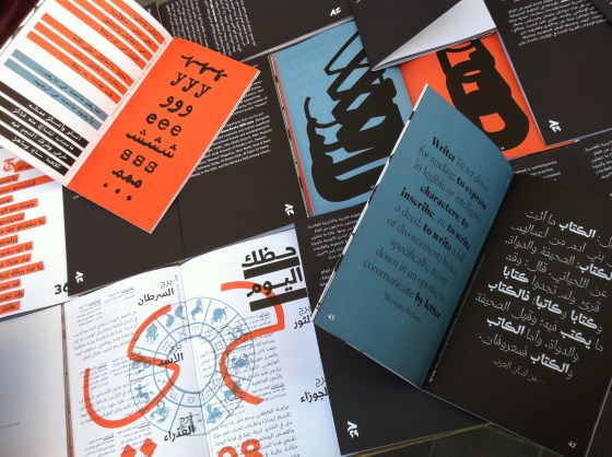
29LT Publications: Topics
29LT publications are modern-day typographic prints that aim to showcase 29LT fonts within content that has been found, written, and based upon texts that explore distinctive themes. The subject matter present in each publication stems from specific research that reflects the concepts behind the design and development of the typefaces.
29LT Oskura: An eloquent companion to Okaso
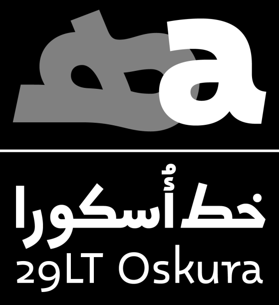
29LT Oskura is the second interpretation of the diverse handwritings found in the Aljamiado manuscripts and works as a fluid alternate to 29LT Okaso. Its humanistic design approach is built on the concept of the progressing pen. It is not rough and grungy as the writings in the manuscript are, but retains the flow of handwriting and presents the letterforms in clean outlines.
Majarra Logo
The letters composing the Arabic word مجرّة (majarra) give endless typographic possibilities for creating a logotype. The first and last letters have closed counters, while the medial letters are diagonally constructed. Geometrically simplified, the word can be envisioned with a circle on each end, linked with a triangle and a line in between. These were Pascal Zoghbi’s initial thoughts when briefed by the Majarra organization’s directors for creating their wordmark.
29LT OKASO: An Inventive Throwback to Aljamiado Manuscripts
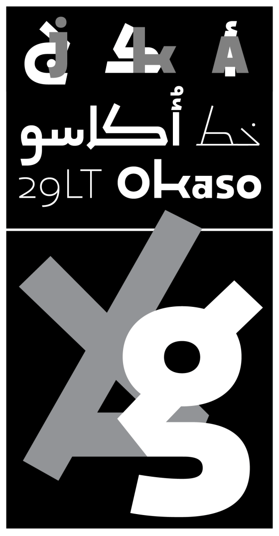
29LT Okaso stands out from standard Arabic fonts, both in aesthetics and functionality. It embodies a fascinating typographical experiment that actually works particularly well when seeking harmonious contrast between enigmatic and mystical overtones and contemporary designs.
Fontstand Article about 29LT and Pascal Zoghbi
The Arabic Script as Springboard for Multiscript Families
Multi-Script 29LT Fonts
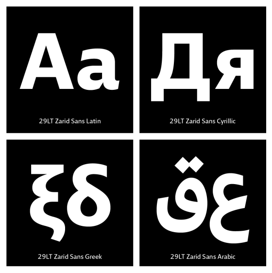
29LT is progressing from a bi-script Arabic and Latin digital type industry into a multi-script fonts entity. The global market we live in and the continuous integration of different cultures is demanding the need for multi-script type systems.
First additions are the Cyrillic and Greek scripts to 29LT Zarid Sans typeface making it cover four scripts; the Arabic, Cyrillic, Greek, and Latin scripts.
29LT ZAWI: A Seriously Rhythmic Typeface
29LT Zawi is a multipurpose typeface that was designed with a maximum legibility focus and an ease of usability mindset. Its simplified and vibrant design works perfectly well for a variety of projects, from fun and urban to serious and corporate ones.
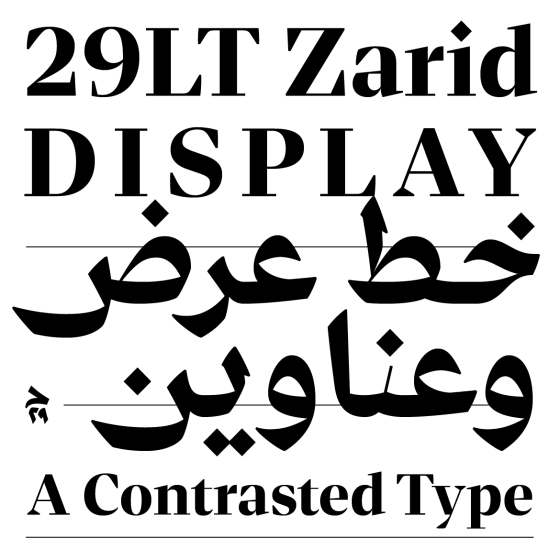
29LT ZARID Display: A Contrasted Typeface
29LT Zarid Display features a large range of weights offering typographic hierarchical solutions in bi-script Arabic and Latin layouts. Its contrasted pen strokes make it ideal for brave headlines and titles whilst being stylish and valiant.
Balenciaga Arabic Logo
Balenciaga Arabic logo echoes the visual identity of Balenciaga international wordmark. The logotype was designed by Pascal Zoghbi in collaboration with Balenciaga’s graphic design team. Several typographic Arabic styles and design concepts were drawn and tested to reach the perfect match. The final outlines of the logotype lend a robust and contemporary look to the brand while preserving a neutral and universal character.
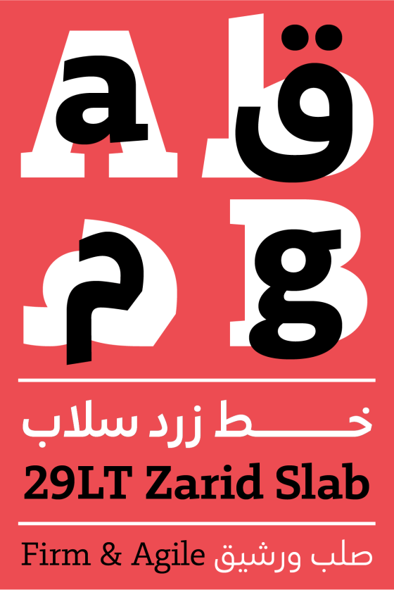
29LT ZARID Slab: A Firm and Agile Typeface
Modern, clean, and sturdy, 29LT Zarid Slab lends itself well for assertive displays and comfortable text readings.
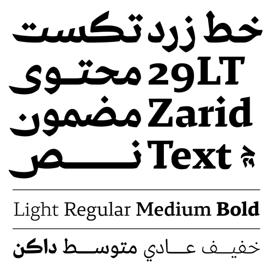
29LT ZARID Text: A legible and Lucid Typeface
29LT Zarid Text displays advanced but softer features. Improved legibility in small point size and habitual appearance are its key characteristics. More calligraphy-influenced with a greater variation in line width, it does offer improved legibility and clearer interlinear space. The range of weights also provides suitable typographic hierarchical solutions in bi-script Arabic and Latin layouts. This reader-friendly typeface is quite useful for diverse long running texts, such as magazines and books, and it works well with both digital and print applications. Its fashionable feel makes it aesthetically functional in display typographic setting too.
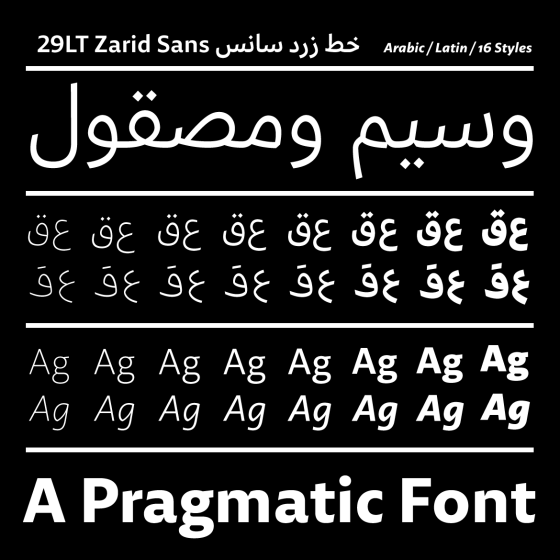
29LT ZARID Sans: A Friendly and Direct Typeface
Versatile, elegant and easy to ready, 29LT Zarid Sans gives diverse typesetting options. It is a clean, crisp and legible typeface that is proper, though not exclusive, to setting body copy texts both in print and digital mediums. It also works perfectly well when used in large display type.
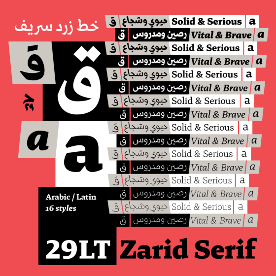
29LT ZARID Serif: A Bold and Vital Typeface
29LT Zarid Serif embodies a sense of elegance, vitality and robustness. The typeface is suitable for a vast array of literature and educational publications besides branding and design projects.
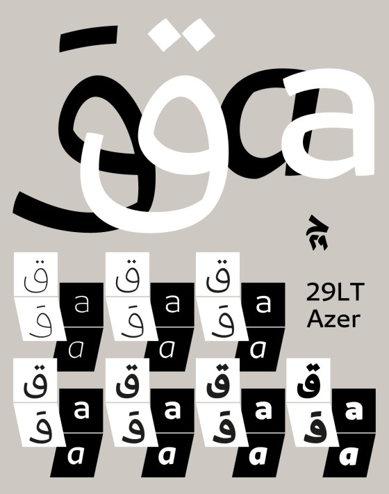
29LT AZER: A Serious and Amicable Font
29LT Azer is approachable without being sloppy, serious but not conformist. The typeface fuses charm, simplicity, and consideration. The Arabic and the Latin mirror each other’s appearances much like fraternal twins with compatible attitudes. Azer Latin is earnest and sincere whereas Azer Arabic is direct and austere. The various weights make this typeface suitable for refined copy-text as well as chunky titles and in-text emphasis.
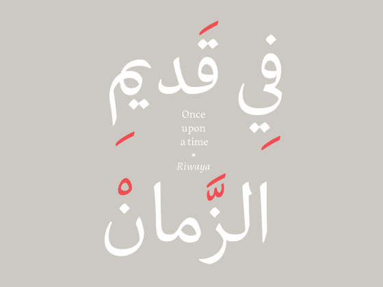
29LT RIWAYA: Nested Stories
29LT Riwaya is a practical and intelligible multiscript typeface family with character and voice. Each script has its own signature harmoniously articulated with the overall typeface family specifics. 29LT Riwaya brings clarity and accessibility to lengthy and encumbered texts while allowing for typographic hierarchy that creates contrast between elements. The differentiation of narrative levels and the natural, pleasant and readable textures make this typeface ideal for literature and story-telling.
29LT AZAL: A Free Geometric Display Font
Azal – which means old in Arabic – is a blast from the past that looks impactful in the present. It has both the flair of old eastern Kufic manuscripts and the modern-day touch, making it a clear and boisterous display font.
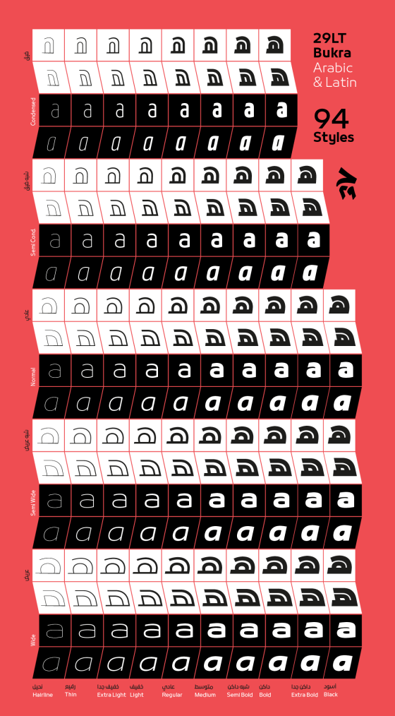
29LT BUKRA: A Versatile Multilingual Type System
With its modern simplistic arrangement in all of its weight variations, 29LT Bukra is go-to typeface for corporate strong headlines and slogans as well as branding applications. The font’s clean and polished outlines allow for powerful corporate identities, while the typeface’s crisp structure portrays bold and memorable messages. It is a type family with endless visuals representations allowing it to be used in an infinite number of graphical applications. Bukra is mainly a display typeface but the lighter styles can be also used for short body texts.
29LT BASEET: A Dynamic and Energetic Type Systems
29LT Baseet is driven by the idea that less is more. The design elements are pared down to the essential. The fonts were designed within a simplified Arabic character set and a monospaced Latin design, along with rounded terminals, enhancing the script’s simplicity and friendly appeal. All of these qualities make Baseet suitable for a diverse range of projects, from fun and urban to serious and corporate ones.
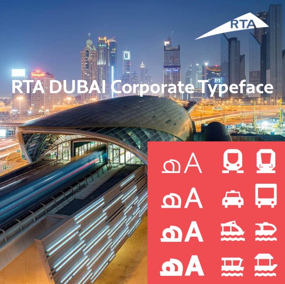
RTA Dubai Corporate Typeface
The RTA Dubai bespoke multilingual typeface is composed of a distinct contemporary Naskh style Arabic accompanied by a humanistic and…
Arabic Type Anatomy & Typographic Terms
Since most documentation and references about the Arabic script stem from the calligraphic methodology, this article will tackle the problem…
29LT Posters Designed by Reza Abedini
Reza Abedini designs vibrant posters with 29LT fonts A Collaborative approach between a graphic designer and a type designer 29LT…
Forbes Middle East Interview: A Font of Creation
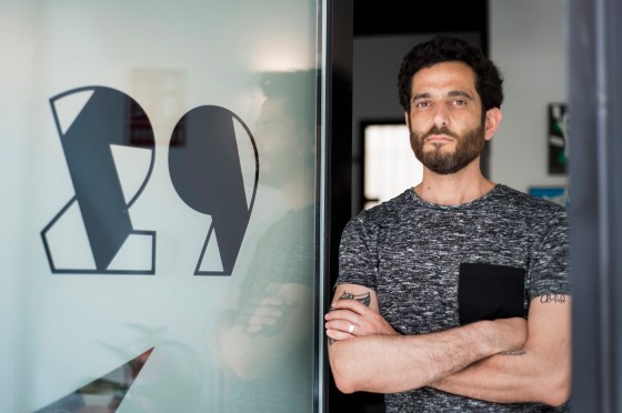
Pascal Zoghbi, founder of online business 29LT, has his pen poised, ready to launch an assault on the typography industry.
29LT Type Specimen
29LT publishes it 1st type specimen showcasing an overview of its multilingual Arabic & Latin typefaces.
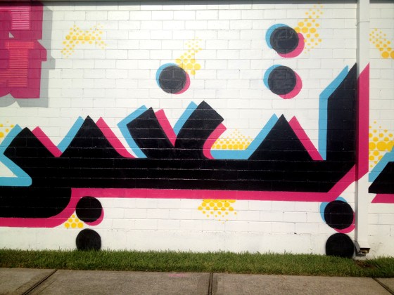
Changing Worlds, Changing Language
Graffiti: Changing Language, Changing Worlds اللغة تتحول، العالم يتغير Designers: Pascal Zoghbi and DUAL Mural Painting: DUAL Wall Size: 10…
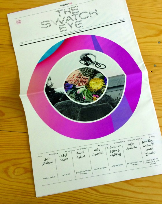
Swatch™ Corporate Arabic Font
Swatch Corporate Typeface (Swatch CT) is a contemporary multilingual typeface covering all Western and Middle Eastern languages used in countries…
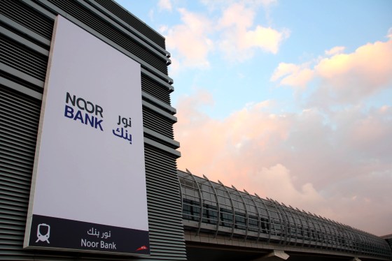
Noor Bank Corporate Type
Noor Type is a simplified, hybrid Kufi/Naskh type family in three weights, light, regular, and bold. Its contemporary outlines reflect…
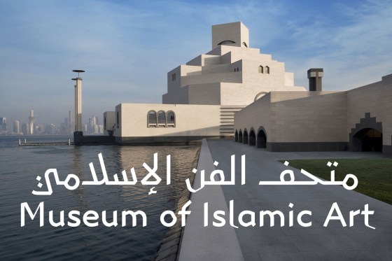
MIA corporate type for The Museum of Islamic Art
MIA type is a contemporary, bilingual Arabic and Latin type-family based on the Eastern Kufic calligraphic style drawn in four…
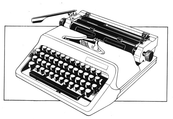
29LT MAKINA: A Multilingual Typewriter Typeface
29LT Makina is an evocative typewriter font arising from a series of experiments. It makes a retro statement that offers a standout vintage vibe with a cutting-edge hint.
29LT ARAPIX: A Multilingual Pixel Font
29LT Arapix’s unique and contemporary pixel approach makes it a perfect titling and display font. It is a funky and expressive typeface inspired from the primitive pixel technology but with vibrant modern characteristics. It can be used for both very low-resolution and high-resolution screens as well as for prints.
29LT UA NEO: A Detached Arabic Type System
29LT UA Neo B and N are a tribute to Nasri Khattar’s pioneering work and a statement on the growing importance and power of contemporary Arabic typography. They are an invitation to explore the fascinating potential of UA fonts, especially when it comes to modernizing Arabic, Urdu, Farsi, or any other language using the Arabic alphabet.
Nasri Khattar’s Typographic Journey
Last August in Beirut, I had the opportunity to meet with Camille Khattar Hedrick, the daughter of Nasri Khattar, the…
29LT MASSIRA: An Inspirational Type Project
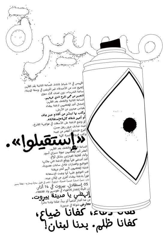
The fluent and smooth curves of Massira Pen make it suitable to give a vibrant punch to publications like comics, whereas the rough and grungy feel of Spray, Lipstick and TippEx styles makes them appropriate to add an urban or revolutionary edge to unconventional projects.
Introductory Arabic Type Course at AUB
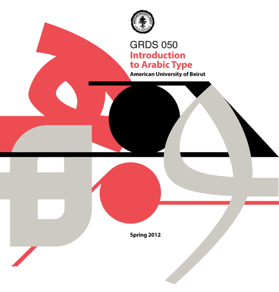
This spring, the elective course “Introduction to Arabic Type Design” at AUB [American University of Beirut] was introduced. It is…
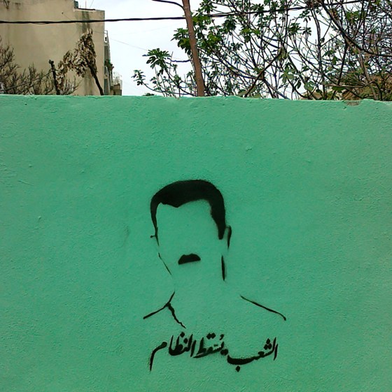
Censored. Why now? Graffiti in Beirut post Arab revolutions.
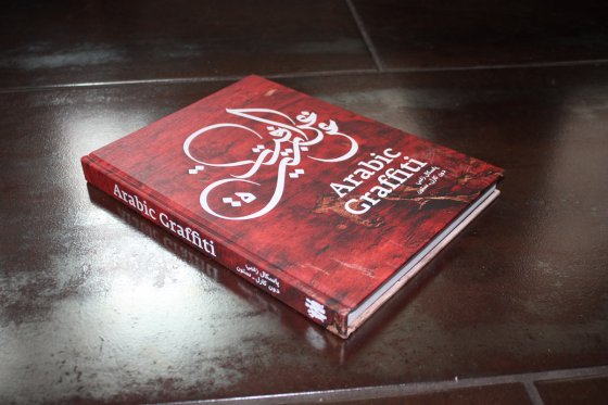
Since the publication of the Arabic Graffiti Book in 2011, which I co-edited with Don Karl, the scene and stance…
Interview with Khatt – Love your letters, they are your babies!
Interview with Pascal Zoghbi by Huda AbiFares from the Khatt Foundation. Part of the Multiple Baselines series. Pascal Zoghbi is…
Mathaf Corporate Arabic–Latin Font
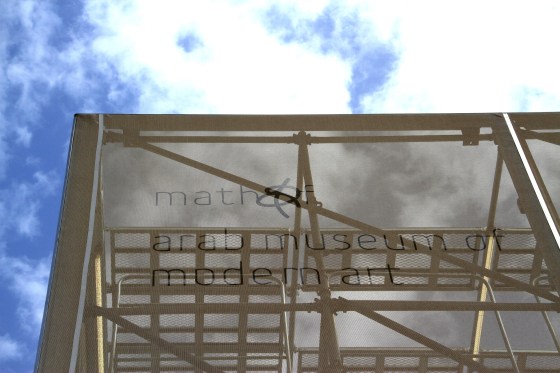
Mathaf Arab Museum of Modern Art opened its doors to contemporary Arab art lovers in December 2010 in Doha, Qatar.…
Beijing Typography 2009 Interview
10 Questionnaires from Beijing Typography 2009 conference. Answered by Pascal Zoghbi. The Interview was published in the BT09 Book Catalogue.
Slanted Magazine Interview
You have been working side by side for that book. How did you get to know each other? Pascal: In…
Page Magazine Interview
Which different styles exist (Kufi, Nashk etc.) and which are the differences between them? & Are the Arabic types divided…
Mediamatic Interview
1. You recently taught a workshop on Kufic design. What does Kufi script mean to you? What place do you…
Arabesque Book Interview
1. short paragraph about yourself … (3-6 sentences) – where and when born, grown up … – education – profession…
bt’09 Beijing Typography 2009 Interview
1. When was the last time you wrote a letter by hand? When was the last time you received a…
ArabAd Magazine Interview
ON A PERSONAL LEVEL – When did you first decide to become a designer? Was there a pivotal moment? Being…
Etape magazine Interview
Like many others of his generation, Pascal Zoghbi began his studies in his native country but had to go abroad…
