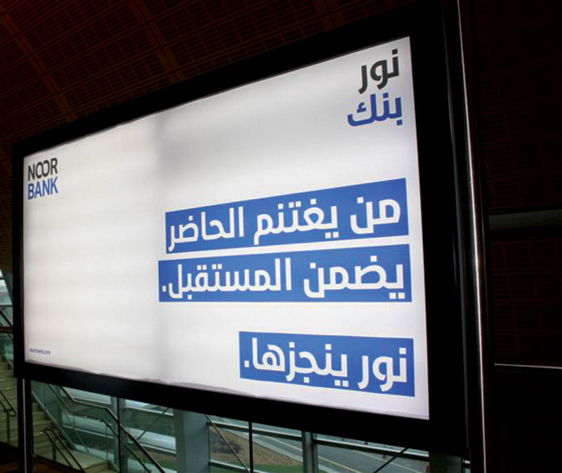
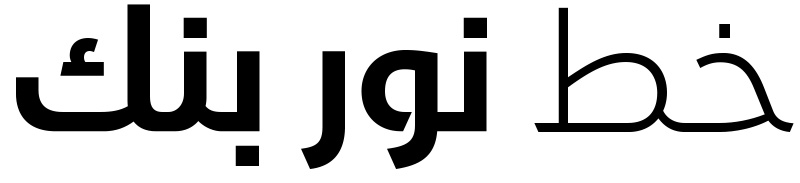
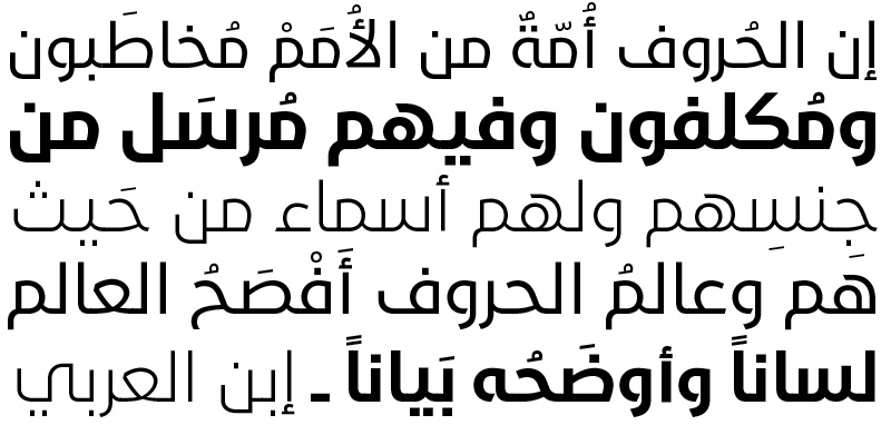
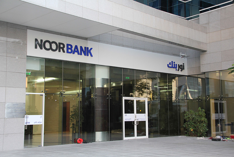
Noor Type is a simplified, hybrid Kufi/Naskh type family in three weights, light, regular, and bold. Its contemporary outlines reflect the new branding strategy for the Noor Bank in the United Arab Emirates (UAE) developed by Wolff Olins, the brand consultancy, in Dubai.
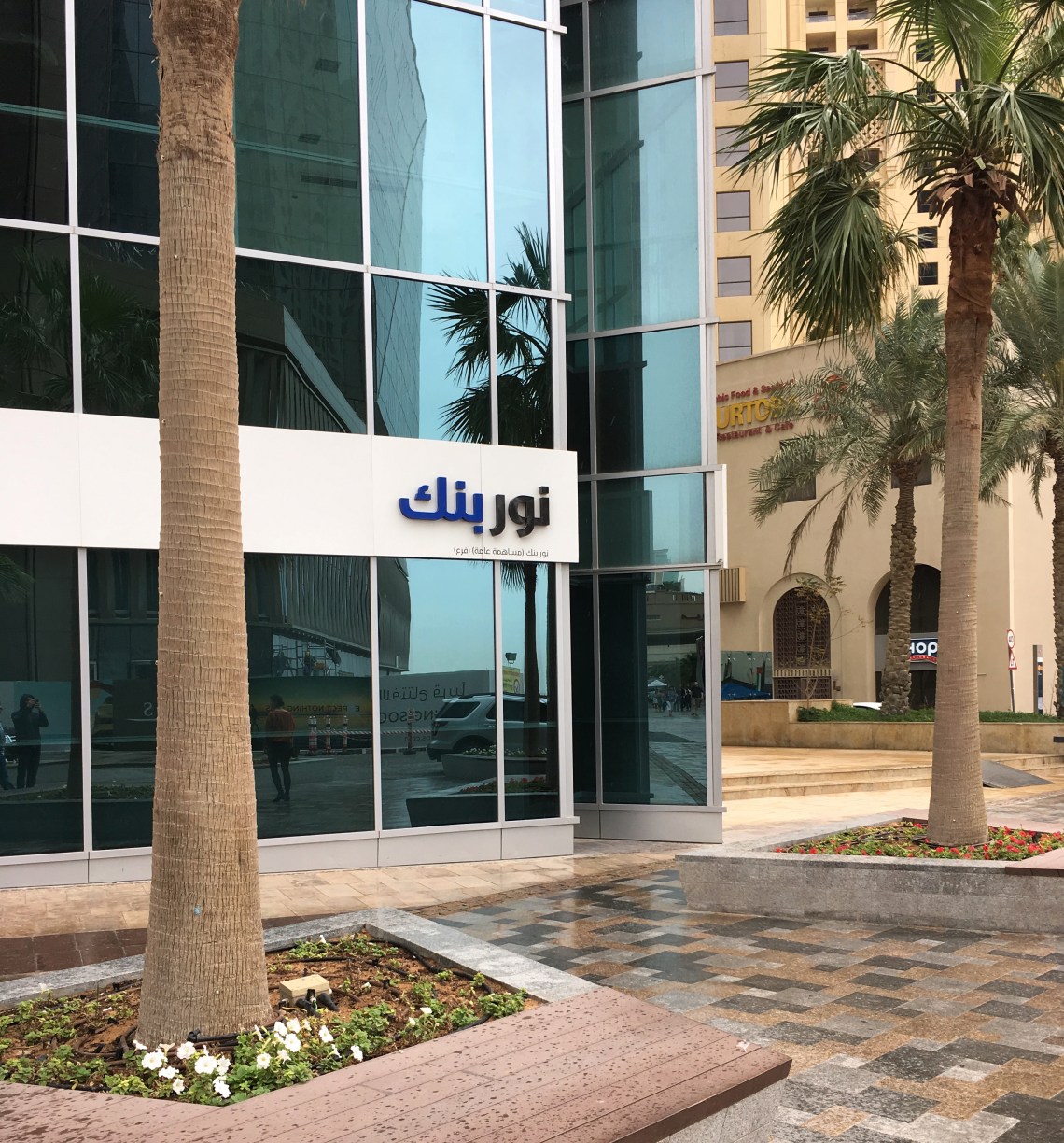

Formerly known as the Noor Islamic Bank, in the past the Noor bank had a traditional brand identity with an old, serif-style type for Latin characters and traditional Kufic type for Arabic characters. Wolff Olins wanted to uplift their branding and give the bank a contemporary visual identity. They replaced the old style serif font by the modern sans serif “Aktiv Grotesk” type, and asked me to create and develop the Arabic counterpart.

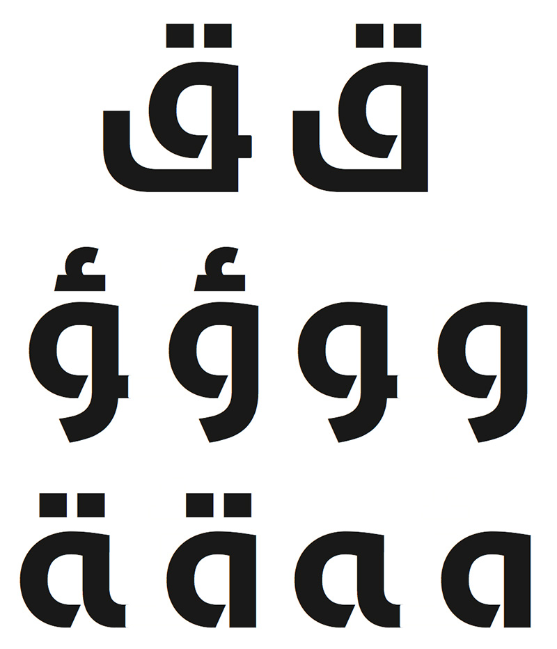
I designed the Arabic with large tooth, loop, and eye height to echo the large x-height of the Latin, with short ascenders and cut descenders for the Jeem, Ha’, Kha’, Ain, Ghain, and Meem. To allow such proportions to exist and keep the Arabic looking proper and not Latinized, I drew the letters based on a hybrid structure between the Kufic and Naskh scripts instead of just adopting one style of proportions.
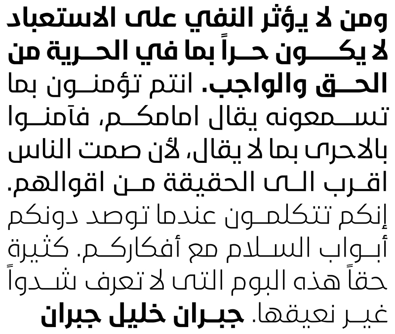
Since the word-mark doesn’t have an icon, the typeface is the solitary graphical element to distinguish the bank. We decided to make an edgy cut in the Arabic letters that contains loops like “Waw, Qaf, Ha’, Ta’, etc. and give the font an open fill and contemporary characteristic. Thus the font is both edgy and organic, containing straight pen stokes that are in balance with curved outlines. The tension between the straight and curved lines gives the font unique properties with contemporary appearance.
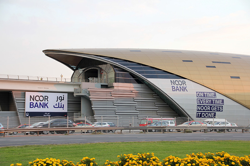
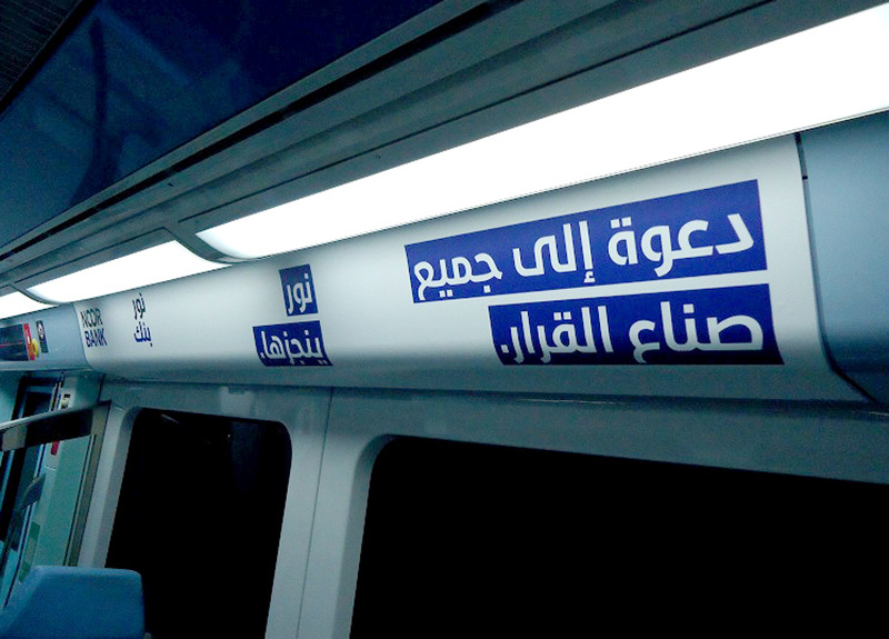
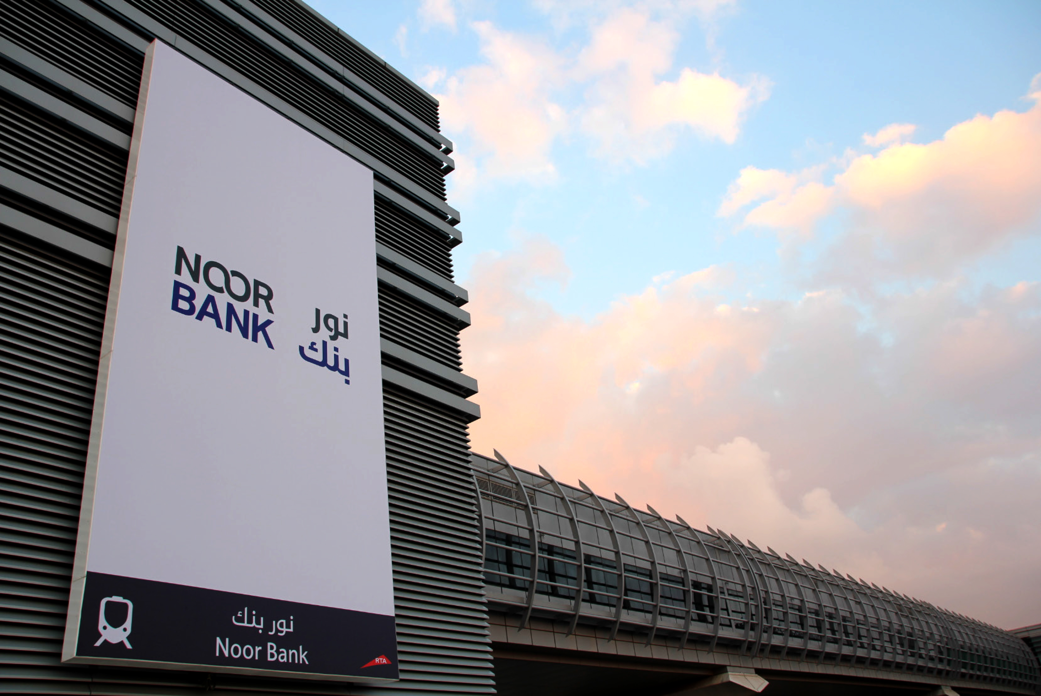
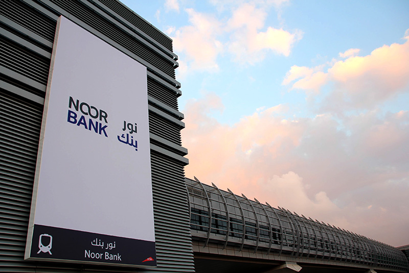
Beside the logotype, Noor type is used in all the bank’s branding and advertising. You can also see the font at the “Noor Bank Metro Station” in Dubai along with all the bank’s branches in the Arab region.