 29LT Zarid Display is the valiant version of 29LT Zarid Text. In the Arabic script, the neo-Naskh glyphs transform into amalgams inspired by both the Thuluth and the Naskh calligraphic styles. Thuluth is considered as the most elegant style in classical Arabic calligraphy that was crafted for important writings. Naskh is however known as the common style designed for standard copy text. The design decision adopted to blend these two realms together gives the typeface a unique characteristic and makes it offer a new Arabic typographic hierarchy option. In the equivalent Latin script, the letters gain vertical contrast inspired by the pointed-pen expansion principle, whilst keeping a hint of the broad-nibbed pen translation structures in the bowls and finials. This design choice gives Zarid Display Latin a unique appearance and preserves consistency with the rest of the type family as well as bridging the Latin and Arabic scripts together. Both type designers, Pascal Zoghbi (Arabic script) and Ramiro Espinoza (Latin script), jointly agreed on this concept of hybridization and applied it on the respective script. The design of the two distinct scripts agreeably coexists while each one of them retains its’ own structure and characteristics.
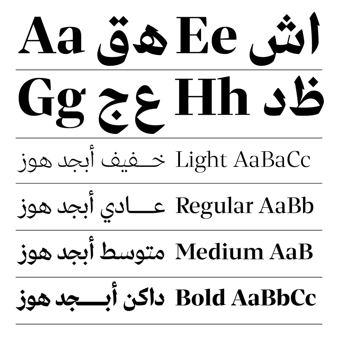
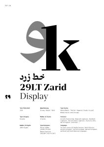
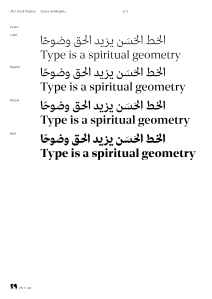
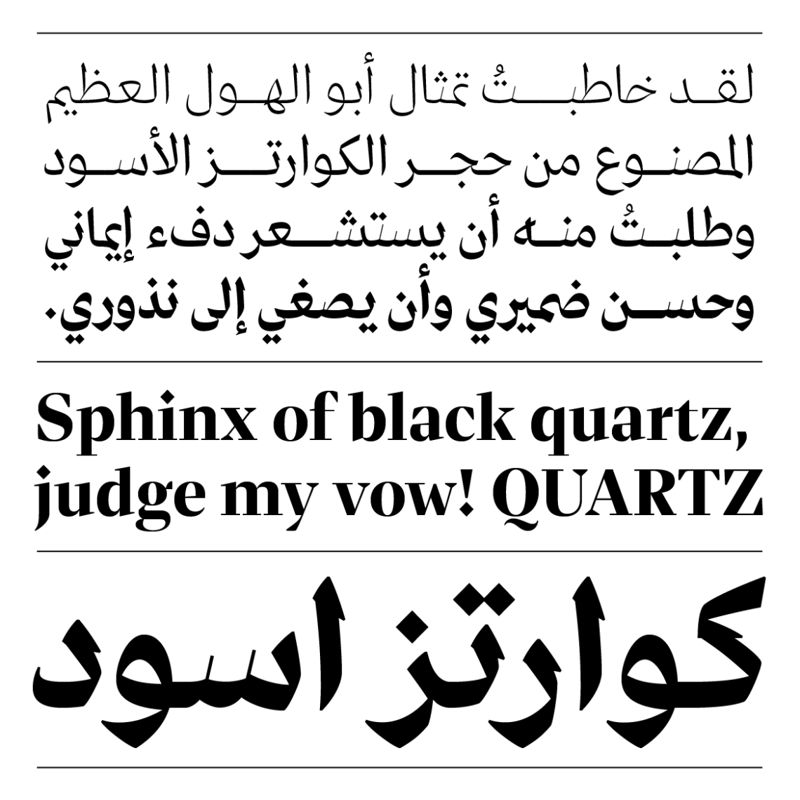
Zarid Display type family consists of 4 weights: Light, Regular, Medium, and Bold. The range of weights provides suitable typographic hierarchical solutions in bi-script Arabic and Latin layouts. Its contrasted pen strokes make it ideal for brave headlines and titles whilst being stylish and gallant in spirit.
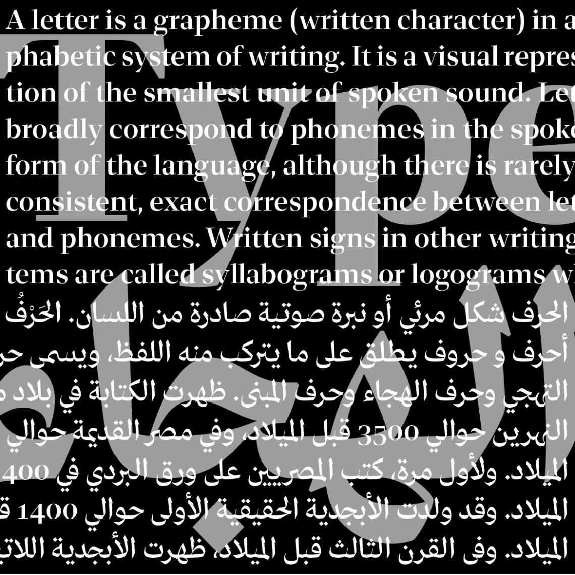
The typeface includes advanced typographical features such as ligatures, alternates and stylistics sets inspired by calligraphy to improve the legibility of the fonts. The fonts cover all Middle Eastern, North African, Eastern European, Central European, Western European, and North and South American Languages. The number of glyphs per font is 1750+.
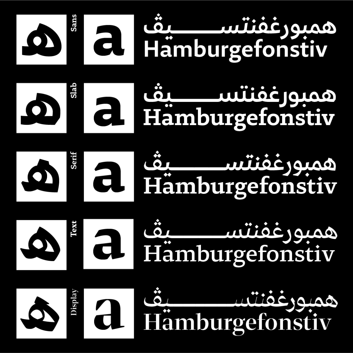
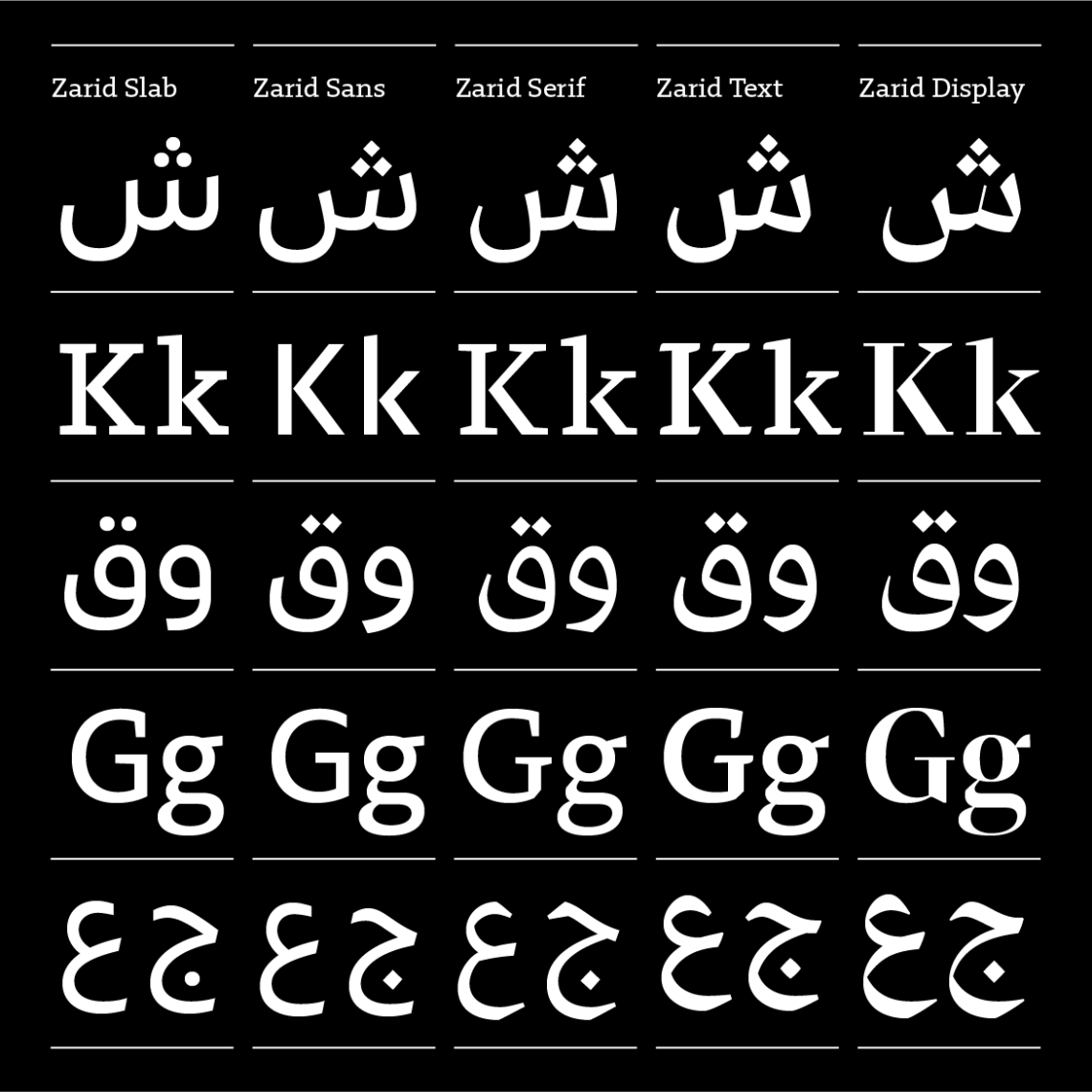
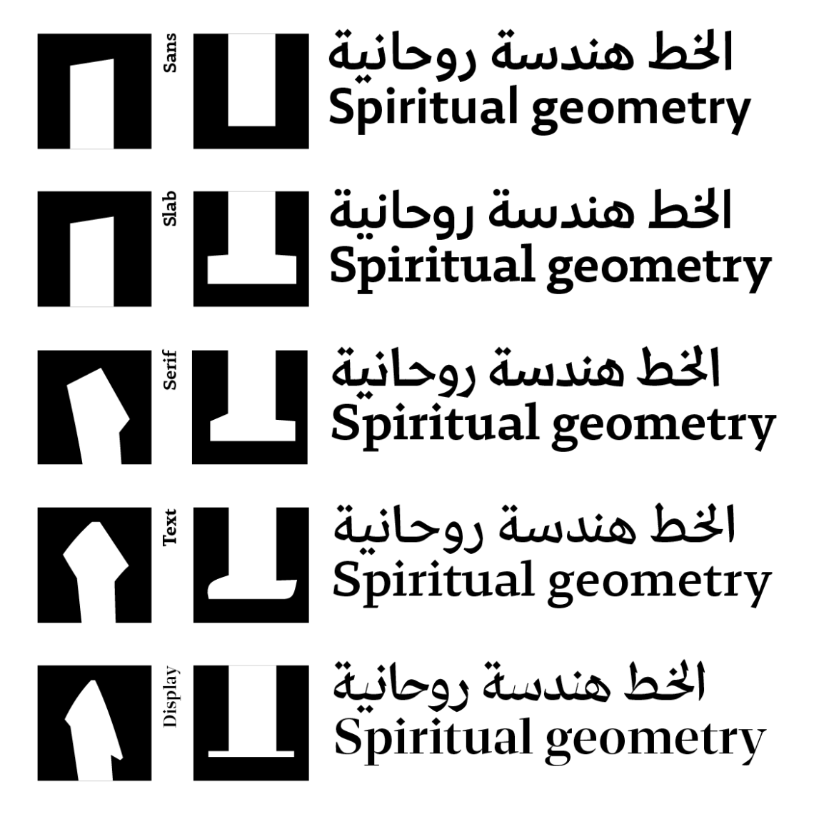
Zarid Display is the fifth family member within the 29LT Zarid super family ongoing development. The type family consists now of: Zarid Serif, Zarid Sans, Zarid Text, Zarid Slab, and Zarid Display.
29LT Zarid Display Design Description:
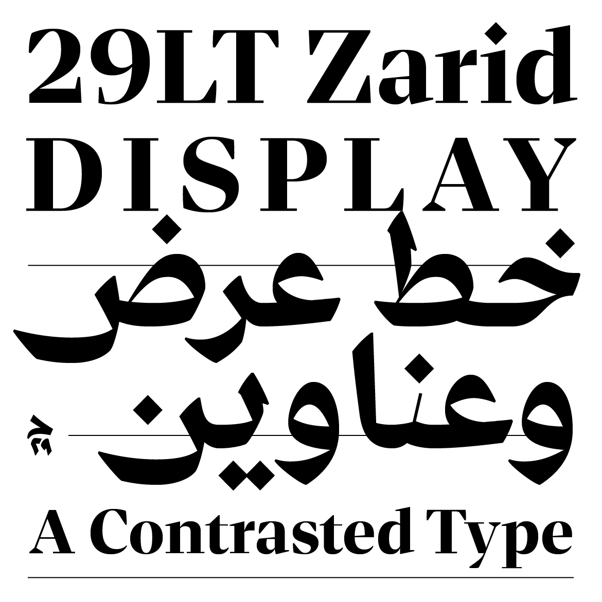
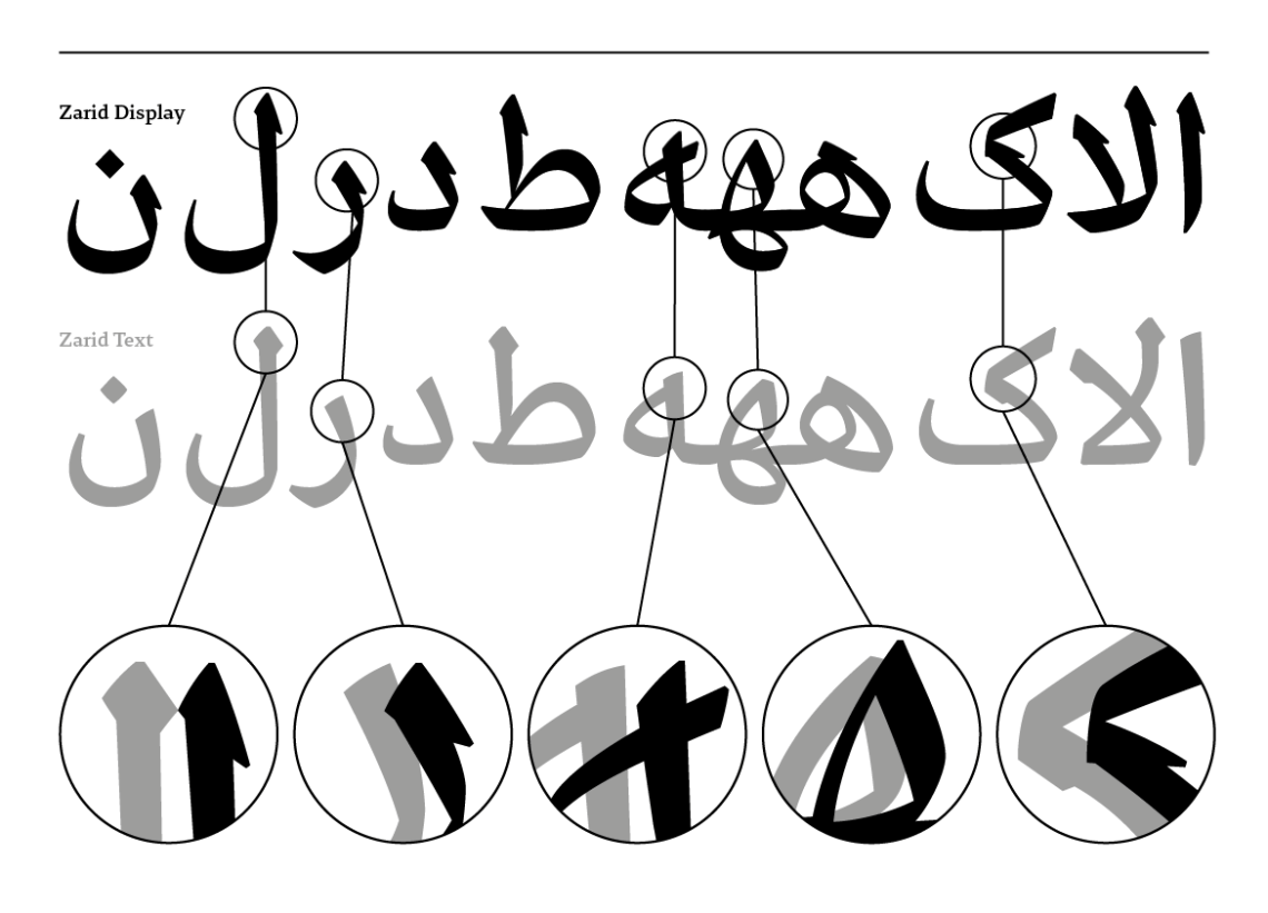
Zarid Display is bold by nature and extreme in character. Its’ evident strong contrast between the thick and thin pen strokes is abrupt and dramatic. However, the application of this contrast had to be applied differently on the distinctive Arabic and Latin scripts since they stem from different calligraphic routes. The concept of transition from a broad-nibbed pen to a pointed-pen in order to achieve the desired contrast doesn’t apply to the Arabic letterforms as it does to the Latin complements. In Arabic, the writing notion is “translation with rotation” using only the “qalam” that is similar to the broad-nibbed pen. On the contrary, the writing theory in the Latin is based either on the broad-nibbed pen (translation principle) or the pointed-pen (expansion principle).
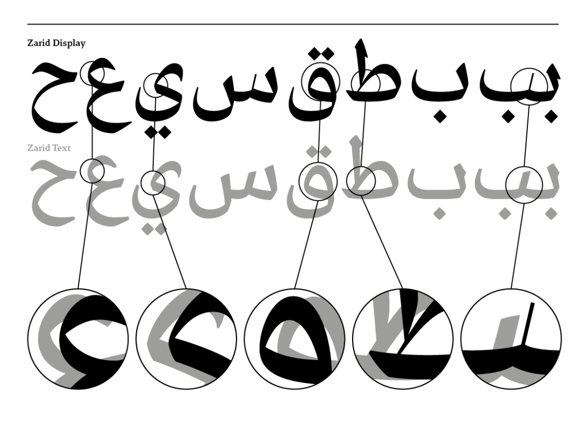
Consequently, not all the Arabic glyphs acquired a thin pen stroke as in the Latin letterforms. The thin strokes in the Arabic script are only applied to the letters that contain right slanted teeth in their anatomy. The other letters with typography bowls, heads, eyes, arms, legs, bellies, tails, etc… only acquired high contrast in their structure.

In the Latin glyphs, the humanistic calligraphic serifs become modern thin serifs. The contrast is applied on the vertical axis based on the expansion concept while keeping a hint of the left slanted axis coming from the translation concept in the bowls flow and structure. Furthermore, the terminals are not in a “ball” shape based on the pointed-pen drawing technic, but a pointed “triangle” shape that is an evocation of the broad-nibbed pen effect. These features make the Latin character set unique and deviates from previous historical Neoclassical & Didone models.
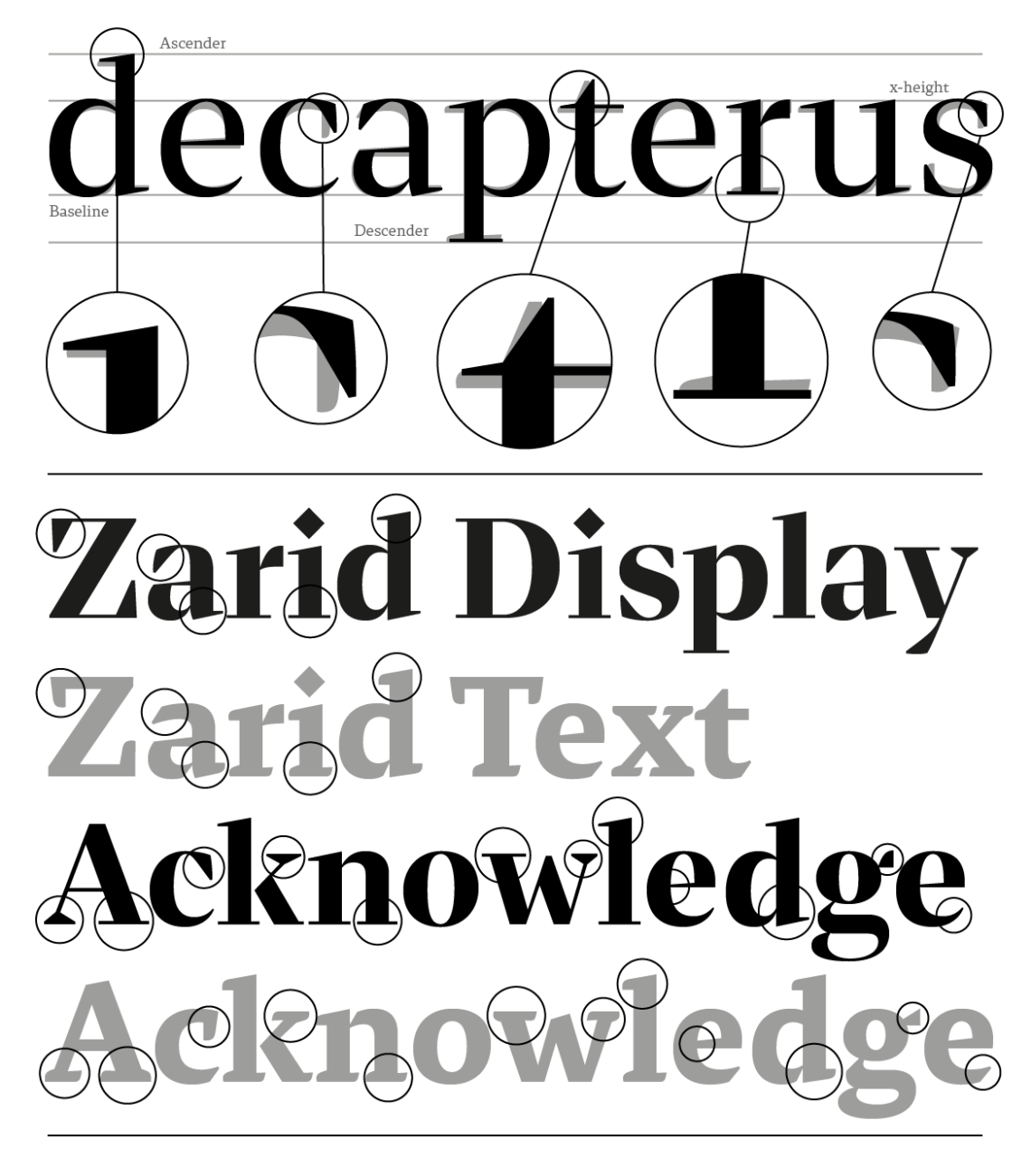

The triangular finials and terminals that are found in the Latin glyphs such as the a, c, f, s, etc. echo the starting calligraphic pen stroke in the Arabic ascending letters such as the Alif, as well as the starting and ending strokes of letters like the Ha’, Ain, Ra’, Waw, etc. This design harmony is equally visible in the use of a sharp diamond-shaped dot in the Latin instead of a rounded dot that is present in standard modern serif typefaces. This feature echoes the strong Arabic diamond shapes diacritics dots.
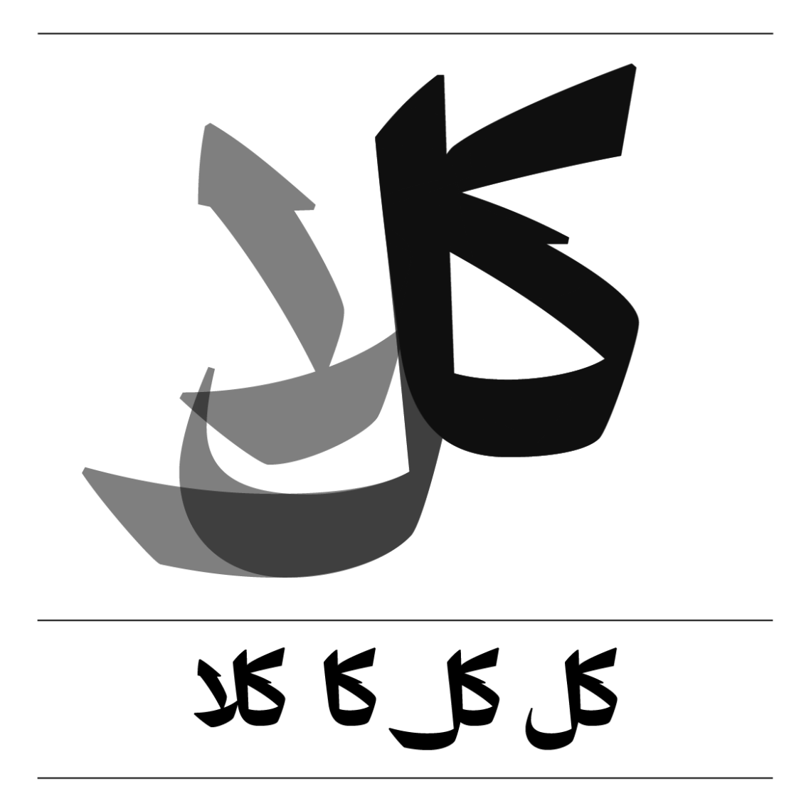
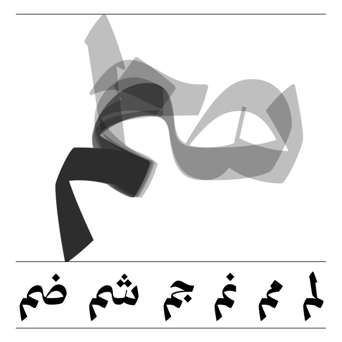
While the typographic ascenders and descenders in the Latin stayed the same between Zarid Display and Zarid Text, the typographic “Earth 2” in the Display is lowered allowing for bigger rounder elegant bellies in the Ha’ and Ain glyphs, and a longer tail in the Meem glyphs.

With the addition of the high contrast, the width of the glyphs got affected in both scripts. In Latin, the whole character set of Zarid Display became slightly condensed in comparison to Zarid Text. This aspect makes the fonts ideal for headlines and titles with horizontal limitations. In the Arabic, some letters became drastically narrower especially if they have teeth structures in their anatomy, while other became slightly narrower with the application of the extreme contrast on the bowls, eyes, heads, etc.
On the contrary, some Arabic glyphs that contain tails and endings gained width in reference to Thuluth based structures in comparison to shorter Naksh ones.
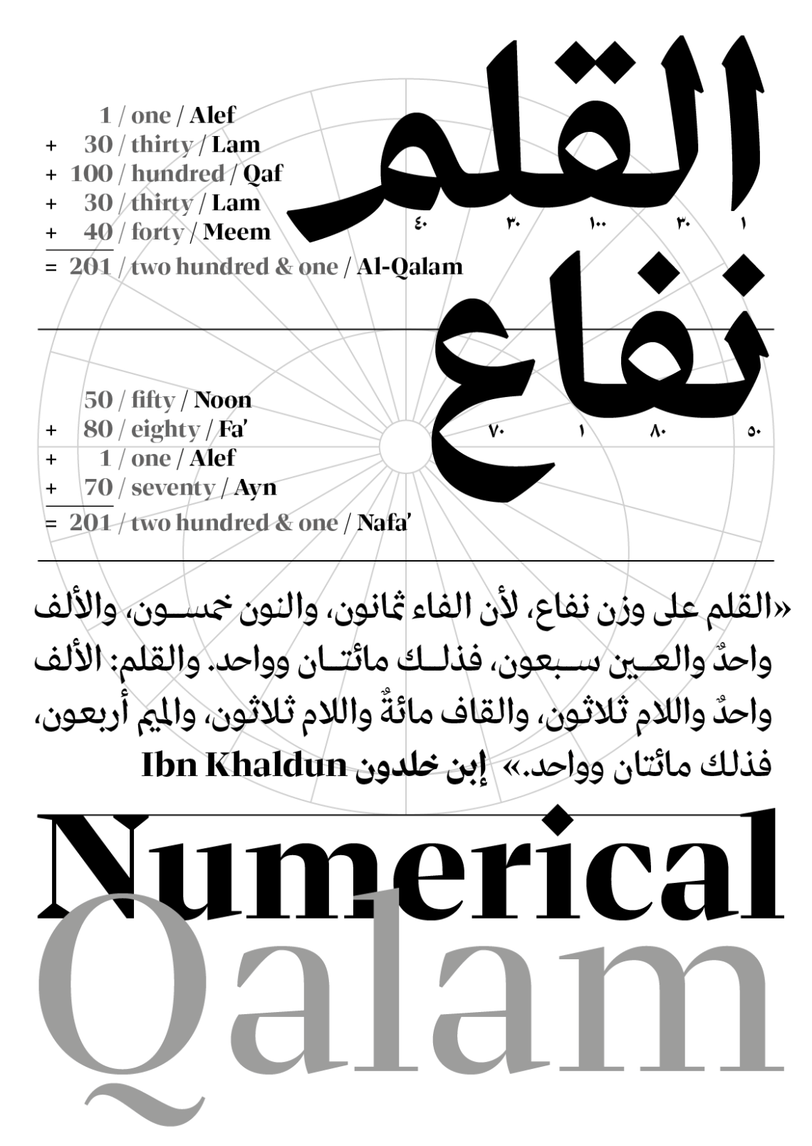
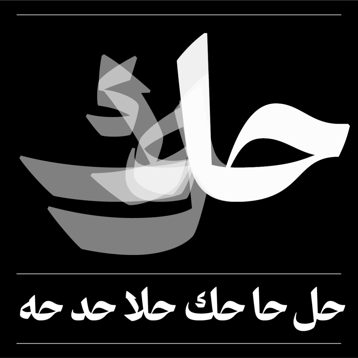
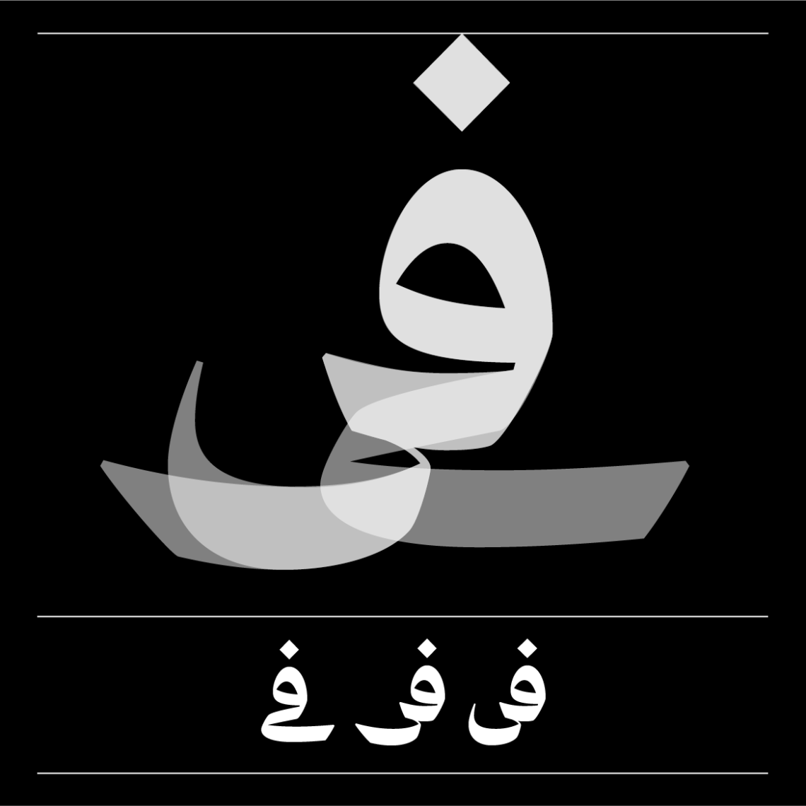
With the adoption of the hybrid Thuluth/Naskh concept in the Arabic letter structures, a major design change was required for some glyphs while others simply gained contrast. While the shape of the serifs changed in the Latin glyphs, the starting qalam stroke of downward vertical stems changed from a rectangular stroke to a sharp triangle one in the Arabic glyphs. This is clearly visible in letters like the Alif, Ba’, Kaf, Lam, Tah, Ra’, Dal, etc. The Lam-Alif ligature got completely redrawn based on the Thuluth structure instead of the Naskh one.
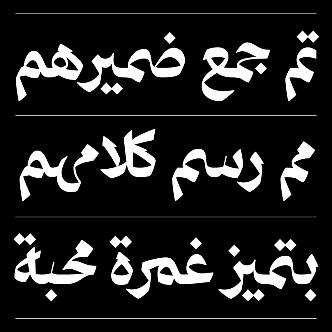
Since the typeface is conceived for large typography and stylish wordings, the Arabic ligature character set went from ± 550 glyphs in Zarid Text to ± 800 glyphs in Zarid Display. Numerous complex ligatures that were not included in Zarid Text (in order not to affect legibility in small sizes) are introduced in Zarid Display to give added calligraphic value and beauty to the typeface. Generally, and not to list all the added ligature sets, the ligatures connected to the Meem letter, Hah letter, Heh letter, Kaf and ascending vertical pen stoke, and Hah and ascending vertical pen stroke were added.


Typographic Versatility:
With the development and growth of 29LT Zarid type family, additional multilingual Arabic and Latin typesetting flexibility are offered. The type family becomes a design tool for graphic designers to explore endless typographic possibilities and explore different communication complexities in their projects. The type family becomes an important contribution to the growing graphic culture in the MENA region.
Each type style present in the superfamily have unique functionality and a defining characteristic whilst sharing the same essential inner skeleton. The superfamily offers a vast amount of weights and styles that strongly exist individually but combine perfectly when jointly typeset. An equal foundation and structure are shared amongst all the fonts, but with distinctive aspects and features. It is a type system created from different type classes and distinguished typographic fonts while sharing the proportions and overall dimensions. It offers a great typographic solution for a graphic designer working on projects with a complex hierarchical requirement and removes the hassle of combining different fonts from different typefaces that contain different weight distribution and typographic proportions. It is an effective mix and match of type styles without risking over-designed layouts.
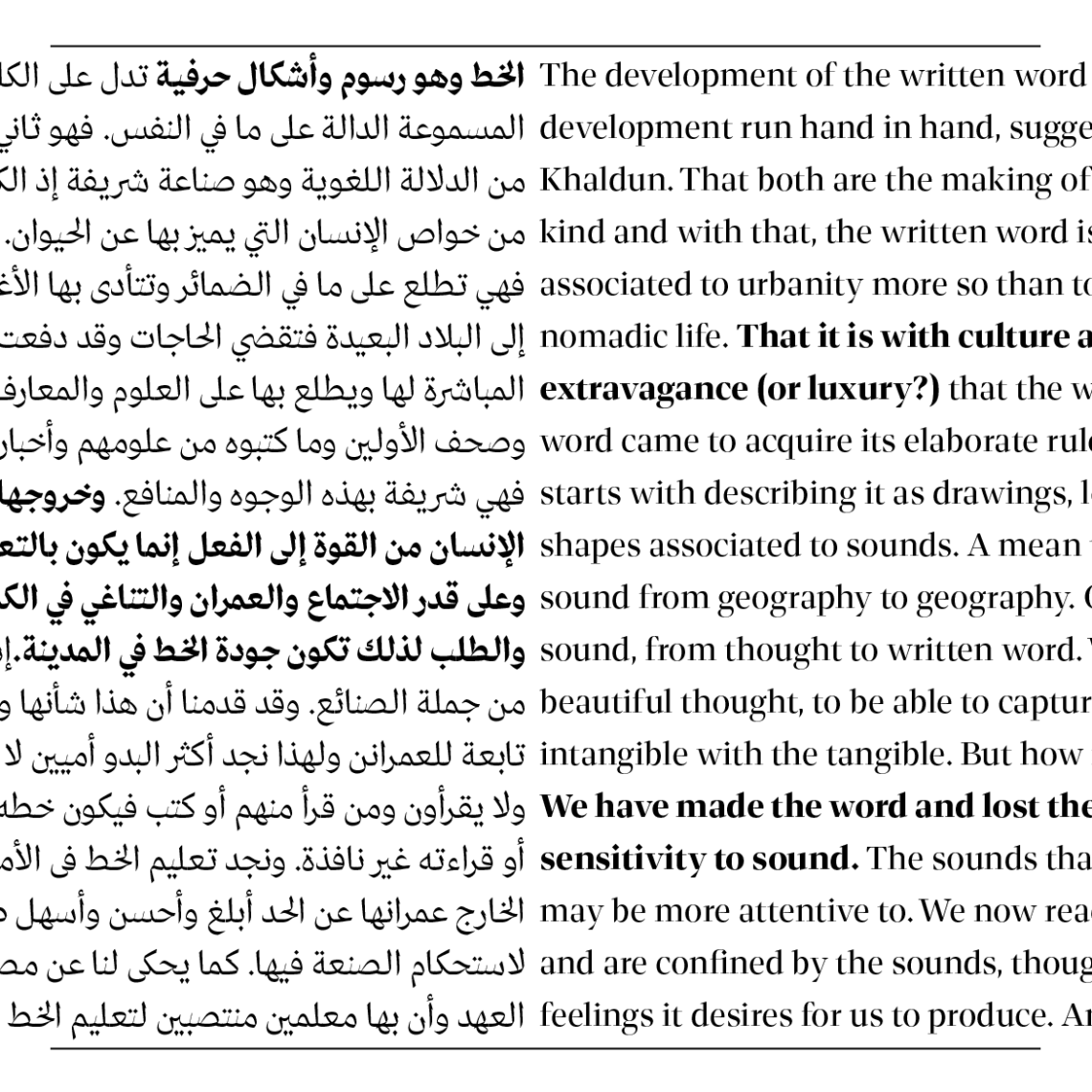
In this section of the article, basic layout samples are exhibited to demonstrate the harmonious usage of different Zarid styles together in the same layout.

29LT Zarid Display Type Specimen
Visit 29LT Zarid Display webpage on www.29LT.com website and download the type specimen for full information about the typeface.