In the fall of 2017, a totally overhauled Balenciaga brand identity was revealed after the new creative director, Demna Gvasalia, took the lead of the French fashion brand in 2015. A sleek semibold and condensed sans serif typography replaced the previously light and wide sans serif letterforms, dropping the double mirrored Bs emblem and using the stretched B letterform on the products but not in the logo anymore.
In 2019, Pascal Zoghbi was asked to design the Arabic counterpart of the new logo, which allowed Balenciaga to introduce its new identity into the Arab world.
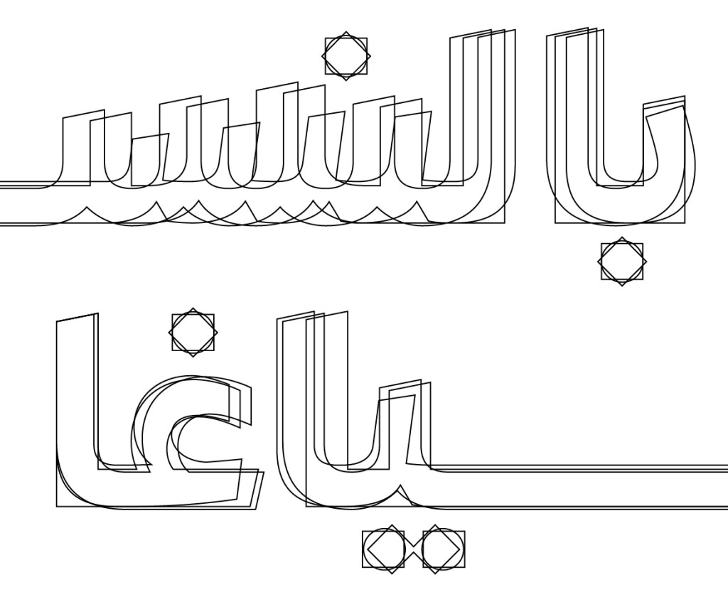
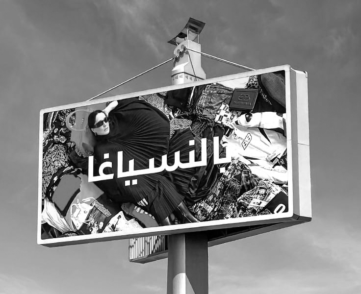
The brief was to create an Arabic logotype that reflects the sleek and urban feel of the Latin typographic wordmark. The client dismissed Arabic calligraphic options from the start and requested simplified typographic Arabic options. After analysing the Latin, Zoghbi proposed three typographic routes, with the client selecting one to be fine-tuned and finalized as the Balenciaga Arabic logo.
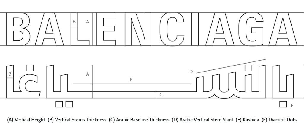
The Latin logo has narrow capital letters, giving it a block rectangular structure. Mirroring that in Arabic would be hard, since capital letters do not exist in the Arabic script, and most of the medial letters connected to a baseline have low median-heights.
Luckily, the Arabic word بالنسياغا Balenciaga has no descending Arabic letters, and all of the letterforms, except for the letter Ghain, are composed of straight or diagonal vertical pen strokes. This facilitated the task of achieving the vertical pen stroke emphasis in the Arabic logo to echo the vertical stems in the Latin.

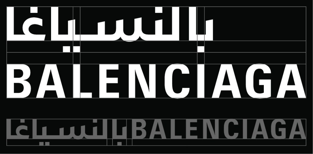
Zoghbi aligned the Arabic baseline to the Latin baseline and the Arabic ascender-height to the Latin caps-height. The question was how to draw the medial letters, and how high they should be to balance with the Arabic ascending letters and the Latin capitals. He tested two main median-lines, a higher one for the Kufic based letterforms and a lower one for the Neo-Naskh typographic option.

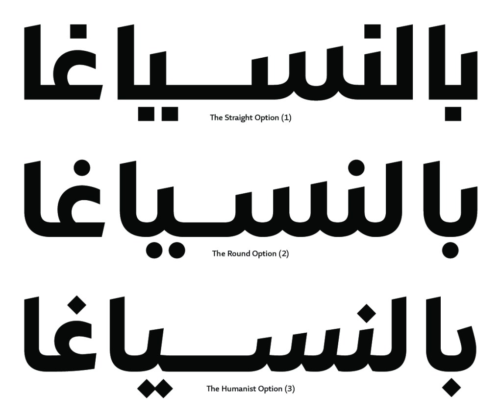
After establishing the typographic vertical heights, he defined the weight and contrast of the letters and developed three main routes for the overall letter structures: 1) straight, 2) rounded, and 3) humanist options. The first two options come from the simplified modern Kufic style, while the third comes from the simplified Neo-Naskh style.
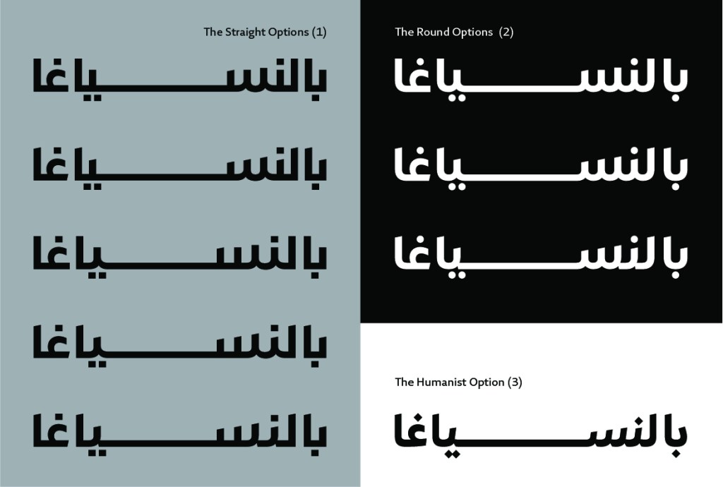
The Kufic-based options had straight teeth, low contrast letterforms, and squarish or circular diacritic dots. The Neo-Naskh option had right slanted teeth, medium contrast letter structures, and rhombic diacritic dots. He investigated different baseline connections and straight and slanted terminals.
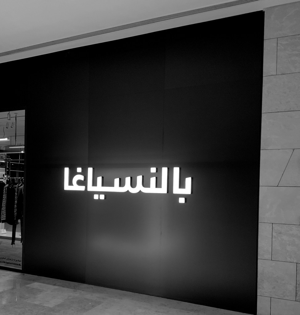
The client selected the straight simple Kufic option, so Zoghbi created additional minor options out of it for the final version. He adjusted the letter spacing to reflect the spacing in the Latin counterpart, and designed two kinds of stem terminals: straight horizontal ones for the ascending letters (Alef and Lam) to achieve the rectangular block wordmark feel, and slanted downward terminals for the medial letters (Ba’, Noon, Seen, and Ya’) to add an Arabic aspect to the design. The final diacritic dots became rectangular with the same width as the Latin letter stems, and the aperture of the letter Ghain had a straight horizontal cut and a slanted baseline cut reflecting the different terminals in the vertical stems.

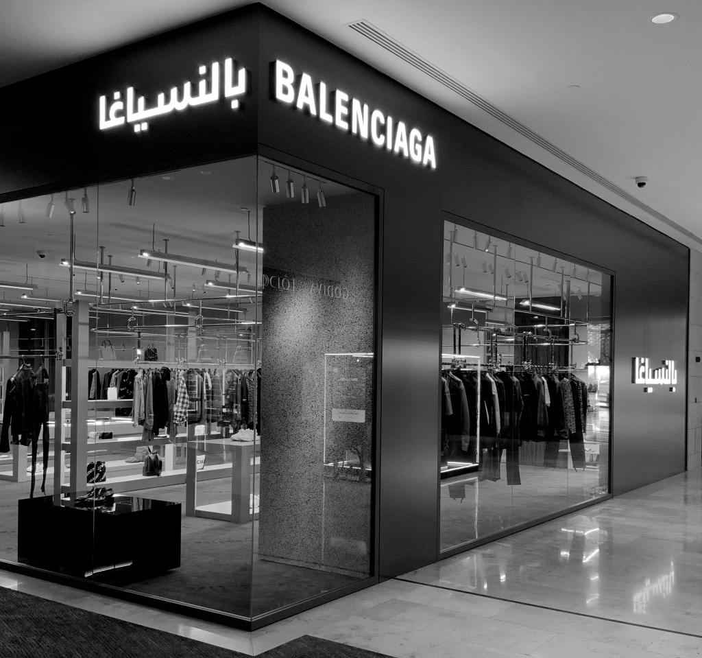
The last step was finding the final width of the Arabic logotype and positioning it with the Latin typography. He tested different baseline elongation options and placed a final kashida application after the Arabic Seen letter in order to make the Arabic Ya’ letter align with the Latin “L” letter, and the Arabic Ba’ letter align with the Latin “I” letter. He fixed the vertical and horizontal space between the Arabic and the French words depending on whether the two words would be placed horizontally on the same baseline or the Arabic word placed above the French word.
Afikra, Balmain, Lanvin, Design Space AlUla, and Majarra are among other Arabic logos Pascal created. Read about them in the 29LT Blog.
