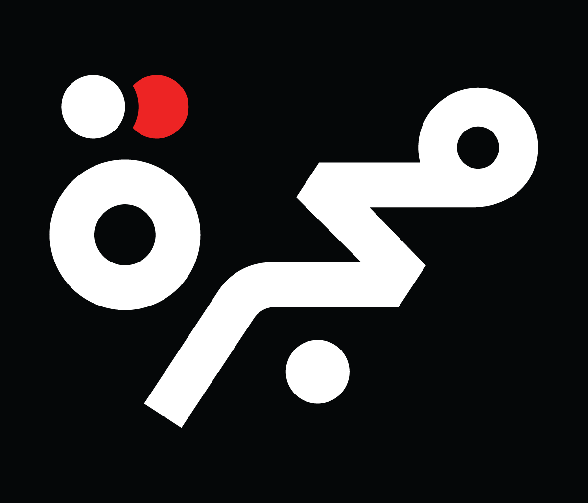
The letters composing the Arabic word مجرّة (majarra) give endless typographic possibilities for creating a logotype. The first and last letters have closed counters, while the medial letters are diagonally constructed. Geometrically simplified, the word can be envisioned with a circle on each end, linked with a triangle and a line in between. These were Pascal Zoghbi’s initial thoughts when briefed by the Majarra organization’s directors for creating their wordmark.

Majarra is a technology company offering a network of reliable, high-quality online content platforms in Arabic. Majarra’s platforms cover management, science, technology, psychology, general health, and finance content. Majarra works with the best content providers in the world, and partners with global institutions and organizations.
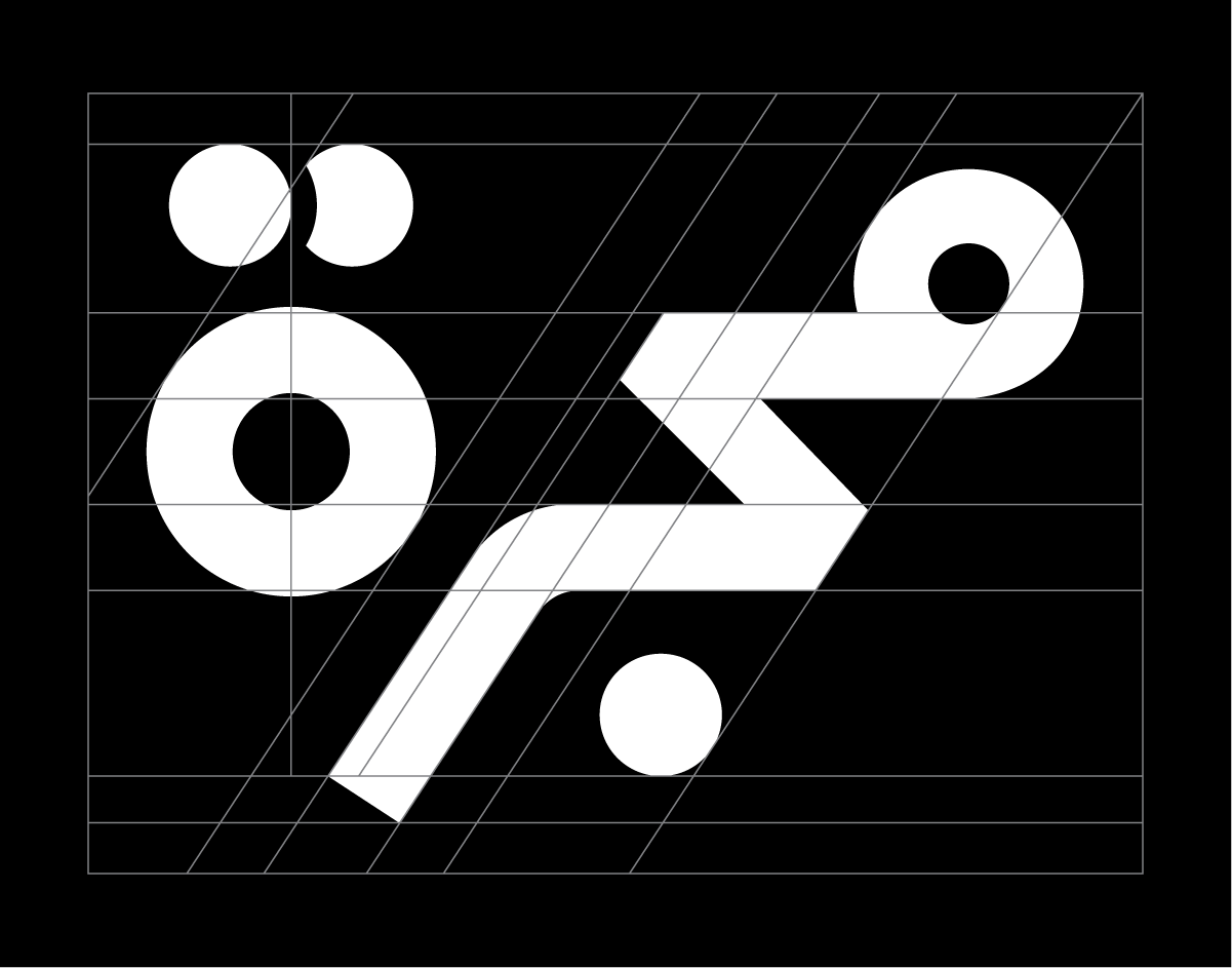
Zoghbi took on the creative challenge and designed several typographic options. At the start, his aim was to create as many options as they came to mind, to develop them, and generate even more options in the next phase. It is like sketching fast to exhaust all the visual possibilities, before selecting the strongest options and fine-tuning them. Of course, before any sketching started, he investigated and researched logos for Arab and international news and content channels, analyzing what exists currently and thinking about how Majarra could be distinguishable in a contemporary approach.
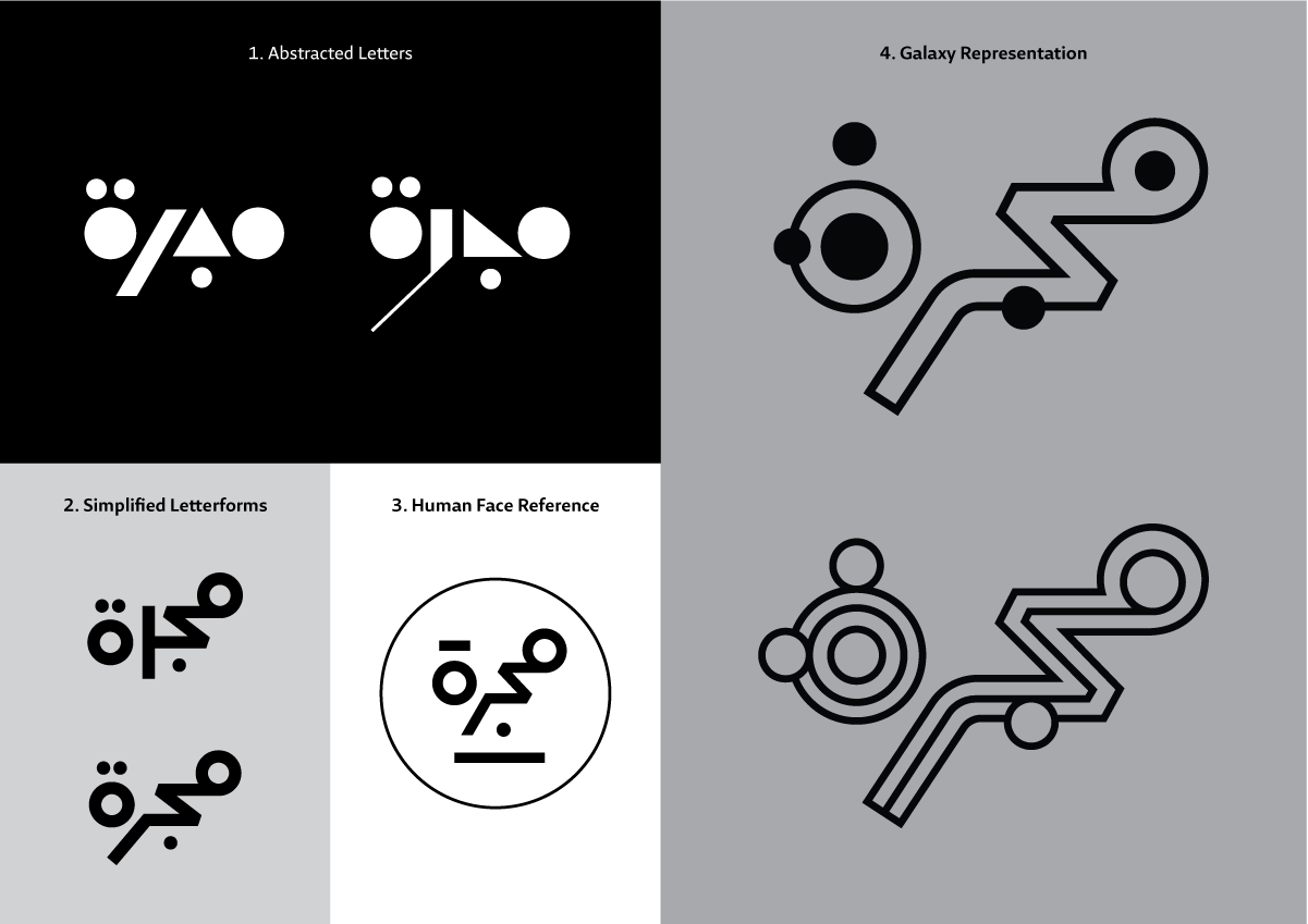
Four prominent concepts are categorized as follows:
- Abstracted Letters
- Simplified Letterforms
- Human Face Reference
- Galaxy Representation
The Abstracted Letters approach is the playful typographic option, where the Arabic letter Meem is simplified to a circle or a square, the letter Jeem to a triangle with a dot below it, the Ra’ to a straight or a slanted line, and the Ta’ Marbouta to a circle with two dots above it, horizontal or vertical. Several compositions were created with these geometric shapes. While the results were visually pleasing, such a route might give a childish feel to the brand, which was not the brand’s aim. This approach might be used in the future if Majarra decides to create a kids’ version of Majarra, targeting kids’ literature and information.

The Simplified Letterforms approach examines the flexibility of the word مجرّة (majarra) and plays around with the endless letter positioning possibilities and connections. Could the Meem link to the Jeem for the top, middle, or bottom of the baseline? Would the Meem be a full circle or a semicircle? How could the Jeem link to the Ra’ – from the top or the middle? Would the Ra’ be straight, slanted, or rounded? Where would the Ta’ Marbouta sit – on the baseline, or aligned from the top, middle, or bottom of the composition? Would the diacritic dots be circular, square, or rectangular? With these ideas translated into typographic options, the final logo was fine-tuned.

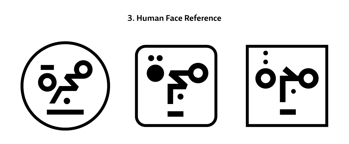
The Human Face Reference option appeared by chance while Zoghbi was working on the simplified letters options: he noticed that in specific placement, the Meem and the Ta’ Marbouta could be visualized as eyes in a face, with the Jeem and the Ra’ as the nose. Since Majarra is an educational and media platform enriching the human mind, exploring whether to have a logo look like a human face was interesting. This option was later dropped since the directors of Majarra did not want any visual icon to age, and Zoghbi thought that it might resemble internationally known logos like the MacOS logo.
The Galaxy Representation concept had to be tried, for Zoghbi’s design process includes seeing and assessing all plausible options before discarding them. Since the Arabic word مجرّة (majarra) means ‘galaxy’ in Arabic, the idea was to visually have the Meem, Ta’ Marbouta, and diacritic dots represent planets, and to incorporate a circular or straight line holding them together as a galaxy or orbit visual. However, it was clear from the beginning that it would be the least interesting and most literal option.

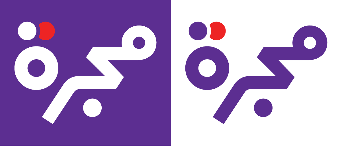
The final logo came out of the Simplified Letterforms design approach. The weight and spacing of the letters were fine-tuned and fixed, making the wordmark legible and strong in small and large sizes, on screen and in print mediums. The circular letterforms of the Meem and the Ta’ Marbouta balanced, and the diagonal slant of the Ra’ aligned with the aperture of the Jeem. Lastly, a small graphical element was added to the dots of the Ta’ Marbouta to hint at the idea of the galaxy, planets, and solar eclipse: the two diacritic dots of the Ta’ Marbouta were colored, and overlapped with a white space in between.

Afikra, Balenciaga, Balmain, Design Space AlUla, Lanvin, and Tamara are among other Arabic logos Pascal created. Read about them in the 29LT Blog.
