The creation of an Arabic logo for an existing Western brand brings challenges and questions that need exploring and assessing. The Arab designer must have a comprehensive knowledge of both Arabic and Latin scripts to achieve a professional result. Since both scripts are distinct from each other, the designer should draw several Arabic typographic solutions to echo the design approach of the Latin logo without Latinizing it. Homogeneous or contrasting typographic design solutions might be adopted to answer the brief.
A homogeneous solution would be to match the two scripts typographically as closely as possible, such as matching Sans Serif Latin with Modern Kufic or Neo-Naskh Arabic, or a high-contrast Serif Latin with a cursive traditional Naskh or Thuluth Arabic. The contrasting solution, on the other hand, is to create a cursive Arabic typographic solution to work with a Sans Serif Latin, or to draw a geometric Kufic Arabic to accompany a cursive script Latin.
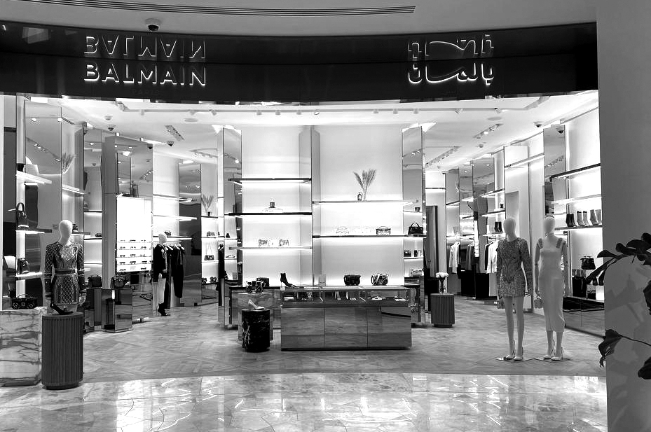
In 2018, Adulte Adulte created the new logotype for the Balmain Paris fashion brand. A solid Sans Serif typography replaced the previously double-line Modern Serif wordmark, giving the brand a voguish identity. In 2022, Pascal Zoghbi was asked by Adulte Adulte to create the Arabic counterpart of the new logo, allowing them to introduce the new Balmain identity to the Arab world.
With the French Balmain logo in caps and in a block layout, the brief sought an Arabic counterpart with the same visual identity. It is always challenging to make Arabic fit inside a block, since it is a unicase and connecting alphabet (capital letters do not exist, and the letters connect on a baseline). Fortunately, the Arabic word بالمان Balmain does not have any descending and connecting letters. Only the stand-alone Noon letter sits at the end of the word and can be shifted up to sit on the baseline instead of the descending line. This aspect occurs naturally in the Ruqaa Arabic calligraphic style, unlike other styles such as Naskh, Thuluth, etc.
Based on the above analysis, Zoghbi drew options based on both the Neo-Naskh and the Neo-Ruqaa typographic styles, to find the best companion to the Latin. The contrasting typographic results from the two design approaches created an interesting discussion between Zoghbi and the client, with the final decision given to the homogeneous design approach.
Beside the horizontal shift of the Noon letter, there was the challenge of drawing the Arabic letter Meem. In the French logo, the M is in the centre of the wordmark, with three letters on each side. The client requested this design feature in the Arabic logo too. Since in the Arabic word there are three letters before the Meem and only two after it, a different design approach was required. Furthermore, in Arabic calligraphy, when the Arabic letter Lam is followed by the Arabic letter Meem, a Lam-Meem ligature is created, and the Meem is written as a small pen stroke below the Lam instead of having its complete medial form on the baseline. Typographically though, the designer has the option to ignore the ligature and allow the separate positioning of the letters. Zoghbi draw both options for the sake of comparison and to find the best solution. The typesetting difference would be between بالمان and بالـمان .
As much as the Lam-Meem ligature made the Arabic wordmark true to the Arabic calligraphy, it made the logotype very narrow horizontally, in comparison to the Latin one. The Meem letter lost its presence and structure as a balancing element of the logo. Hence, the ligature was adopted, and a unique form of the letter Meem was drawn to echo the Latin while following the Arabic calligraphic structure.
To make the Arabic logotype slightly wider and to balance it with the French counterpart (without being exactly the same width), a cursive Kashida (Madda) was added after the Meem. The flow of the Kashida from the upper part of the Meem down to the baseline gave the logo a calligraphic hint, making it more appealing to Arabic viewers.
The Arabic typography is now fluent without a straight baseline. The letters are connected coherently with no straight links or corners. The cut on the endings of the vertical stems adds an extra layer of Arabic style without breaking the block structure of the wordmark.
Afikra, Balenciaga, Design Space AlUla, Lanvin, Majarra, and Tamara are among other Arabic logotypes Pascal created. Read about them in the 29LT Blog.
