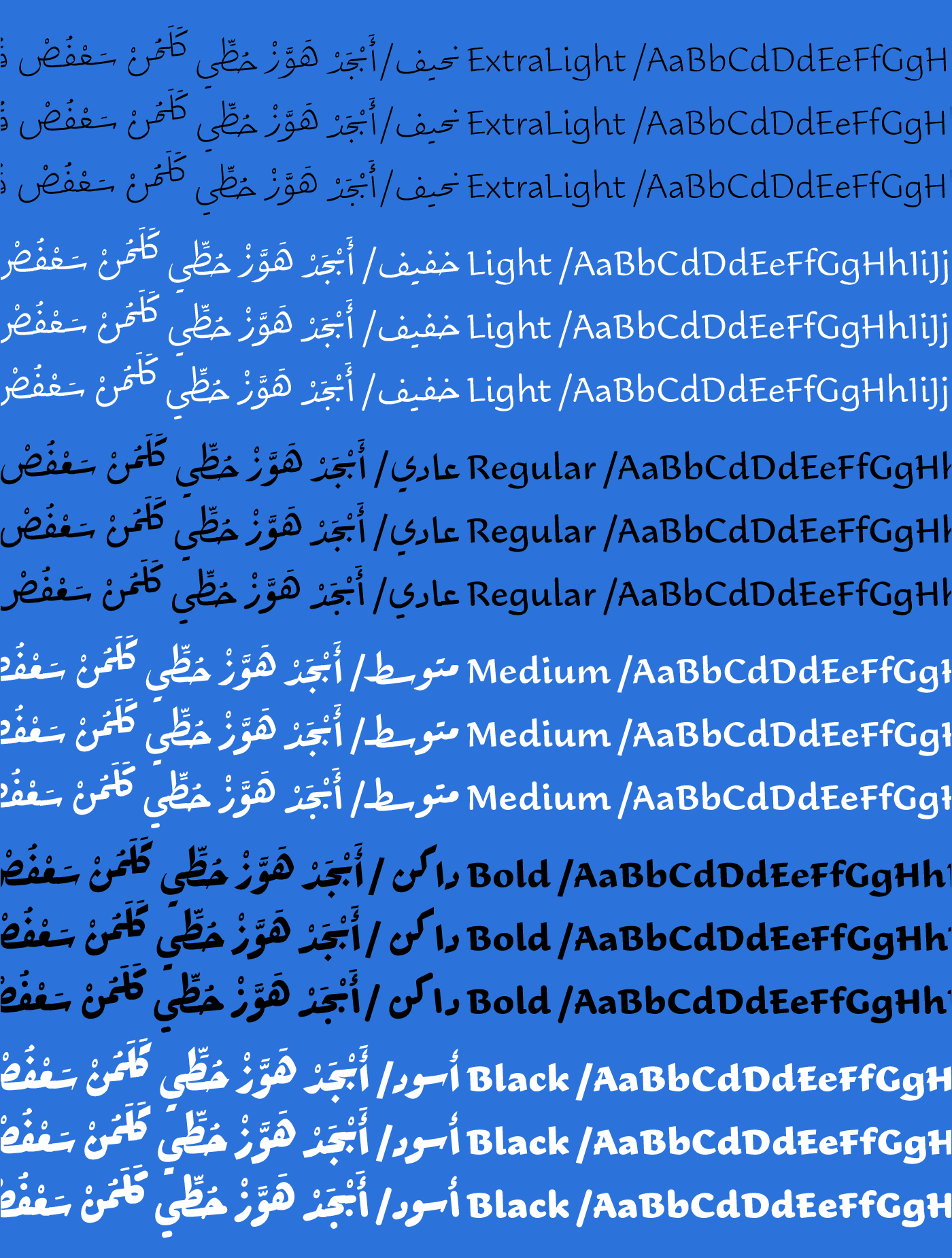
29LT Ada is a contemporary type design based on the Ruqʿah Arabic calligraphic style. It is a superfamily of Sharp, Flat, and Round typefaces, each in 6 weights, adding up to 18 styles. With all of its variants, Ada is the largest Ruqʿah-based type system to date. Challenging the boundaries of the style, it acts as a strong visual communication tool with different typographic voices.
Type System
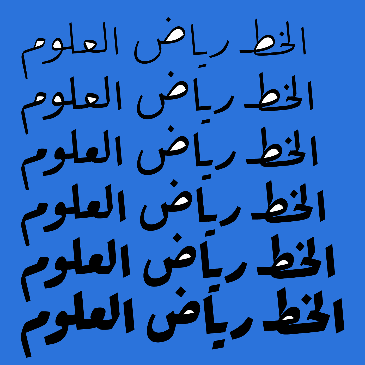
The three styles give vast typographic hierarchical options. It makes 29LT Ada a versatile design tool offering different typographic solutions and endless possibilities. While each style has its own skin, they all share the same essential inner skeleton. They can exist individually and combine perfectly when typeset together. All the fonts share an equal foundation and structure, but have distinctive aspects and features. It is a superfamily with three voices.
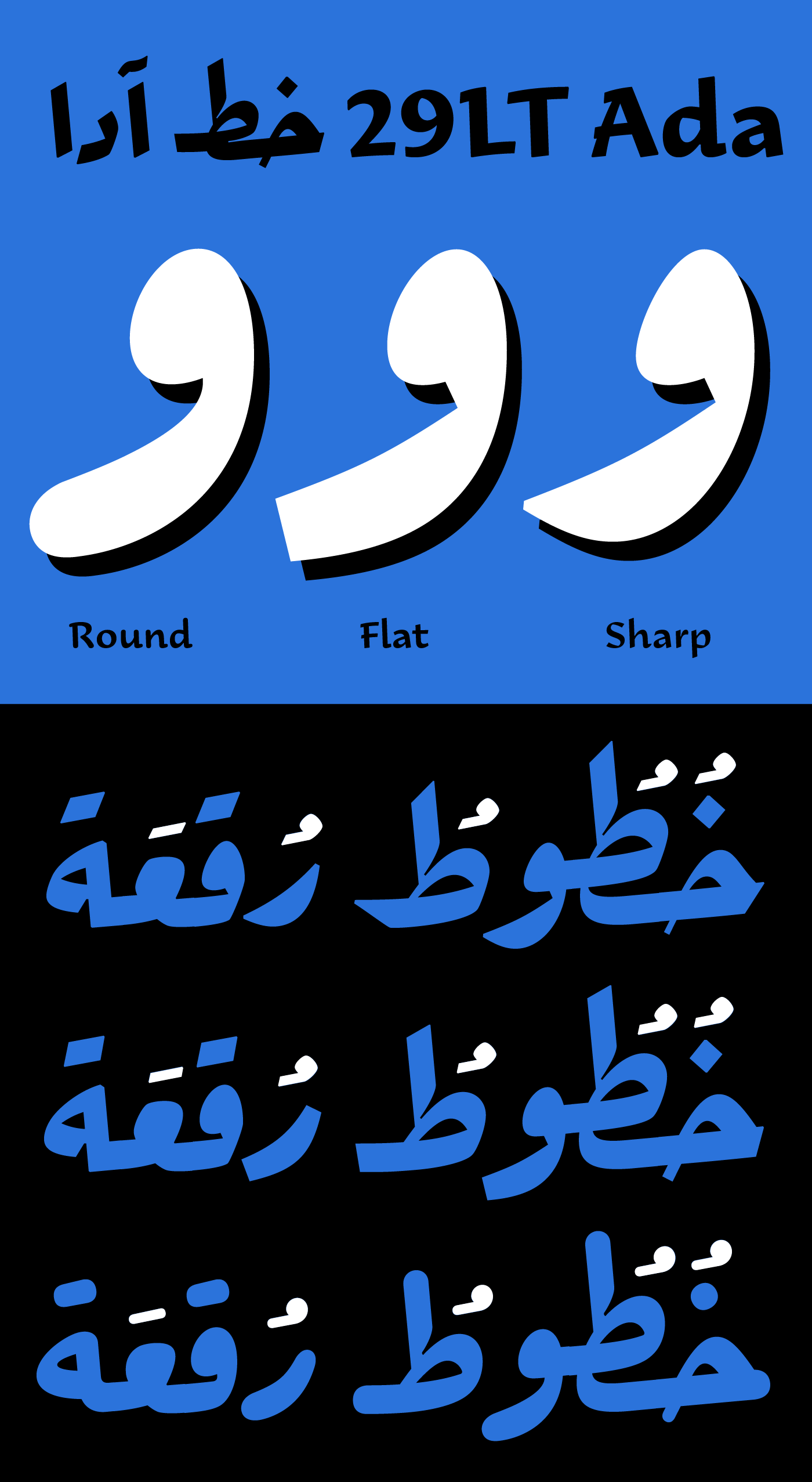
In general, all the heavyweights of all three styles can be considered as display styles. With high-contrast letterforms, all of the weights of the Sharp are classified as display or headlines fonts, while the Flat and the Round can be considered text or body typefaces offering a homogeneous weight distribution in small point sizes.
Ada Sharp is a display typeface with steep cuts, pointy terminals, and high contrast. It is the closest in style to the traditional calligraphic Ruqʿah style.
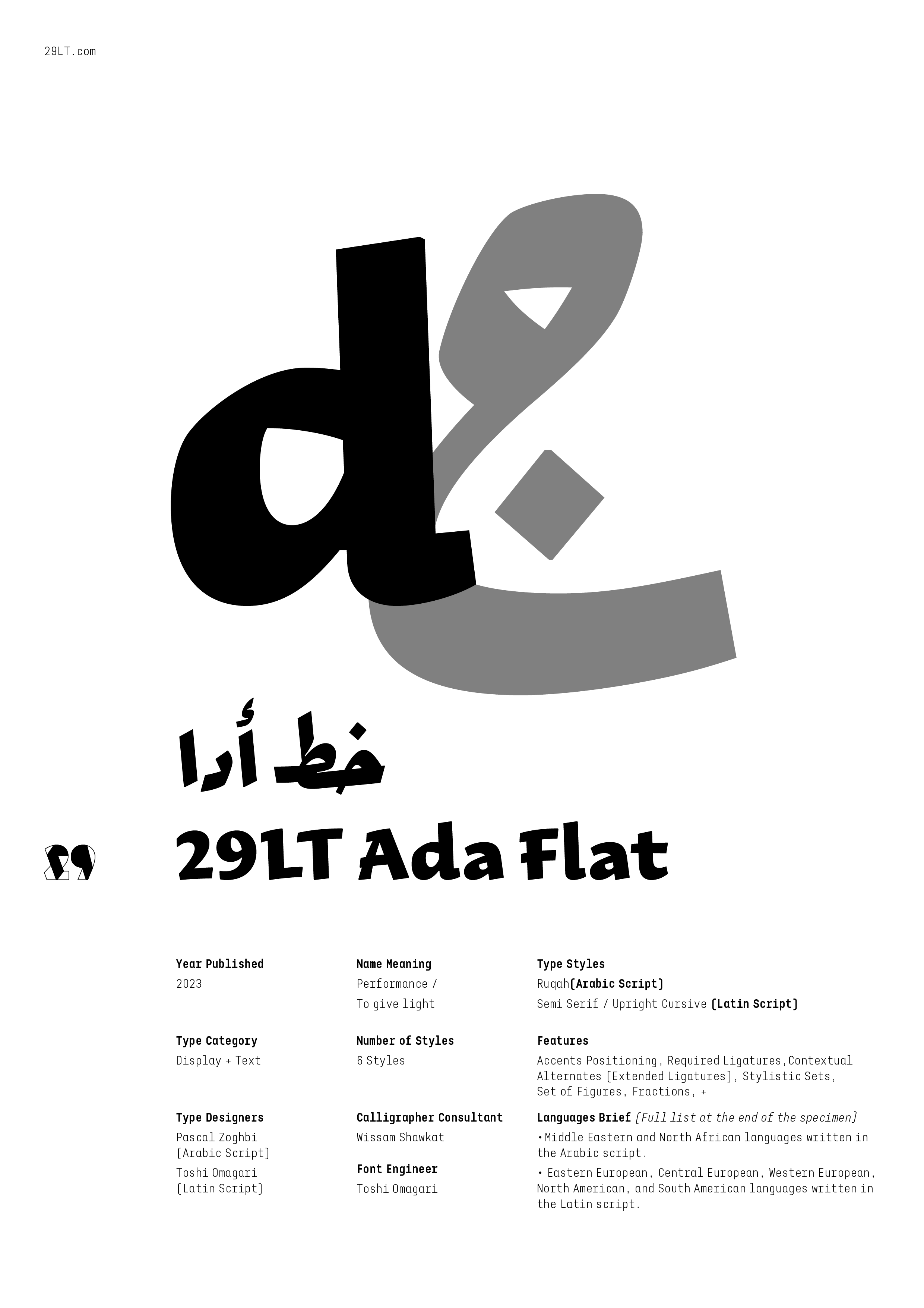
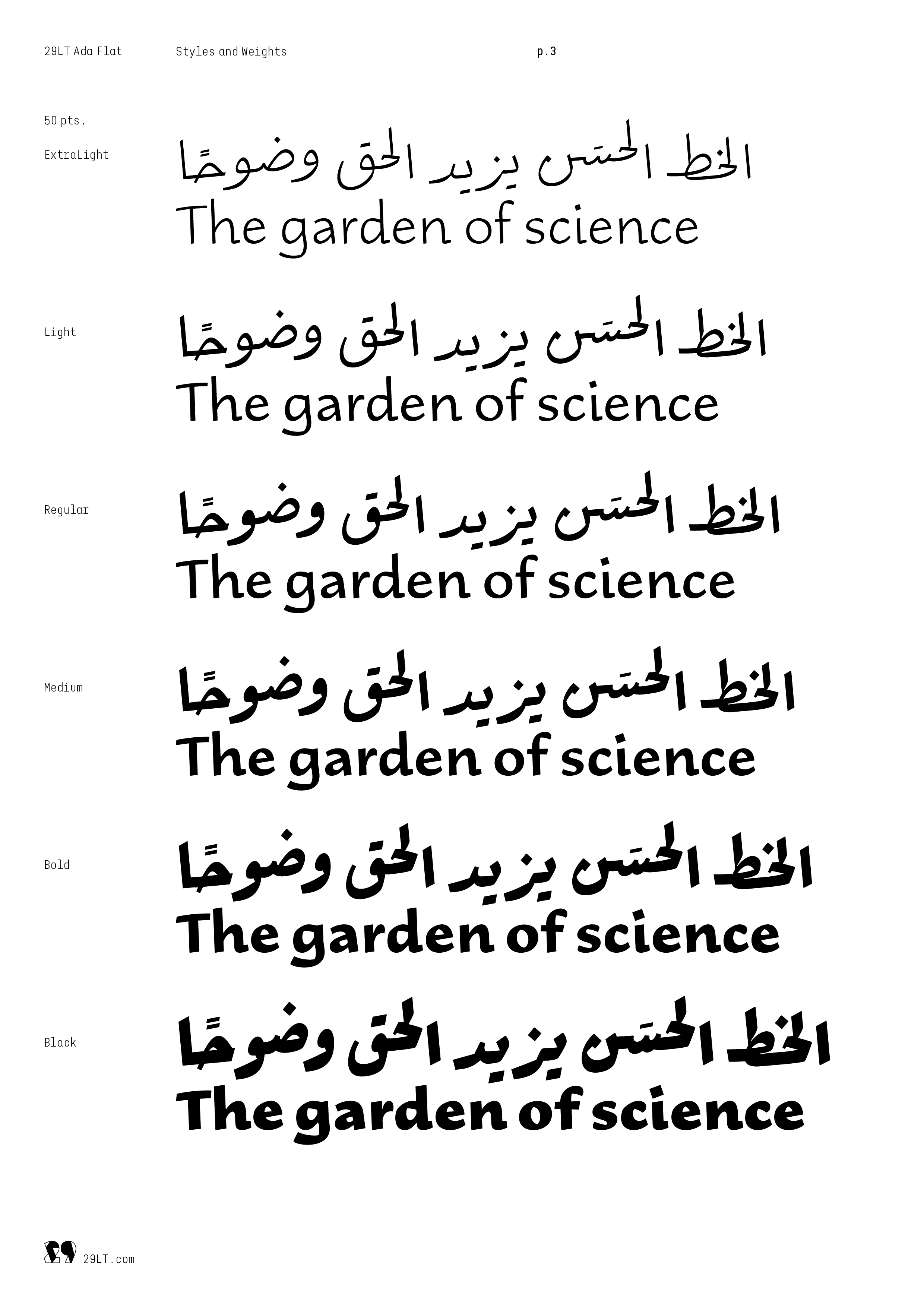
Ada Flat is a blunt typeface with neutral cuts, straight terminals, and low contrast. It can be described as a Neo-Ruqʿah typographic style, focusing on the flow of the pen stroke while removing any additional calligraphic cuts.
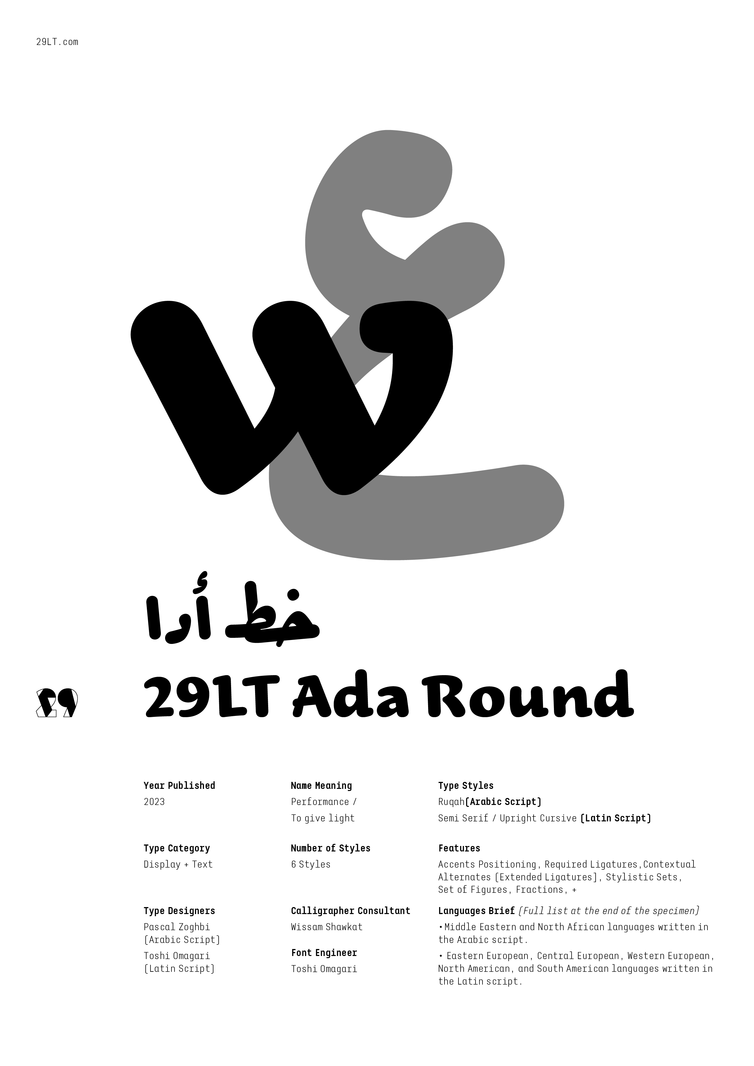
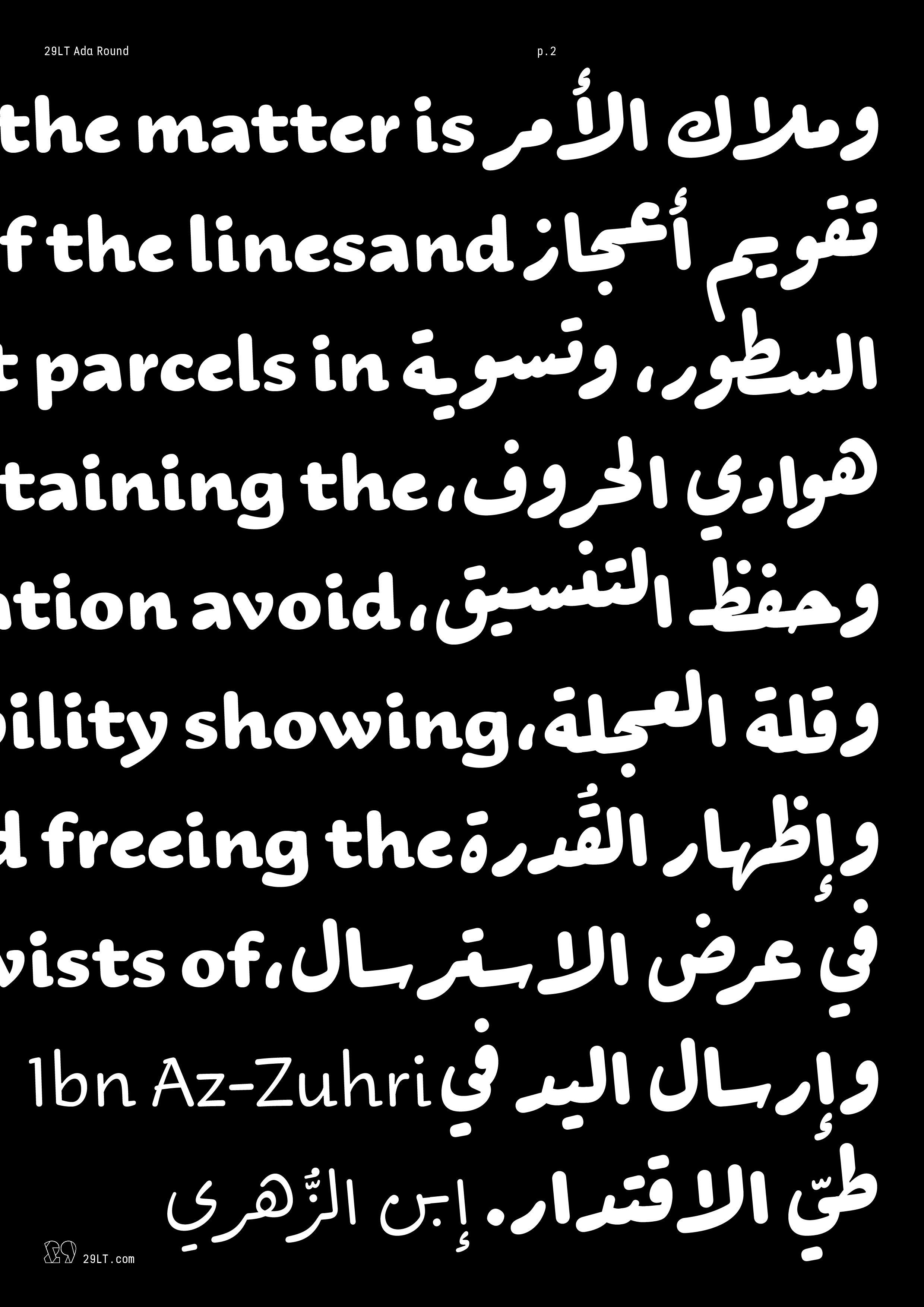
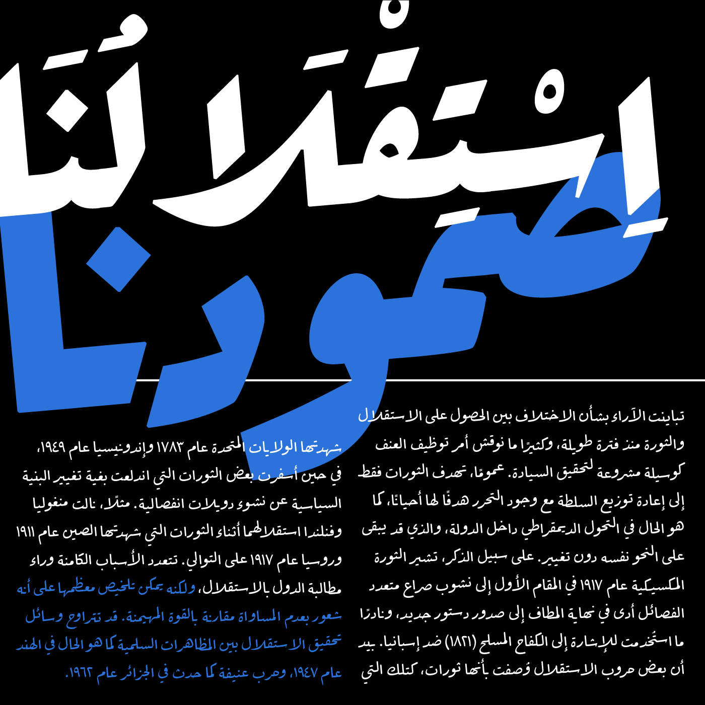
Ada Round is a rounded low contrast typeface with smooth cuts. It comes close to handwriting style with a ballpoint pen.
Ada Sharp and Ada Flat are united in one variable font of two axes: weight and contrast. On the other hand, the Round stands alone as a separate variable font with only one weight axis. It proved challenging to create the three styles in one variable font and have all the letterforms compatible. The change between the sharp and the round terminal was so vast that it was not possible to incorporate them.
Name
The name Ada comes from the Arabic transliterated word ’ada‘ of two Arabic words: أداء and أضاء. The Arabic word أداء means performance in English, while the word أضاء means light or to give light.
Presence of the Ruqʿah Style
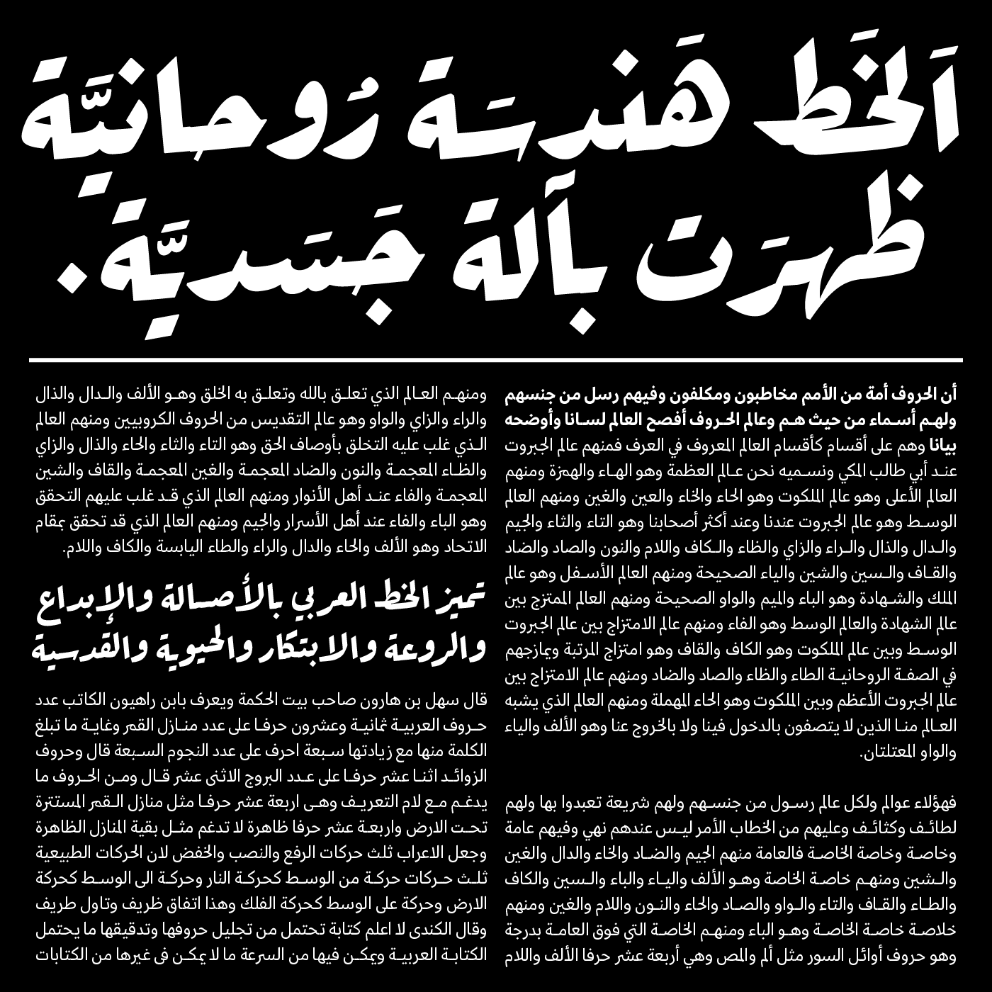
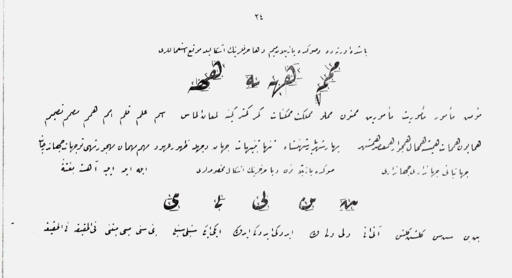
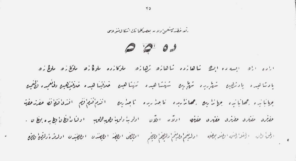
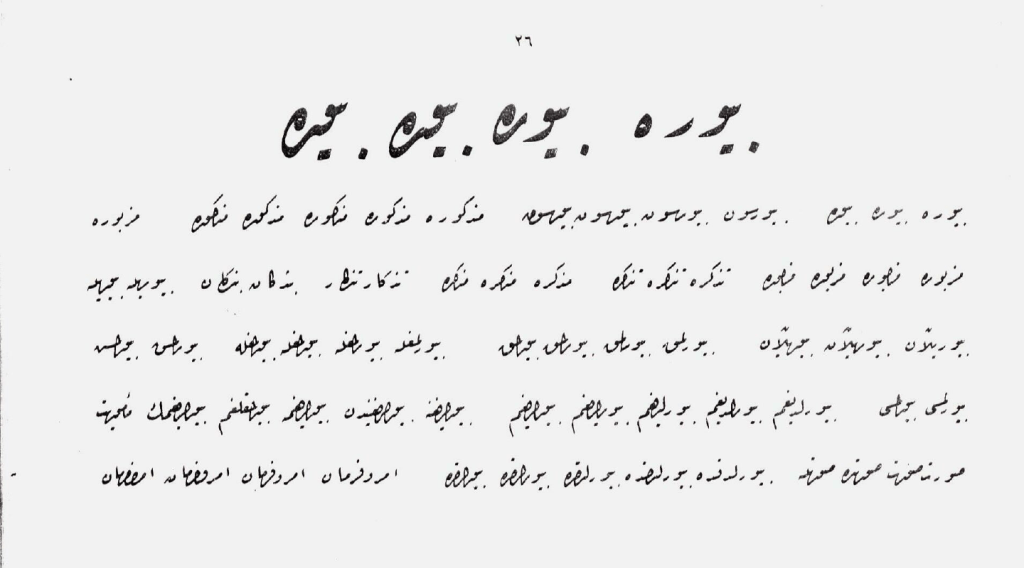
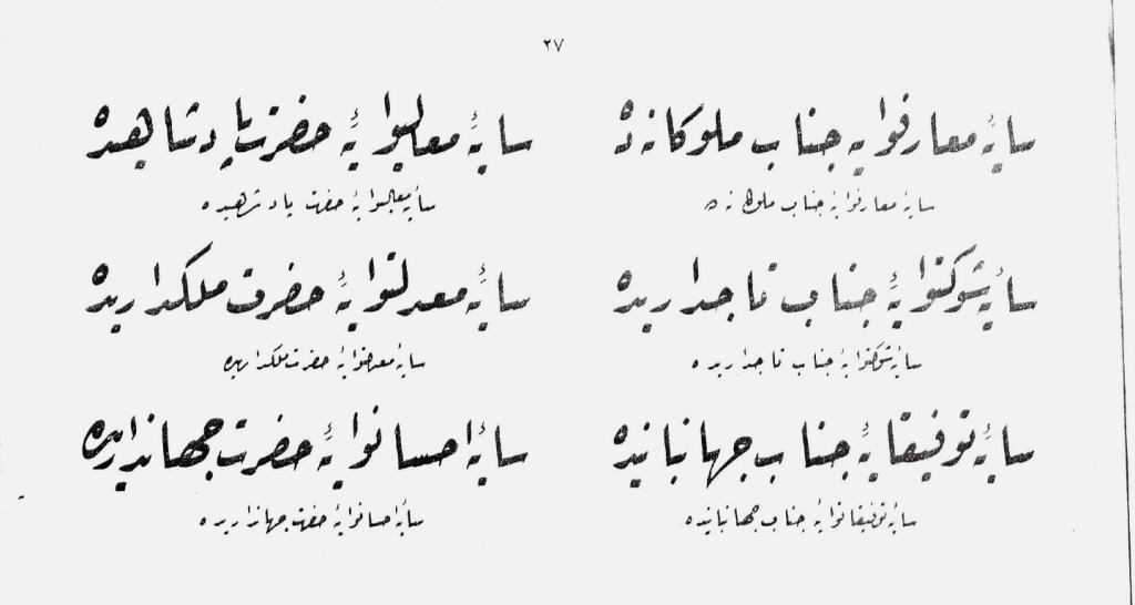
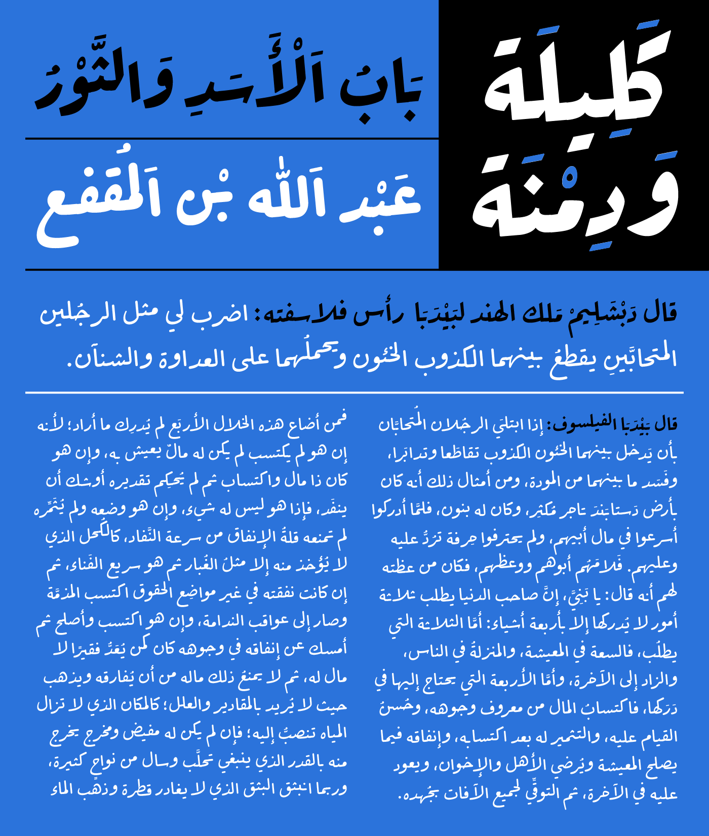
The Ruqʿah Arabic calligraphic style is one of the most simplified styles yet is one of the most complex ones to digitize. Derived from the elaborate and ornate Ta’liq and Dīwānī, Ruqʿah keeps the general contextual structure of the letterforms and the cascading baseline, doing away with all extra decorative pen strokes or detailing. Ruqʿah is straightforward and clean, for fast handwriting. It is the shortest calligraphic style, alongside the Nasta’lik (Farsi) style, with three rumba dots height for the Alif, in comparison to five, six, or even eight dots for the Naskh, Diwani, or the Thuluth styles respectively. This makes Ruqʿah functional, quick, and easy to read. It is intended for the rapid production of content, instead of decorative and elegant calligraphy.
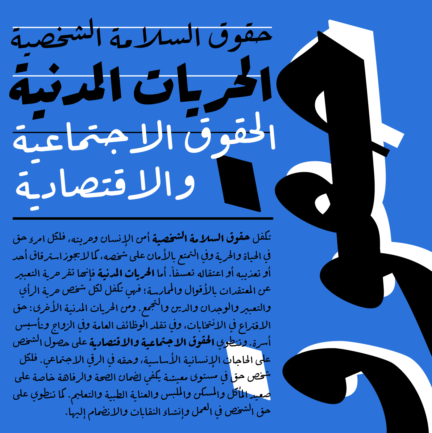
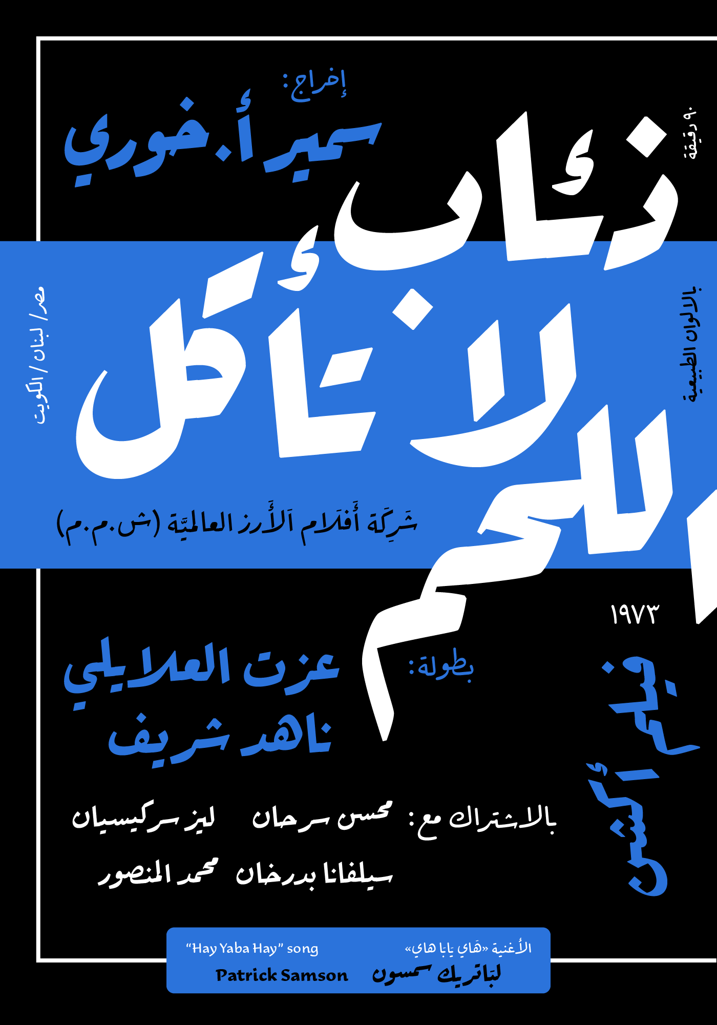
In modern times, it is the common style used in urban visual communications, and at school, most Arab children grow up learning to write in the Ruqʿah style, and learn to read in Arabic books mostly typeset in Neo-Naskh typography. The Naskh style is considered the common publishing typeface, found in most Arab publications over decades. Ruqʿah is the robust style for street calligraphy, handwritten road banners, traditional shop signs, vintage road signs, and Arab cinema posters, among other urban settings.
In modern publications, Ruqʿah can accompany the Naskh style for titling or to add an extra level of typographic hierarchy. 29LT Ada can accompany any other 29LT typefaces based on the Neo-Naskh style for such applications: 29LT Azer, Riwaya, and Zarid type families, for example.
Understanding Ruqʿah
After two decades of focusing on Kufic and Neo-Naskh styles to create new fonts, Pascal Zoghbi decided to take on the challenge of creating a contemporary typeface based on the Ruqʿah style. He had three reasons. The first is the need for a new challenge and to learn new Arabic type design skills. The second is the addition of new fonts to the 29LT catalogue outside the realm of the Kufic and Naskh styles. And the third is the latest advancement in type technology enabling the production of modern Ruqʿah fonts within the Glyphs App, accompanied by the use of advanced OpenType features.
In comparison to a modern Kufic or a Naskh style, the Ruqʿah style demands a complete overhaul of the design and technical process for creating a typeface. Zoghbi needed to understand the calligraphic behavior of the style and decide how to transfer this into modern typography.
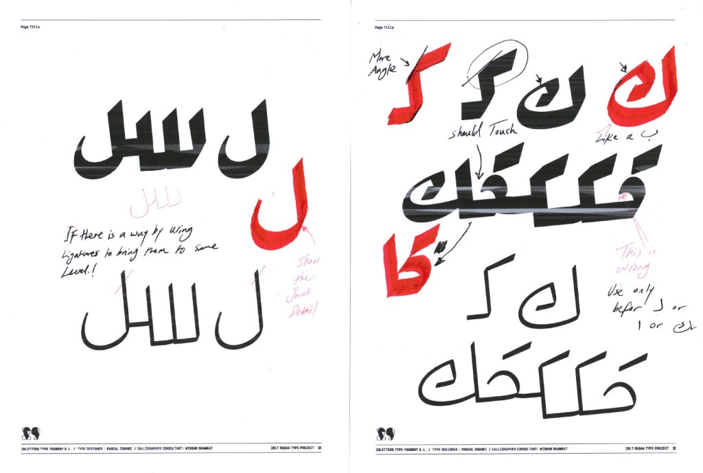
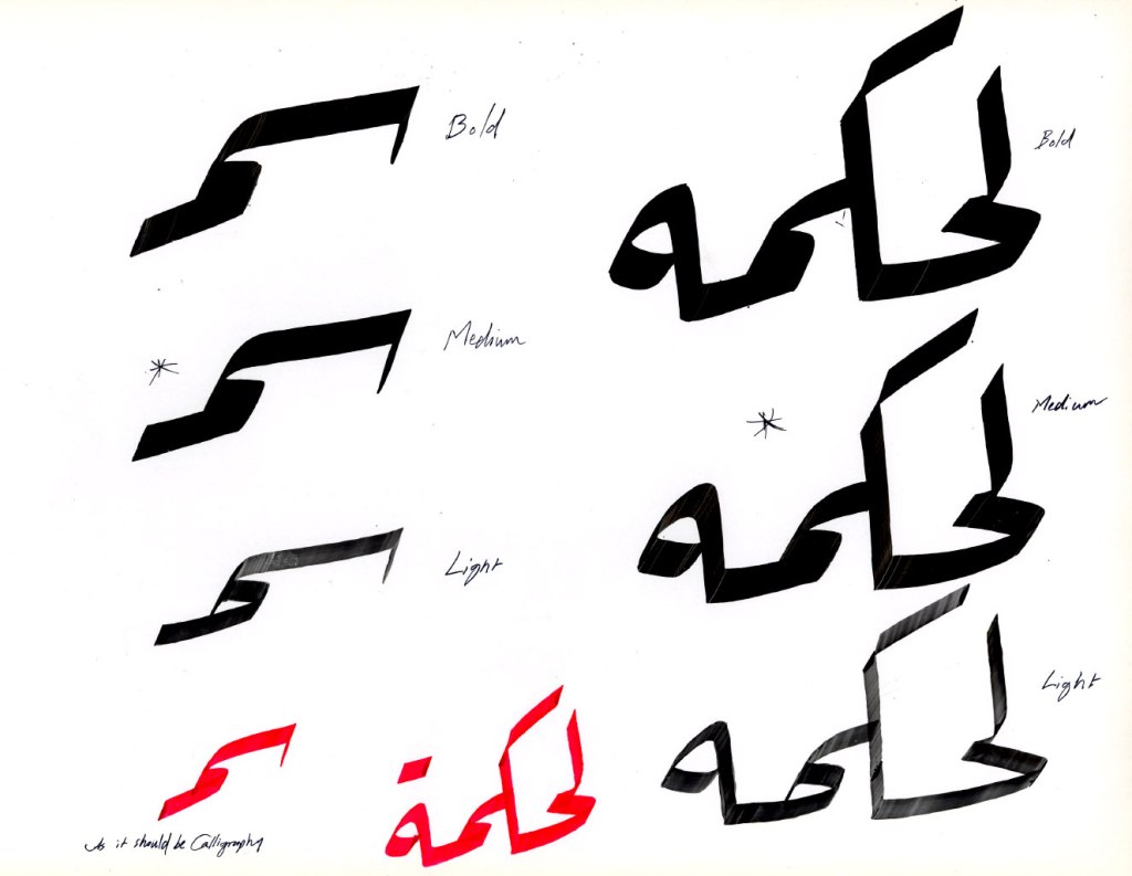
With the help of renowned calligrapher, artist, and designer Wissam Shawkat, Pascal understood and learned the overall logic of the style through examples shared by Wissam from renowned master calligraphers such as Izzet Effendi, Hashem Al Khattat, and Mustafa Halim. Wissam clarified the vertical escalation of syntaxes, and also the calligrapher’s aim to bring down the rising baseline when possible. He stressed the importance of achieving a balanced text flow in the typeface and avoiding open white spaces.
Hashem Al Khatta Ruqʿah

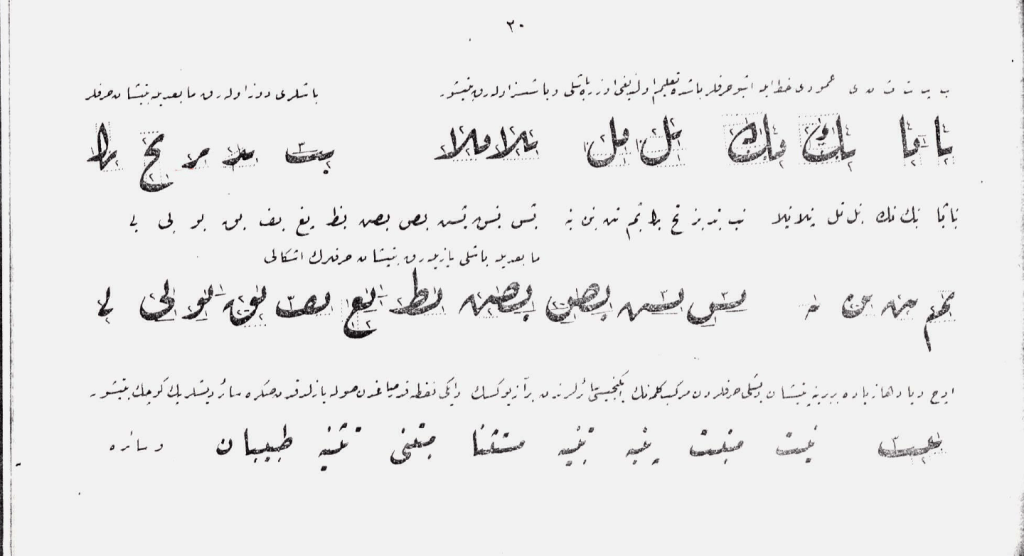


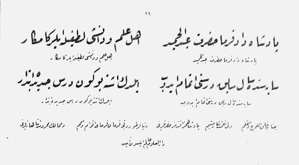
Izzet Effendi Ruqʿah
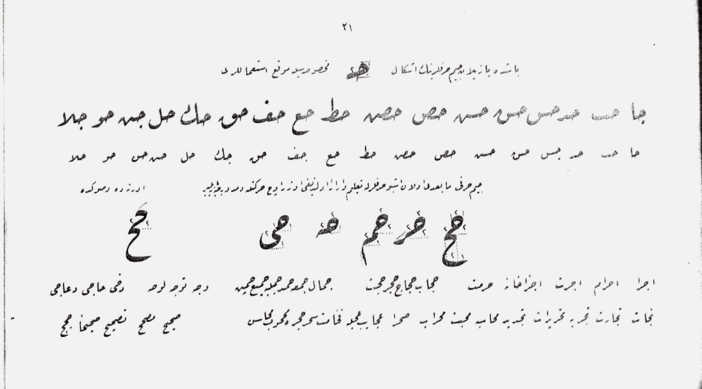
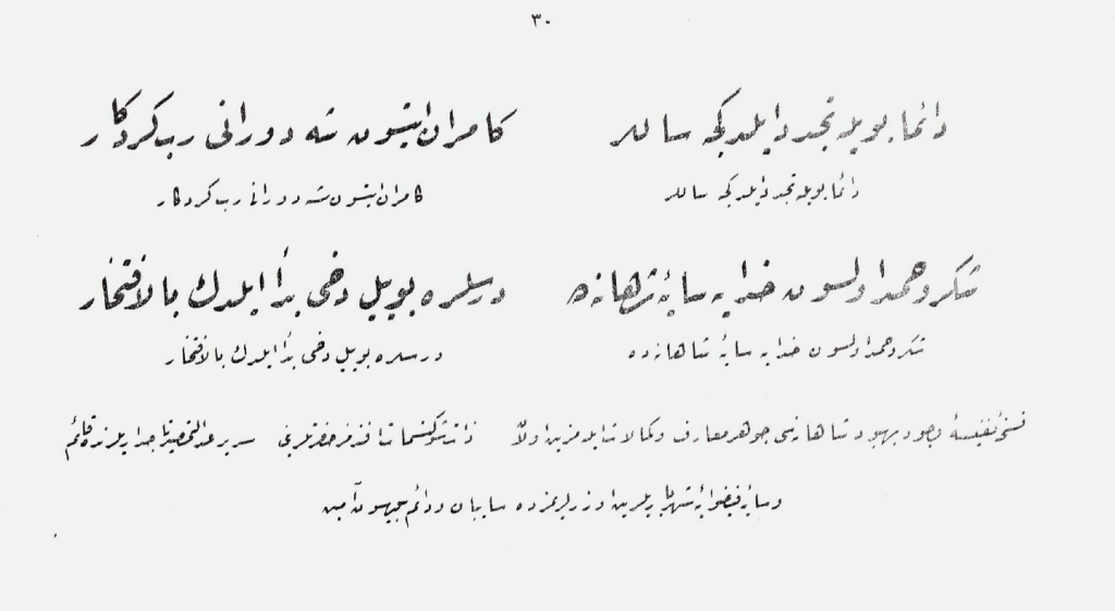
At the beginning, Pascal shared the digital outlines of the letters and Wissam hand-corrected them over printouts. The aim was to achieve the correct proportions of the letterforms as well as drawing them beautifully with the correct pen contrast application. The challenge was to achieve adequate letterform structures to work in all the weight spectrums of the type family, not only the heavyweights. Most calligraphic references demonstrate the proportions and the contrast in a thick qalam broad-nibbed pen. With Pascal’s aim to create a broad Ruqʿah type system, the challenge arose of how to apply the knowledge in the light weights and achieve a homogenous transition in all the styles.
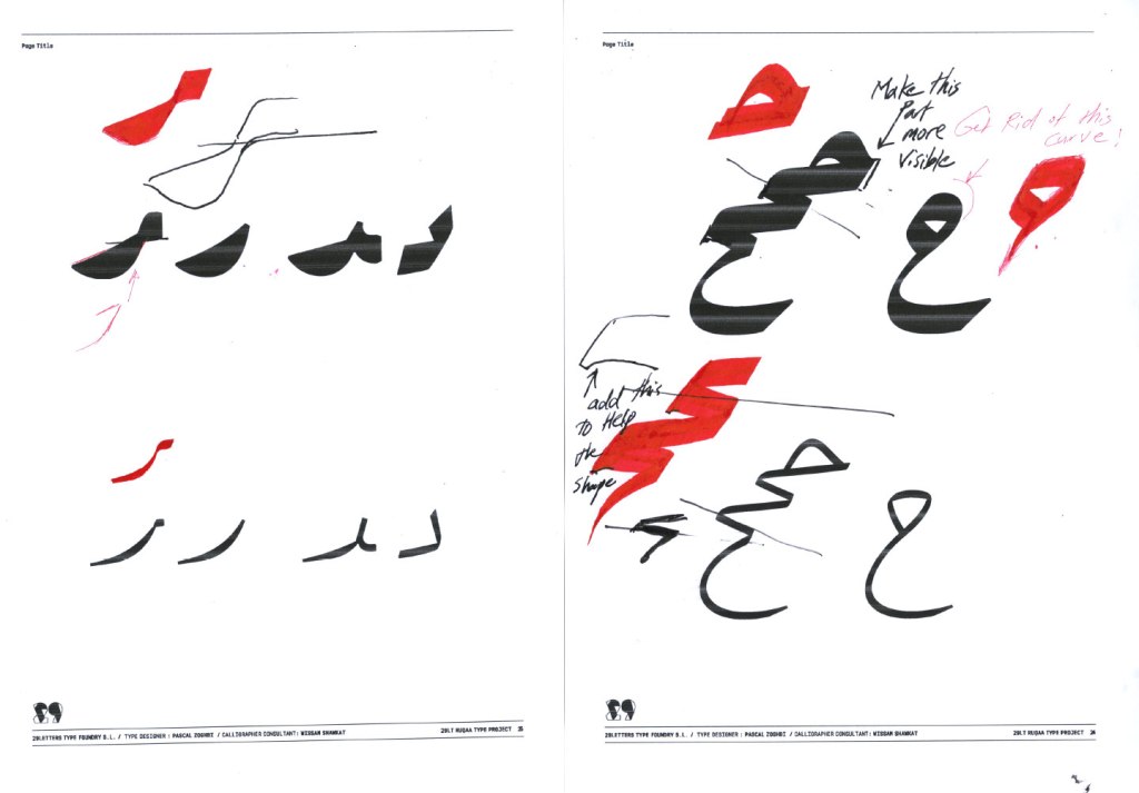

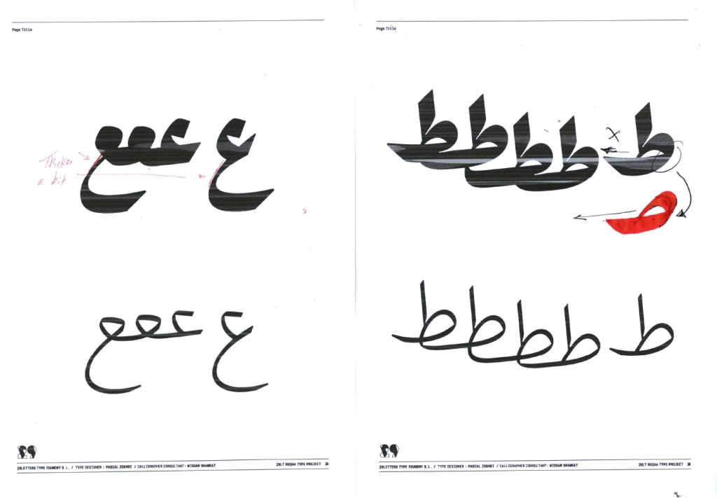

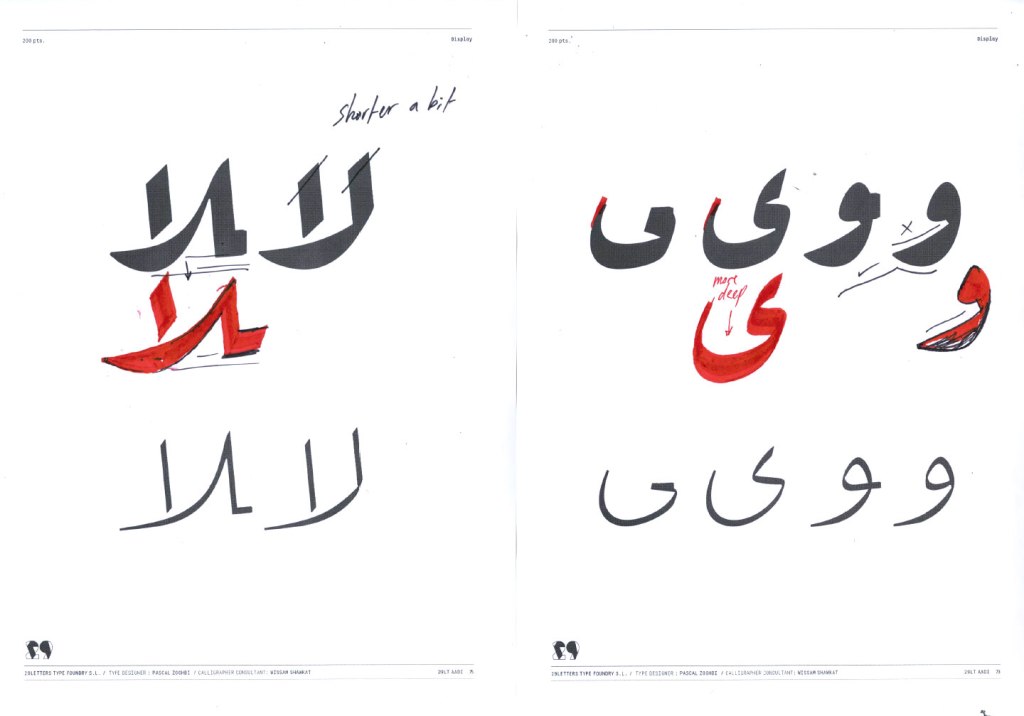
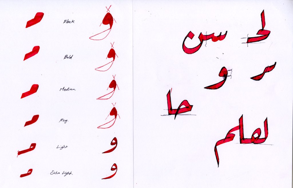
Wissam Shawkat consultancy outlines corrections for Pascal Zoghbi
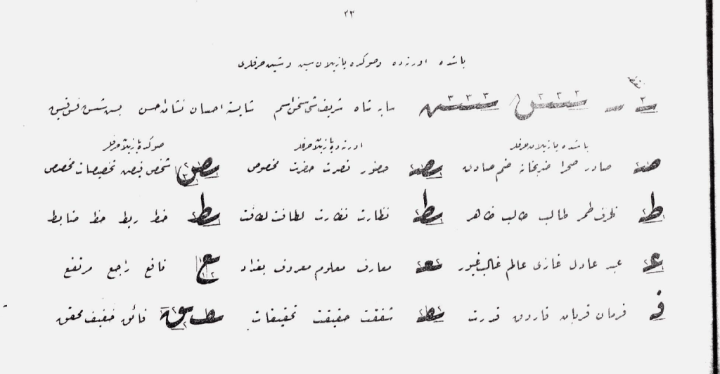
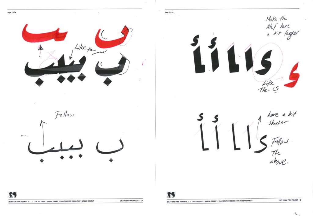
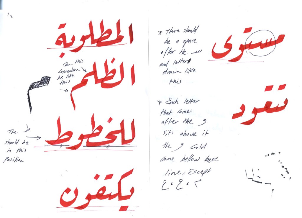
The degree of the baseline slant was the other challenge. The appropriate angle is needed to keep the typeface as true as possible to the calligraphic style, while reducing the vertical escalation to stay within the digital vertical limits. Pascal decided on a five-degree angle slant and adjusted all the letterforms accordingly. In calligraphic Ruqʿah styles, the slant angle can range between five and thirty-five degrees or even more depending on the calligrapher’s hand, the letters present in a word formation and the shape of the letterform itself. The decision to harmonize the slant to a five-degree angle gave the typeface a contemporary feel and solved part of the major problem of empty white space inside or between words. The low slant angle demanded a creative drawing process of fitting cursive calligraphic letterforms to a typographic grid.
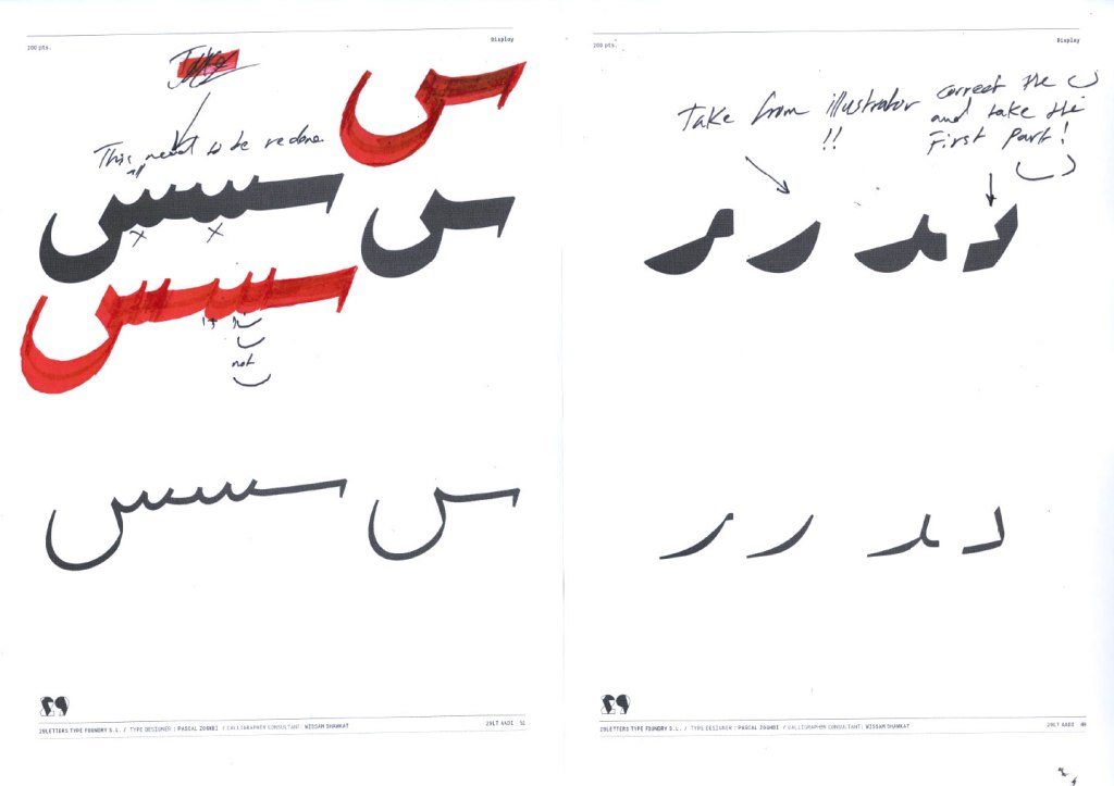
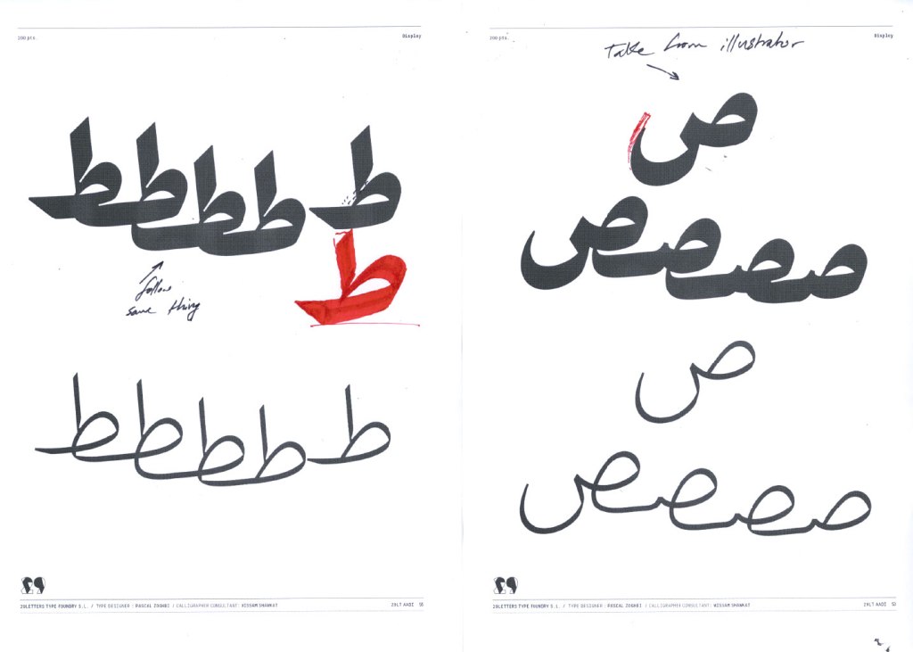
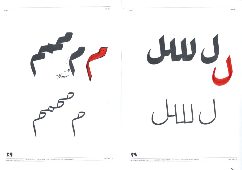
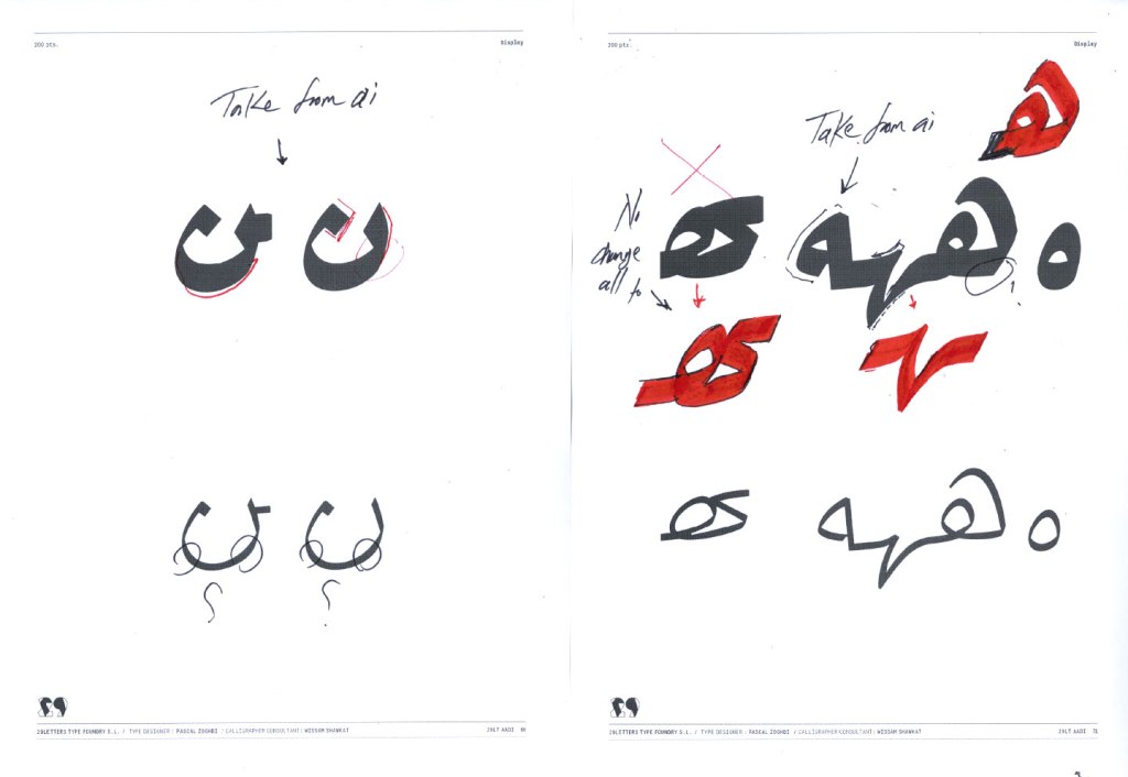
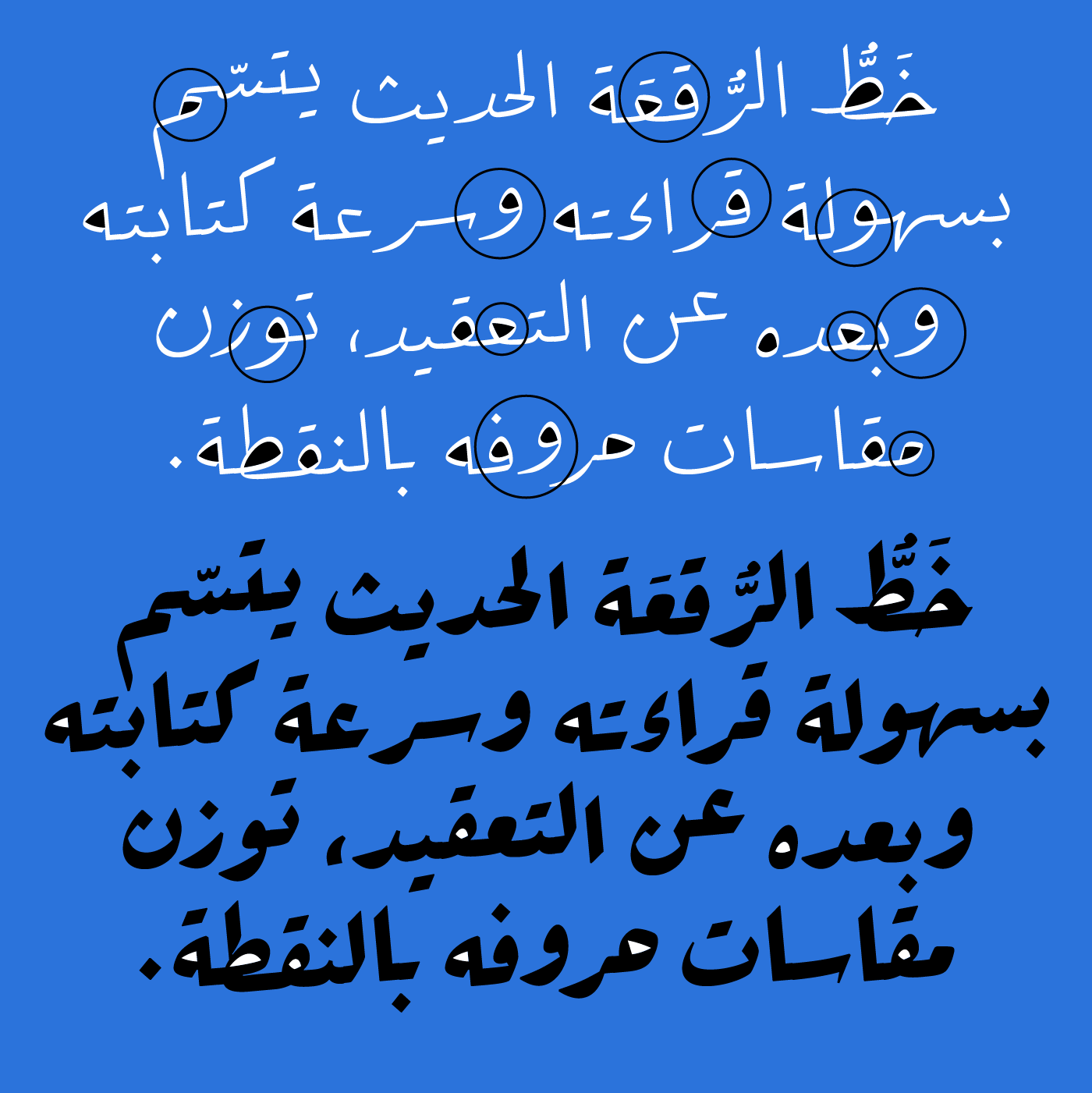
With Wissam and Pascal both happy with the overall look and feel of the letterforms, next came the creation of all the alternating forms of the letters that change or shift the baseline down, based on what precedes or follows them. This is the main design and technical feature that would make a Ruqʿah typeface render correctly. Wissam explained that the calligrapher tries to always fill in the white space in a certain syntax, but it is important not to force it and break the flow of the word image. Hence decisions on how and where to apply these different contextual letterforms in the typeface and how to achieve a balanced word structure. They created contextual alternating letterforms for the common letters combinations, while dropping some complex and rare alternates to keep the typeface simple and clean.
With Wissam’s valuable knowledge and experience, Pascal understood the calligraphic style and the best way to transfer this knowledge into a digital typographic typeface.
Arabic Typographic Eyes and Heads
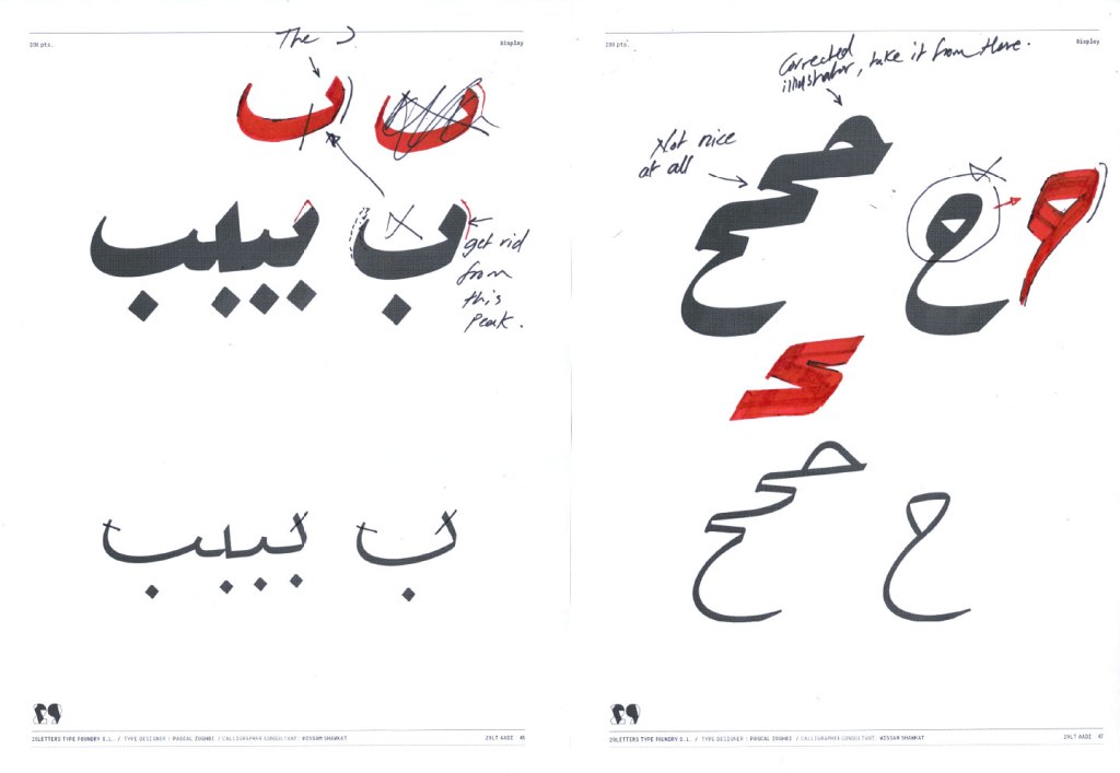
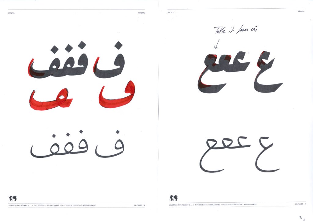
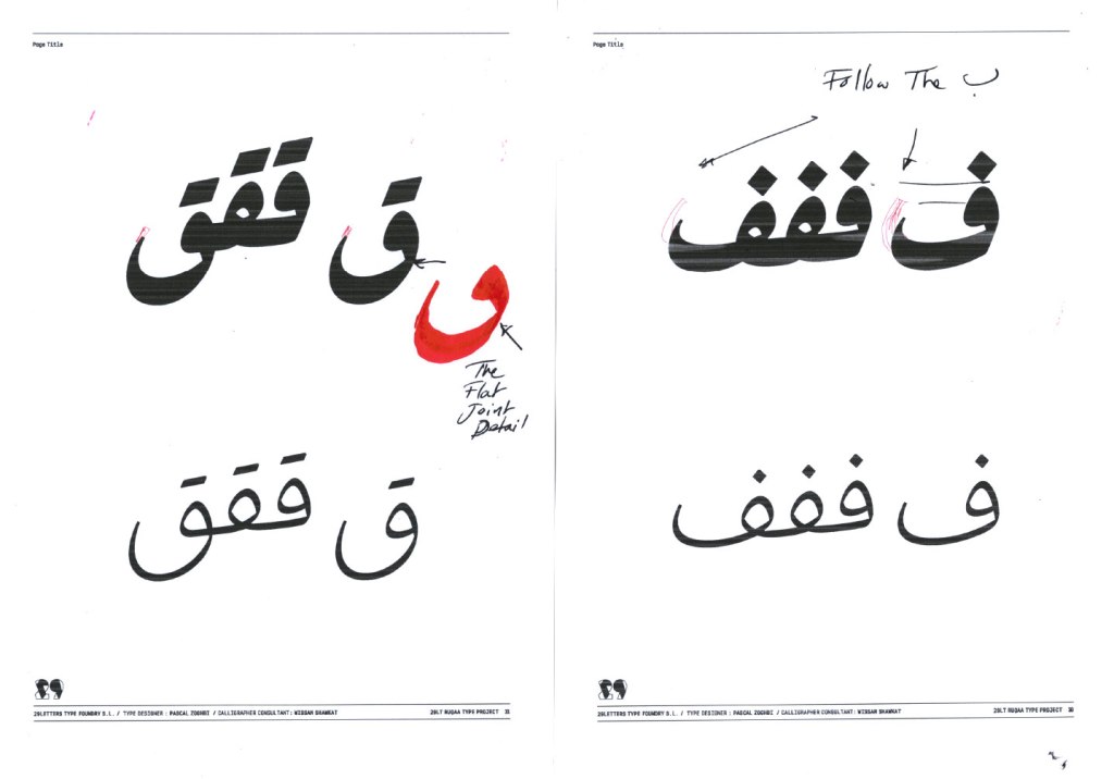
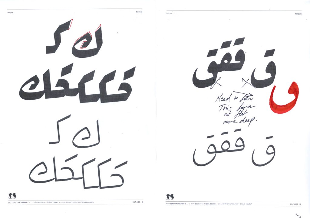
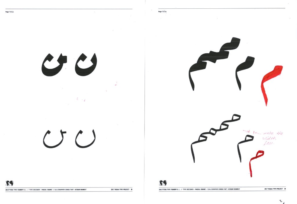
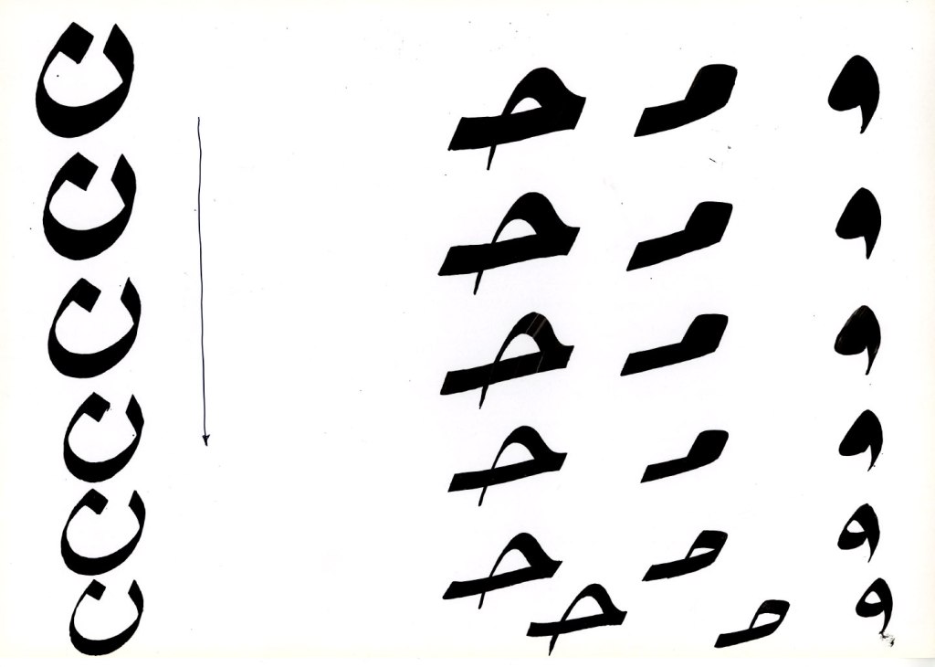
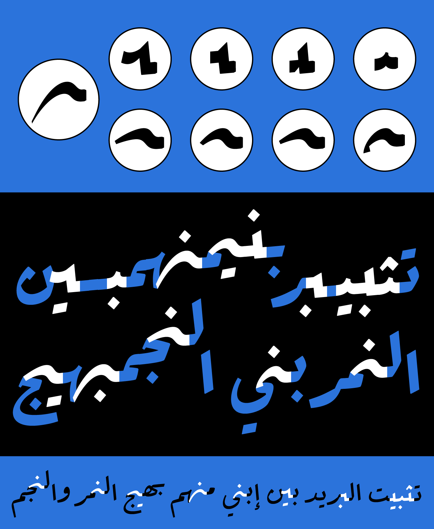
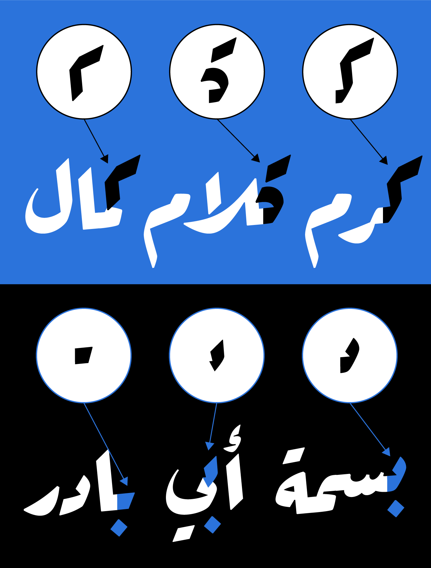
In the Ruqʿah calligraphic style, the small closed counters clot, as in the Arabic letters Ain, Fa’, Qaf, Meem, and Waw. The clotted counters balance well with the straightforward clipped letterforms and give a robust feel to the written words.
While this aspect works well in heavy weights, the clotted counters start to pop up in the light weights, out of balance with the thin pen strokes. Hence, Pascal decided to open up the counters in the light weights and have the typographic color even in the Light and Extra Light styles of the type family.
This made the typeface legible in small point sizes and removed reading confusion with similar letters. He created alternating special layers for such glyphs, with closed and open counters, with the counters open in only the Light and ExtraLight styles. Wissam advised on the best open shapes possible to stay true to the Ruqʿah approach and not transition to another style like a Naskh one.
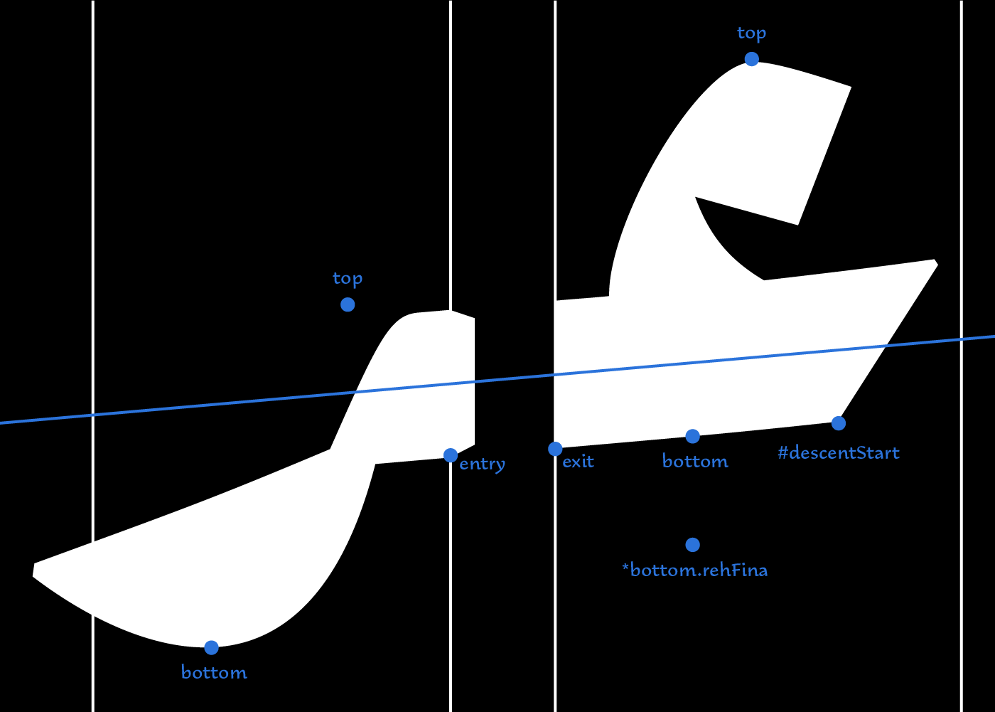
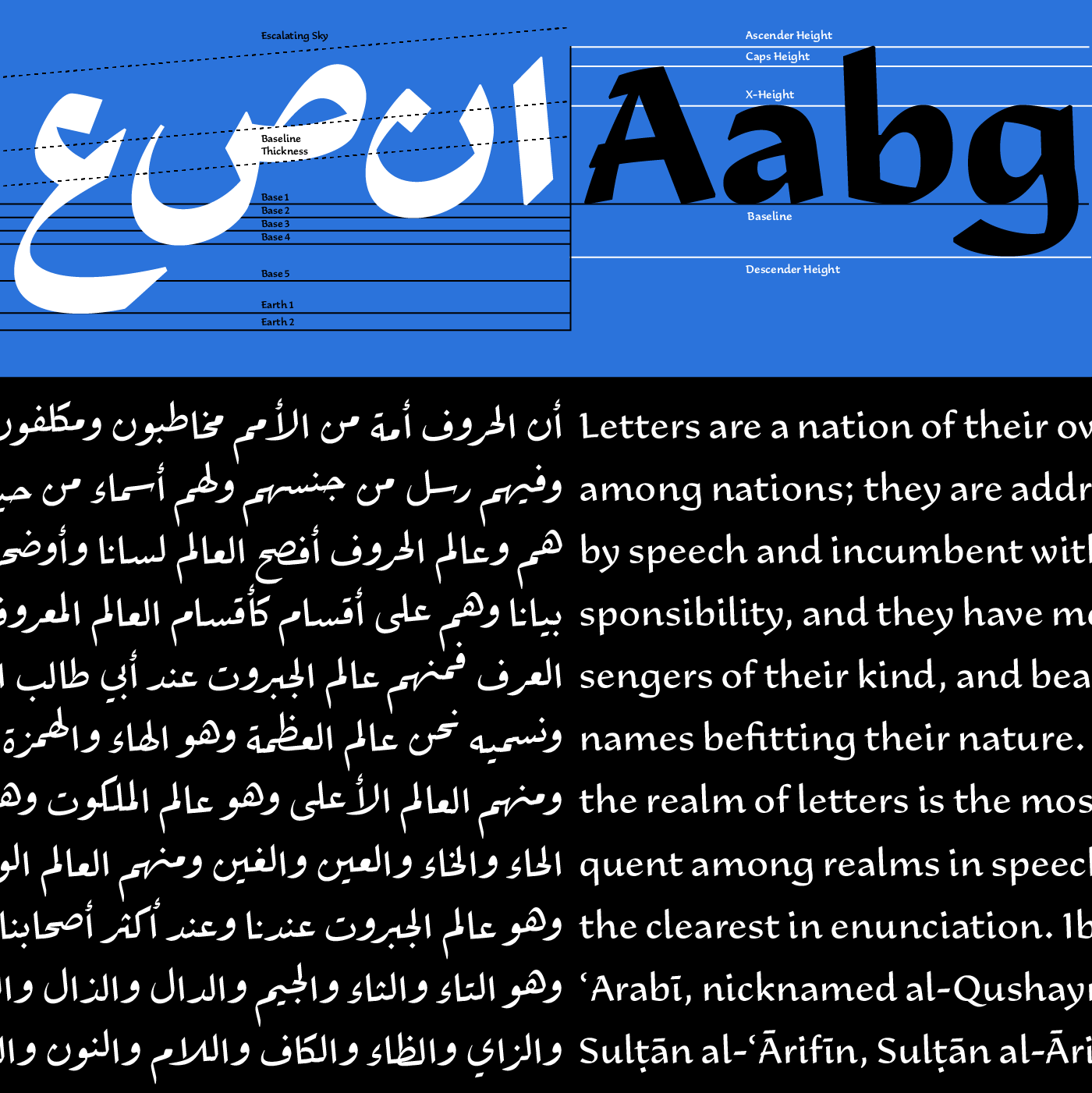
Vertical Typographic Guidelines
Unlike Latin typography, the vertical typographic guidelines for Arabic typography are not fixed across the different styles; there is no universal set of guidelines agreed upon by all Arab type designers when creating their typefaces. Started work on the Ruqʿah type project, Pascal knew he had to redefine his logic about vertical alignment. He drew up a new guideline system for Ada, different from the previous system for the Kufic and Neo-Naskh fonts.
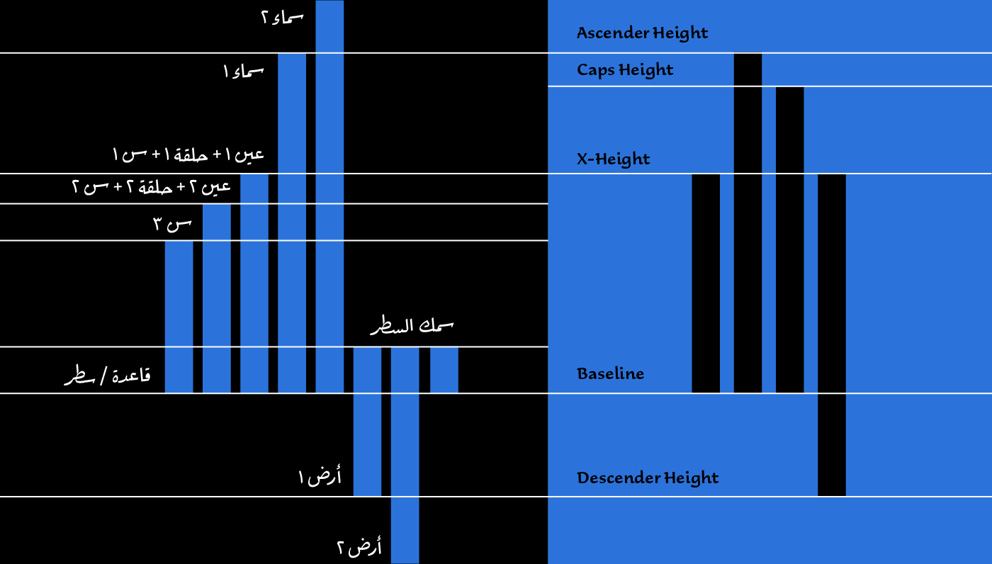
Finally understanding the calligraphic positioning of the letterforms in the Ruqʿah style, Pascal noticed the importance of the descender and baseline positioning, and the irrelevant positioning of median or ascender heights. In his 2015 article “Arabic Type Anatomy & Typographic Terms”, he had defined a guideline system based on fonts with a fixed horizontal baseline, without vertical escalation. Hence the importance of a fixed baseline level and thickness where all connecting letters meet, several median highest (Tooth, Loop, and Eye Heights), with the presence of two descending lights (Earth 1 and 2), and the vertical limit of ascending heights (Sky 1 and 2). While this system works perfectly for horizontal-based Arabic typefaces, it fails in vertically escalating ones.
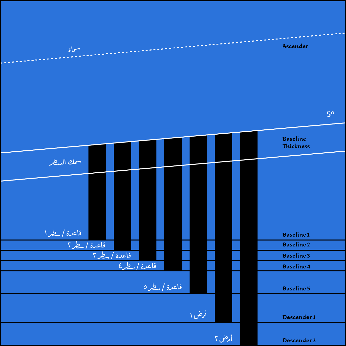
For the Ruqʿah project, the importance of the earth/s and base/s levels was clear. Pascal kept Earth 1 and 2, defined four bases instead of only one, and ignored the median and ascender heights since these change in every word formation. Based on the final letterform positioning and the length of the word, the important decision is the position of the isolated and final letterforms, with the medial and initial forms following.
Latest Type Technology
29LT Ada takes advantage of the latest type technology, present since 2020. It uses the latest features in the Glyphs App that apply to the Arabic script, as well as applying advanced OpenType features intuitively to match the behavior of the Ruqʿah style.
Anchors
Beside the standard (top and bottom) anchors are used for diacritic dots and marks positioning, the (entry and exit) anchors for the baseline slant connectivity, and (*bottom and *top) conditional anchors for the contextual positioning of diacritic dots and marks to avoid overlaps with problematic letters; finally the (#descentStart) vertical elevation anchors are placed in initial letters, functioning as elevation markers in the typeface, allowing the contextual kerning to work properly.
Contextual Alternates
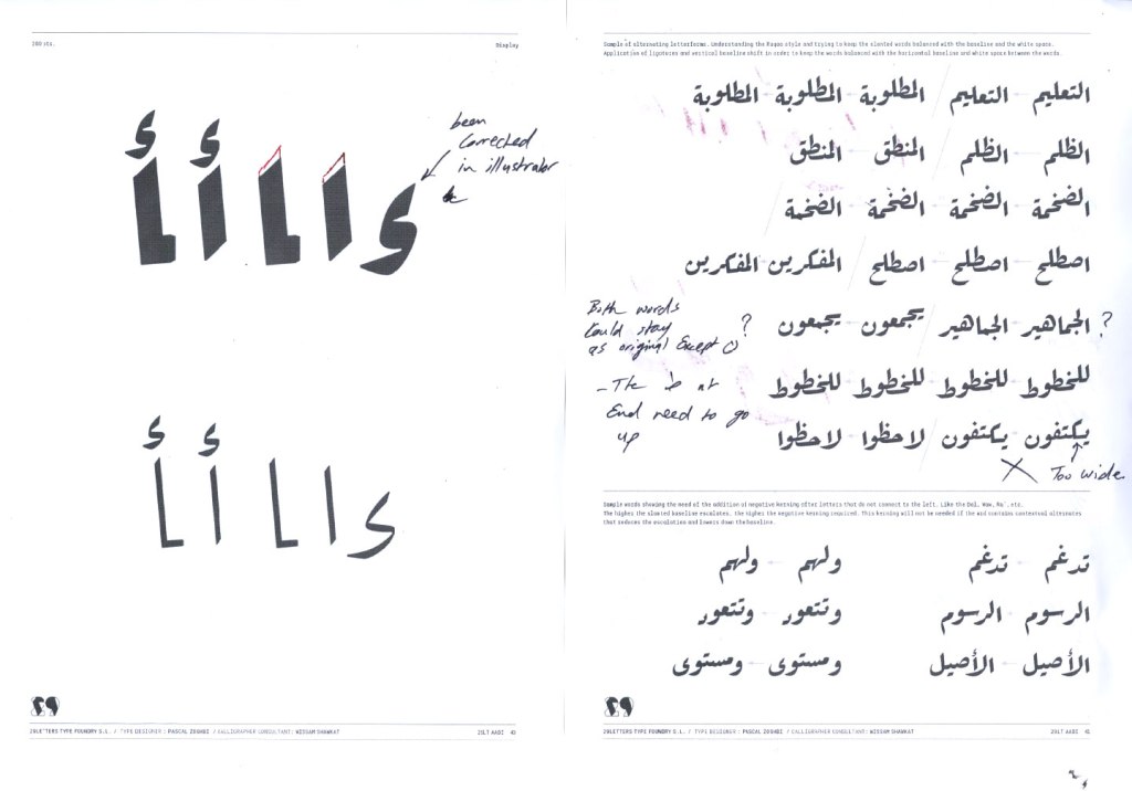
During the design process, Pascal decided on the important letter combinations for the typeface, generating them all as ligatures in the glyphs set. This important visual representation enables the different letter components to fit perfectly together. The ligatures also allow for the application of the standard class kerning. The file ended up with almost 1,000 ligature glyphs out of the full 1,350 Arabic character set.
With the design completed, the ligatures set, and the standard class kerning applied, Pascal asked Toshi Omagari to take over and create all the necessary contextual alternate coding.
Toshi Omagari is a multi-script Japanese type designer based in London, who graduated from the University of Reading and worked previously for Monotype. Besides his design skills, he handles Python and OpenType coding to find typographical solutions for complex typefaces.
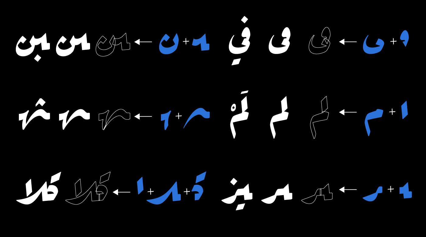
Toshi wrote the appropriate code, allowing the typeface to create all the required ligatures without needing them present in the character set. After testing and approving the functionality of the code, he removed most of the 1,000 ligatures, keeping the character set clean and simple. The character set dropped to two-thirds its original size, but the OpenType coding strings grew in lines. Toshi built on his Ruqʿah-style knowledge achieved while developing his Ruqʿah typeface Klaket, and now applied it to 29LT Ada.
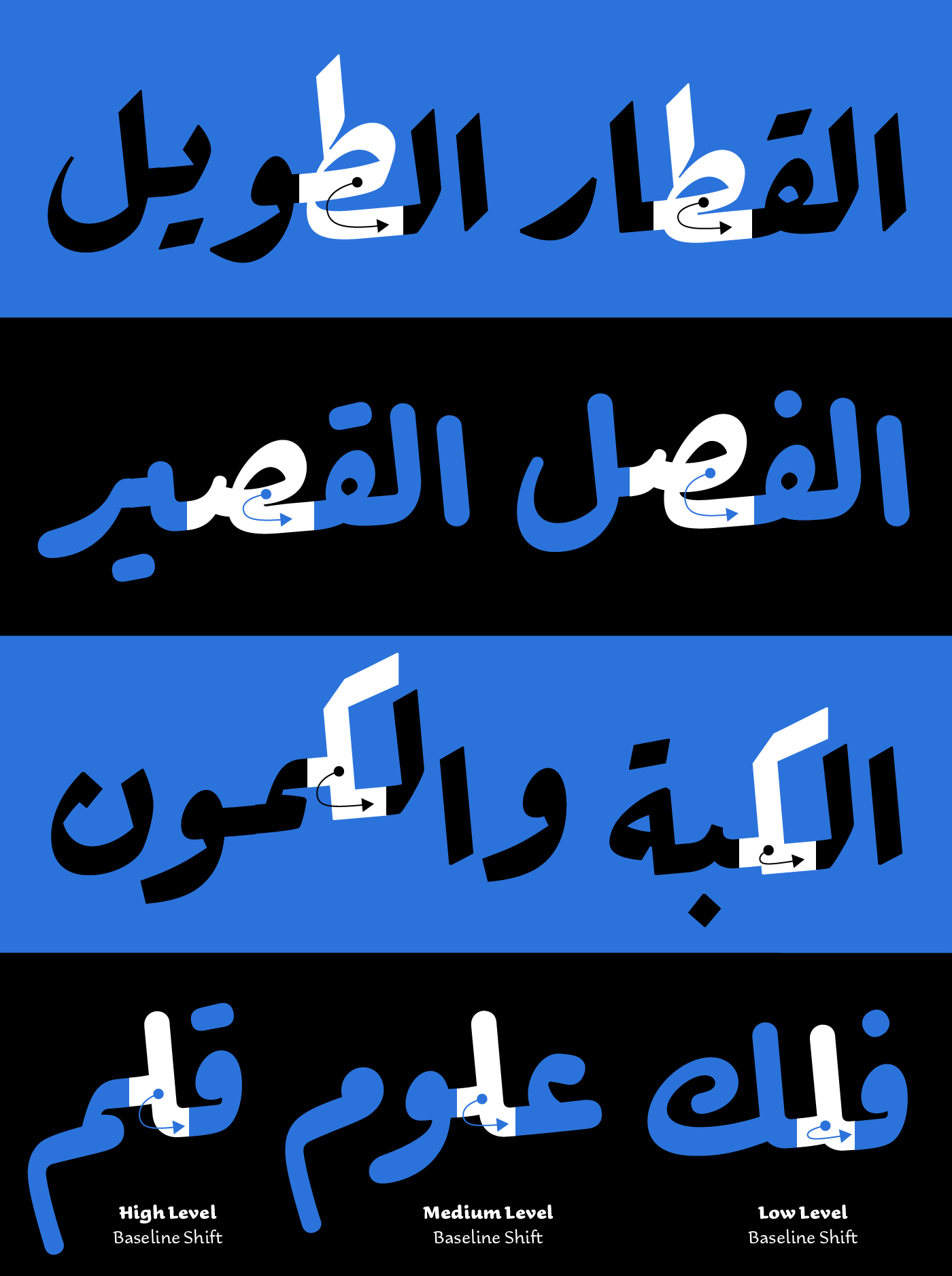
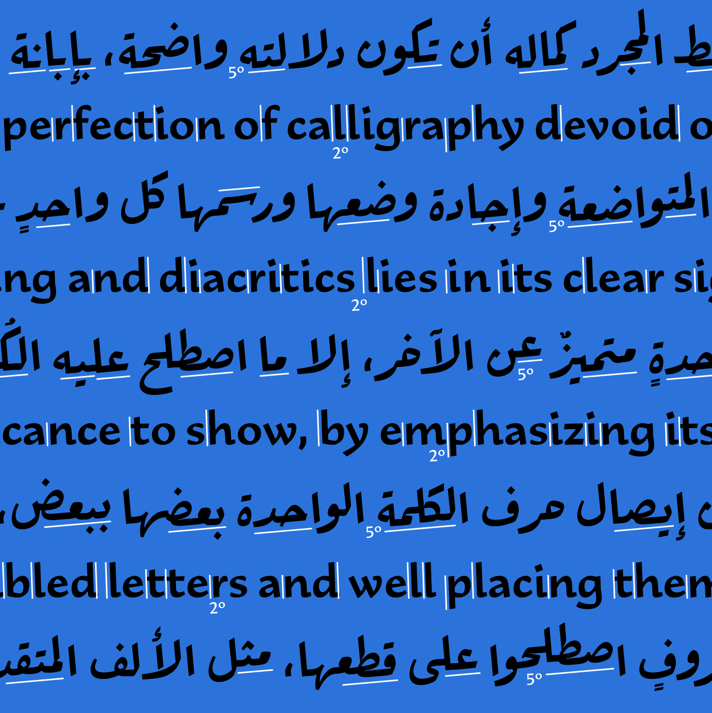
Contextual and Elevation Kerning
The non-horizontal nature of the Ruqʿah style demands a new and intuitive elevation kerning solution. This is because the slanting baseline results in an indefinite number of possibilities in the vertical placement of letters in Arabic words. Short words escalate less than longer ones, and some Arabic letters shift the baseline upwards (like the Arabic letters Hah and Meem), while others try to lower it back to the base (like the Sad, Tah, Lam, Kat, etc.). Additionally, some words have breaking letters (such as the letters Alef, Dal, Reh, Waw, etc.), and the hanging baseline breaks and white space occurs within the word itself. Kerning becomes problematic since the letter spacing is not fixed and horizontal like standard typefaces, but is changeable, diagonal, and vertical.
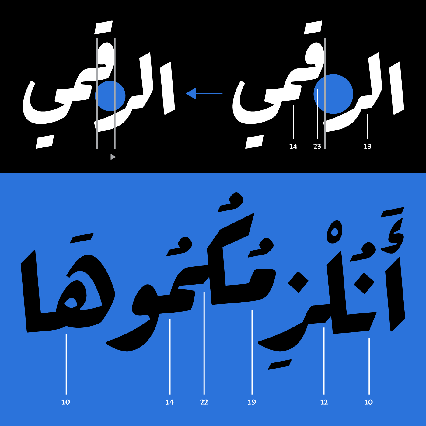
Advanced contextual kerning needs to be applied based on vertical marking or leveling. Toshi applied this ingenious solution based on learning from his Arabic type mentor, Kamal Mansour, during his work at Monotype.
In brief, the main task is to assign an elevation marker for each initial Arabic letterform and apply a certain kerning value based on the vertical height of this letter and the isolated or final Arabic letter preceding it from the right. The higher an initial Arabic letterform is from the base level, the higher the value of the negative kerning; the closer it is to the descender, the lower the value.
Latin Design Approach
Alongside font engineering the Arabic character set, Toshi designed the Latin counterpart for Ada.
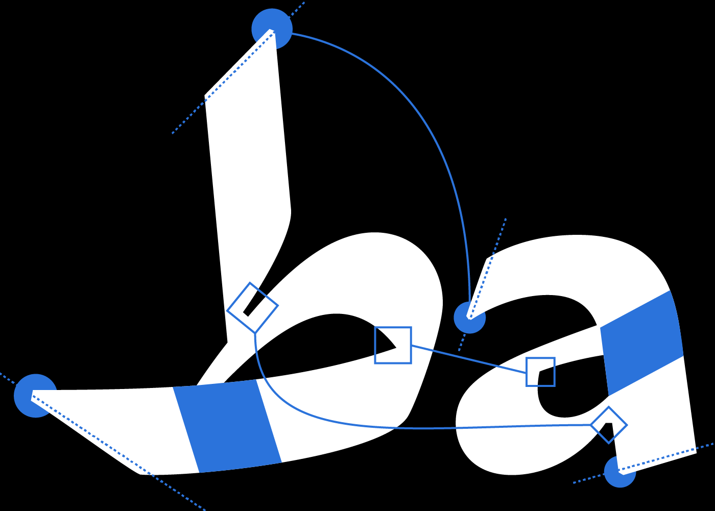
Having the Arabic without a defined median height made it tricky for Toshi to define the x-height of the Latin. He conducted several typesetting tests with different x-heights with a difference of 10 units in between, then he and Pascal decided on the appropriate height across the weights spectrum. Beside the x-height decision, all the typographic aspects (proportions, weights, contrast, etc.) are carefully balanced between the two scripts.
Since the Ruqʿah is a quick handwritten style, Pascal asked Toshi to draw the Latin based on the idea of quick pen stroke, without making it a Latin script style. So Toshi decided on a two-degree back slant in the Latin to mimic the Ruqah structure. He drew semi-serif capitals accompanied by sans lowercase letterforms with exit terminals. He drew the letters in a semi-cursive style like handwriting, with the texture matching that of Ruqʿah, since a traditional italic would look too dense.
Prominent ink traps are present in both scripts, while in the Latin they become part of the design aspect of the letterforms.
Lastly, Pascal asked Toshi to try the clotted counters concept in the Latin to echo those present in the heavyweights of the Arabic, so clotted (a) and (e) were created and placed in a stylistic set; the user can activate these when needed.
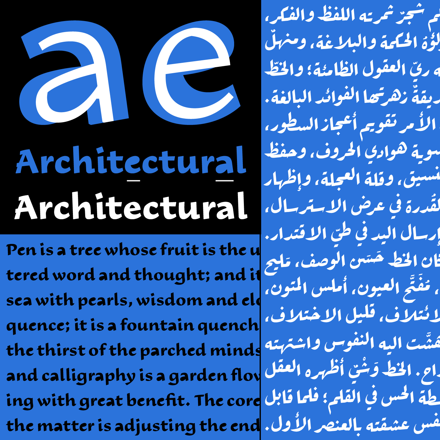
As much as the Latin script is distinctive from its Arabic Ruqʿah counterpart, both scripts have been designed to echo each other without one dominating the other. They each stand well on their own and work together perfectly in multilingual projects.
29LT Ada Type Specimens
Visit 29LT Ada Sharp webpage on www.29LT.com website and download the type specimen for full information about the typeface.


Visit 29LT Ada Flat webpage on www.29LT.com website and download the type specimen for full information about the typeface.
Visit 29LT Ada Round webpage on www.29LT.com website and download the type specimen for full information about the typeface.