Graphic designers have a huge need for new Arabic typefaces.
First published by Diptyk Magazine in French, written by Juan Palao, on April 7, 2023.
At a Master Class held at ESAV, typographer Pascal Zoghbi recently advocated for a diversification of Arabic fonts as a means to accompany the profound societal transformations occurring in the MENA region.
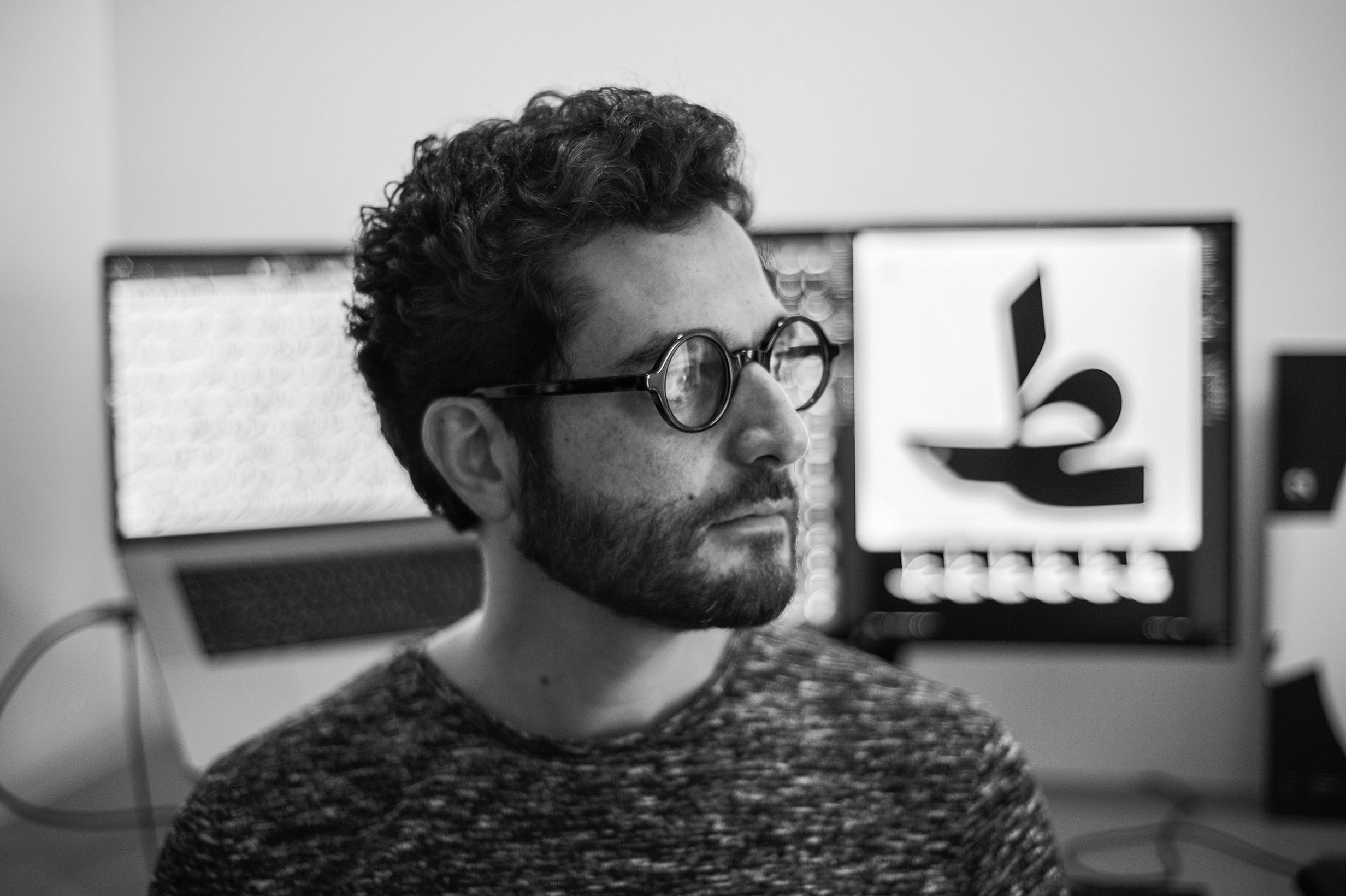
“Graphic designers have a huge need for new Arabic typefaces“. Based in Madrid since 2017, Lebanese font designer Pascal Zoghbi runs the digital typographic foundry 29 Letters Type Foundry (29LT). When he grew interest in graphic design in the early 2000s, a few universities in Lebanon were already teaching digital Arabic typography, yet it was still in the early stages of development. Only a few pioneers had developed Arabic typefaces designed to meet the needs arising from the advent of the internet and the
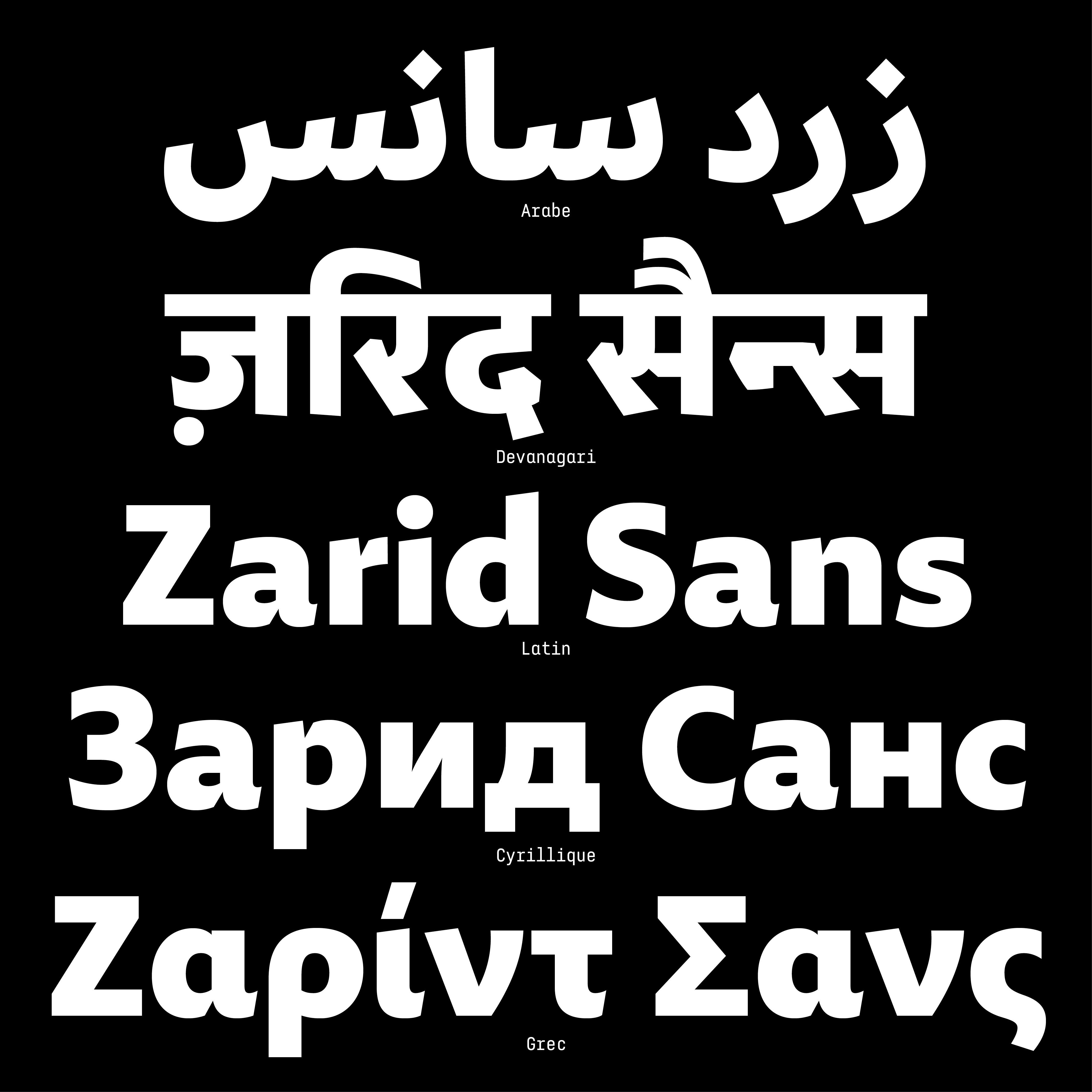
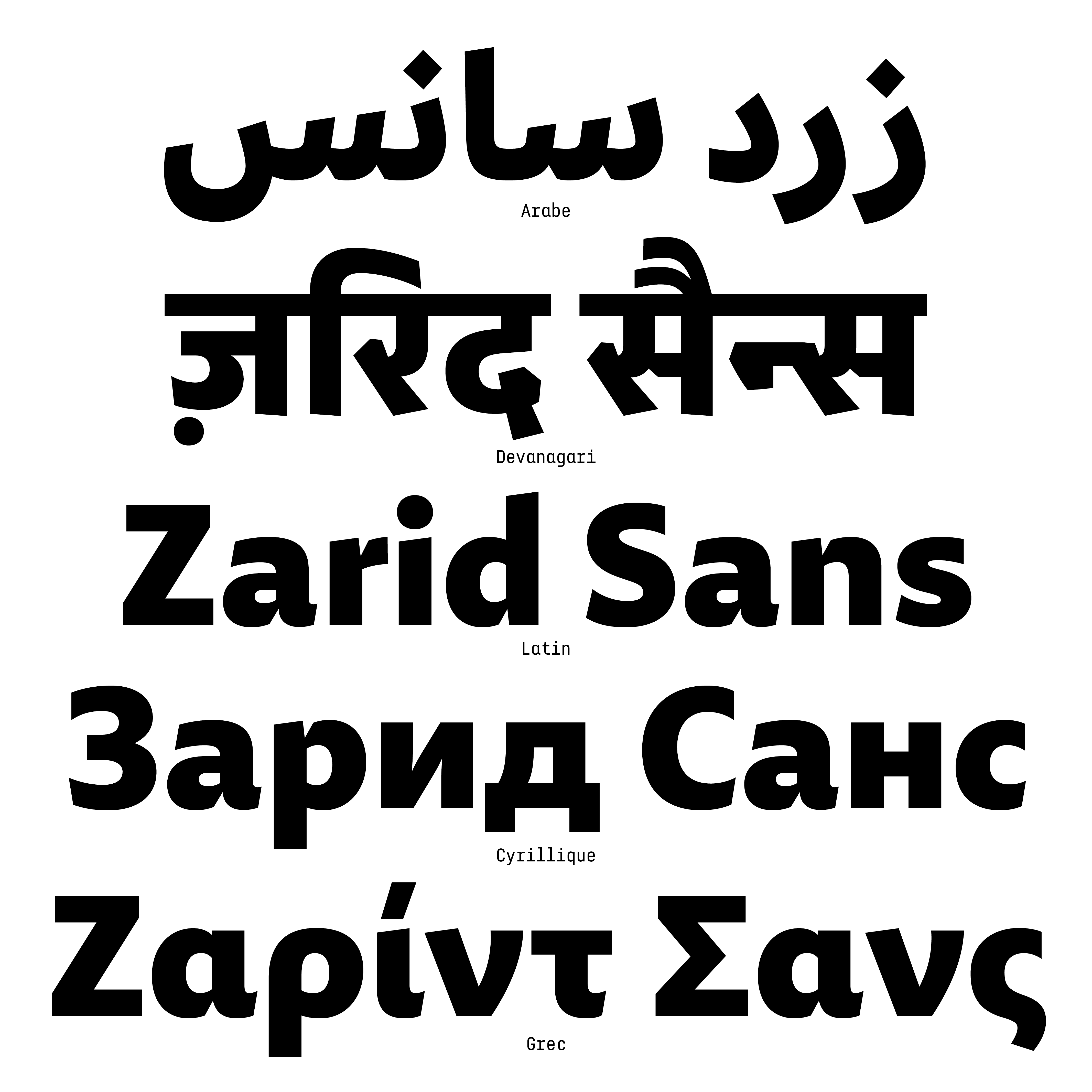
Pascal Zoghbi was not discouraged by this shortage in any way. After studying graphic design at KABK, The Hague, he founded 29LT in 2007. Since then, he has created several Arabic and Latin typefaces, in collaboration with design experts. More recently, 29LT has proposed to transcribe the Zarid Sans font — initially based on Arabic Naskh script and Latin — into other scripts such as Greek, Cyrillic, and Devanagari.
Societies Thirsting for Visual References
“Arabic calligraphy has developed throughout its history an extraordinary formal variety, which denotes an incredible source of inspiration,” he explains. When embarking on a new creative project, Pascal Zoghbi systematically returns to the major classical styles, particularly the Kufic and Naskh ones. Yet his practice is not a continuation of calligraphy, a traditional art he does respect but which is clearly different from the particular challenges posed by typography. Indeed, typography ought not to be regarded as a spiritual and artisanal aesthetic exercise. Instead, it should address the needs of modern societies in the Arab world thirsting for self-expression and visual references.
Media, museums, startups, all seek to develop a unique graphic identity today. “As typographers, we design the tools to accompany these changes.” The designer counts among his clients the Mathaf [Arab] Museum [of Modern Art] and Museum of Islamic Art in Doha, and the Emirati Noor bank. While the typefaces developed by 29LT are subject to copyright, some of them are available for free access.
A Golden Age to Come
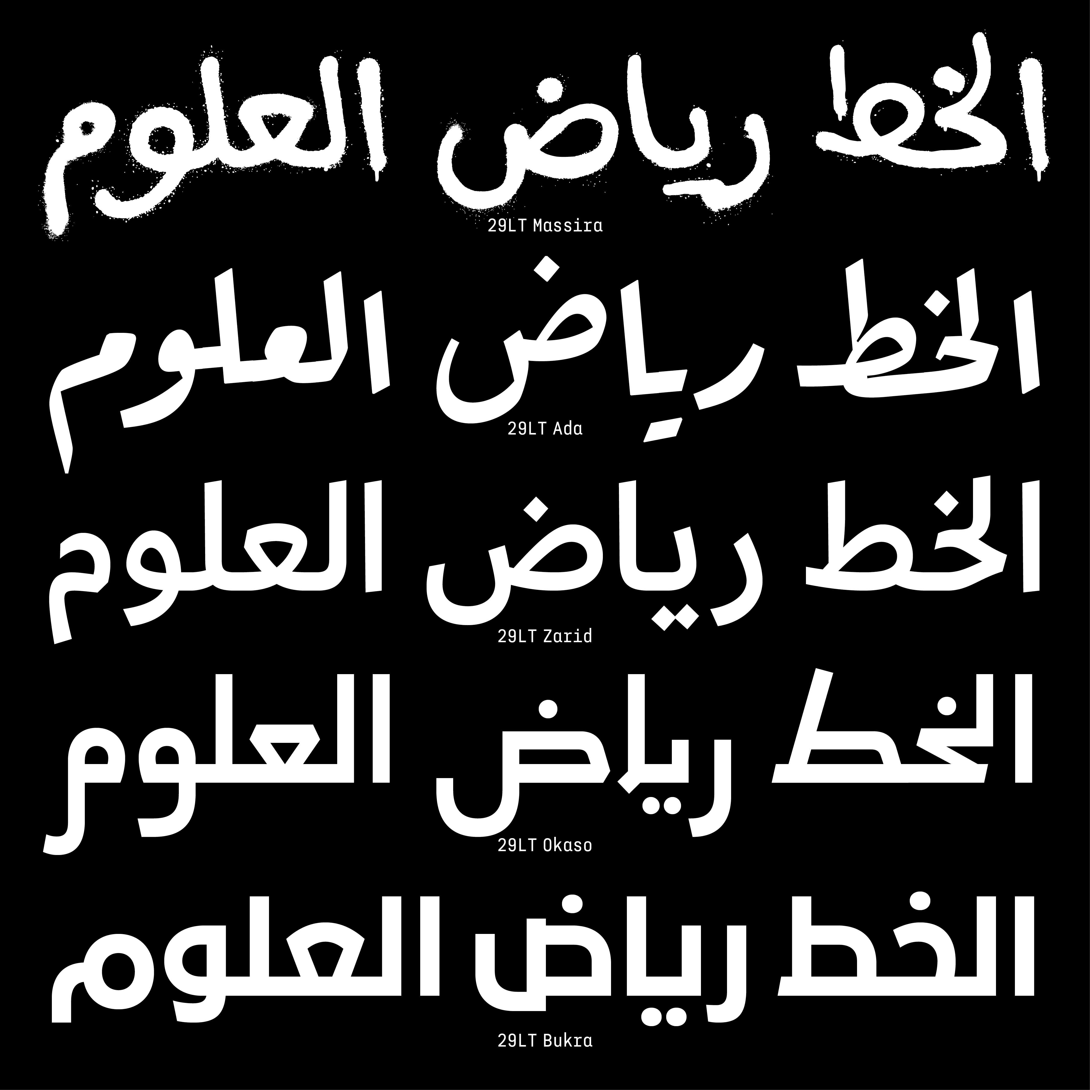
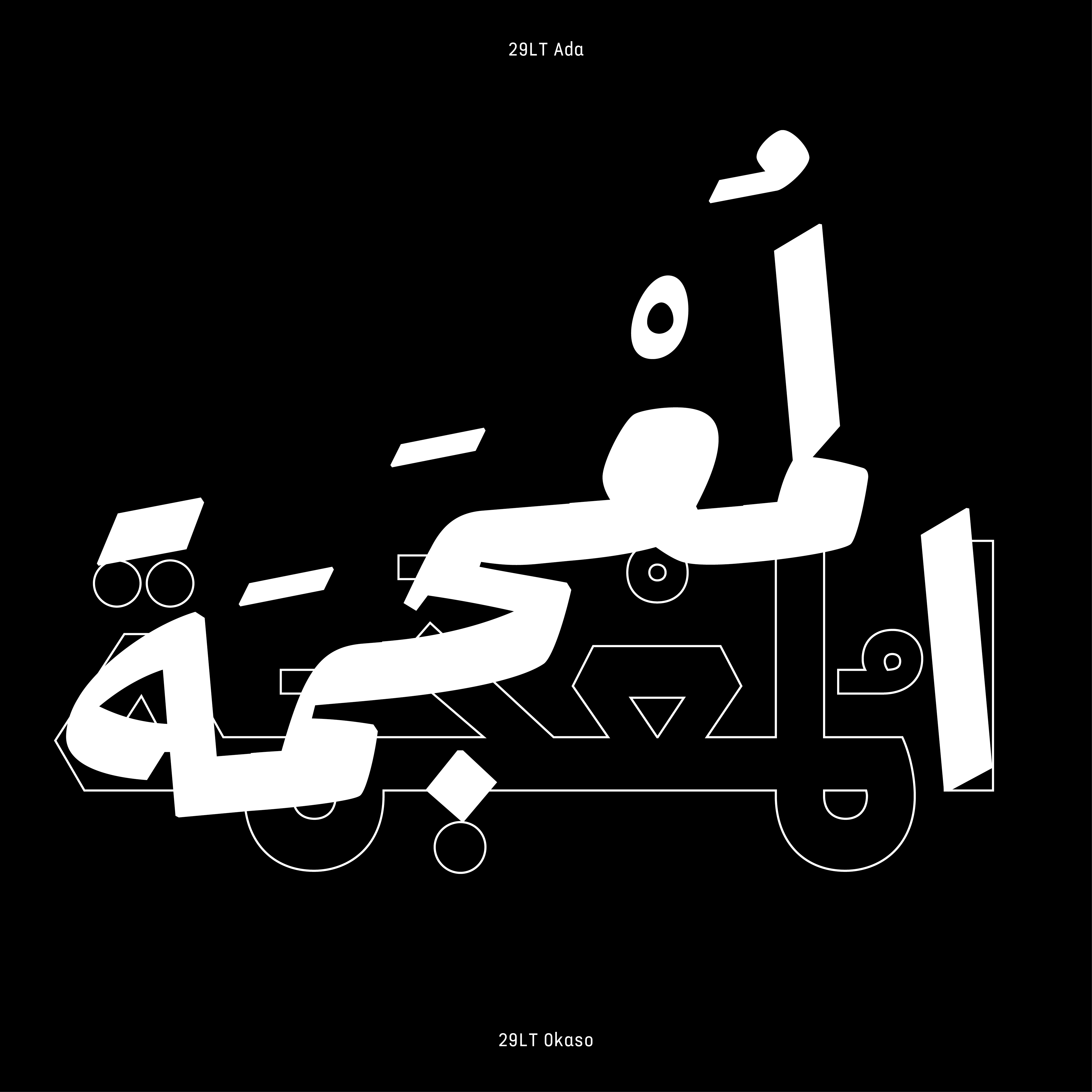
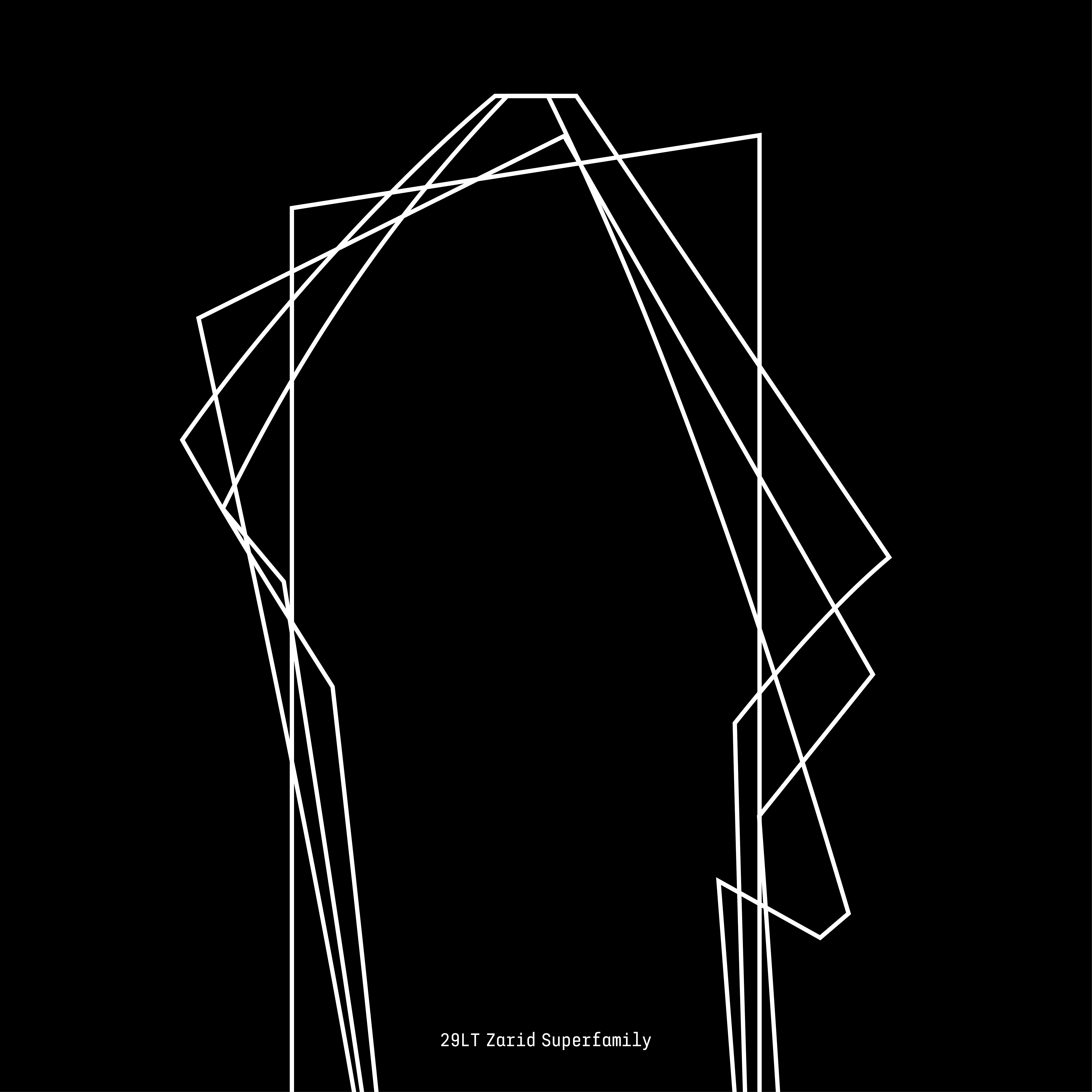
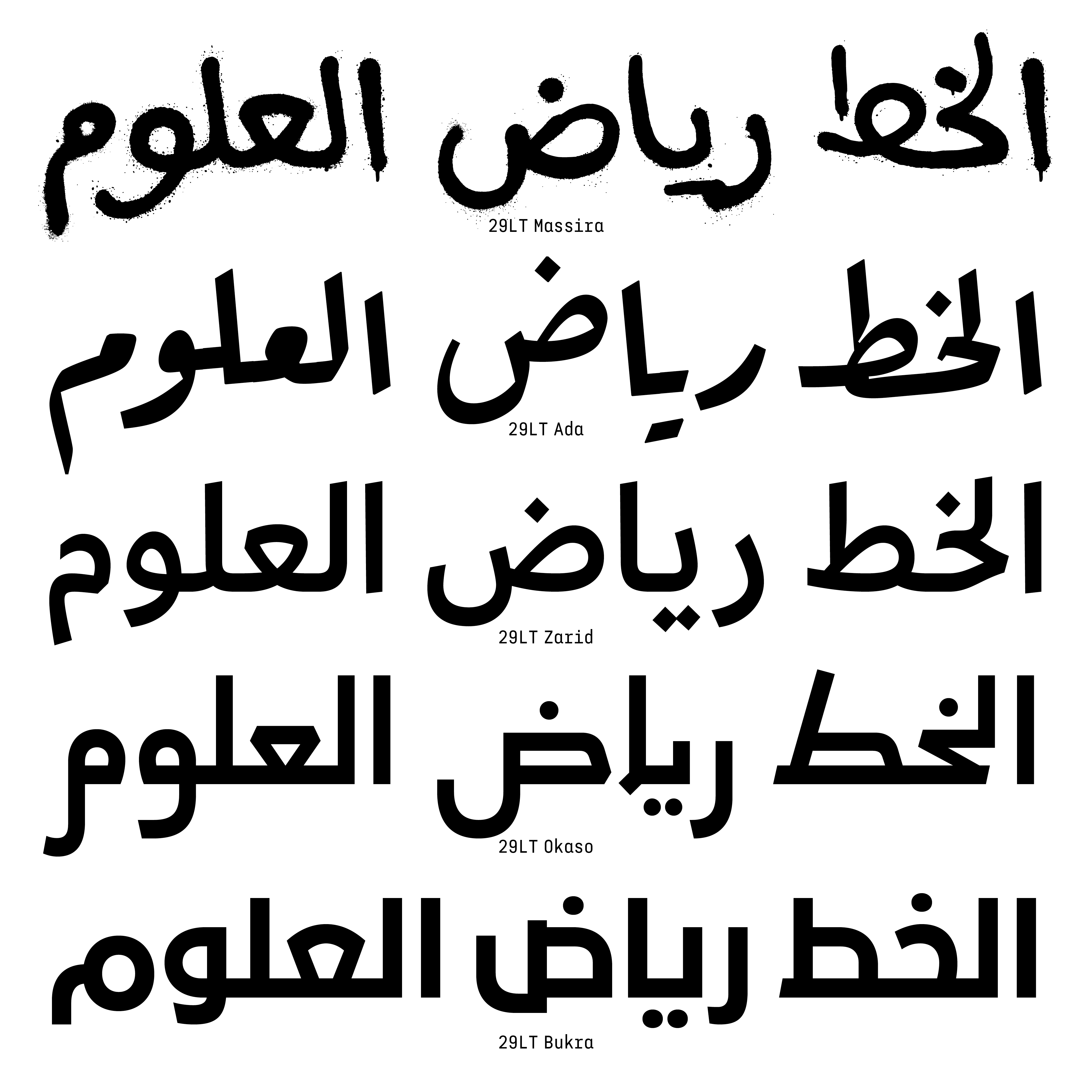
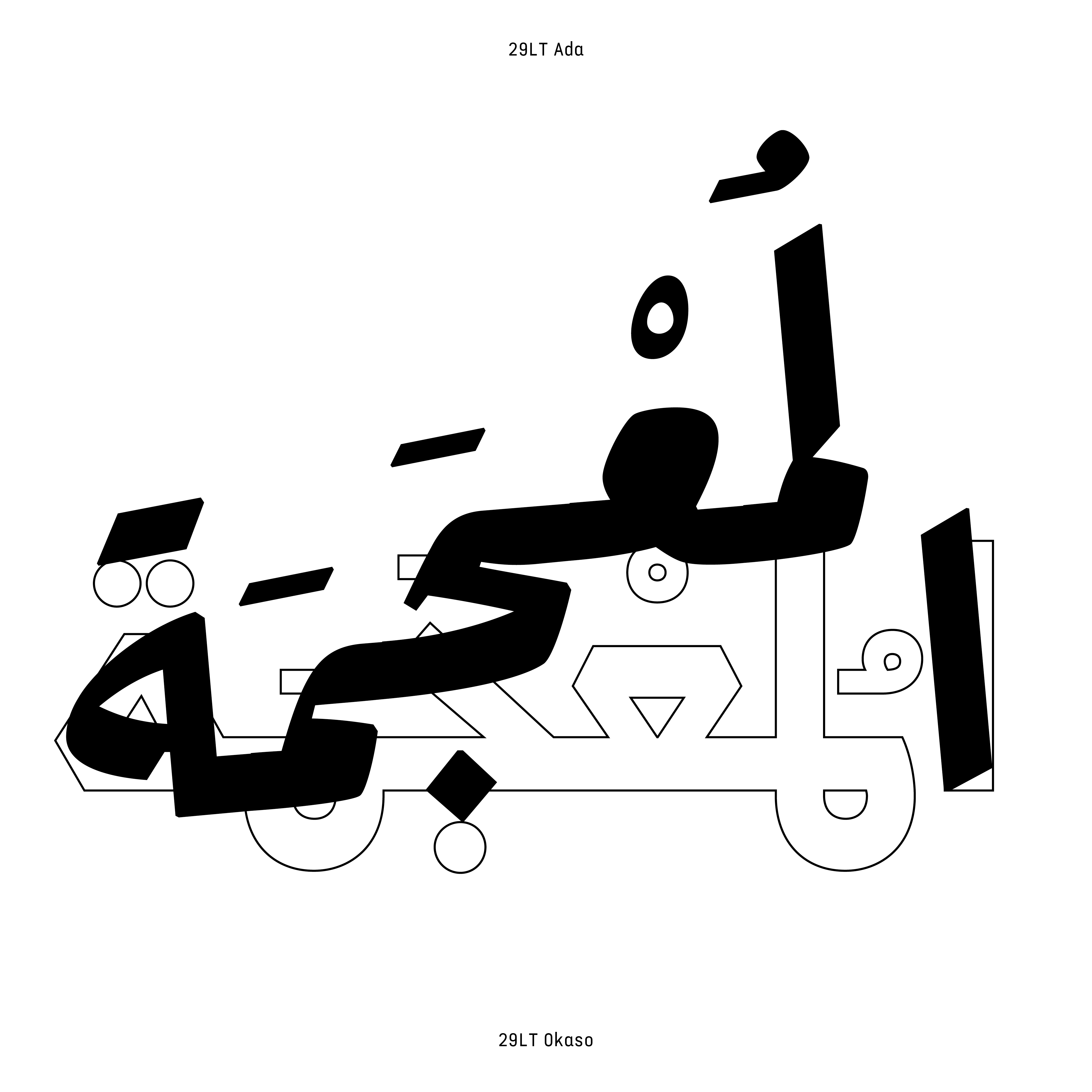
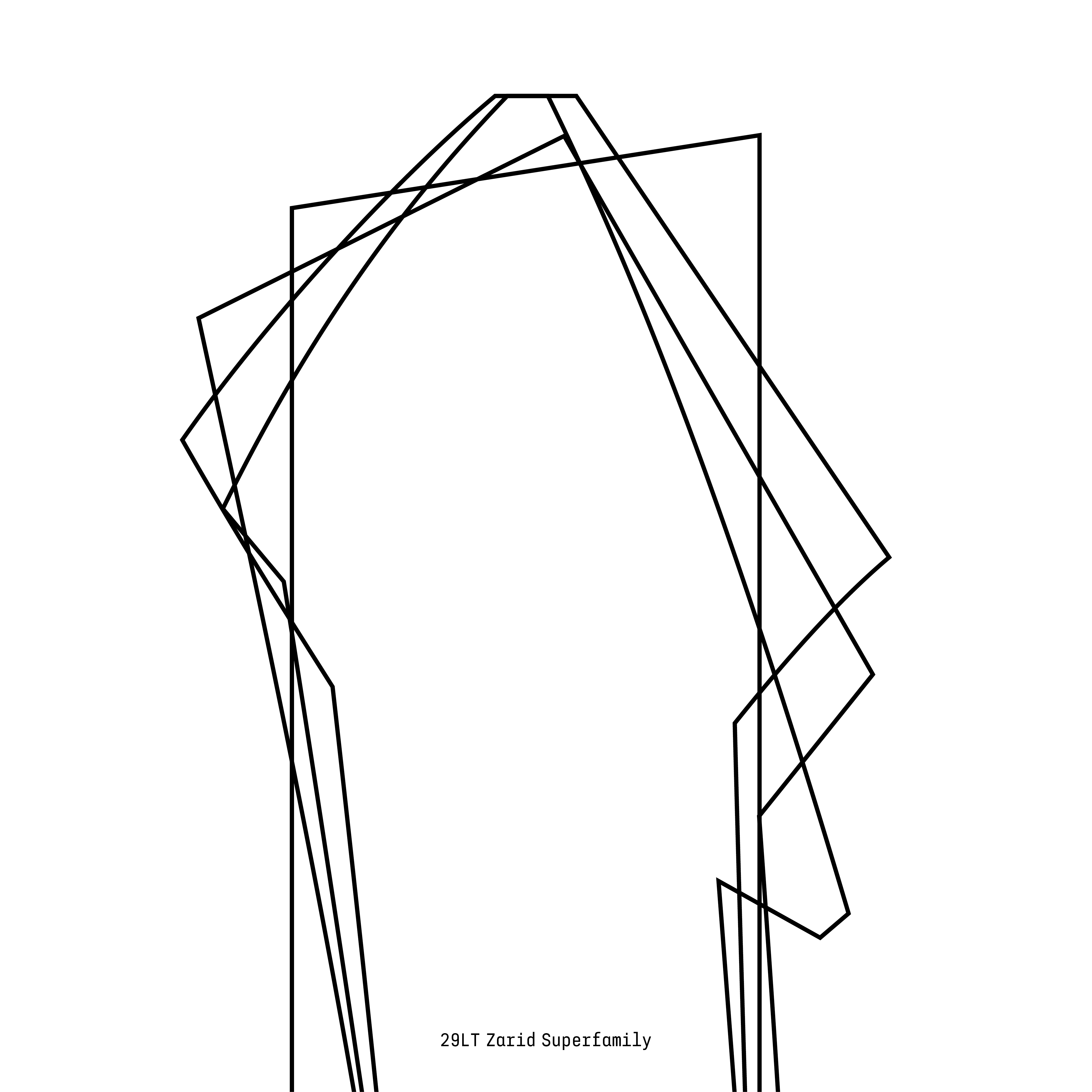
Pascal Zoghbi is presented with new avenues for typeface exploration as he draws from the wealth of cultural heritage found in Arabic fonts. In 2020, he developed a typeface called Okaso that directly draws inspiration from the famous aljamiado manuscripts — written using the Arabic script but transcribing the Spanish language — of the Moriscos. For the Massira typeface, Zoghbi was inspired by the graffiti that covered the walls of Beirut in the spring of 2005, during the withdrawal of Syrian troops from Lebanon. Arguably, the Zarid typeface family, developed since 2014, best captures the creative impetus that drives the collaborative work of 29LT studio. In its Latin version, Zarid harnesses the genius of Arabic strokes without resorting to vaguely Eastern embellishments.
Much has changed in fifteen years. Today, a significant number of Arab countries offer instruction on digital Arabic typography. Despite the near lack of dedicated literature, students now have access to digital references and resources on Arabic typography, and several useful manuals have been published. The upcoming upheavals of the Arab world will be fundamentally written in Arabic. The golden age of Arabic typography has just begun.
يحتاج مصممو الجرافيك بشكل كبير إلى خطوط عربية جديدة
دعا مصمم الخطوط الطباعية باسكال زغبي أثناء دورة رئيسية أُقيمت مؤخراً في المدرسة العليا للفنون البصرية بمراكش إلى تنويع الخطوط العربية كوسيلة لمواكبة التحولات المجتمعية العميقة الجارية في منطقة الشرق الأوسط وشمال إفريقيا
يحتاج مصممو الجرافيك بشكل كبير إلى خطوط عربية جديدة». يقيم مصمم الخطوط اللبناني باسكال زغبي في مدريد منذ عام ٢٠١٧ حيث يدير مسبك الطباعة الرقمية ٢٩حرف. عندما نما اهتمامه بالتصميم الجرافيكي في أوائل العقد الأول من القرن الحالي، كانت الطباعة الرقمية العربية تُدرَّس في بعض الجامعات في لبنان، لكنها كانت لا تزال في مراحلها الأولى من التطوير. فلم يبتكر سوى عدد قليل من الرواد خطوطاً عربية مصممة خصيصاً تلبّي الاحتياجات الناشئة عن ظهور الإنترنت وانتشار التكنولوجيا الرقمية.
إن النقص هذا لم يثبط عزيمة باسكال زغبي بأي شكل من الأشكال. فبعد دراسة التصميم الجرافيكي في الأكاديمية الملكية للفنون في لاهاي، أسس شركة ٢٩حرف عام ٢٠٠٧. ومنذ ذلك الحين، قام، بالتعاون مع زملائه، بتصميم العديد من الخطوط العربية واللاتينية. في الآونة الأخيرة، اقترحت شركة ٢٩حرف نسْخ خط زريد سانس إلى خطوط أخرى مثل اليونانية، والسيريلية، والديفاناغارية
مجتمعات متعطشة لمراجع مرئية
يوضح باسكال زغبي قائلاً: « لقد طوّر الخط العربي عبر تاريخه تنوعاً شكلياً هائلاً، مما يشير إلى مصدر إلهام مذهل». لدى الشروع في مشروع إبداعي جديد، يعود باسكال زغبي بشكل منهجي إلى الأساليب الكلاسيكية الأساسية، لا سيما الكوفي والنسخ. مع ذلك، فإن ممارسته ليست استمراراً للخط العربي، وهو فن تقليدي يحترمه لكنه يختلف بشكل واضح عن التحديات الخاصة التي تواجه الطباعة. بالفعل، يجب عدم النظر إلى الطباعة على أنها تمرين روحي وجمالي حرفي. بدلاً من ذلك، يجب أن تتناول الطباعة احتياجات مجتمعات العالم العربي الحديثة المتعطشة للتعبير والمراجع المرئية
تسعى اليوم وسائل الإعلام والمتاحف والشركات الناشئة جميعها إلى تطوير هوية بيانية فريدة. «إننا نقوم، بصفتنا مصممي خطوط طباعية، بتصميم الأدوات لمواكبة هذه التغييرات.» يعد المصمم من بين عملائه المتحف العربي للفن الحديث في الدوحة، ومتحف الفن الإسلامي في الدوحة، وبنك نور الإماراتي. تخضع الخطوط التي طوّرتها شركة ٢٩حرف لحقوق الطبع والنشر، لكن بعضها متاح للوصول المجاني
عصر ذهبي قادم
لدى باسكال زغبي مسارات جديدة للاستكشاف في مجال تصميم الخطوط حيث يستفيد من ثراء التراث الثقافي المتاح في الكتابات العربية. ففي عام ٢٠٢٠، قام بتطوير خط يُسمّى «أوكاسو» والذي يستوحي مباشرةً من المخطوطات الألجامية الشهيرة للموريسكييين التي كُتبت بالحروف العربية ولكنها تنسخ اللغة الإسبانية. بالنسبة لخط مسيرة، تأثر باسكال زغبي بالجرافيتي الذي انتشر على جدران بيروت في ربيع عام ٢٠٠٥، خلال انسحاب القوات السورية من لبنان. لكن عائلة الخطوط زريد التي تم تطويرها منذ عام ٢٠١٤ هي التي تجسد بشكل أفضل ربما جوهر روح الإبداع الذي يدفع عمل ستوديو ٢٩حرف الجماعي. ويستثمر خط زريد في نسخته اللاتينية عبقرية الخط العربي دون اللجوء إلى زخارف شرقية بشكل مبهم
لقد تغير الكثير خلال السنوات الخمس عشرة الماضية، فاليوم، يجري تعليم الطباعة الرقمية العربية في جزء كبير من العالم العربي. على الرغم من الغياب شبه التام للدراسات السابقة المرجعية المخصصة لهذا الموضوع، يتمتع الطلاب اليوم بوصول إلى مراجع وموارد رقمية متعلقة بالخط العربي، كما تم نشر بعض الكتيبات الجيدة و المفيدة في هذا المجال. سوف تُكتب التحولات المقبلة في العالم العربي باللغة العربية بشكل أساسي. فقد بدأ للتو العصر الذهبي للطباعة العربية
First published by Diptyk Magazine in French, written by Juan Palao, on April 7, 2023.
