
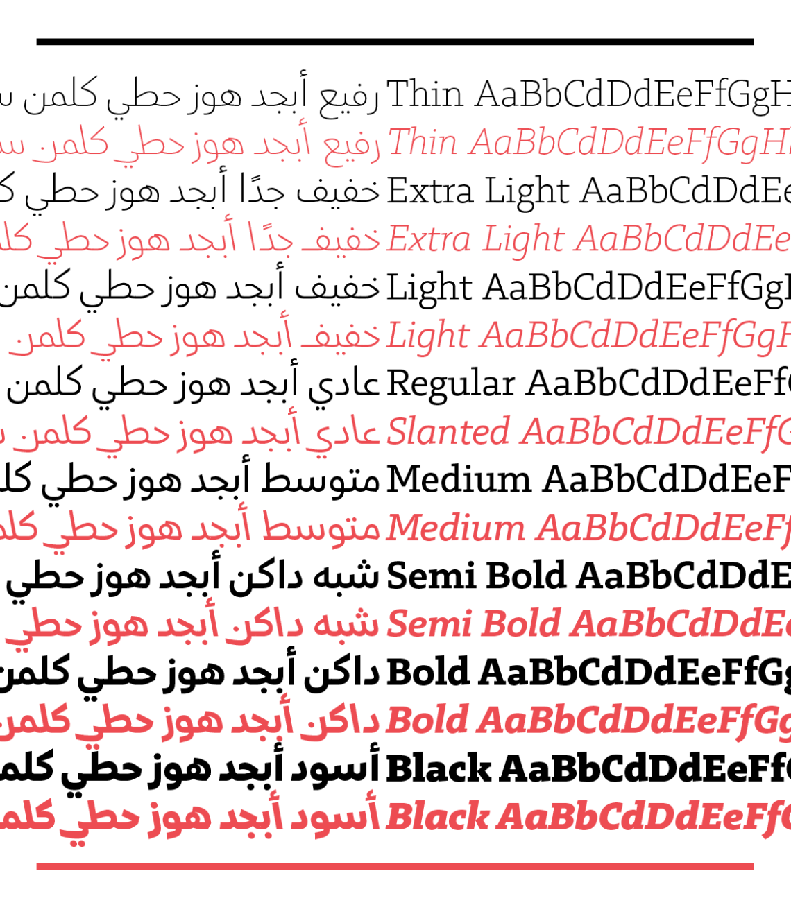
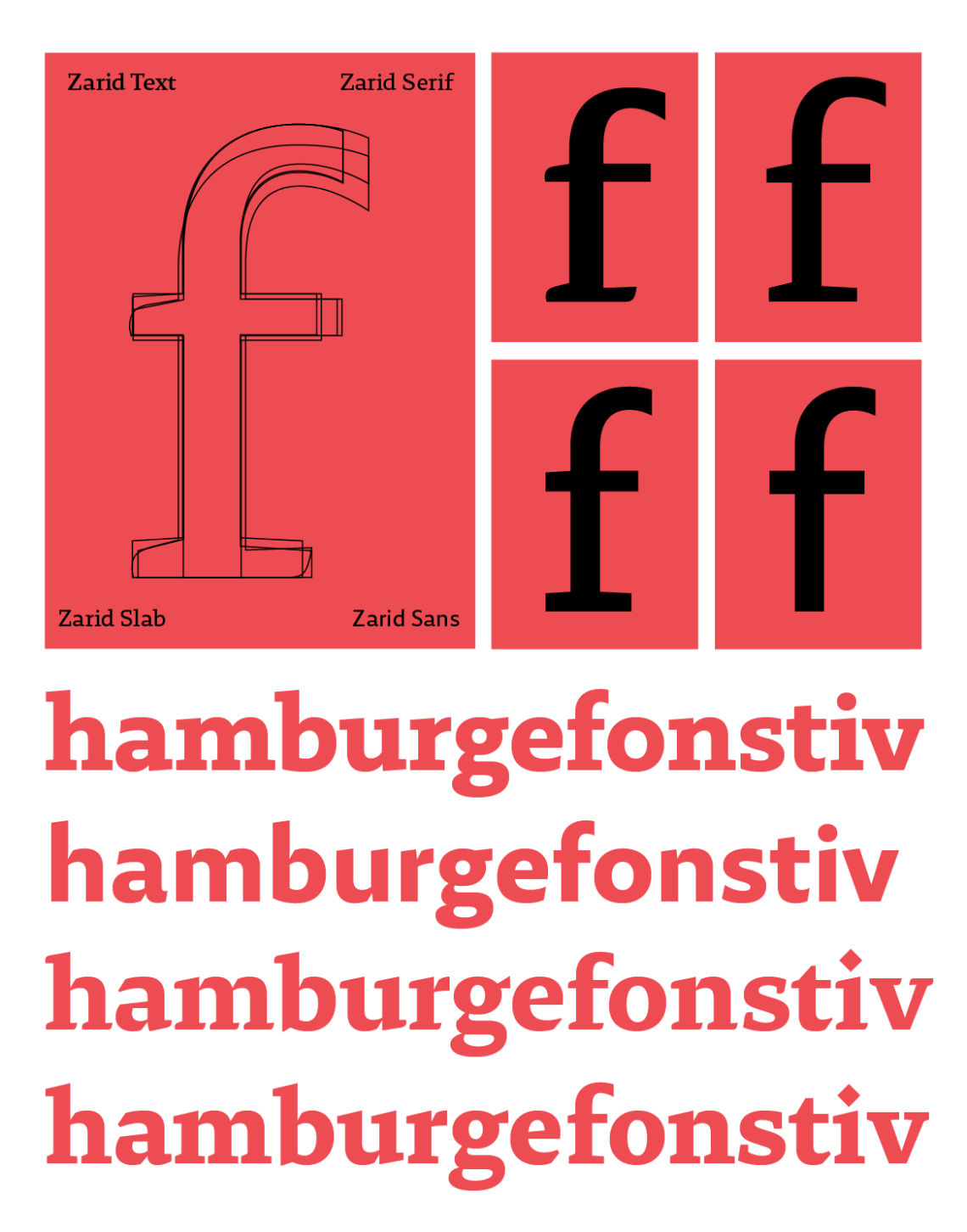
29LT Zarid Slab type family consists of 16 styles: 8 Standard styles and 8 Slanted styles, covering the following weights: Thin, Extra Light, Light, Regular, Medium, Semi Bold, Bold and Black. The range of weights provides suitable typographic hierarchical solutions in bi-script Arabic and Latin layouts. Its design approach makes it ideal for display text as well as short copy text. A hybrid Arabic typographic design that lives between the geometric and cursive realm echoes a strongly built Latin slab serif type design of firm and agile qualities. The design of the two distinct scripts agreeably coexists while each one of them retains its’ own structure and characteristics. The Arabic script is designed by Pascal Zoghbi while the Latin script is designed by Jan Fromm.
The typeface includes advanced typographic features (ligatures, alternates and stylistic sets) that improve legibility and give diverse typesetting options. The fonts cover all Middle Eastern, North African, Eastern European, Central European, Western European, and North and South American Languages. The number of glyphs per font is 1450+.
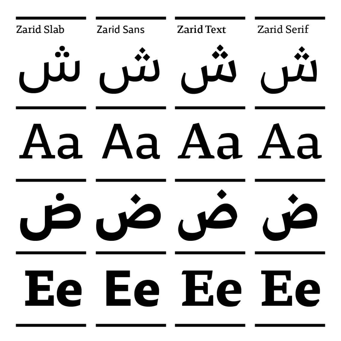
Zarid Slab is the fourth family member within the 29LT Zarid superfamily ongoing development. The type family consists now of: 29LT Zarid Serif, 29LT Zarid Sans, 29LT Text, and 29LT Zarid Slab. Future family members will be published in the near future such as 29LT Zarid Display and 29LT Zarid Stencil amongst others.
29LT Zarid Slab Description:
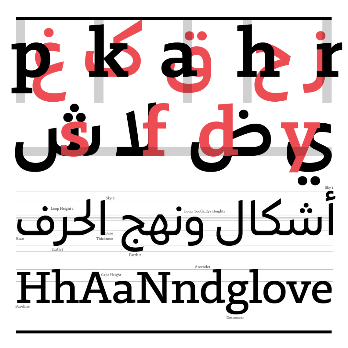
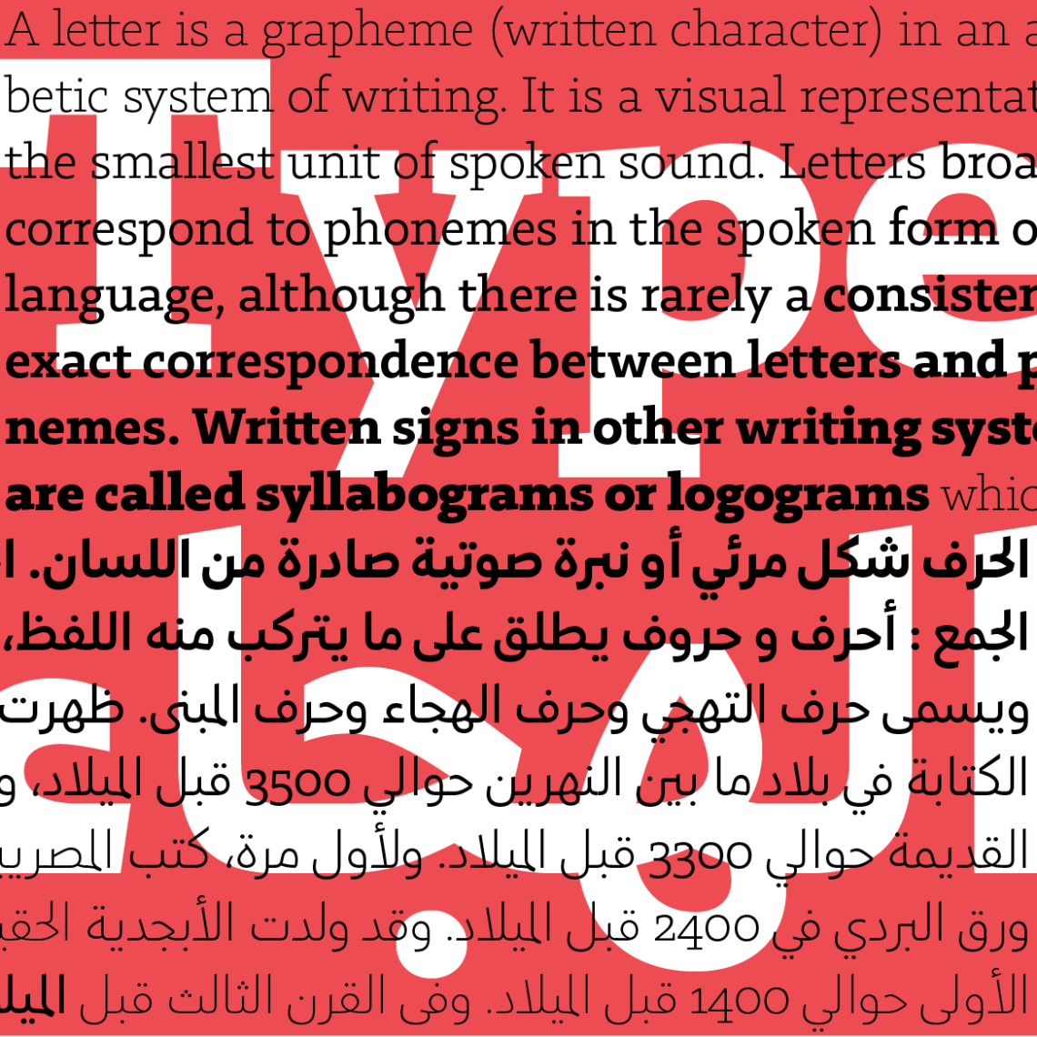
29LT Zarid Slab is a firm typeface with agile attributes. The strong slabs in the Latin are countered by a sturdy Arabic baseline and straight letters structures. While the Latin letterforms follow the Latin Slab Serif typographic structures, the Arabic doesn’t follow a specific Arabic calligraphic style. It borrows from the overall calligraphic approach that is found in the Naskh and the Geometric Kufic styles and renders the outlines is a contemporary innovative way. It is an exercise of typographic balance between geometric and cursive outlines. The positive outlines balance the negative spaces and give a unique reading flow.
The Arabic design approach can be rationalized as a study of the limits between solid and fluid forms. In comparison with its other siblings (Zarid Sans; Zarid Serif; and Zarid Text), the counters are rounded and simplified whilst the contrast is reduced. The Arabic medial structures of the letterforms (heads, eyes, ears, almonds, etc.) are opened-up while kept in proportions with the upper and lower parts of the outlines (bowls, bellies, tails, arms, legs, etc.). These Arabic constructions are echoed with a moderate open x-height and relatively long ascenders and descenders in the Latin letters. The equilibrium between the main body structure of the letterforms and their corresponding ascenders and descenders is carefully studied to give the typeface a contemporary composition without affecting legibly. Zarid Slab is the hipster of the family that is free from conventional perceptions while being well-suited in conformist environments.
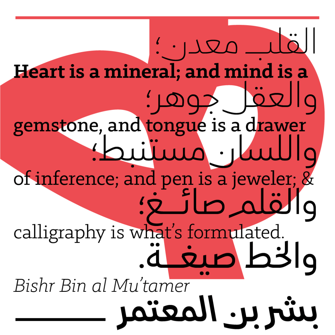
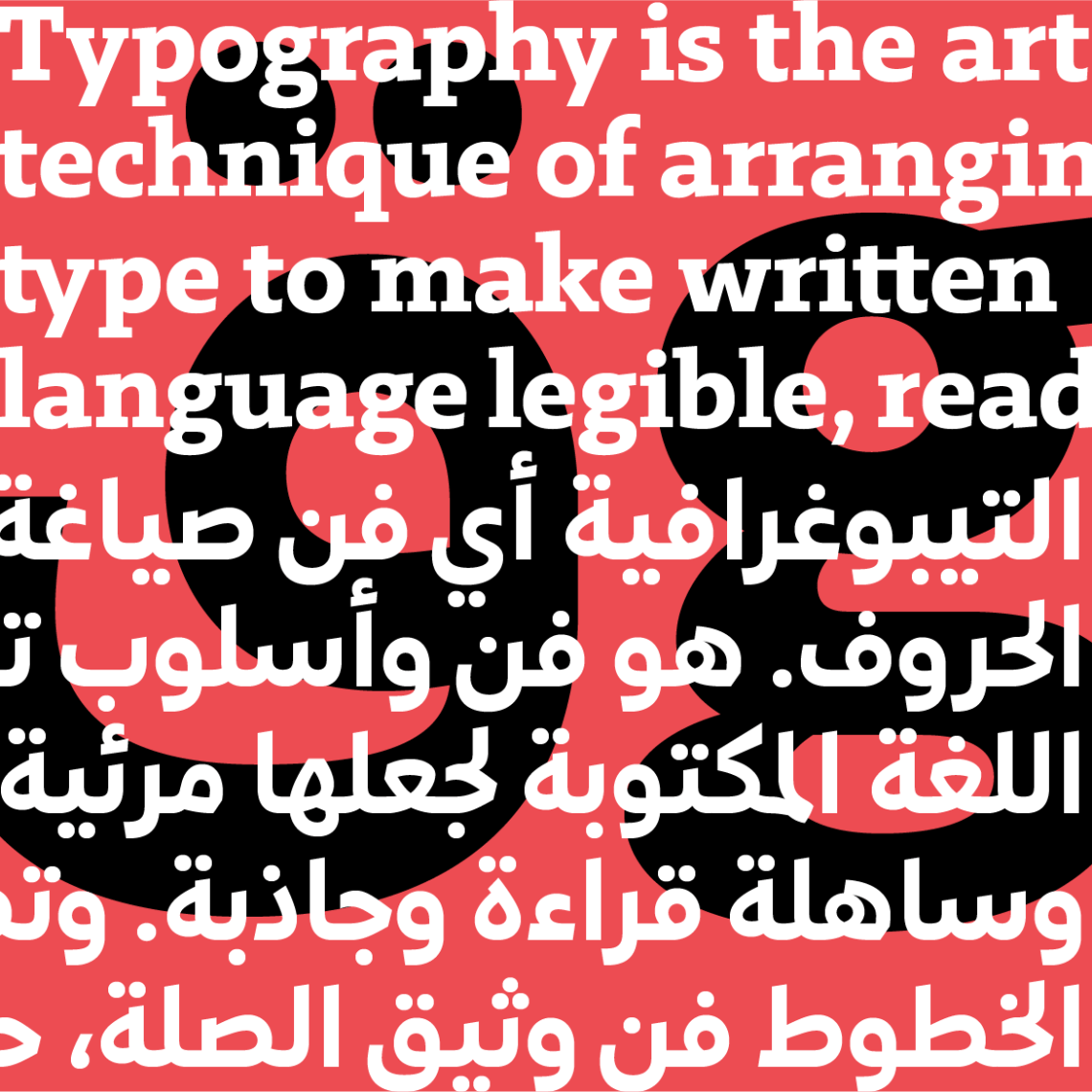
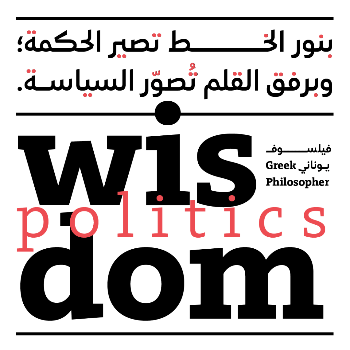
Its unique characteristics make it ideal for display text and equally legible in short content text. It displays accurately in screen and print typographic layouts, and is suitable for a vast array of typographic usage such as branding, publishing, signage/wayfinding, advertising, etc. Likewise, the diverse weights present in the type family gives graphic designers endless options of visual hierarchies, while the slanted styles add typographic highlight or emphasis. The Arabic ligatures and elongated stylistic sets give the fonts a unique calligraphic touch and make the typeface friendlier to the classical Arabic reader.
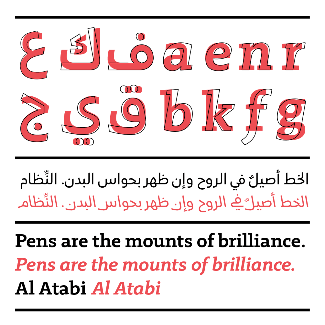
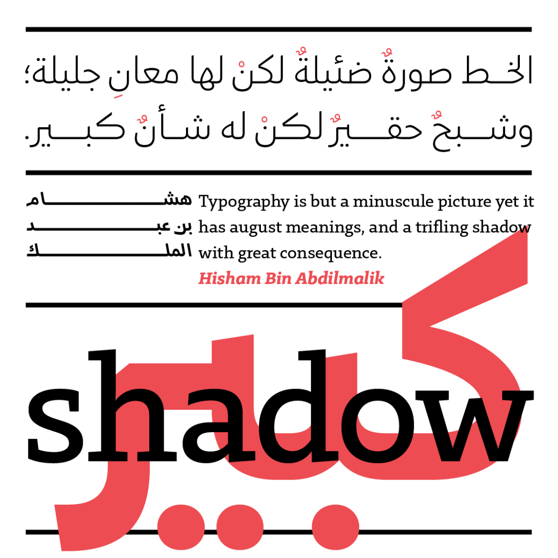
The slanted styles are the casual siblings of the standard styles of the type family. As in the other typefaces in the family, the slanted letters were redrawn based on fast hand-gestures and not merely slanted from the standard letters. In Zarid Slab though, the fast hand-gestures design approach is drawn on a slanted geometric construction. They are a set of styles that can accompany the standard set for a change of text tone, or stand alone as a causal copy text or a delightful display text. Despite the name, Zarid Slab Latin Slanted is a “real Italic” than just a sloped derivate. The letters structures are based on writing with a pen, most obvious in the bowls of a, b, d, g, etc.; in the shoulders of h, m, n and u; and in the k. The name “slanted” was adopted instead of “italic” for the inclined styles since in Arabic typography and calligraphy there is no such term as italic style.
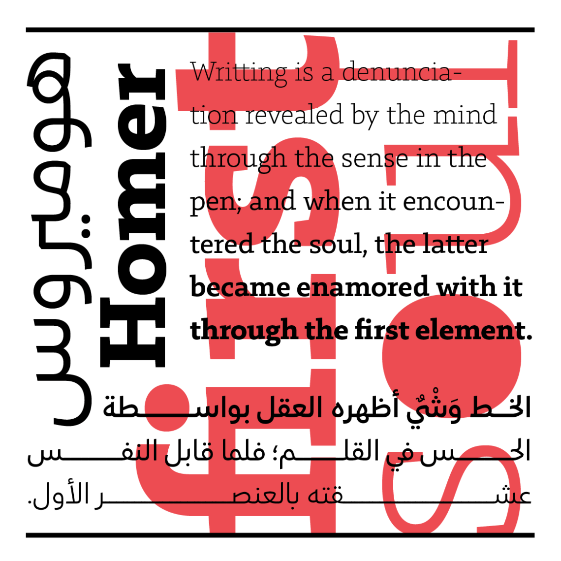
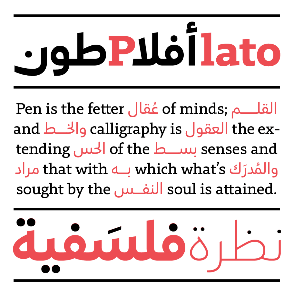
The design approach, with open counters, clean terminals/finials, balanced weight, and low contrast, are all elements that bring the Arabic and Latin scripts together. Unsurprisingly, both scripts were created in synergy and were inspired by each other simultaneously. While Arabic typefaces have a strong horizontal structure because of baseline letter connections, Latin typefaces have a vertical rhythm because of an upright stem structure present in most glyphs. The balance between the Arabic baseline thickness and the stems width in the Latin letters makes bilingual text color perfectly even and give bi-script typesetting layouts a harmonious texture.
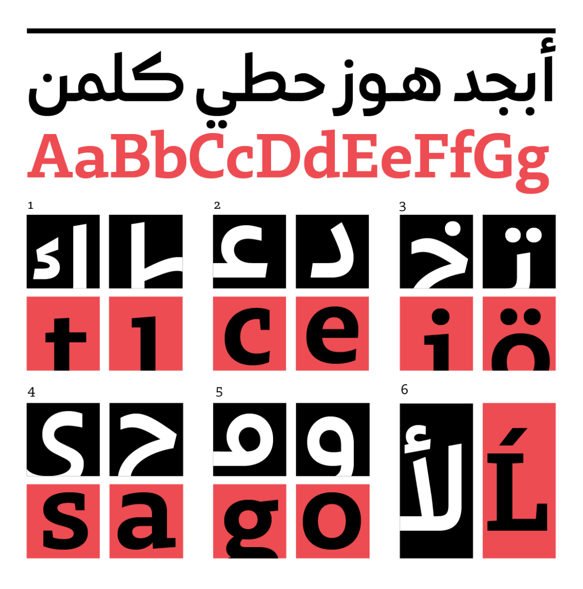
Below are typographic graphics showcasing the most prominent design elements between the Arabic and the Latin letters within Zarid Slab:
- Vertical Stems with inclined top.
- Angled calligraphic terminal.
- Elliptical Arabic diacritic dots and Latin tittles.
- Low contrast outlines
- Open round counters
- Straight vertical and horizontal letters structures.
29LT Zarid Slab Development and Process:
The bigger the type family becomes, the more aspects one has to pay attention to when adding a new type family member. The new variant has to speak the same visual voice as the others, but has to be distinctive enough to justify a new scope of application.
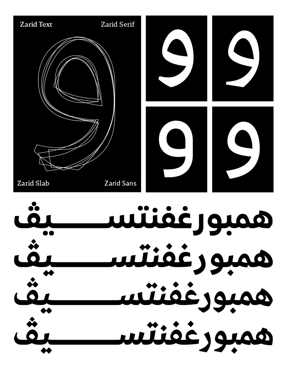
Zarid Slab is the fourth family member within the 29LT Zarid superfamily ongoing development. The growth of the family gives a limitless amount of typographic combinations and hierarchal solutions for a graphic designer while designing a modern-day project. While Zarid Text is conventional and serious, Zarid Serif is robust and edgy. Zarid Sans is modern and friendly, whereas Zarid Slab is daring and progressive.
Typographically (technically) described: Zarid Serif is a combination of a Naskh Mastari Arabic accompanied by a wedged serif Latin counterpart; Zarid Text is a combination of a conventional Naskh Arabic complemented by a cursive serif Latin counterpart; Zarid Sans is a combination of a Neo Naskh Arabic accompanied by a sans serif Latin equivalent; and Zarid Slab is a combination of a hybrid Arabic accompanied by a slab serif Latin equal.
The creation of Zarid Slab Arabic required a total rethinking of the Arabic character set. It wasn’t just a question of reducing contrast or slightly adjusting the curves, but an overall reshaping of the outlines had to be established based on the experience gained by Pascal Zoghbi’s involvement in the design of geometric and hybrid Arabic fonts over the past years. Design lessons were previously learned from successful and flopped type design approaches that Zoghbi explored. The balance between Arabic calligraphic structures and contemporarily designed letterforms is always a struggle and the borderline of legibility is continuously tested.
Several design decisions were undertaken in the design process of Zarid Arabic Slab. Compared to Zarid Sans, the tilted vertical strokes (ascenders, arms, and teeth) were strained up, and the triangular cursive counters (heads, eyes, and almonds) were rounded up. The contrast was reduced and the flow of the letters was refined. The equilibrium between the geometric and cursive outlines was amplified by the introduction of a smooth tension amongst the curves. The sharp calligraphic cuts in the baseline were replaced by smooth round links. The finials and terminals in the glyphs got leveled up and drawn in line with the geometric design approach. The bowls and cups were simplified and got aligned with the straight vertical structures. The elliptical diacritic dots got adopted instead of the rhombic ones. And many other design changes were realized in order to achieve the desired new appearance. Without a doubt, a complete spacing and kerning adjustments were accomplished at the end of the design phase to ensure proper positioning of the Arabic letters and smooth reading experience.
While designing the counterpart, Zarid Slab Latin, Jan Fromm had to look back and forth between Zarid Serif Latin and Zarid Sans Latin. He started developing the Latin glyphs after establishing the design concept, which was inspired by the initial design of the Arabic letters. Compared to the other Zarid family members, the basic forms of the Slab were designed to have an upright and round aspect. These core features gave the Latin character set an almost geometric feel, but also a subtlety that made them pleasant to look at.
The deep cuts at the joints of stem and shoulder (for example lowercase m, n, and u), that are dominantly visible in Zarid Serif and Sans, have disappeared in Zarid Slab. Instead, the joints are fluid and smooth and have a lesser contrast between thin and thick strokes, which emphasizes the geometric character. This is especially visible in the Italics. To underline the feeling of roundness, the counters of round letters such as the lowercase b, d, o, p, and q are wide and open. The serifs are sturdy and slightly angled, which builds a visual bridge to the angled terminals in the Arabic letters.
Despite those new characteristics and conceptual thoughts, Zarid Slab Latin is still part of the Zarid family. Like the other family members, it has open letterforms (for example lowercase a, e, and s), a moderate x-height creating a right amount of elegance, as well as a humanistic aesthetic reminiscent of writing with the hand.
During the work on Zarid Slab, both Zoghbi and Fromm continuously compared all the different Zarid styles, Serif, Text, and Sans, with the newly developing Slab styles. They set Latin text next to Arabic text and analyzed their texture and how it changed between the different styles. They took special care in equalizing the proportion, weight, and letter spacing throughout the different styles, aiming to gain a consistent and harmonious result.
Typographic Versatility:
With the development and growth of 29LT Zarid type family, additional multilingual Arabic and Latin typesetting flexibility are offered. The type family becomes a design tool for graphic designers to explore endless typographic possibilities and explore different communication complexities in their projects. The type family becomes an important contribution to the growing graphic culture in the MENA region.
Each type style present in the superfamily have unique functionality and a defined characteristic whilst sharing the same essential inner skeleton. The superfamily offers a vast amount of weights and styles that strongly exist individually but combine perfectly when jointly typeset. An equal foundation and structure are shared amongst all the fonts, but with distinctive aspects and features. It is a type system created from different type classes and distinguished typographic fonts while sharing the proportions and overall dimensions. It offers a great typographic solution for a graphic designer working on projects with a complex hierarchical requirement and removes the hassle of combining different fonts from different typefaces that contain different weight distribution and typographic proportions. It is an effective mix and match of type styles without risking over-designed layouts.
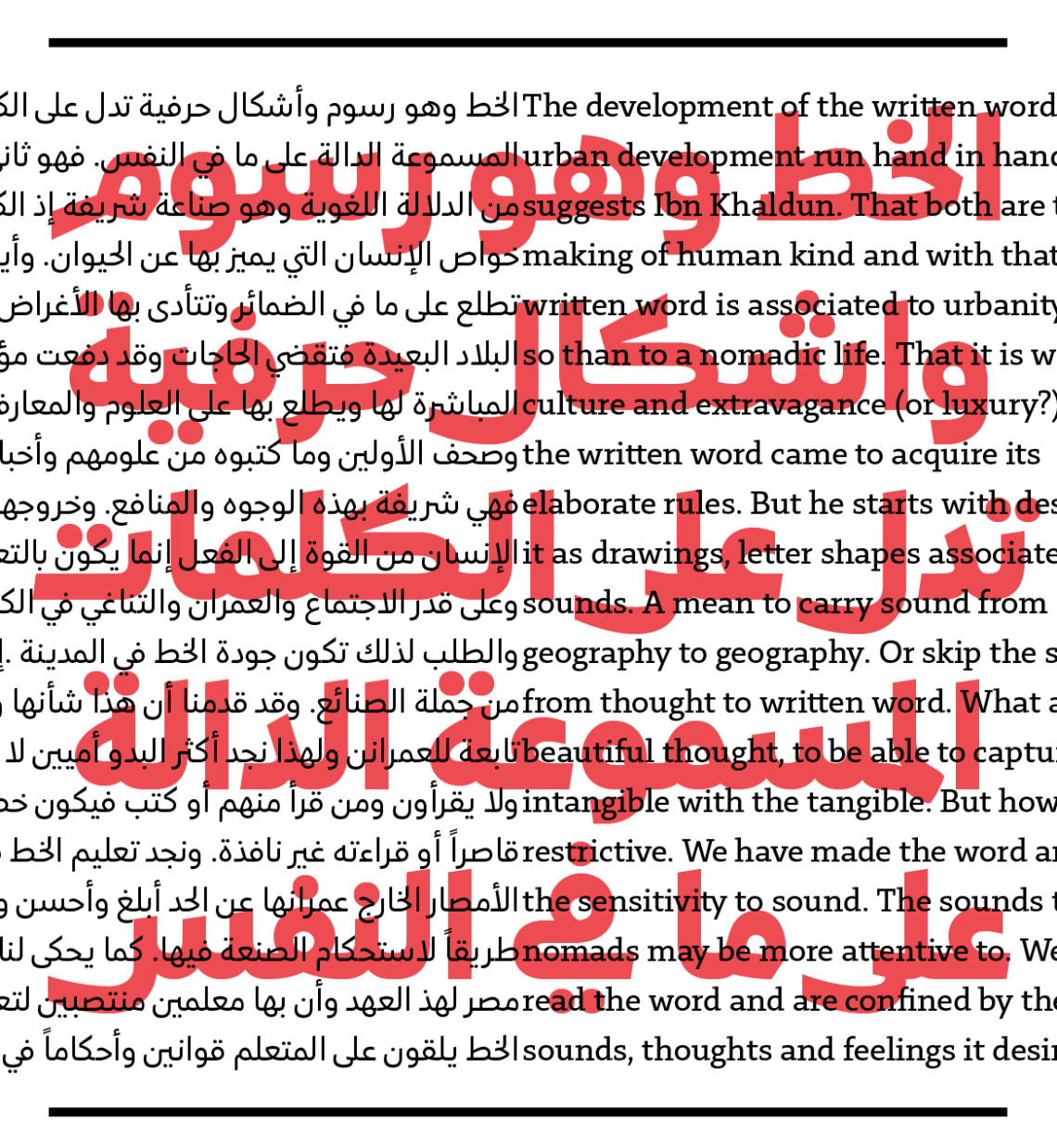
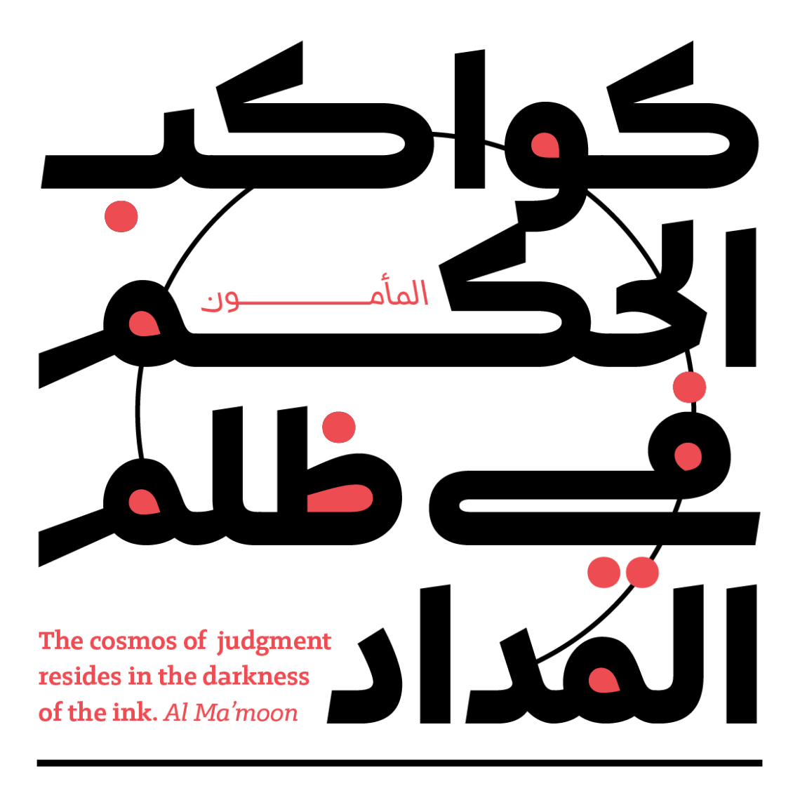
In this section of the article, basic layout samples are exhibited to demonstrate the harmonious usage of different Zarid styles together in the same layout.
29LT Zarid Slab Type Specimen
Visit 29LT Zarid Slab webpage on www.29LT.com website and download the type specimen for full information about the typeface.


1 Comment