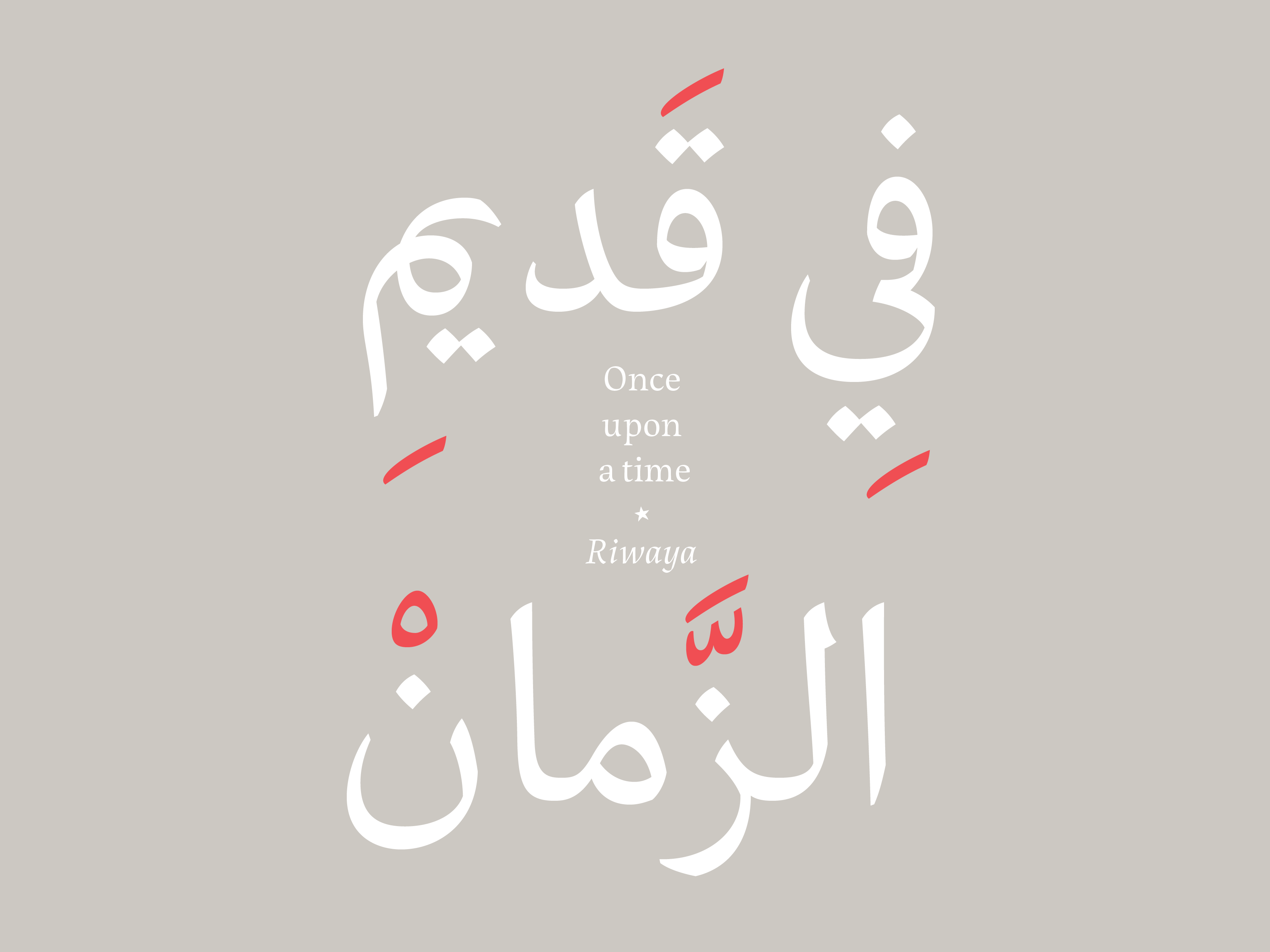
Type offers so many possibilities to give depth and atmosphere when reading a book– just like our voices would when telling stories. In designing Riwaya I set out to create a family of type suitable for comfortable continuous reading, as well as eloquent storytelling; a typeface that would not be neutral, but lend a pleasant voice to the author.
I questioned the existing Latin convention of complimenting roman styles with subordinate italics. Instead, I focussed on forming a family of styles that would suit each other, that would harmonise in colour yet differ in texture, both in the Latin and the Arabic script.
Most of the Latin typefaces follow a conventional family structure: the regular style is accompanied by a secondary italic or a slanted style. Arabic script traditions offer a wealth of styles – from Naskh and Nastaliq to Kufi and Ruqa to name just four – that trigger different associations and express different emotions. While they are sometimes combined, they do not have the hierarchy the Latin roman-italic pairing has, and are rarely combined within one typeface family.
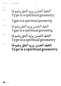
Rather than just offering a secondary slanted style, rooted in Latin italic traditions, Riwaya explores the concept of complementary, but equal styles differing in tone and texture. It offers a regular style, a Latin italic, and an informal style across both scripts, thus honouring both scripts’ typographic traditions.
The letterforms of each style are based on different skeletons where possible to differentiate them clearly. I carefully weighed slant, density, and modulation of the Latin italic, and of the informal Arabic and Latin next to the regular styles to create a very different texture at paragraph level, yet a similar colour on the page. This results in italic and informal styles which can be harmoniously used in combination with the regular style. The styles are neither darker nor more condensed and as such offer comfortable readability even for longer passages.
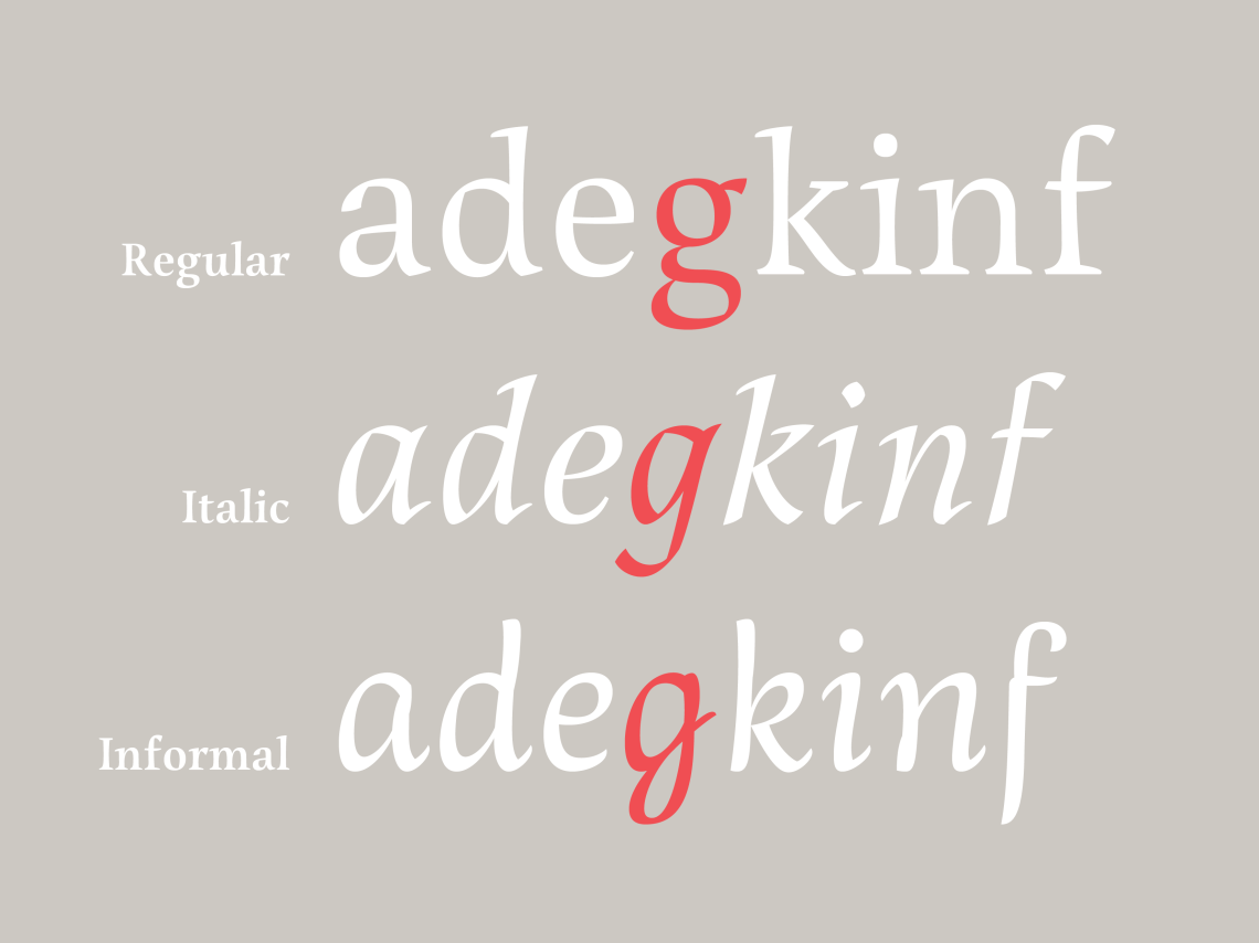
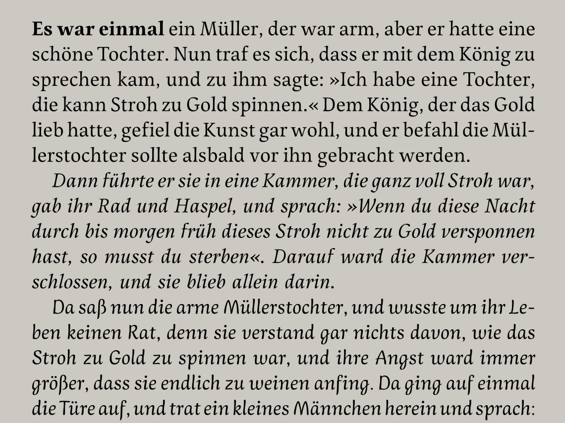
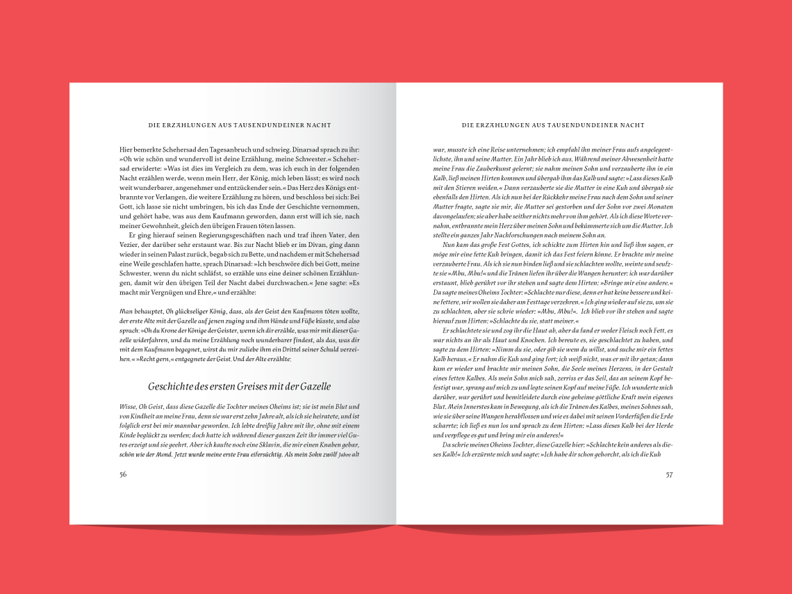
Similarly to the styles, I also considered the relationship of the scripts very deliberately. Intended for books the typeface needed to guarantee great legibility in each script, while fitting well in combined use and expressing a similar tone. This meant judging the Arabic and Latin both on their own as a bookface, and together for their tone of voice. Neither script’s legibility should be compromised to fit a certain style – so modulation, features and stylistic details where not matched across scripts. Both scripts have their own traditions, and a characteristic such as modulation is not a stylistic feature, it is intrinsic to the writing system. It was important to me to treat each script by acknowledging its own traditions and attributes, and thus create great legibility and a pleasant texture for either native reader.
I matched the feel and expression of the style, and the origin of it: the regular style in both scripts follows conventional book face models, while echoing calligraphic broad nib traditions of either script. Riwaya Arabic follows Naskh proportions to cater to most Arabic users’ expectations for a book face. It offers full vocalisation and a multitude of ligatures to create a beautiful texture on the page. The informal style in both scripts is based on contemporary handwritten shapes with returning strokes, reflecting the use of felt tip pens and pencils. However, it does not simulate handwriting, but rather gives typographic Naskh shapes a more casual expression.
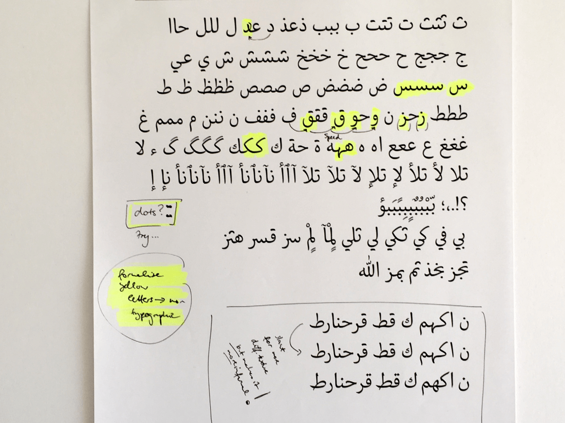
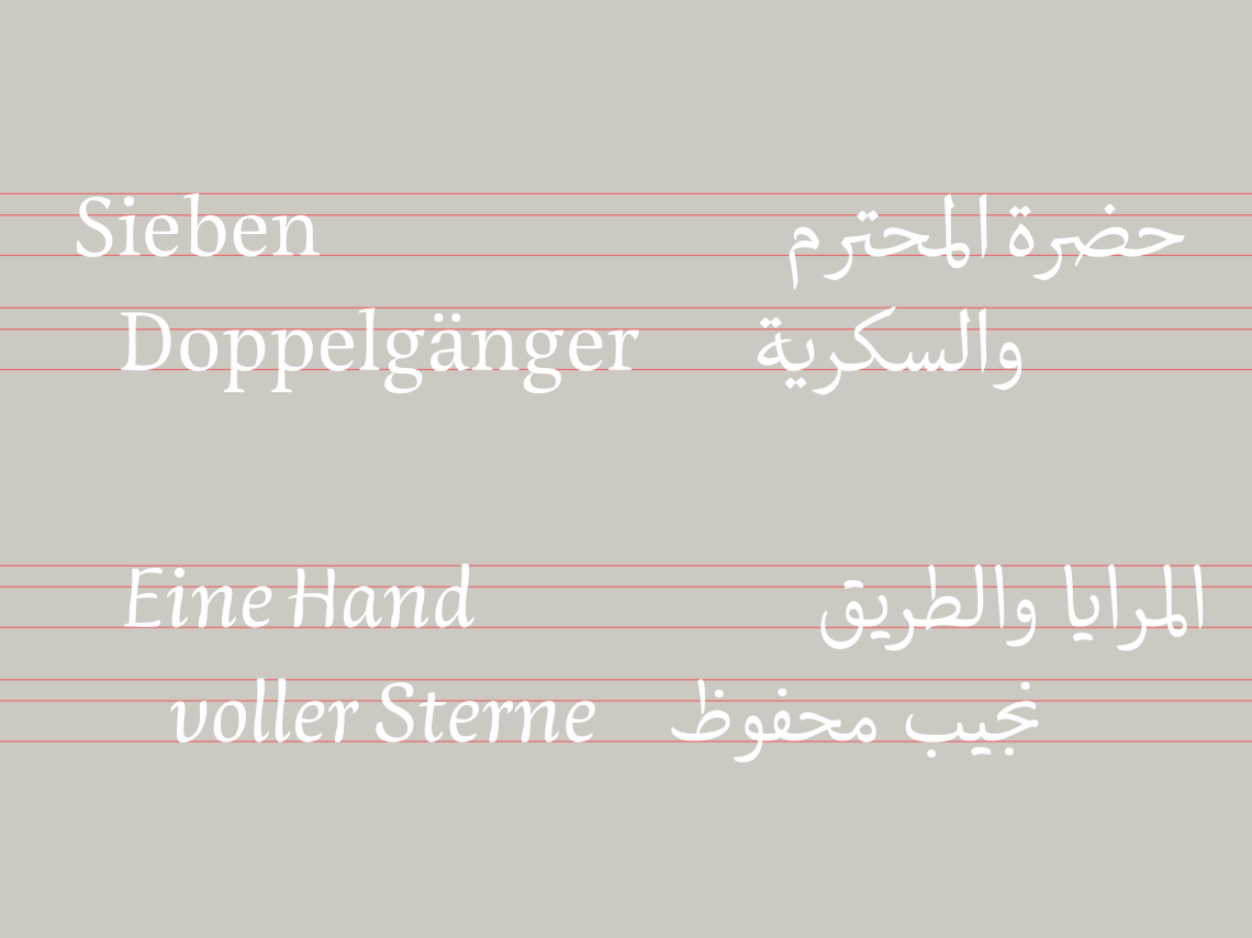
As a result of this design process, Riwaya is highly legible and pleasant to read in either script. The textures of both the Latin and Arabic are fitting the application and use, while the overall colour and scale matches. And most importantly, the expression, the tone of voice, of each style is the same across scripts. The regular style – Old Style in Latin, Naskh in Arabic – feels formal and traditional, yet calligraphic; the informal style expresses a more casual and contemporary feel, while still following typographic models.
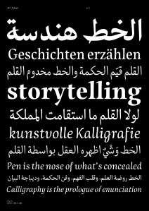
For a designer working on long texts, Riwaya’s styles offer the chance to typeset with different levels and to visualise written as well as spoken text. And to do so with one typeface family, with styles that are made to be combined.
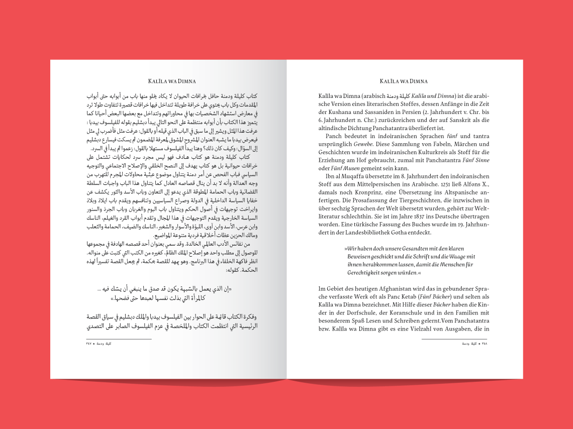
With Riwaya you can tell many stories, in different scripts and languages, in different voices. Or you can tell a story, within a story, within a story.
For some more detail on the development of Riwaya, see my presentation at the tgm, the typographic society of Munich (in German language).
This article is written by Katharina Seidl, the type designer of 29LT Riwaya.
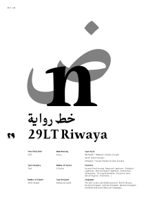
29LT Riwaya Type Specimen
Visit 29LT Riwaya webpage on www.29LT.com website and download the type specimen for full information about the typeface.
