
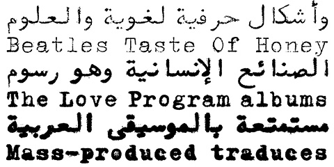
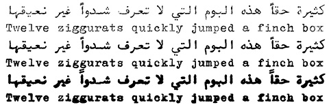
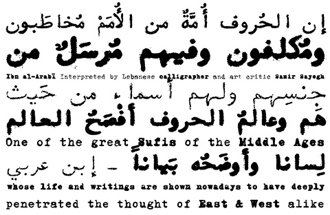
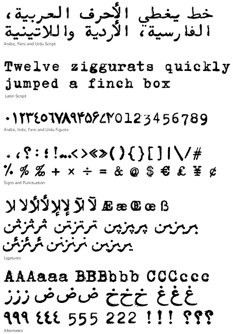
29LT Makina is a revival of an Arabic, Persian and Latin typewriter. “Makina” in Arabic means ‘machine’, which is inspired from the translation of a typewriter from English to Arabic. The type-family contains 3 weights (Light, Regular & Bold) with each containing ligatures, stylistic sets and contextual alternates.
The story of Makina started a few years back when I went on a hunt for a traditional Arabic typewriter while working on a project with a designer colleague of mine. The hunt started in Beirut and ended in Damascus. In Beirut, I started with the Sunday Market, then the antique shops in Beirut’s souqs, Byblos, Tripoli, and ended with the Basta region. In Damascus, I started in Souq al Hamadiya and then visited shops where employees still type documents on typewriters, slightly outside the city-centre of Damascus. I typeset several samples and took plenty of photos in each location and documented the names of the machines along with the date and place.


After several investigations and inquiries, I ended up finding the source of typewriters in Lebanon; Najjar Continental. I found their small shop in Hamra street with some typewriters displayed. Some were 60 year-old machines while others dated a few decades back. After several visits to their shop and a brief introduction to their history, I discovered that they were the main developers and distributors in Lebanon and the Middle East from the 1950s till the 80s, before the computer technology took over the market. They took me to their storage area and it was like a treasure cave full of old typewriters. Mostly Optima and Continental Brands with languages ranging from Arabic, Persian, English and French.

I kept on visiting Najjar Continental and typesetting samples from different machines until I selected the best sample to create the fonts from. My index fingers went sore and were stained black for some days, while the sound of the keys being typed made a rhythm that broke the silence of the store.
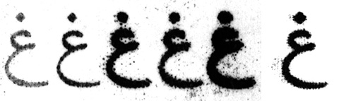
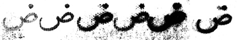
Besides finding the best machine for each language to typeset on, I had to come up with a technique to create the light and bold weight alongside the standard regular weight. This was due to the fact that the machines only came with a regular weight with an option of changing the colour of the ink. The bold weight was created by manually holding the cylinder (the piece that holds the paper) in place which stopped the paper from moving, allowing me to type the same glyph one on top of the other, in turn fattening the letter and clotting the counters.

A lot more experimenting had to be done when creating the light weight. My first trial was starting out by trying to press lighter on the buttons, hoping for a lighter hit of the glyph on the paper, resulting in a thinner letter. That failed. The second trial was having two papers on top of each other, hoping to soften the hit of the metal glyph on the paper. That also failed. My third attempt was after I discovered the emboss feature of the typewriter. This option allows typing without ink. This meant that typing regular mode followed by typing on emboss mode ends up with less ink on the paper. The residue of the first hit of the glyph during regular typing showed up when typing in emboss mode; therefore resulting in lighter letters. It is the humble Eureka moment, and the sample typeset papers kept going.
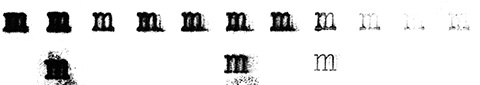
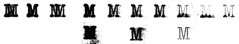
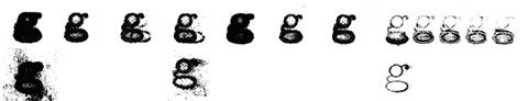


Transferring the rough ink embedded glyphs into digital outline curves was the third phase. The typeset papers had to be scanned with the highest resolution available to have it as faithful to the original typewriter effect as possible. Several image manipulations were needed before having the best black and white proportions for each of the three weights. All glyphs had to be organized and sorted with all its trials before digitalizing them into rough outlines. The best result from each glyph was selected and imported into the font developing software.
Typewriters are known to be monospaced (all glyphs have the same width), but this is not the case with Arabic. The later has three different widths defined depending on the need of each letter: tight, normal, wide. This is echoed in Makina where the Latin glyphs were kept monospaced while the Arabic retained its three glyph different widths. Arabic glyphs like the Alif, Ra’, Dal, Meem, etc were assigned the tight width; while glyphs like Ha’, Ain, Ya’, etc had the normal width; and isolated forms of the glyphs Ba’, Ta’, Seen, Sad, etc were set in the wide width.
The design of Makina is faithful to the design and letter variations in the traditional arabic typewriter. Due to the limited number of keys on the typewriter keyboard, the Arabic script needed to be simplified and letter variations were reduced to minimal except for complex letters like the Ain and the Ha’. Letters like Alef, Dal, Thal, Ra’, Zain, Waw, etc. that usually have isolated and final letterforms in standard font; they only have isolated shape in the typewriter. Letters like Ba’, Ta’,Hah, Seen, Sad, Fa’, Qaf, Kaf, Lam, Meem, Noon,Ya’, etc. that usually have four letterform variations in initial, medial, final and isolated forms; they only have two letterform variation that are initial and isolated. The isolated form is used for both final and isolated, while the initial form is used for both initial and medial. Only the letters Ain, Ghain retain their four letterform variations while the Ha’ retains three of the four.
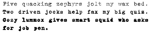
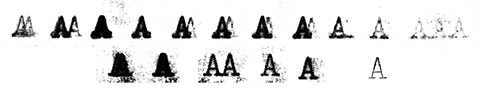
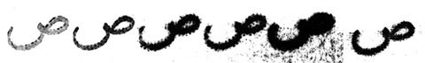
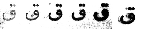
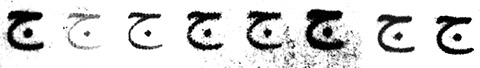
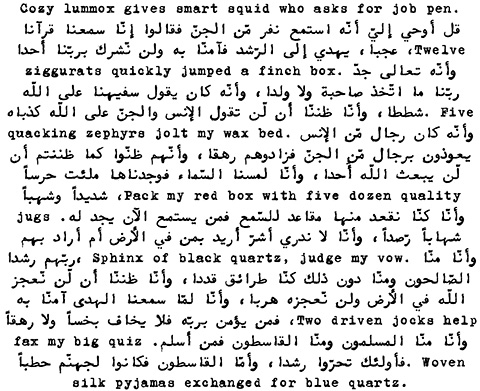
Three glyph alternates are created for each letterform in the Arabic and the Latin script in order to mimic as close as possible the randomness of the typewriter print of letters on paper. Advanced Open Type ( Stylistic Sets & Contextual Alternates) features were added to the font to allow a random cycle of glyphs’ alternates while typesetting Makina. More then 900 glyphs are present in each weight of the type family of Light, Regular and Bold.

Alongside the Lam-Aelf ligatures, the elevated tooth which proceeds the letters Ra’, Zain and Noon were present in the typewriter keyboard. Hence the ligatures Ba’-Ra’, Ba’-Zain, Ba’-Noon, and all corresponding teeth variations were created in Makina.
Finally, all missing glyphs that are needed in the font like Arabic accents, Urdu letters, extended Farsi and Urdu figures, extended Western European glyphs, punctuation, symbols, etc. were designed and created to cover all the character set for Arabic, Farsi, Urdu, and Latin.


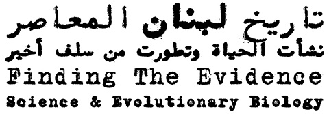
29LT Makina Type Specimen
Visit 29LT Makina webpage on www.29LT.com website and download the type specimen for full information about the typeface.