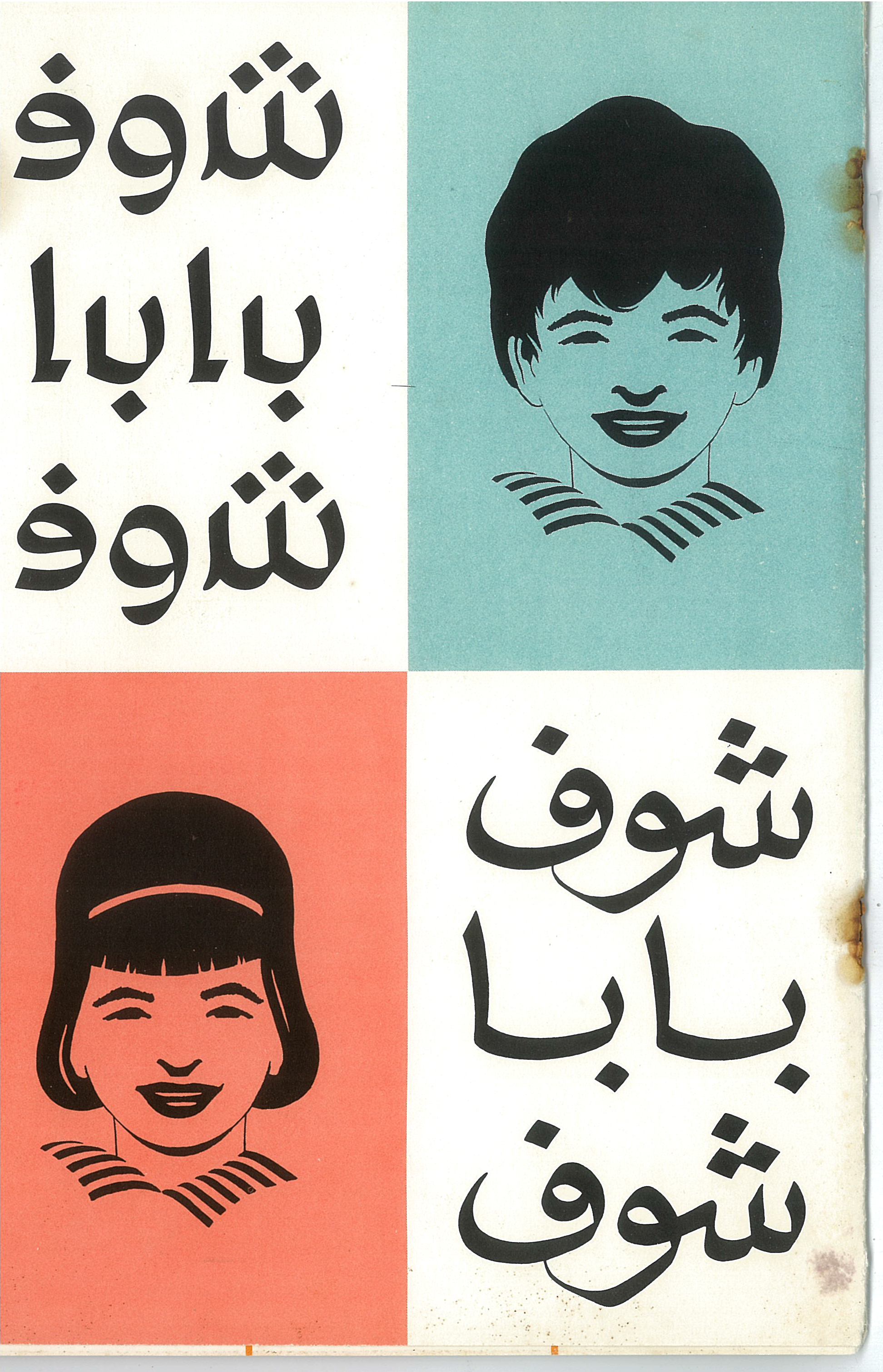

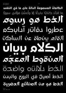
UA Neo B, originally known as UA Beiruti Modern, and UA Neo N, originally known as UA Neo-Nashki, belong to the first set of type revivals of Unified Arabic first introduced by Nasri Khattar in the 1950s. They belong to the Unified Arabic™ type system that contains a library of eight typefaces, including both print (detached) and cursive (connected) styles. After over 60 years, Mr. Khattar’s daughter, Camille, has entrusted 29Letters with the revival of her father’s fonts to keep them in line with his vision and design approach
.
29LT UA Neo fonts will be published in August 2013 with the release of the new website 29LT-Fonts dedicated to the showcase and promotion of 29LT custom and retail fonts.

Since UA fonts originally launched the innovative idea of detached Arabic type, at 29LT we decided to use the word Neo for all UA revival fonts, and to reduce the secondary name to its initial only. It is our way of making the UA fonts work properly as a set, especially when considering that most of the glyphs are based on the same skeleton with only outline changes or modifications.
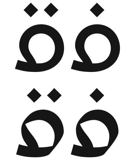
The revival is justly based on the drawings of Mr. Khattar’s UA fonts, His concept was initially based on the idea of one single glyph shape per letter, but after thorough analyses of the drawings and patents, we noticed that some letters had two glyphs instead of only one, like the letters (Ha’) and (Ya’).

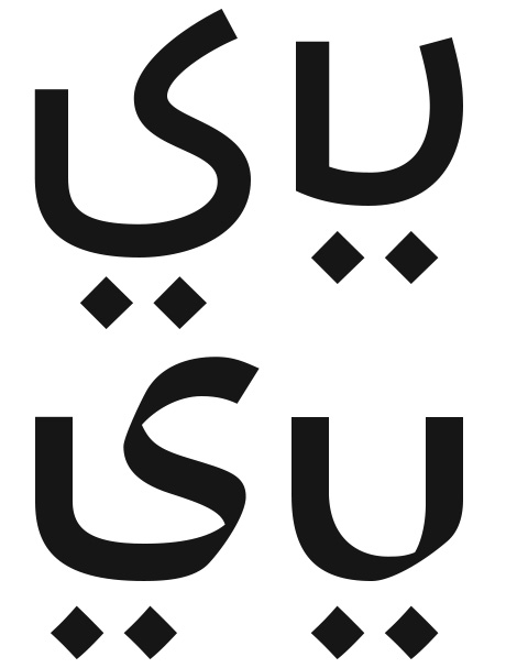
Furthermore, and after some legibility tests of the original set of glyphs, some letters showed that they were confused or misread as other letters especially in their final or isolated positions. Hence, we were led to draw additional glyph shapes for the letters (Ain) and (Lam) which will appear in the final and isolated positions, in the same way that Mr. Khattar decided to draw the (Ha’) and (Ya’) letters. We drew the new glyphs in the same spirit and characteristics as Mr. Khattar would have done himself. The (Ain) needed a final and isolated glyph form since the intial and medial forms were misread as (Hamza), while the (Lam) was confused with the (Alef).

Another minor change from the original design was the loop glyphs of the letters (Fa’) and (Qaf) since they looked like the flipped Latin glyph “e,” and they were not in line with the shape of the (Waw) and other round letters. We made these changes in both the UA Neo B and N set of fonts.
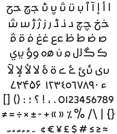
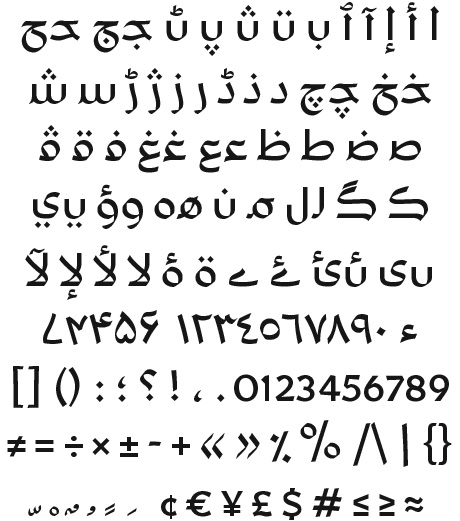
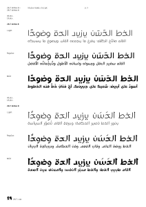
UA Neo B and N are based on the same skeleton forms, though UA Neo B is mono-linear and geometric, while UA Neo N is calligraphic and cursive in feel. The original designs only existed in Regular weights; we added two additional Light and Bold weights to each of the two sets. Mr. Khattar drew the fonts with a character set initially limited to the typewriter and later for primitive computers: Hence the glyph set only covered a basic Arabic set with limited punctuation and symbols. Therefore, we needed to add the full set of punctuation and symbols, as well as the additional Farsi and Urdu letters to allow support for these scripts.
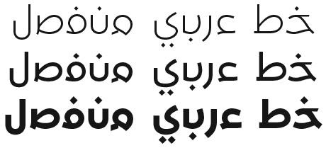
UA Neo N weights Light, Regular & Bold
Note from the 29LT type designer, Pascal Zoghbi
Even though the letters were drawn 60 years ago, the contemporary structure of the glyphs is unique, and I now think how revolutionary Mr. Khattar was to imagine such a solution for the Arabic script back in the 1950s, even though his concept was not publicly used or accepted at that time. I am honored to be the type designer reviving Mr. Khattar’s fonts and making them available to the public via a 29LT retail font set. The revival and publication of UA fonts should be considered as documentation of part of the history of Arabic typography and its evolution starting in the 1930s, and not as a statement that the Arabic script should be at present detached or that we should abandon esthetical cursive Arabic.
The detached Arabic concept was originally created to solve the problems of 1950s’ technology, limited in the typesetting and printing of Arabic, which today is no longer the case. At 29LT, we are publishing UA detached fonts for the reason of documentation as well as to experiment or explore the concept from a modern-day viewpoint and approach to the Arabic script. We encourage the use and exploration of the potential of UA fonts.
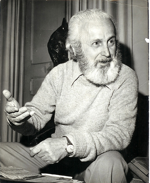
About Nasri Khattar (1911-1998)
A dual American-Lebanese national, Mr. Khattar was an architect, type designer, inventor, painter, sculptor, and poet, After finishing his architectural apprenticeship as a disciple with the great American architect, Frank Lloyd Wright, Mr. Khattar worked as an Arabic consultant to IBM in the 1950s, and architect, Arabic calligrapher, and Arabist to Arab-American Oil Company (Aramco) in New York City, 1950-1957. He received a Ford Foundation grant for the years 1958-1961 to promote his “Unified Arabic, UA” system. Unified Arabic is Mr. Khattar’s Arabic type system that simplifies the printing and teaching of Arabic, Urdu, Farsi, and other languages utilizing the Arabic alphabet.
As he continued to work on Unified Arabic, Mr. Khattar designed new Arabic typefaces, some of which were “Unified,” but also designed to automatically connect. In 1986, Reverend Dennis Hilgendorg and Dr. Ben Wood, Director of Educational Research at Columbia University, nominated Mr. Khattar for the Nobel Peace Prize for his life’s visionary achievements and their vast implications for the fields of linguistics, literacy, printing, information technology, and telecommunications.
To read more about the Typographic Journey of Nasri Khattar, refer to this previous post.
29LT UA Neo Type Specimen
Visit 29LT UA Neo webpage on www.29LT.com website and download the type specimen for full information about the typeface.


Hello,
The letters ba, ta, na and tha would benefit from being asymmetrical, ie the amount on the left less than that on the right.
Hello,
Very interesting work!
I think that the letters ba, ta, na and tha would benefit from being asymmetrical, ie the amount on the left less than that on the right.