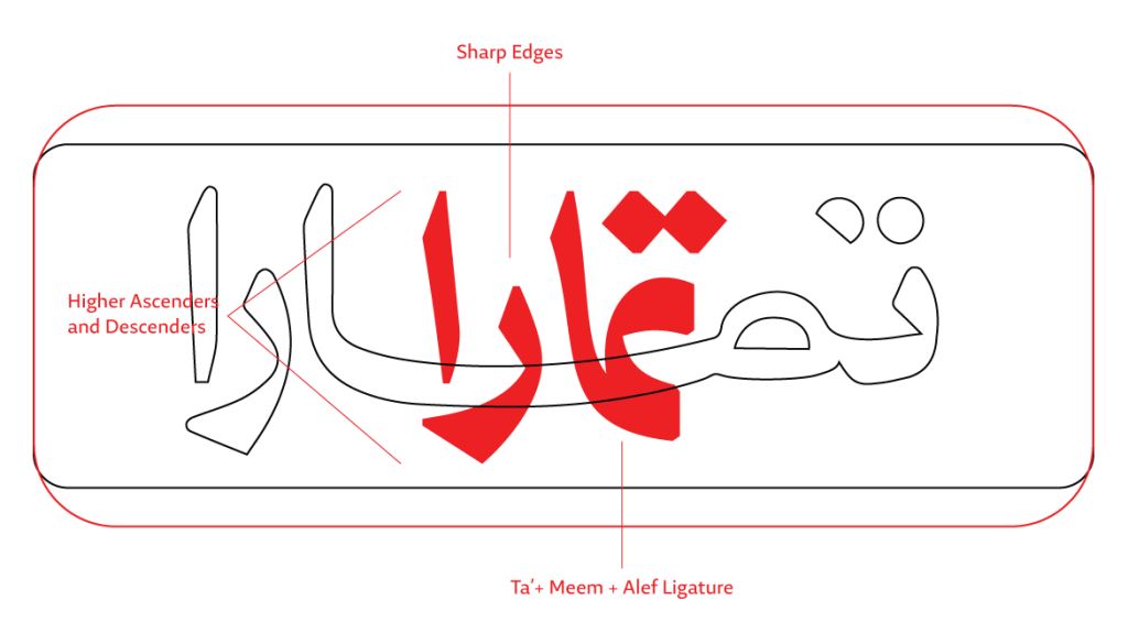
Rebranding an existing brand is a delicate and challenging task. The new design should subtly reference the previous image while simultaneously introducing a fresh and daring look that signifies the brand’s evolution and continuous development. With the Tamara brand, what started at a slight uplifting of the wordmark ended up as a complete redraw of the Arabic and English logotypes.

Tamara Finance Company, a Saudi joint-stock company, is a leading shopping and payments platform in the GCC region. It offers a fair, transparent, and Sharia-compliant payment experience. Backed by prominent investors, Tamara partners with businesses to boost customer loyalty and drive growth.

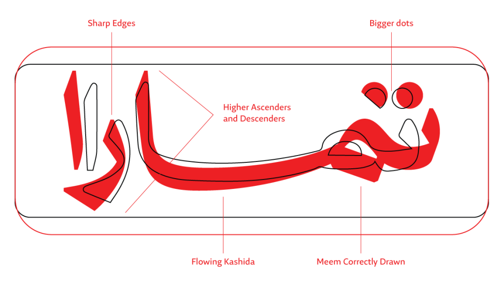
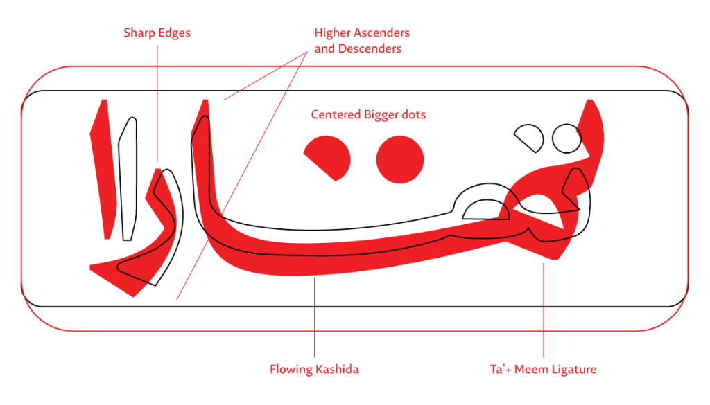
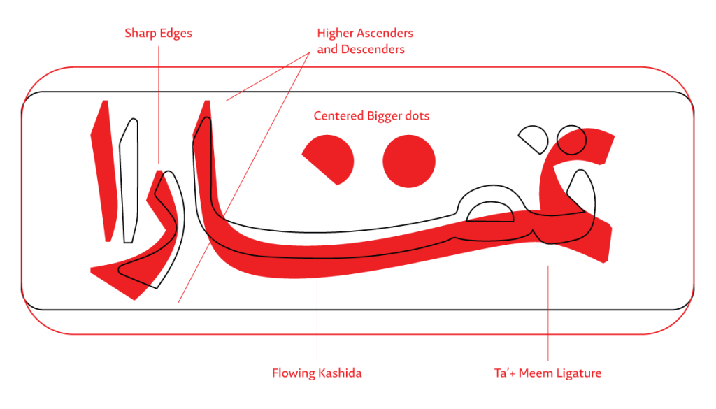
Pascal Zoghbi was approached by Tamara to analyze their previous wordmark. The company sought Zoghbi’s expertise to correct the outlines and proportions of the Arabic letters, to give the logotype a contemporary feel. From the initial analysis, it was evident that the Arabic Ta’ and Meem letterforms needed to be redrawn based on the pen flow structure in the Naskh calligraphic style. Additionally, the overall weight and contrast distribution of the logotype was updated to give a sharp and clean outline. For the English counterpart, the overall look of the letters required a clean and fresh design.

Pascal began by emphasizing the three distinct letter combinations in the Naskh style used to write the two letters, Ta’ and Meem, at the beginning of an Arabic word. Inspired by this observation, three Arabic calligraphic design options were developed. These included refinements to the weight, contrast, terminals of the entire word, and the flow of the kashida. Subsequently, additional options were created by exploring the combination of the three letters, Ta’, Meem, and Alef, together, resulting in a single, cohesive typographical element. Similarly, different design forms were experimented with for the Ra’ as a standalone letter, and the same approach was applied to the Alef.
What began as a minor update and edit of the old wordmark evolved into a complete redesign after several meetings between Tamara and Pascal. Pascal set aside the calligraphic options and took on the challenge of creating a clean, minimalist wordmark that reflects the new image Tamara aimed to achieve. He explored both humanistic and purely geometric forms, as well as the idea of width flexibility. This included the notion that the new Arabic logotype could fit into either a square or a rectangular format.

The design of the diacritic dots was also discussed. The team considered whether to retain the circular and semicircular forms for the two dots of the Ta’, inspired by the phases of the moon and the concept of time. An alternative idea was to remove this visual element and opt for bold diamond-shaped diacritic dots, which align more closely with traditional Arabic script.

In the English counterpart, which was designed in consultation with Linda Hintz, it was evident that the contrast needed to be diminished and the outlines had to be redrawn in a fresh and innovative design. As for the Arabic, humanistic and geometric letterforms were explored, and the concept of letter abstraction and minimization was tested. Four letters compose the word “Tamara”: the “t”, the “a”, the “m”, and the “r”. Various forms of these letters were created, mixed, and matched to explore a range of intriguing and diverse options. Some of these options closely resembled the standard form of the word, while others were daring and gave the logotype a more distinctive appearance.


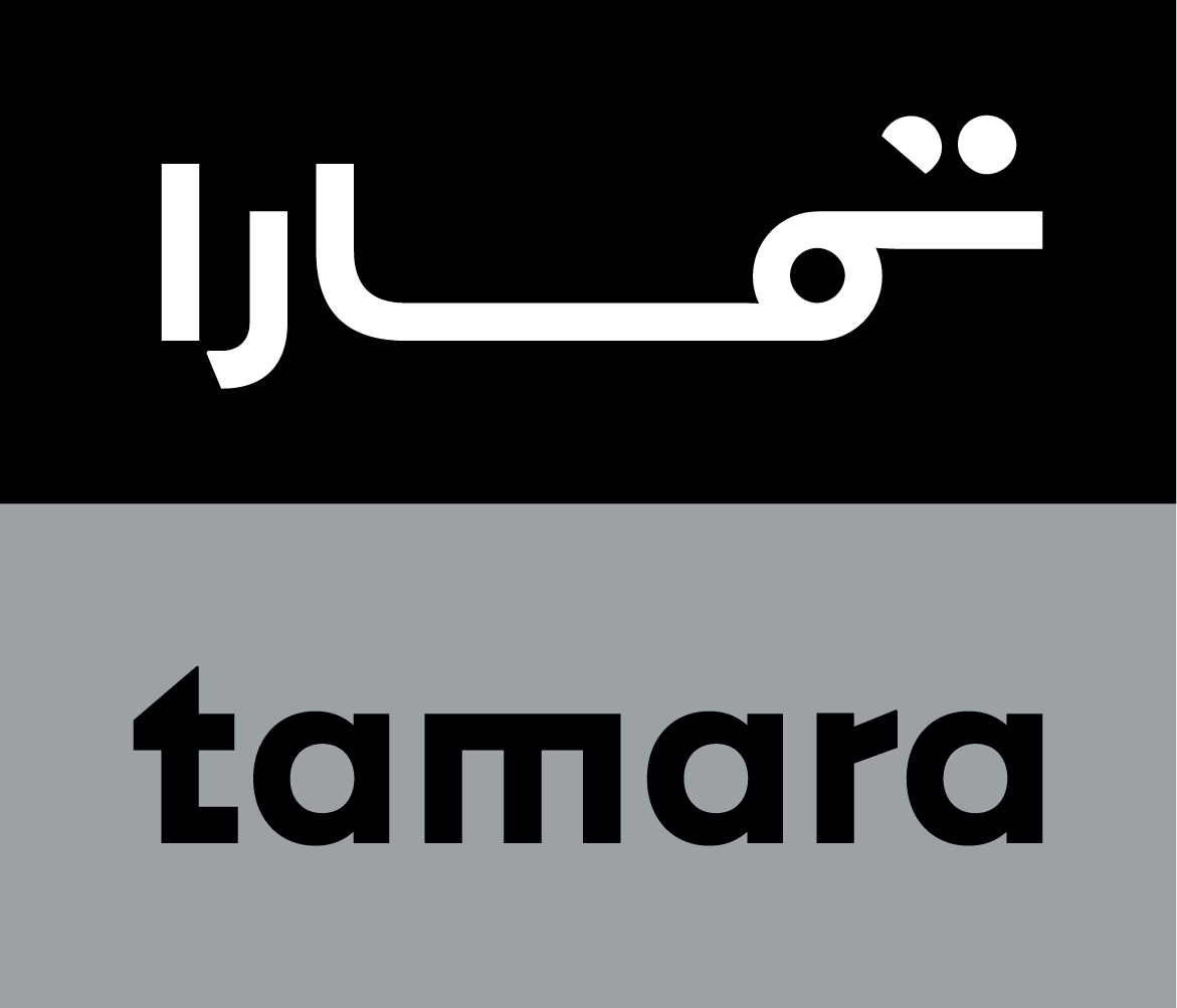
After extensive and meticulous discussions, the final bilingual Arabic and English design was approved. The logotype’s typographic elements and grid dimensions were finalized. The result was a simplified geometric Arabic wordmark, featuring circular and semicircular dots for the Ta’. The English version included an open, single-story “a”, along with flat and angular “t”, “m”, and “r”. Both the Arabic and English versions share the same width, which is essential for positioning the logo within horizontal, clickable digital buttons.

Reaching a final result is a long journey filled with passion and conceptual exploration. The letterforms are a source of inspiration, and their ability to take on hundreds of shape variations feels magical.
Afikra, Balenciaga, Balmain, Design Space AlUla, Lavin, and Majarra are among other Arabic logotypes Pascal created. Read about them in the 29LT Blog.
