
It’s common to see shop signs in the Arab world with bi-scriptual wordmarks. This is true for local Arab brands that have both an Arabic and a Western name, as well as for international Western brands that have branches in the Middle East. Making sure that both logotypes have a consistent visual language is a challenging task. The designer needs to decide whether to make the two scripts homogenous or divergent while exploring various design options. Designing the Arabic logotype based on specific Arabic calligraphic styles and respecting the anatomy of Arabic letters is crucial to achieving a professional result.
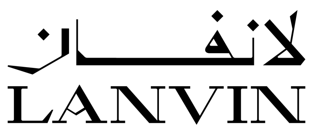
Lanvin is a French luxury fashion house located in Paris. It was founded by Jeanne Lanvin in 1889 and remains the oldest French fashion house still in operation. Introduced in 2022, M/M (Paris) designed a new Lanvin logotype, featuring a sharp modern serif typography, to replace the previous smoother transitional serif version. The designers adopted a unique capital A letterform with a broken crossbar, a distinguishing design element in the new wordmark. In 2023, Pascal Zoghbi was tasked with reflecting this typographic aspect into the Arabic logotype. The brief also revolved around the concept of classical old typography.

Discussions between M/M (Paris) and Pascal led to exploring two typographic Arabic routes, one based on the Thuluth calligraphic style and the other on the Eastern Kufic calligraphic style. These two styles were chosen as starting points since the Latin typography is high in contrast, and in these Arabic styles, extreme contrast can be achieved without breaking the flow or proportions of the letters. Pascal also wanted to explore the idea of creating the new logotype while exploring the extreme ends of the spectrum of the Arabic calligraphic styles.
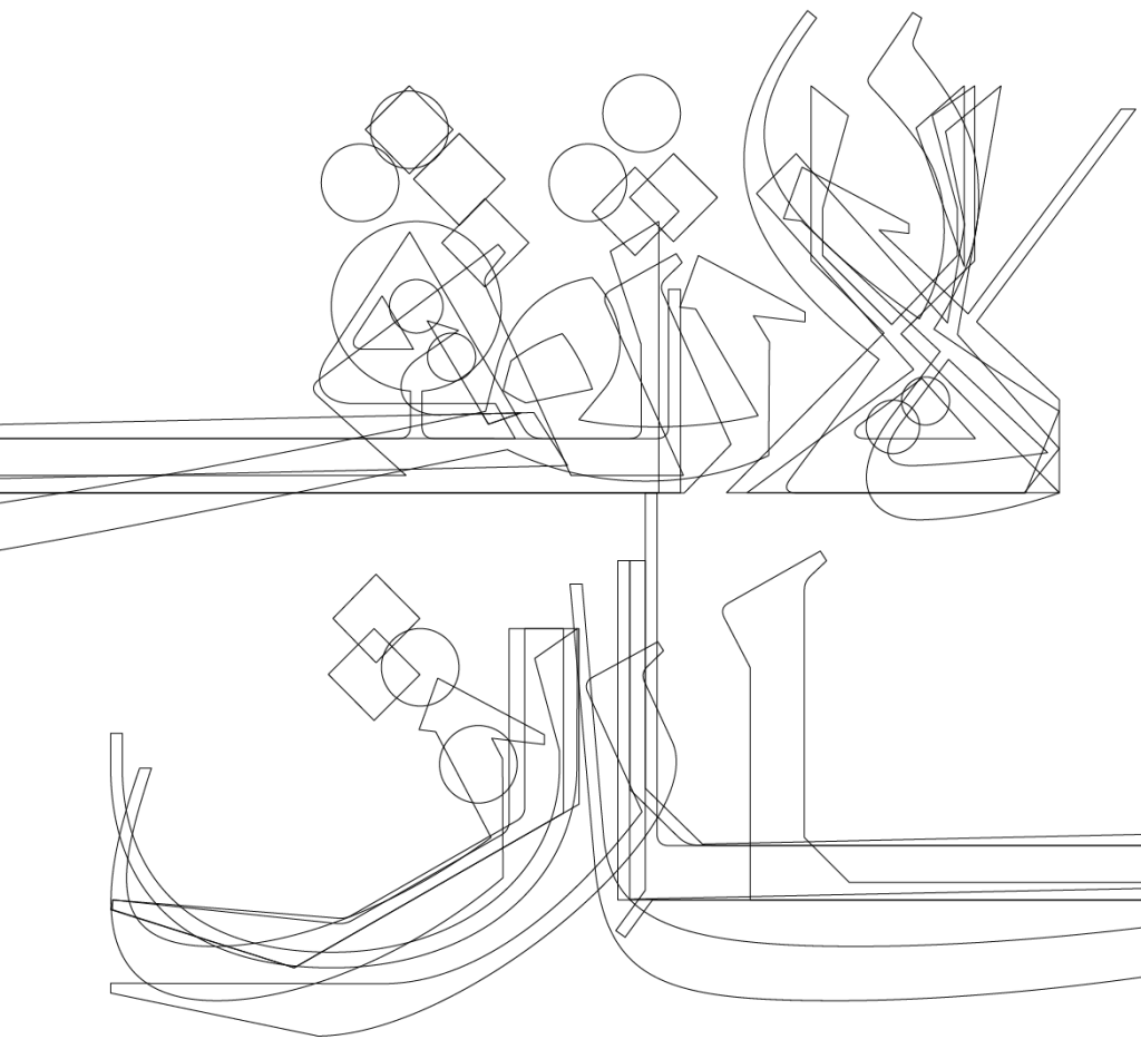
Arabic calligraphy can be grouped into two main categories: dry scripts (الخطوط الجافة) and soft scripts (الخطوط اللينة). The Kufic styles fall under the dry scripts and were developed during the Arab era. The cursive styles such as the Thuluth fall under the soft scripts, and these were developed in the Ottoman time. Of all the Kufic styles, the Eastern style is the highest in contrast, while the Thuluth is the most elegant of the cursive ones.
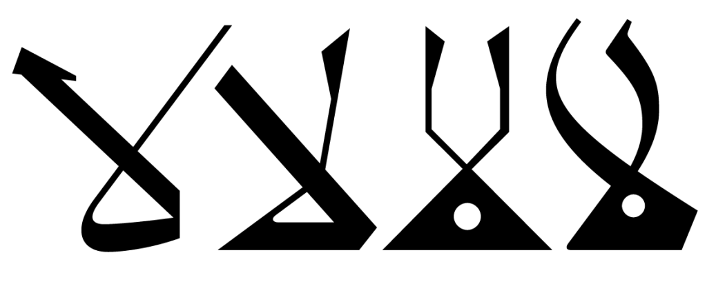
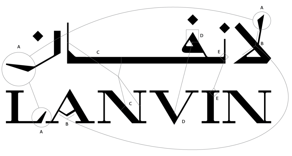
Looking at the Arabic word image of the Lanvin word (لانفان), it was clear that the Lam-Alef, the first two-letter combination in the Arabic word that represents the phonetic sound of “La,” would be the distinguishing letterform in the Arabic wordmark. We can write Lam-Alef in two ways, with the Alef sitting on top of the flat bowl of the Lam, or the Lam intersecting with the Alef in a crossed way. We explored the latter since the crossed pen strokes echo the broken crossbar in the A as well as the apex and the vortex in the letters A and V.
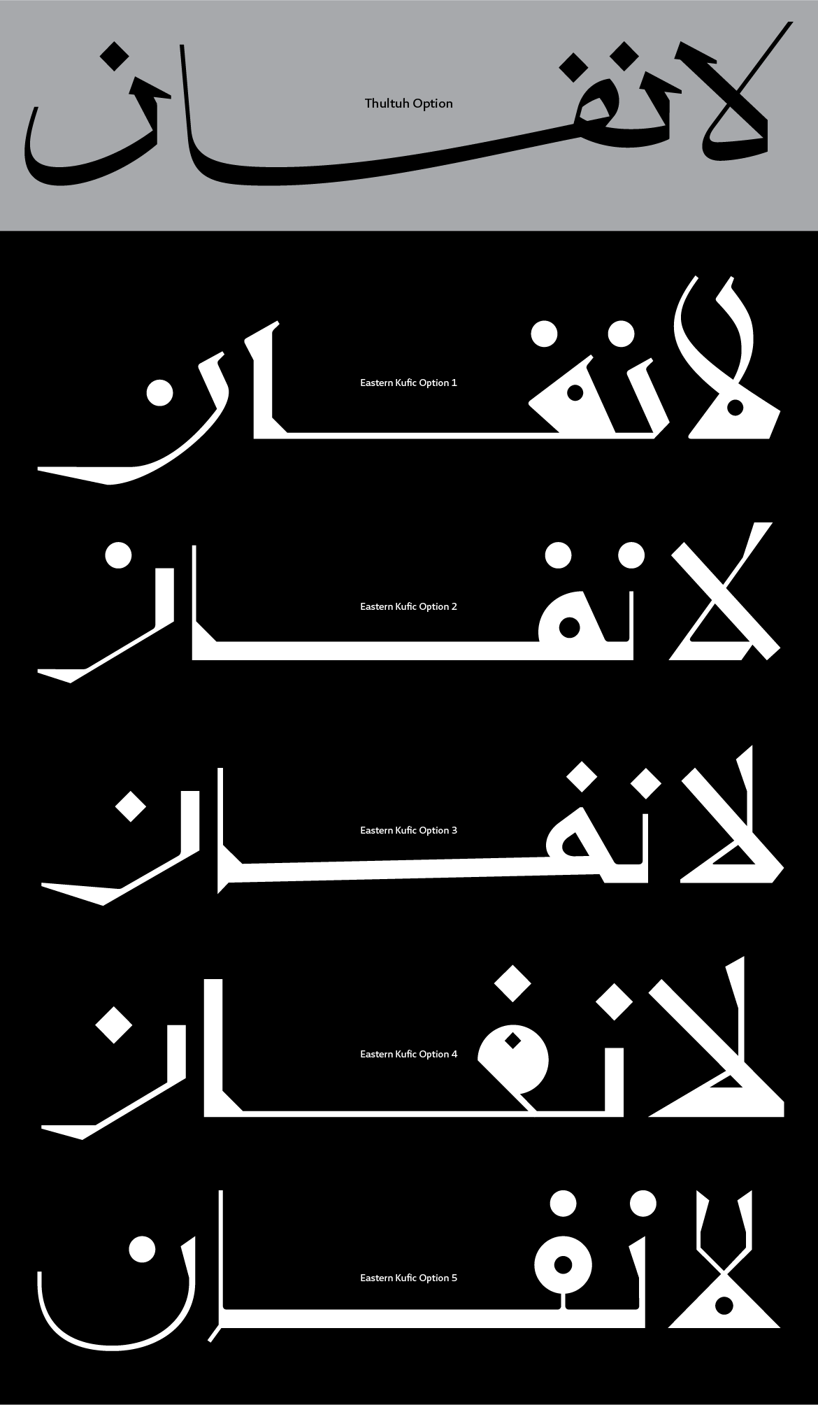

In Arabic typography, there are no serifs, but the “Nabra,” the starting pen stroke in some Arabic letters, can reflect the idea of the serifs. It is drawn differently in the Kufic scripts and the Thuluth style. In the Thuluth, the starting pen strokes are triangular in shape, while in the Eastern Kufic, there is a thin entry stroke to the stems. We explored Nabras in the primary Kufic options and the Thuluth option, but dropped them in the final version of the wordmark. On the other hand, the triangular terminal of the capital L was reflected in the starting pen stroke of the Lam-Alef and the ending terminal of the Noon letter.

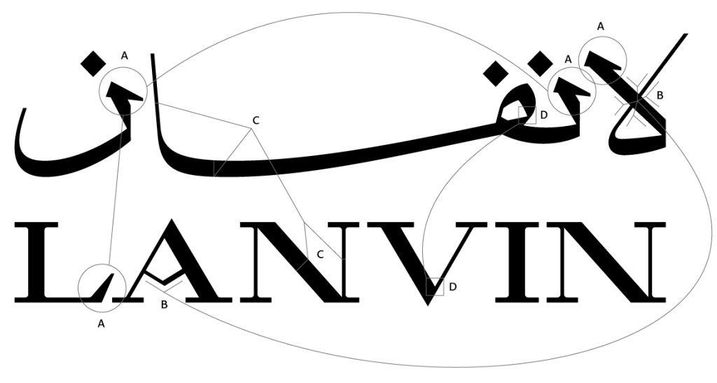
We tested the contrast application by applying the thick stroke horizontally and another vertically. In the Thuluth style, it is clear that the baseline should be the thick stroke, while the vertical or the diagonal should be thin. But when it came to the Kufic, the application could be either way since in the Eastern Kufic, the baseline and diagonals are thin, while in most other Kufic styles, the letterforms are somehow monolinear and clotted counters. We adopted the thick baseline approach in the end after some testing and made the decision not to use the heavy-clotted counters with the thin baseline.


Out of all the possible shapes of the letter Fa’ in the Kufic script, we chose the triangular one to reflect the V letterform of the Latin script. also, we incorporated into the Arabic typography the curved links between the serifs and the stems between the vertical or diagonal curves and the baseline in the Latin typography. To maintain the sharp and edgy image of the logotype, we used diamond-shaped diacritic dots, as opposed to the round or elliptical dots typically used in the Kufic script.
Afikra, Balenciaga, Balmain, Design Space AlUla, Majarra, and Tamara are among other Arabic logos Pascal created. Read about them in the 29LT Blog.
