afikra | عفكرة is a global organization that aims to convert passive interest in the Arab world into active intellectual curiosity. It’s a grassroots movement that has grown into a global media and educational platform that is collectively reframing the dominant narrative of the region by exploring its histories and cultures – past, present and future. With its online and worldwide events, afikra has established a community of volunteers, thinkers and explorers from across the globe.
What sets afikra apart is a shared belief that curious people make better citizens, and that curious communities make better societies. It encourages members to question the dominant narratives about the history and culture of the Arab region proactively.
As we enter 2024, afikra is preparing to celebrate its 10th anniversary. To mark the occasion, Pascal Zoghbi designed a new wordmark that was based on afikra’s existing one. The Latin typography was changed from Charter to 29LT Zarid Text, while the Arabic typography was completely redrawn. The decision to redesign the wordmark was taken because afikra started using 29LT Zarid fonts in its visual communication in 2021. It made sense to unify the Latin typography with the logotype to create a consistent typographic identity.
The Arabic counterpart was drawn in Naskh style to match the humanistic serif Latin. afikra’s aim is to promote intellectualism and the diversity and richness of the Arab world’s cultures and histories, which is why a unique and representative Arabic wordmark felt necessary. afikra’s creative team even put a lot of consideration into discarding the English part and having the new wordmark be exclusively in Arabic, but in the end, decided to keep both scripts.
Both typographies have a consistent visual language and while the proportions, weights and contrast of both scripts are in harmony, each was drawn based on its calligraphic reference:
- (A) the weight of the Arabic baseline is balanced with the stem weight of the Latin letters
- (B) the anatomies of Arabic and Latin letters are respected to achieve a professional result
- (C) the contrast between the thin and thick pen strokes is balanced in both scripts
- (D) the title of the letter “i” reflects the diamond-shaped diacritic dot of Arabic script
- (E) the terminals of both scripts are drawn similarly
- (F) the Arabic Kaf [كاف] letter took the swash elongated shape to allow the Arabic word to have the same width as the English word
If you are interested in reading about other Arabic logos created by Pascal, you can check the logos of Balmain Arabic, Balenciaga Arabic and Majarra.
Historical Point of View
In Arab nations, it is common to have bi-scriptual wordmarks. The Arabic language is usually the first language, followed by English and/or French as a second language. Arabs are often exposed to two or three languages throughout their lives: starting with a mother tongue usually via their family, and continuing through school, university and work environments. This makes them multilingual and able to connect with the global community on both personal and professional levels. However, this can also result in a disconnection drawing them further away from a deeper understanding of the Arab language and nuances, as western culture is often viewed as more trendy, modern, and even advanced. Considering this conversation is a big social, educational and political one, in this typographic article we will only delve into how Arabic and Latin scripts influence one another in design.
When graphic design was established in university programs in the Arab world in the late 80s and early 90s, it was mainly based on design programs from renowned universities in Europe and the United States. These programs offered foundation and advanced design courses which enabled students to become professional designers and contribute to the Arabic visual mediums. However – even though students did receive essential design skills – the overall mentality was western-based, lacking in Arab design (including Arabic calligraphy) history and culture. As a result, students’ skills in Arabic typography were lacking compared to their Latin counterparts. While some Arabic calligraphy workshops or electives were available, these weren’t enough to enable students to think as Arab designers instead of western ones.
In addition to university-level education, schools (especially English and French private schools), did not include Arabic calligraphy or culture classes in their curricula. Arabic was only taught as a language class, while all other classes were taught in English or French. During the period between the 1980s and the beginning of the 21st century, there was a noticeable absence of Arabic calligraphy, design and type culture, which had a significant impact on bi-scriptual design projects during that time, from branding to publishing, advertising and other visual practices.
During this period, the tendency was to create Arabic logos by converting Latin letters into Arabic ones. This process resulted in many brands with Latinised Arabic wordmarks and the design process to get there involved selecting Latin letters that resemble Arabic letters and required copying, cropping, rotating, flipping, and pasting them together to create Arabic words. Nadine Chahine coined the term “Frankenstein Arabic typography” to describe this phenomenon of stitching letters together to stress on the disconnection from Arabic calligraphic proportions and design approach.
There is a need for new bilingual logos that don’t alter the Arabic script or make it more Latinised. The redesign of the afikra logo can serve as an example to visually illustrate this topic.
Analysing the old afikra logo:
- (A) the terminal of the Arabic letter Ain [عين] is a flipped form of the terminal of the letter “a”
- (B) the tail of the Arabic letter Ra [راء] is a rotated form of the upper terminal of the letter “f”
- (C) the title of the “i” and the diacritic dot of the Arabic letter Fa [فاء] are too small in proportion to the base letterforms
- (D) the top part of the Arabic letter Ra [راء] is taken from the top serif part of the letter “i”
- (E) the arm of the Arabic letter Kaf [كاف] uses the same serif shape as in the Latin typography
- (F) the counters of the Arabic letters Fa [فاء] and Ta’ Marbouta [ة] are a modified version of the letter “o”
- (G) the baseline of the Arabic is too thin in that it does not link to the stem weight of the Latin typography
The period after 2010 was good news for Arabic typography and calligraphy. Arab nations started paying more attention to their heritage – and promoting it. Professional Arab designers began introducing Arabic typography classes in design schools and some curricula got (or will be) revamped entirely from an Arab perspective. Additionally, high-quality Arabic and bi-scriptual Arabic-Latin fonts were introduced to the market, new books emerged on the topics of Arabic typography and the history of Arab graphic design, and several digital and real archival initiatives started documenting the history of Arab visual design. This contributed to the growth of Arab pride, and the love of Arab culture was reintroduced to the new generation. This is a positive development that only means that Arab visual culture is on the right path to growth.
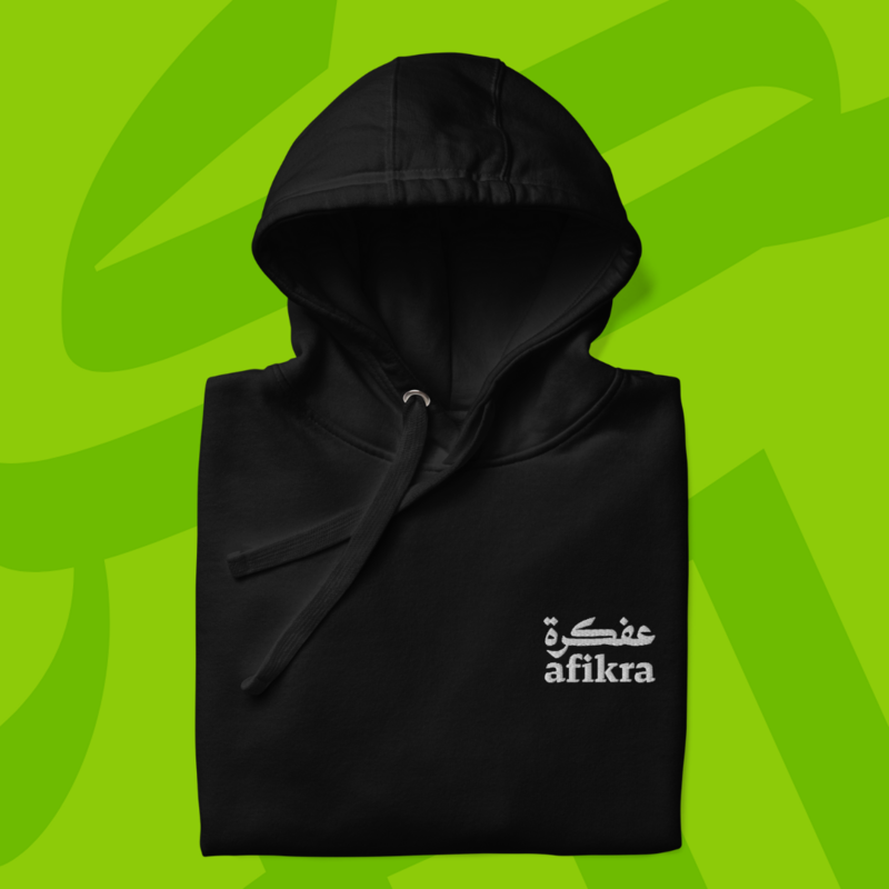
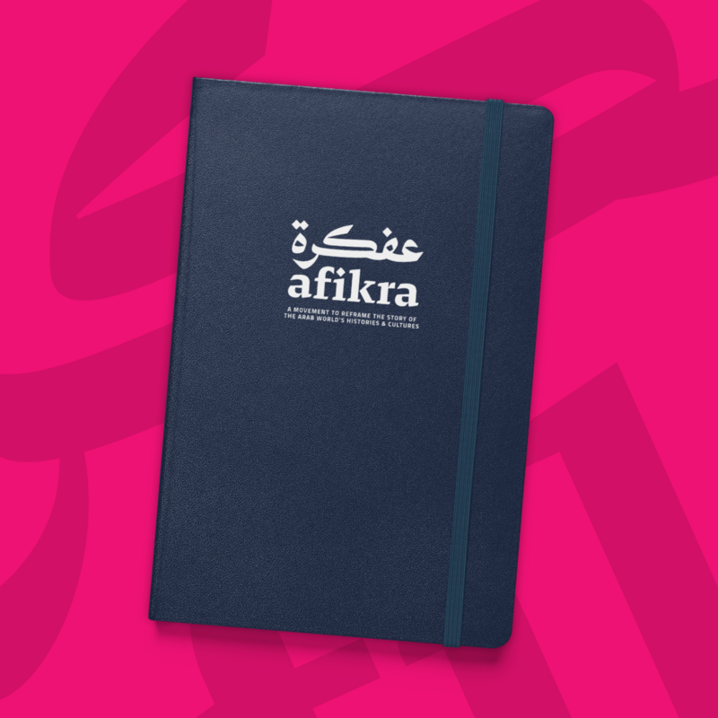
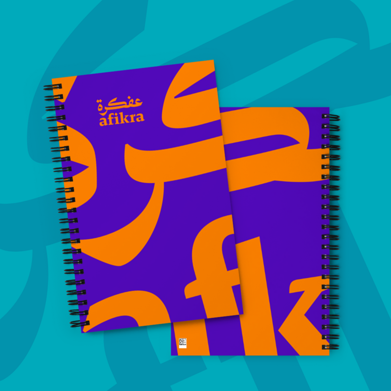
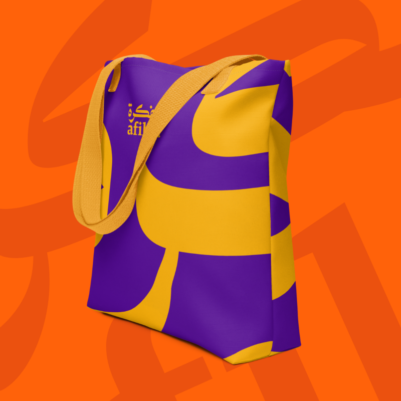
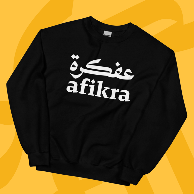
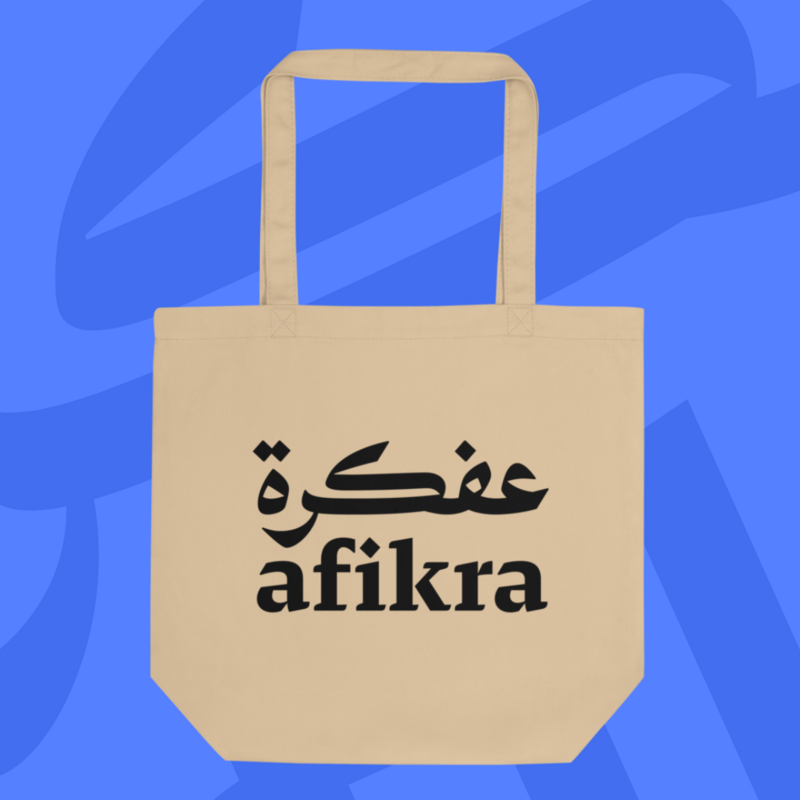
You can support afikra | عفكرة by purchasing one of their merchandises :
Balenciaga, Balmain, Lanvin, Design Space AlUla, Majarra, and Tamara are among other Arabic logotypes Pascal created. Read about them in the 29LT Blog.
