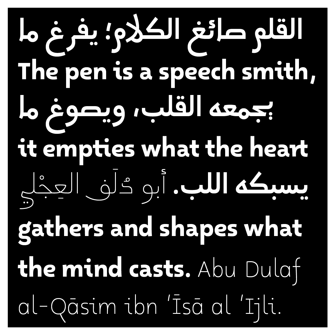
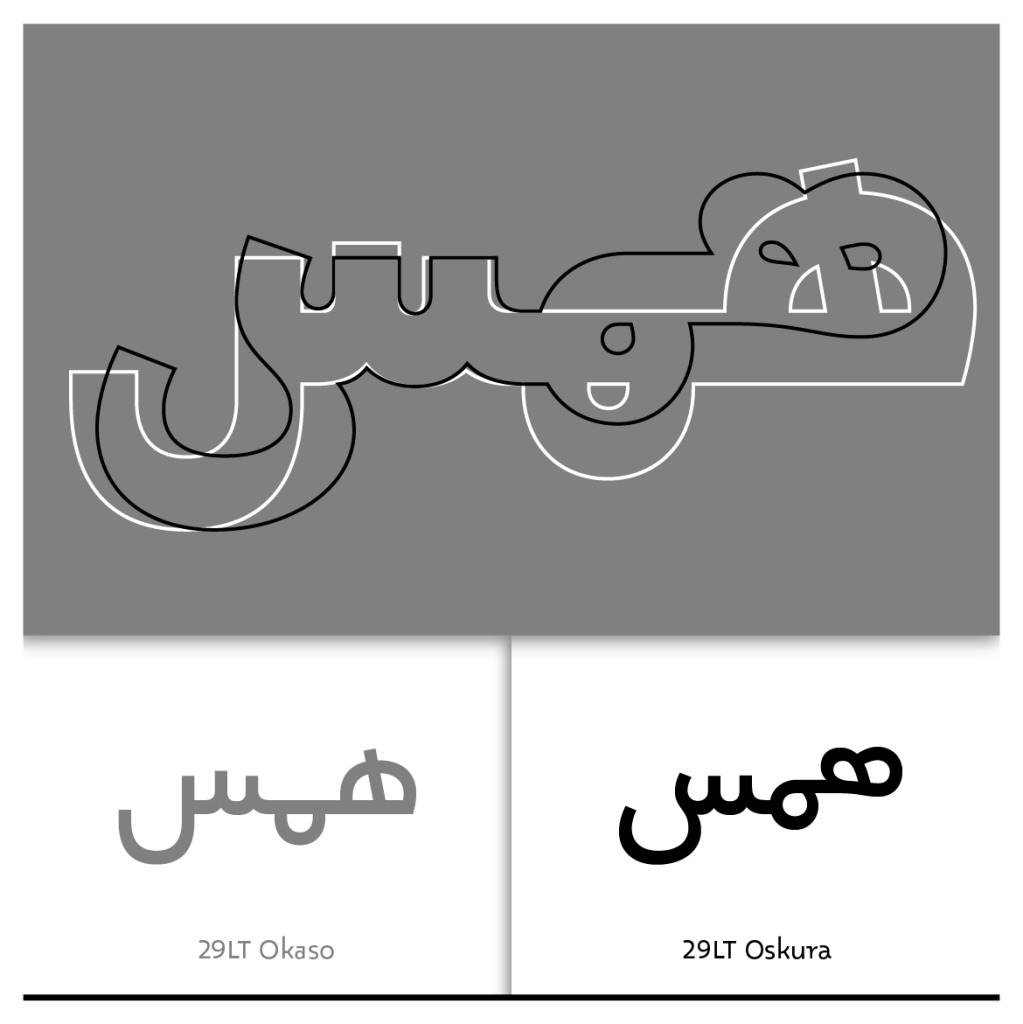
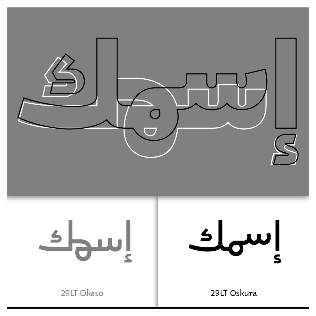
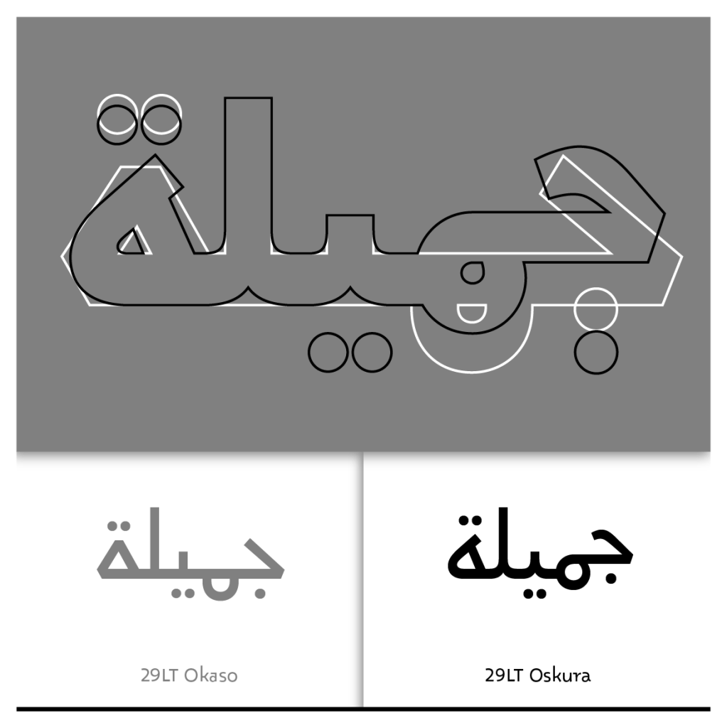
29LT Oskura is the second interpretation of the diverse handwritings found in the Aljamiado manuscripts and works as a fluid alternate to 29LT Okaso. Its humanistic design approach is built on the concept of the progressing pen. It is not rough and grungy as the writings in the manuscript are, but retains the flow of handwriting and presents the letterforms in clean outlines.

“Oscura,” “dark” in Spanish, was chosen as a name because it refers to the dark era of the end of the Muslims’ existence in the Iberian Peninsula. Moreover, the Aljamiado manuscripts were hidden in enclosed and dark spaces, like ceilings and double walls of houses. Hence the name Oskura with the c replaced with a k.
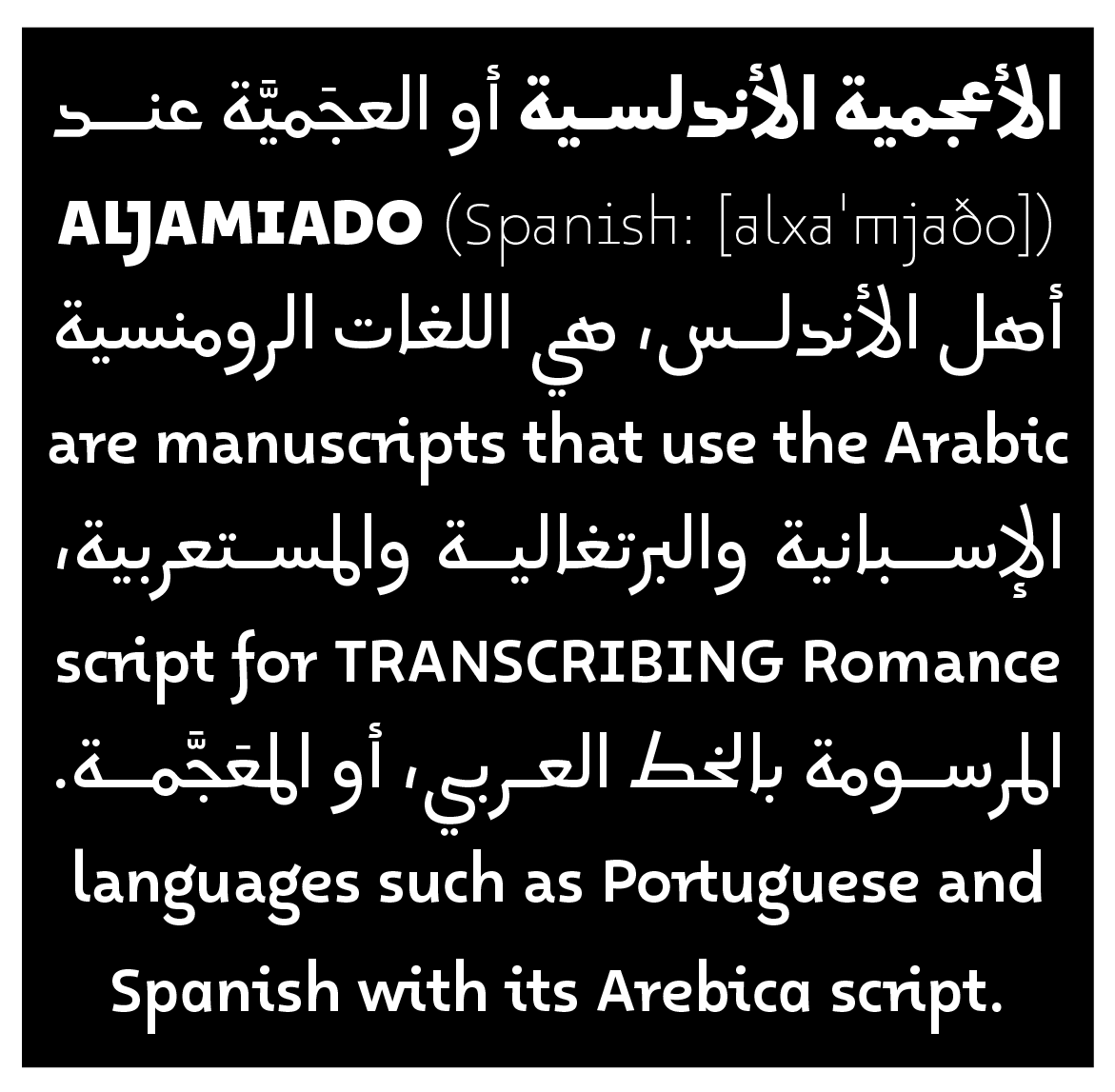
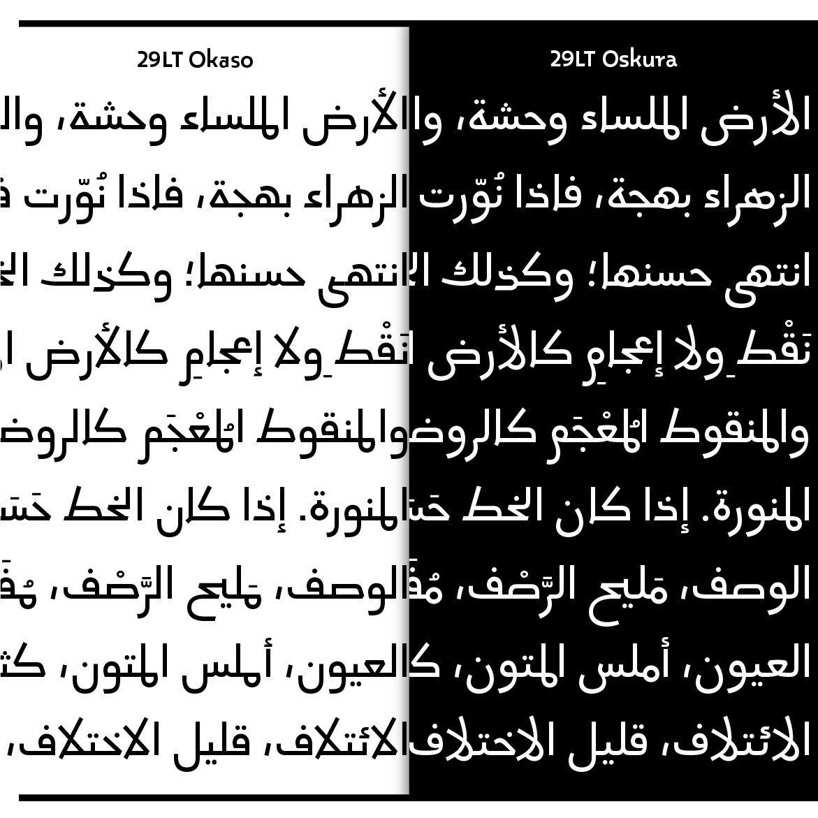
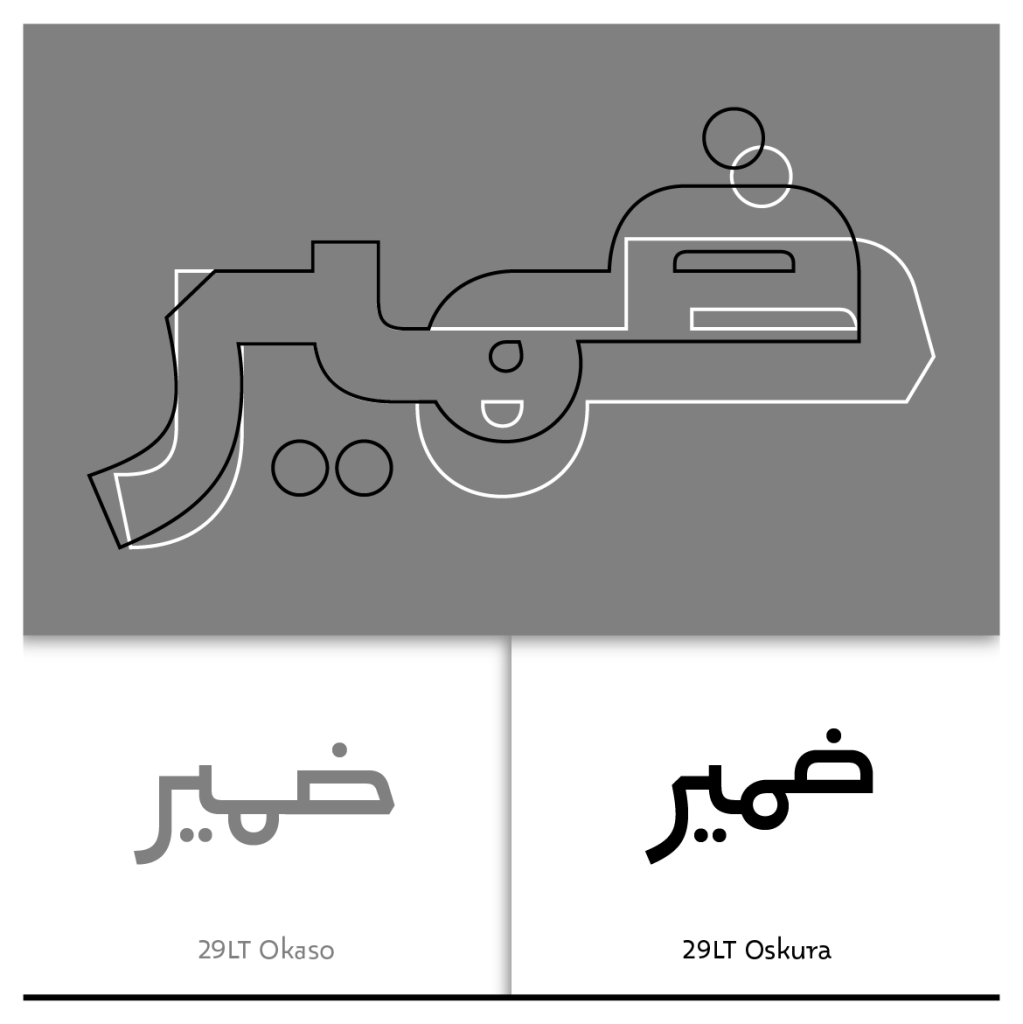
A brief summary of the Aljamiado topic is present in the 29LT Okaso article. Exploring some sample spreads from different sections of the Islamic Fiqh book Tanbīh Al-Ġāfilīn” by Naṣr ibn Muḥammad al-Samarqandī manuscript illustrates the link between the simplified geometric handwritings and the cursive rough writings. This spectrum is represented with Okaso and Oskura, placing Okaso on the geometric side and Oskura on the cursive side.
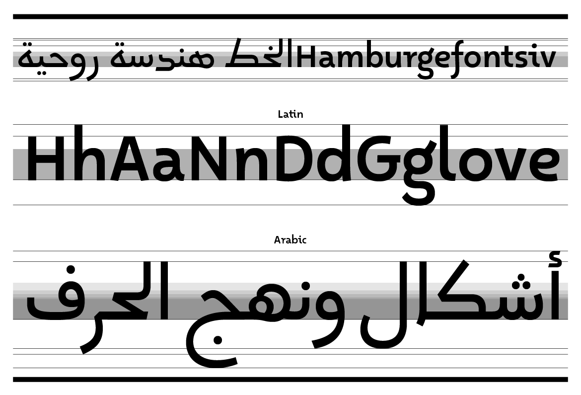
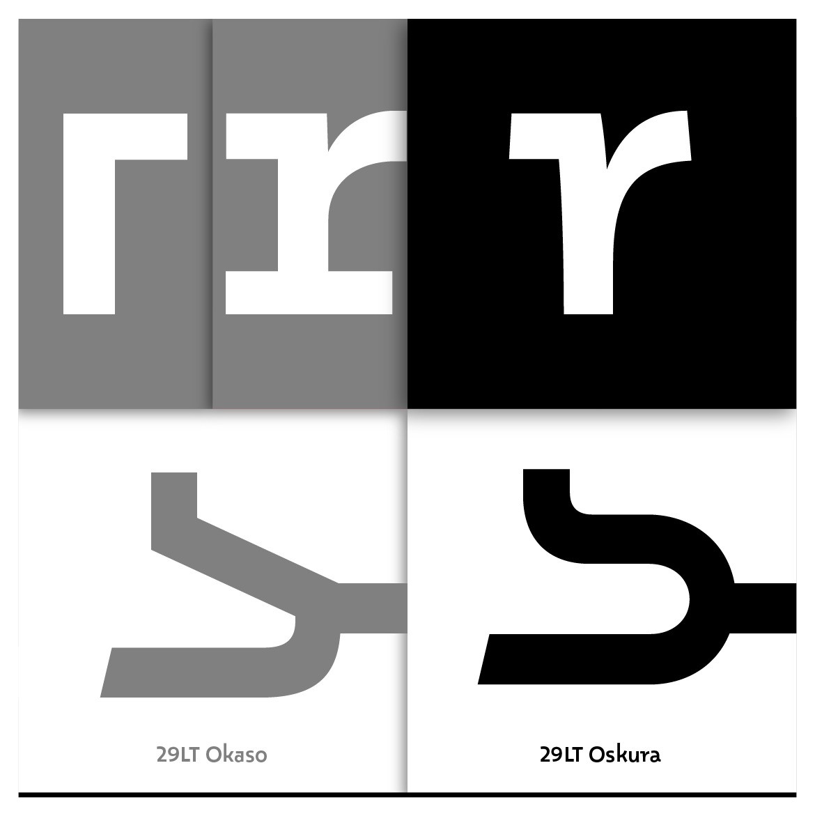
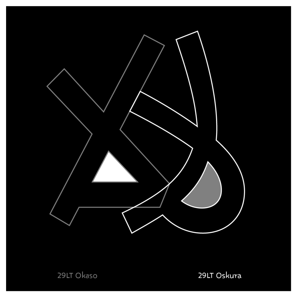
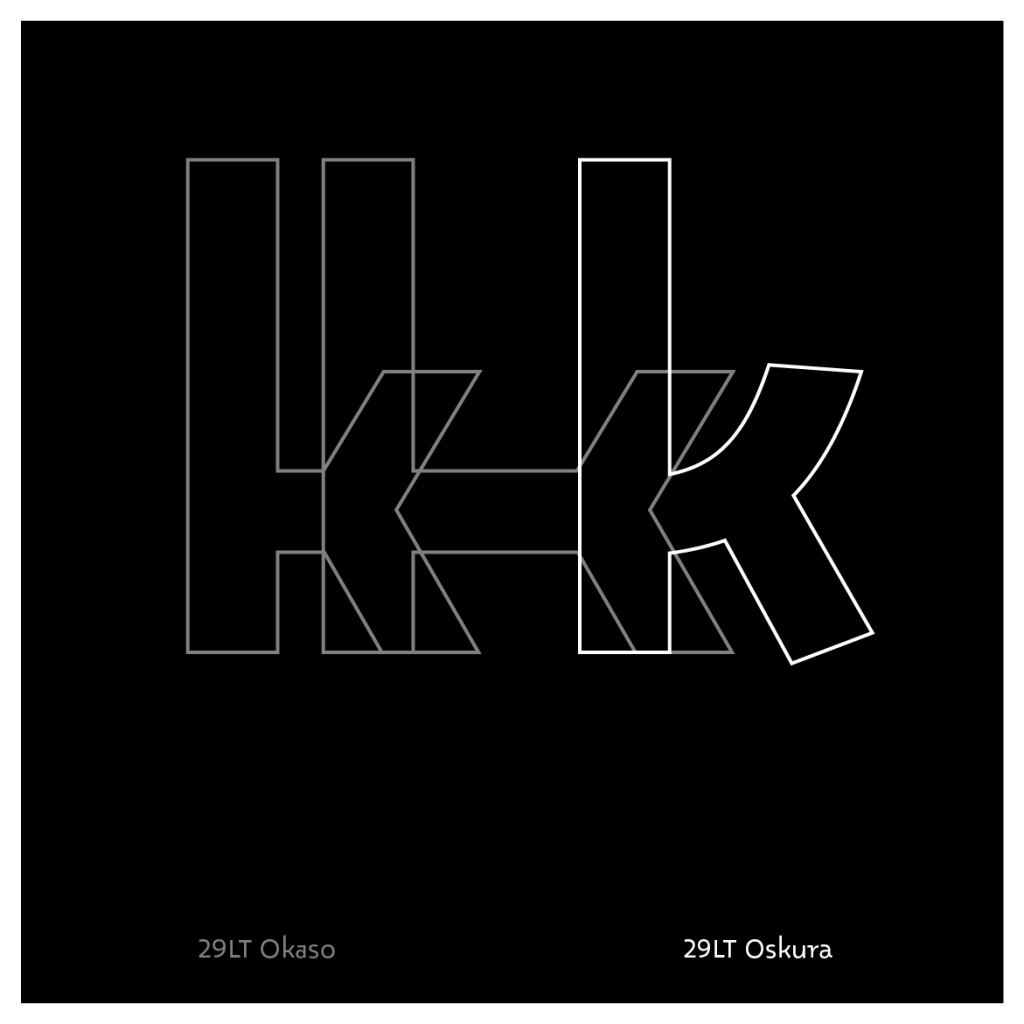
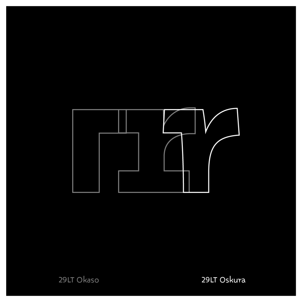
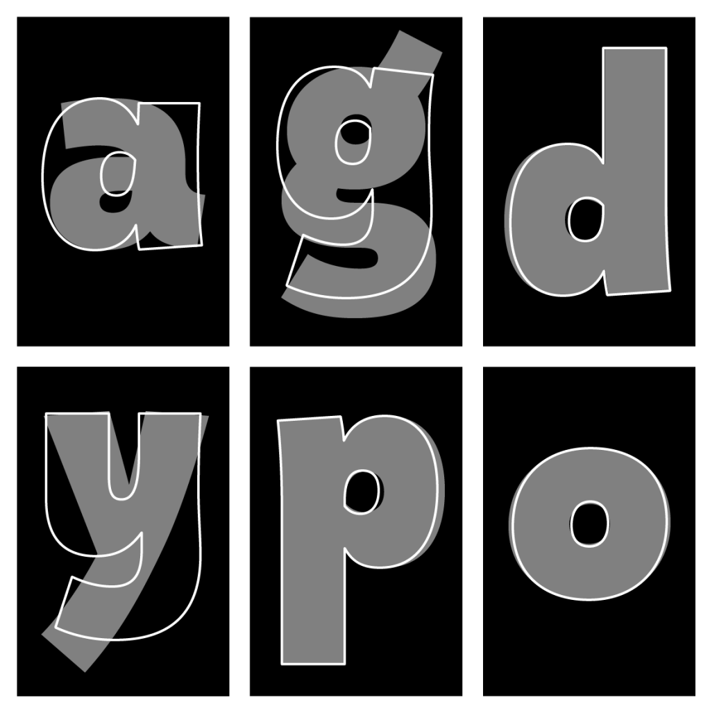
Analyzing the manuscripts, different forms of each Arabic letter were noted and later filtered out to create a coherent character set in each typeface. The simplified options were placed in Okaso, while the more fluid options were placed in Oskura. Typographically, some glyphs in Oskura can be categorized as the rounder version of their counterpart glyphs in Okaso, while others are totally redrawn with a different skeleton and outlines. In the Arabic letter the [ hā’ / هـ], for example, the initial form of the letter is a totally redrawn glyph, while the final form is a rounded version of the geometric one found in Okaso. This approach is also echoed in the Latin where forms become lively in construction. The legs of K and R start to swing, for example, and the stroke terminals in n, m, and r bend outwards a little. In addition, a whole set of alternate forms in italic construction were added for the a, d, p, b, and q. All these changes add an extra typographic level when the two typeface families are used together.


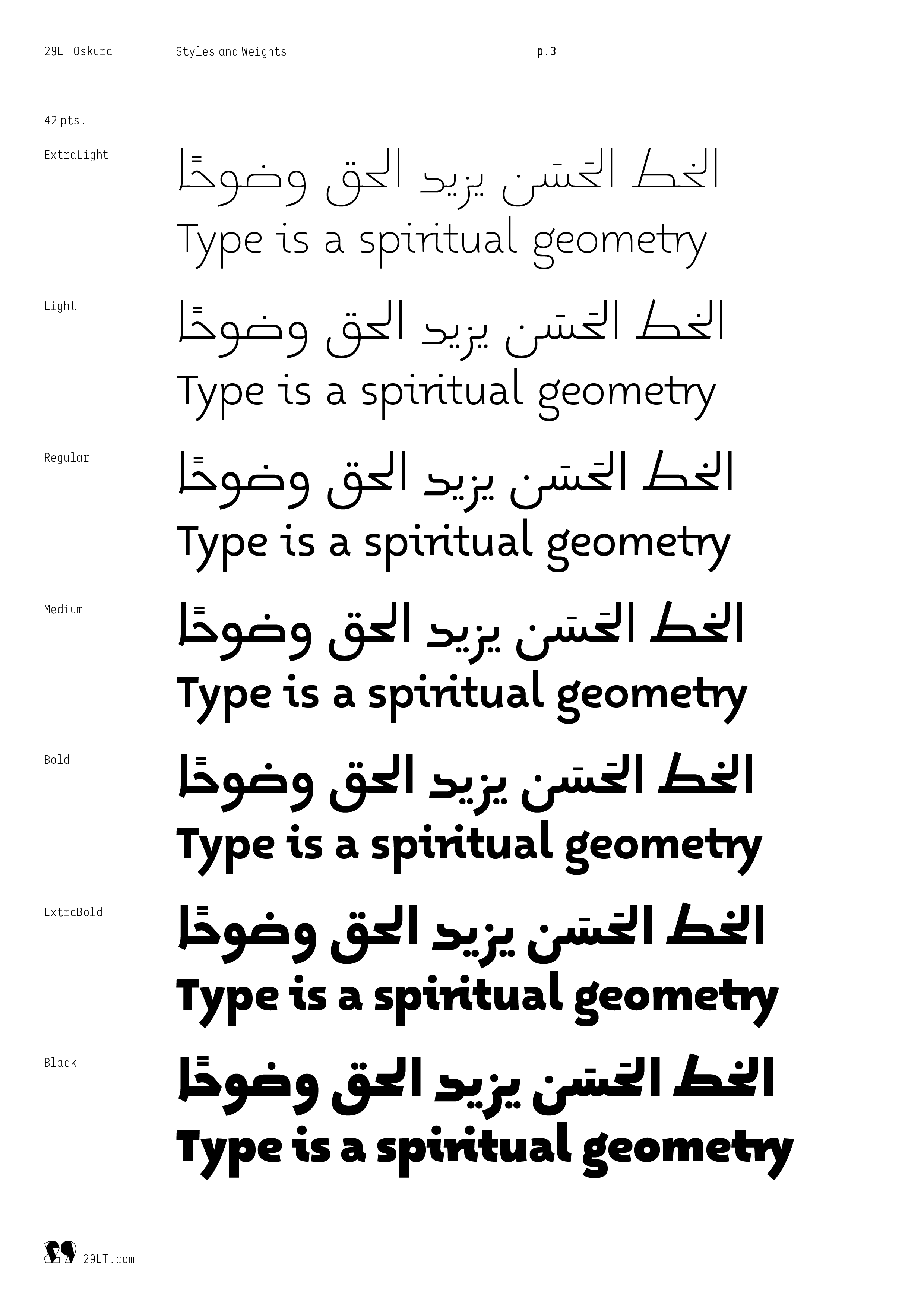
29LT Oskura exists as a typeface on its own and can act as a companion to 29LT Okaso. In the Latin, it can be used as an upright italic, especially when the stylistic set 3 is activated. In the Arabic, it can be used as the cursive or freehand version of Okaso. A change of typographic voice can be achieved between the two, and interesting typographic combinations can be achieved. The typefaces share common parameters in many respects, such as vertical metrics, general glyph proportions, or weight distribution across the seven styles, making it easy to switch between one and the other within a project.

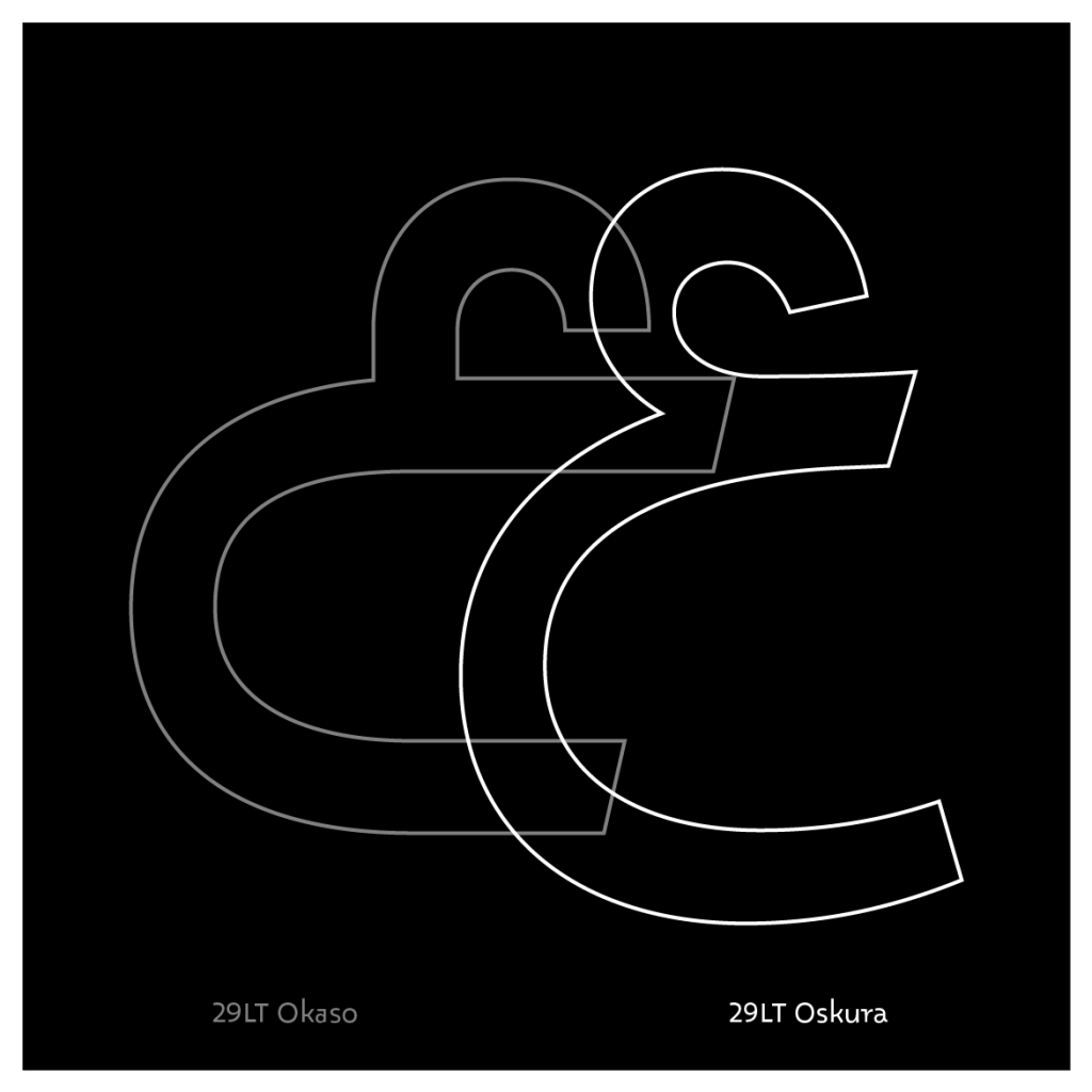


Making Oskura fluent meant adding extra ligatures and alternates to the already extensive set present in Okaso. The Arabic character set offered an added vertical baseline shift, such as the addition of the initial Arabic glyphs that precede a medial form of the Arabic glyph [ mīm م / ], alongside the ligatures that are composed of initial Arabic glyphs that precede a medial form of the Arabic glyph [ ḥā’ / ح ], which are present in both typefaces. In the Latin character set, the extra ligatures added smooth, horizontally connected letterforms, which reflect the baseline link in the Arabic script, as well as the smooth Arabic letters structures.
Furthermore, the Latin is equipped with shifted capitals that can be activated by stylistic set 4. It shifts all the capital letters downward to make them align to the x-height instead of the capital height. This feature makes the Latin come closer to the Arabic, since the Arabic script does not have capital letters and pays tribute to the handwritten origin the typefaces are based on. This alternate capital treatment is not something commonly seen in Latin type design and is a result of a joint design process where one script inspired the other. The character set grew from 2,100+ in Okaso to 2,600+ in Oskura. In all, 500 extra glyphs are added to enrich the design approach of the typeface and enhance its legibility in small text. This feature enforces the link to the manuscripts and makes Oskura function as a text typeface in comparison to Okaso, which might be categorized as a display typeface.


It is important to note that both typefaces are not straight revivals of the different handwritings found in the manuscript, but contemporary interpretations that are designed with inspiration from the unique letterforms discovered in the manuscripts. They are drawn with clean outlines and follow a defined set of typographic horizontal guidelines, unlike the manuscripts, which are roughly written and have a vernacular flow of text.

A more detailed description of the design concept and the whole type system can be found in the 29LT Okaso article. You can also watch the Fontstand talk given by Linda and Pascal about this type project.
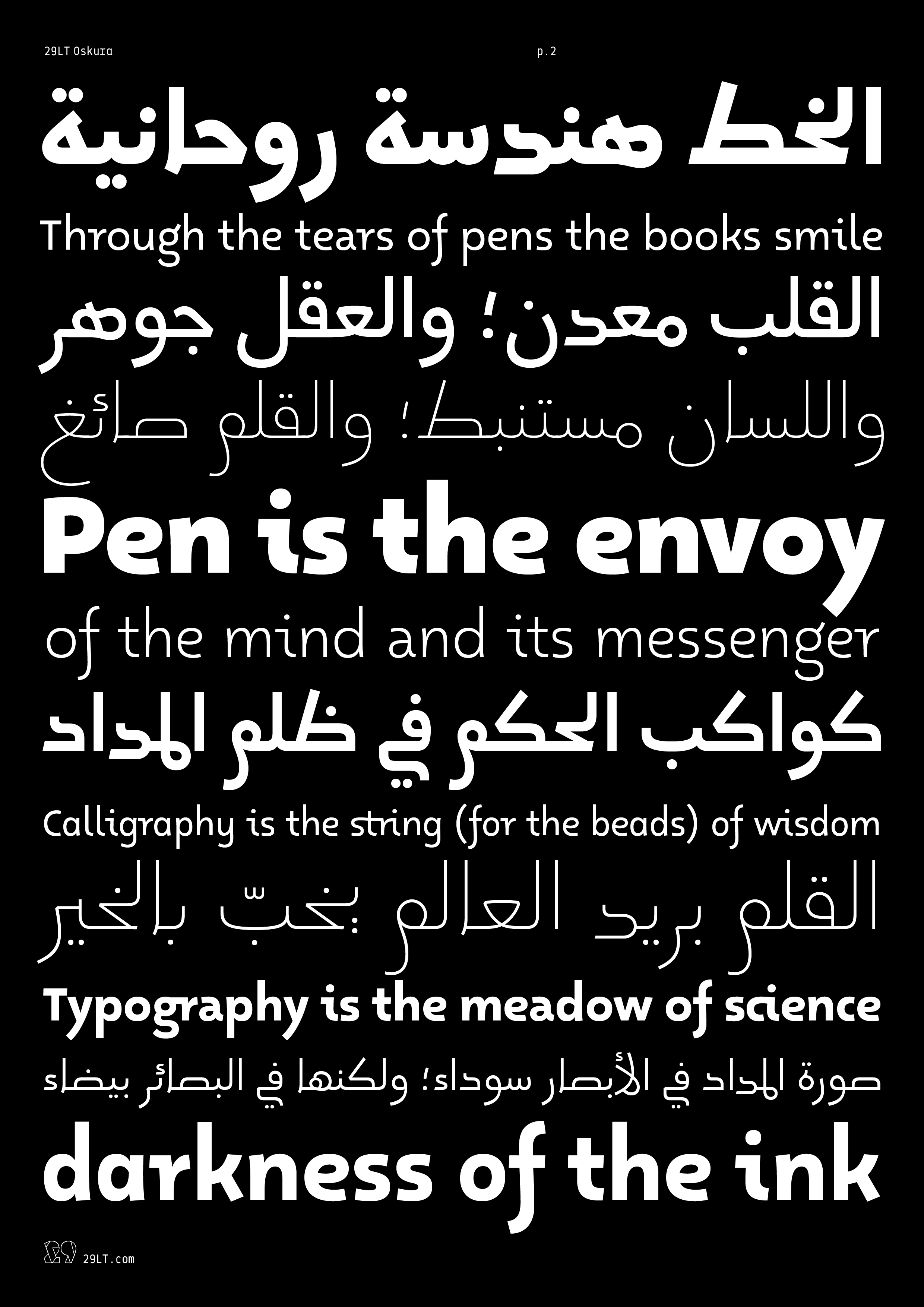
29LT Oskura Specimen
Visit 29LT Oskura webpage on www.29LT.com website and download the type specimen for full information about the typeface.