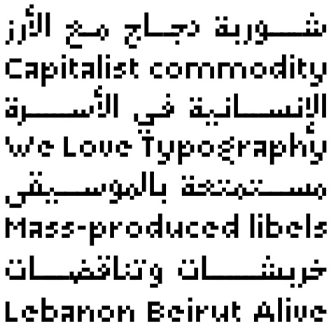
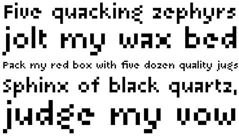
29LT Arapixis a 12 pixel high multilingual Latin-Arabic pixel font with incredible capabilities.
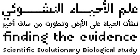
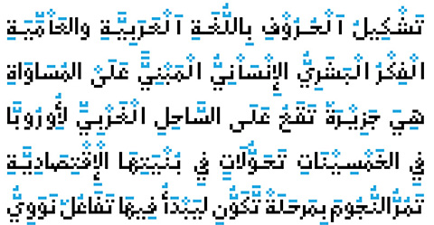
The Arapix is an almost traditional Naskh. It is elegant and easy to read even in very small sizes. It includes almost every feature you would expect from a high range Naskh font. Its humanistic look and feel fits perfectly to its Latin counterpart.
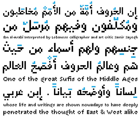
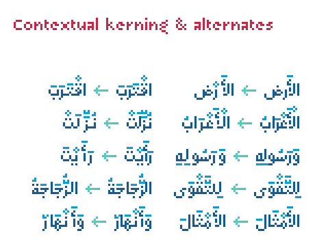
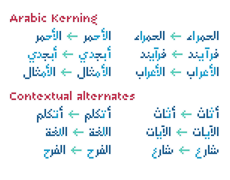
Arapix was originally designed for a web project that didn’t see the light a few years back. It started with the idea of fitting both Latin and Arabic into a 12 pixel vertical grid. The latin glyphs fitted properly within the vertical limits, but when it came to the arabic glyphs, it proved to be more challenging. Arabic letters with lower diacritic dots like the (Yeh-fina) or letters with accents above like the (Alef-Hamza-above) need much more space than any Latin letter, add to this the fact that accents needs to be positioned above and below the glyphs. It is technically impossible to fit a (Yeh-fina-kasratan) or a (Alef-Hamza-above-shadda-damma) into 12 pixels. Initially the accents were dropped and not included in the design, but although it seemed impossible at the start, Sylvain Mazas found a solution in the end, including as many contextual alternates and contextual kerning as needed to avoid every collision between letters and diacritics, letters and accents, and diacritics and accents. The contextual kerning was added to achieve an even letter and word spacing in longer text.
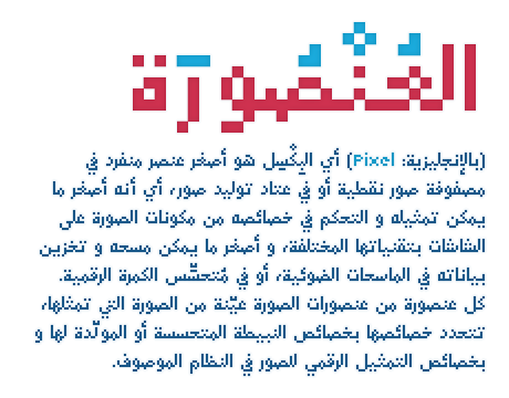
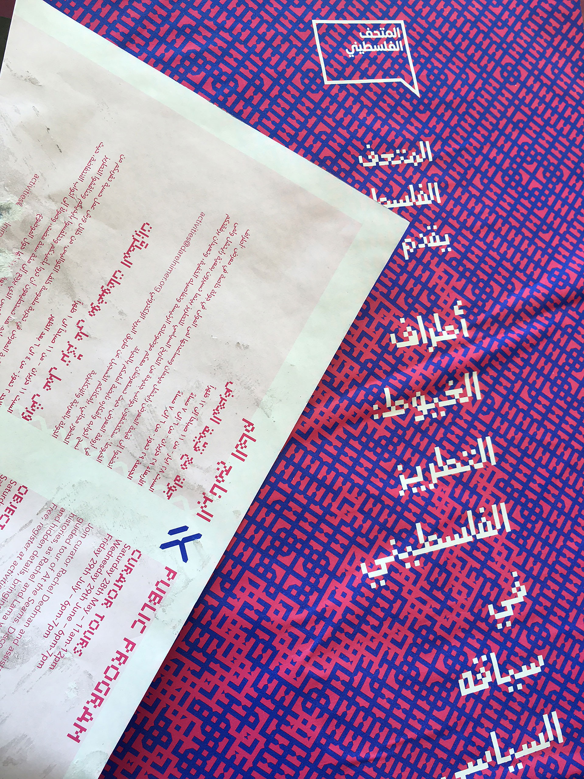
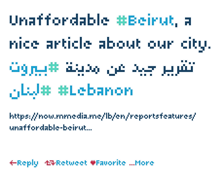
Arapix is amazingly legible in small size on screen and in print. On the other hand, it also works perfectly as display titling font due to its unique and contemporary pixel approach. It can be used for screens with very low resolution as well as for high-resolution screens and prints. Arapix is a funky multilingual typeface inspired from the primitive pixel technology with modern characteristics.
The new Arapix comes with a bunch of new features and new glyphs including Persian and Urdu letters, stylistic set, old style figures, contextual kerning, contextual alternates and a few icons too. Additional weights and special letters or icons can be added to the font if asked for by the users.
When setting up to establish 29LT digital type foundry in 2013, Lebanese designer and educator Pascal Zoghbi aspired to explore the diversity and potential of the Arabic script. Zoghbi envisioned 29LT with a cross-cultural approach. Having evolved, studied and worked in a multicultural and largely bilingual environment, he embraced multilingualism. Coming into contact with more than one language in his everyday life, he has developed an exceptional ability to think global and to reflect the various technical, conventional, and cultural writing systems into his work. Accordingly, he has excelled in creating innovative, high-quality contemporary multiscript type families, each of which is unique in its design approach and responds to regional and international market needs. Staying true to his culture, he worked on turning traditional Arabic script into contemporary type. Always on the lookout for new ideas and harmony between scripts, he explores various tools and techniques and regularly partners with a team of professional designers specialized in specific scripts to create multiscript typography.
Not only is he heavily involved in the practice of Arabic type design and typography, but he has also contributed to the field as an educator. Between 2007 and 2017, he taught at various design schools in Lebanon (American University of Beirut, Lebanese American University, and Notre Dame University) and in the UAE (American University of Sharjah). Besides lecturing at universities, he takes part in a range of design events worldwide and provides trainings and workshops on Arabic typography at universities, conferences, and agencies.
Zoghbi has gained an international reputation for his work and has received throughout his professional career prestigious design awards and honors, such as TDC Typographic Excellence, Granshan, AIGA, and was nominated to Jameel Prize 3. His work encompasses an outstanding collection of contemporary Arabic and multilingual typefaces. He co-authored and edited the “Arabic Graffiti” book published in 2010.
Zoghbi started his academic journey at Notre Dame University in Lebanon where he grew interest in Arabic typography. He further developed his type design skills at the Royal Academy of Art (KABK), the Netherlands, where he obtained in 2006 a Master of Design in Type & Media.
In 2018, he relocated to Madrid where he is currently based. Since then, his interest in a vast number of Spanish historical and cultural topics, especially those that showcase the merging of Arabic and Spanish cultures, grew keener. 29LT expanded accordingly, shifting from supporting only Arabic and Latin scripts to a global multiscript approach tapping into other world scripts.
View all posts by Pascal Zoghbi