
Since most documentation and references about the Arabic script stem from the calligraphic methodology, this article will tackle the problem of allocating typographic terms to Arabic type and typography.
بينما نجد معظم الوثائق والمراجع التي تتناول جذور الخط الطباعي العربي من ناحية المنهجية الطباعية، تعالج هذه المقالة مشاكل تحديد صفات الحرف والخط الطباعي العربي.
_____________________________________________________________________________________
The following typographic demonstrations compare the anatomy of Arabic type to that of Latin type. The diagrams show a contemporary Naskh / Sans Serif typeface, called Suisse Int’l that comes in eight (8) weights designed by Pascal Zoghbi and SwissTypefaces .
الاستدلال التالي يقارن تشريح الحرف الطباعي العربي بالحرف الطباعي اللاتيني. تظهر الرسوم البيانية خط النسخ المعاصر / الخالي من التذييل (Sans Serif) المسمى «سويس إنتل» ذو الثمانية أوزان المصمَّم من قِبل باسكال الزغبي وإيان بارتي.
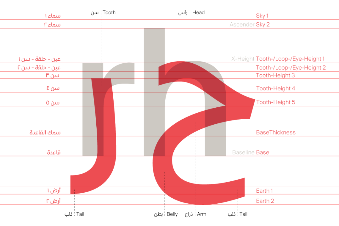
 Latin type conventionally sits on a baseline, with five main vertical levels of reference: baseline, x-height, ascender, descender, and caps-height. By contrast, Arabic type is less constrained, with more invisible typographic levels at the type designer’s disposal. A humanistic typeface inspired by the cursive Naskh scripts, such as this one, may make use of up to twelve imaginary typographic levels, whereas a typeface based on a geometric Kufic script may require only four or five levels. This means that it is essential for Arabic type designers to possess expert knowledge of Arabic calligraphic styles and systems in order to be creative and to translate the calligraphic rules into typographic guidelines for their typefaces.
يجلس الخط الطباعي اللاتيني عادة على خط ارتكاز، بخمسة مستويات عمودية مرجعية: خط الارتكاز (Baseline)، ارتفاع الحرف إكس (x-height)، الصاعد (Ascender)، النازل (Descender)، خط ارتفاع الحرف الكبير (Caps-height). بالمقابل، فإن الحرف الطباعي العربي أكثر تحرراً، مع مستويات غير مرئية أكثر في خدمة المصمم. يمكن لخط إنساني كهذا الخط مستوحى من مخطوطات بخط النسخ، أن يستخدم حوالي إثني عشر مستوىً وهمياً، في حين يستخدم خط آخر مرتكز على الخط الكوفي فقط أربعة إلى خمسة مستويات. هذا يعني أنه على المصمم أن يمتلك المعرفة المحترفة لأساليب وأنظمة التخطيط العربي ليكون مبدعاً ويترجم قواعد التخطيط لخطوات توجيهية في الخط الطباعي لاستخدامها في انشاء الخط.
 For each of the cursive Arabic calligraphic styles (Naskh, Thuluth, Diwani, etc.), the proportions of the letters are governed by several systems—dot, circle and similarity—which act as guides for Arabic type designers. There is no one set of typographic levels in Arabic type anatomy as there is in Latin type anatomy. Type designers decide on the number of levels needed for the typeface they are designing, and according to the calligraphic style that the typeface is based on.
في كل أسلوب تخطيط عربي (نسخ، ثلث، ديواني، إلخ..)، تتحكم عدة أنظمة بنسب الأحرف، النقطة، الدائرة والمشابهة، والتي تمثل الدليل لمصممي الخط العربي. هناك مجموعة واحدة من مستويات التخطيط الطباعي في تشريح الحرف الطباعي العربي كما في تشريح الخط الطباعي اللاتيني. يقرر مصممو الخطوط عدد المستويات التي يحتاجونها في الحرف الذين يصممونه استناداً على أسلوب التخطيط الذي يرتكزون عليه.
 Instead of one mean-line—in Latin typefaces, the x-height—there may be several: tooth-, loop-, and eye-heights. Instead of a single ascender, there may be two, called the ‘Sky’. In place of a single descender, there may be two or three, called the ‘Earth’. In between the previously mentioned guidelines, there are two further invisible lines that define the baseline’s position and thickness.
عوضاً عن مستوى وحيد – في الحرف اللاتيني هو ارتفاع-س – يمكن أن يكون هناك العديد من المستويات: ارتفاع السن (Tooth-height)، ارتفاع الدورة (Loop-height)، ارتفاع العين (Eye-height)، وعوضاً عن صاعد واحد، يمكن أن يكون هناك مستويان، يطلق عليهما اسم “السماء” (Sky). وبدل النازل الواحد، يمكن أن يكون هناك اثنان أو ثلاثة اسمهم “الأرض” (Earth). وبين المستويات المذكورة آنفاً، هناك مستويان إضافيان غير مرئيان يحددان موضع خط الارتكاز وسماكته.


_____________________________________________________________________________________
A summarised and edited version of this article was firstly published in Eye Magazine issue #90 within the “Beyond Latin: Type design panel” article published in June 2015. This brief article on Arabic type anatomy is the fruit of my experience from the past years in: 1. Designing Arabic fonts; 2. Lecturing about Arabic typography; 3. Discussing the Arabic script with calligraphers and colleagues; and 4. Reading and researching about Arabic calligraphy. Hopefully I will be able to publish a comprehensive detailed article or book on this topic and other Arabic typography topics in the near future.
هذه المقالة الموجزة عن تشريح الخط الطباعي العربي هي ثمرة خبرتي من السنوات الماضية في: ١ – تصميم الخطوط العربية؛ ٢ – المحاضرات في الخطوط الطباعية العربية؛ ٣- مناقشة الخطوط مع خطاطين وزملاء؛ ٤ – القراءة والأبحاث حول التخطيط العربي. على أمل أن استطيع نشر مقال أو كتاب مفصل وواضح حول هذا الموضوع وغيره من المواضيع التي تخص الخط الطباعي العربي في المستقبل القريب.
_____________________________________________________________________________________
Written in English by Pascal Zoghbi
Generously translated to Arabic by Zein Noureddeen
_____________________________________________________________________________________
_____________________________________________________________________________________


5 Comments