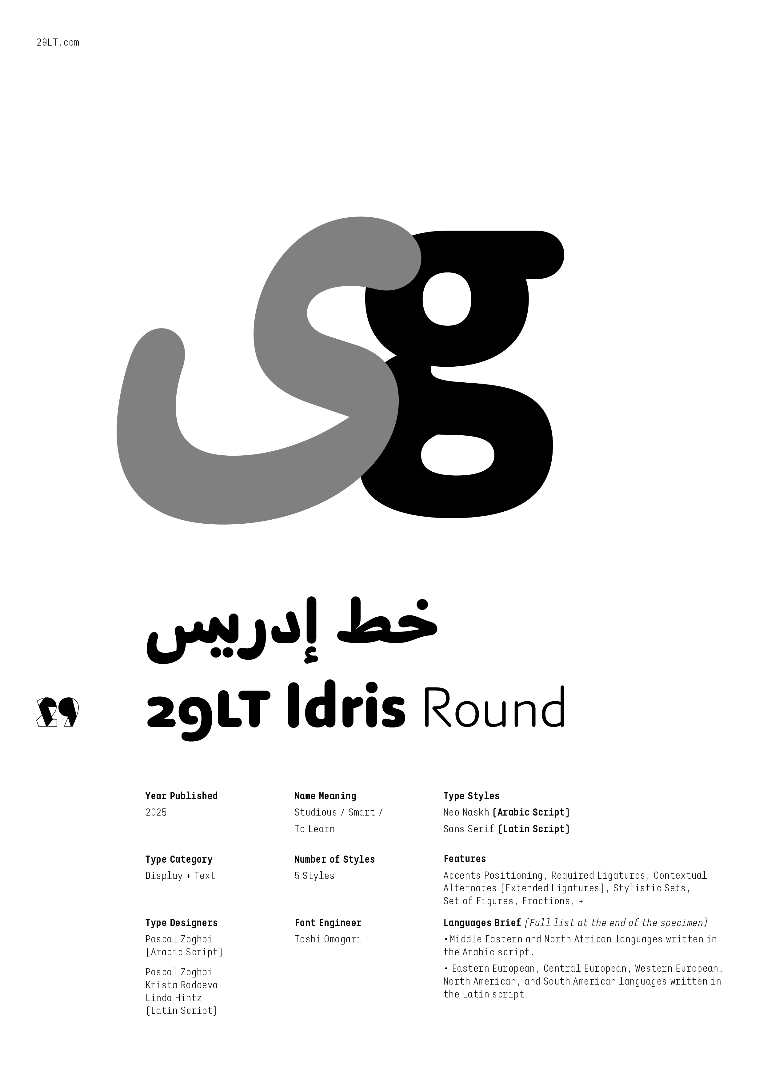
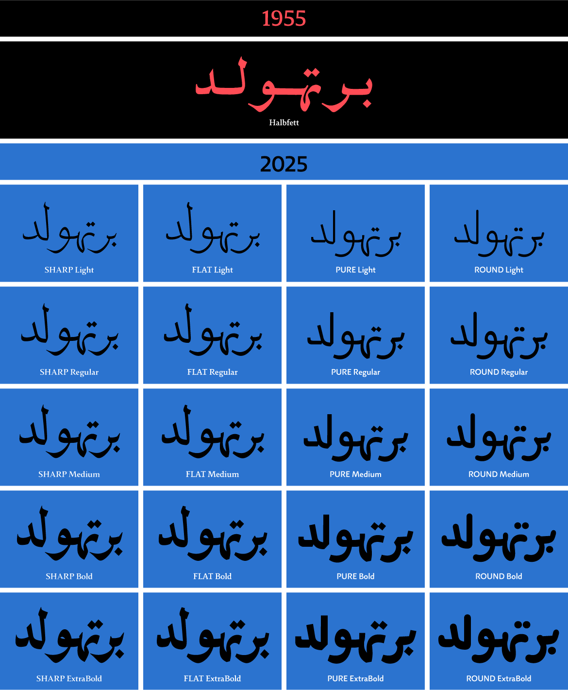
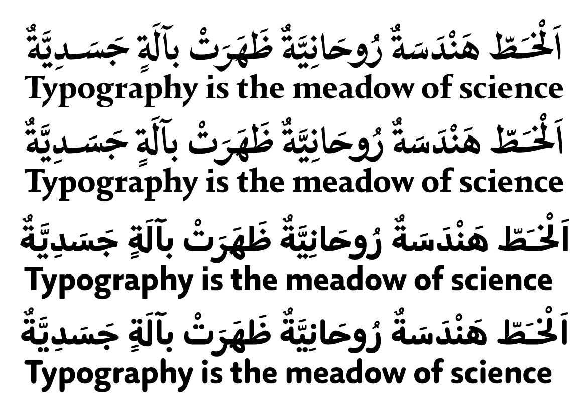
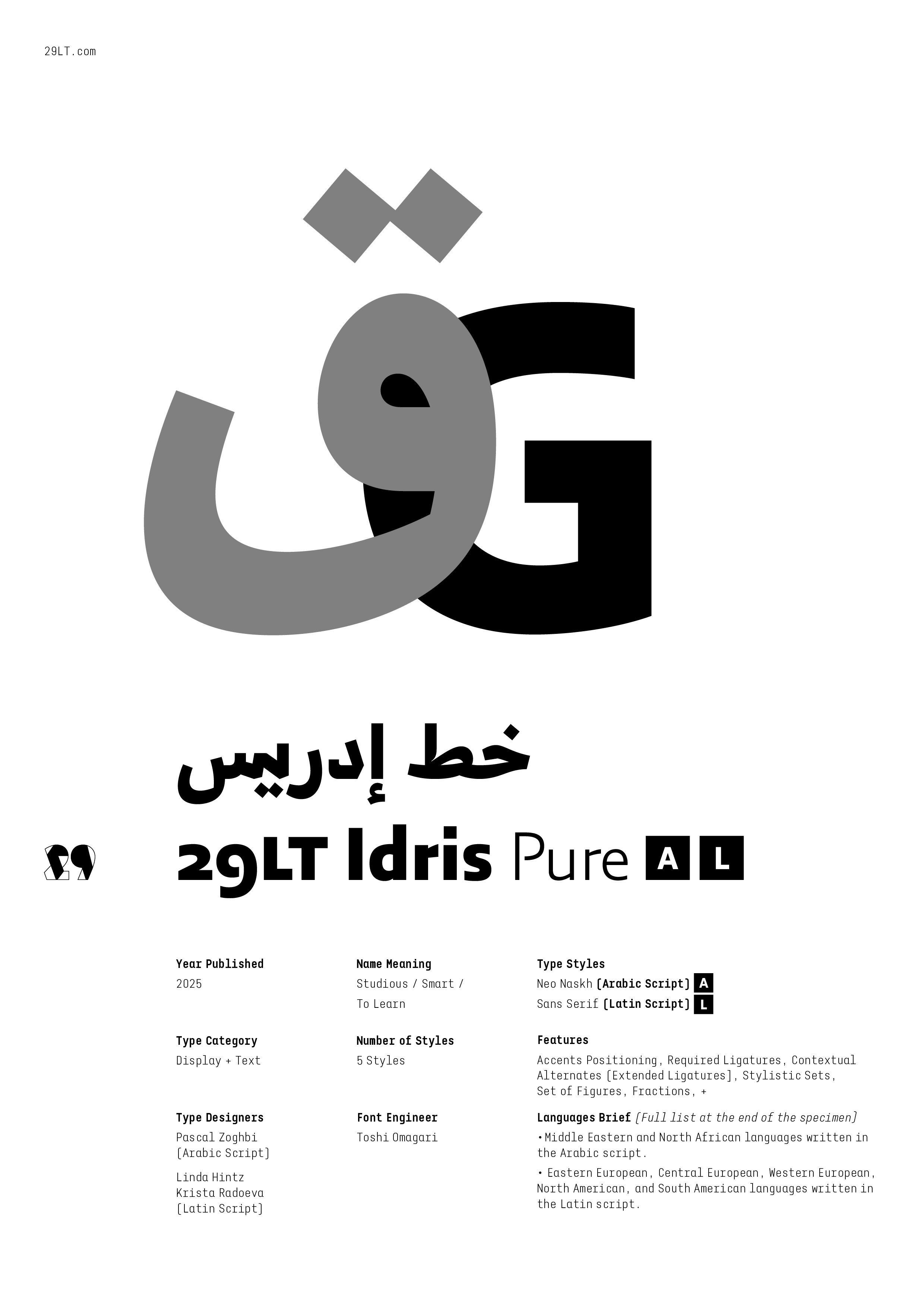
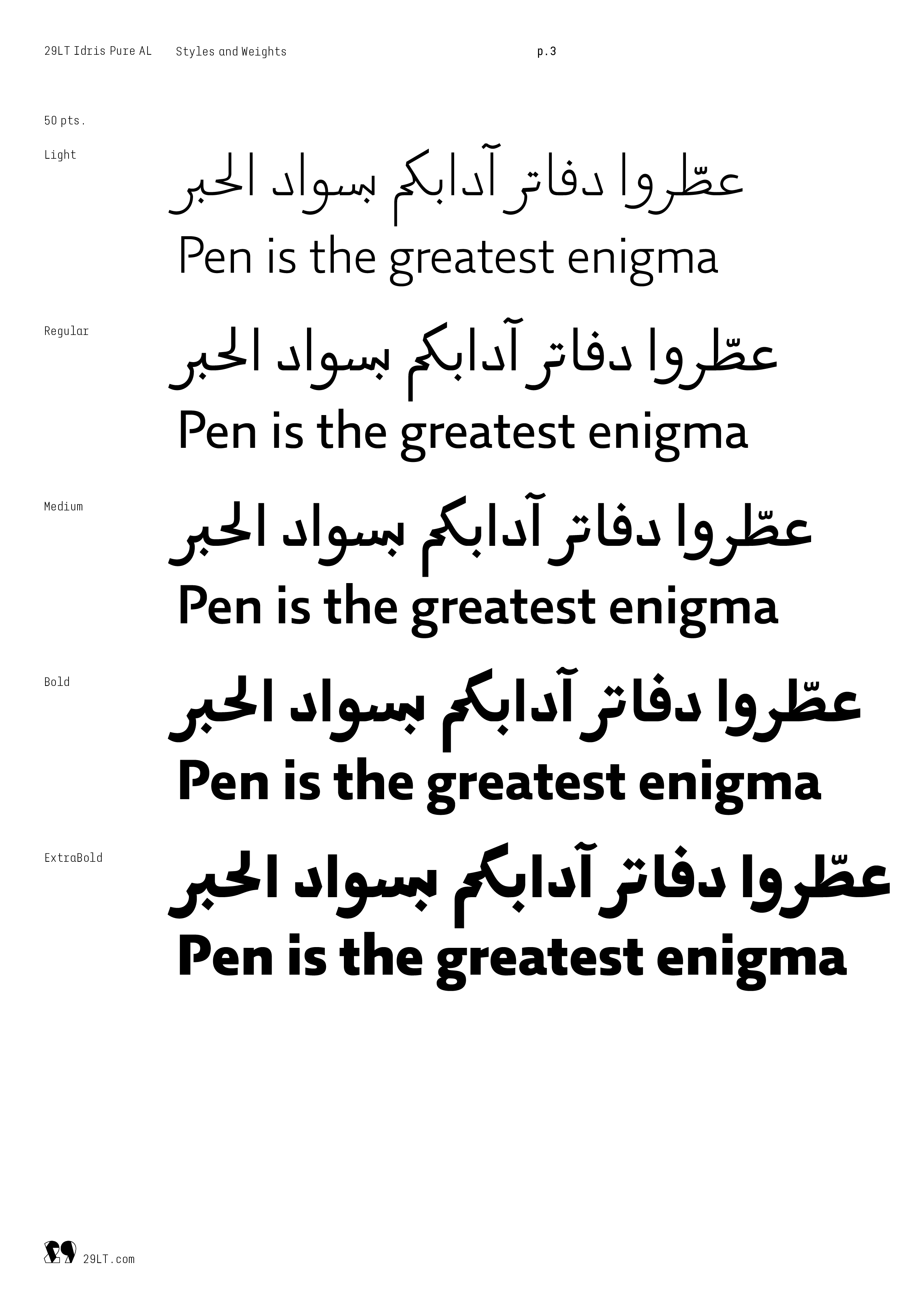
29LT Idris Pure and Round are a continuation of the Idris Sharp and Flat type family, introducing two new typographic voices to the contemporary Naskh type system. The type set expanded from ten to twenty styles, with five styles in each typeface, resulting in a more diverse and versatile visual communication tool. While all four versions are suitable for display or copy text, the Sharp version is recommended for display text, the Flat and Pure versions for copy text, and the Round version for casual text. Generally, the Sharp and Flat styles are associated with formal text, while the Pure and Round styles can represent modern and informal text.
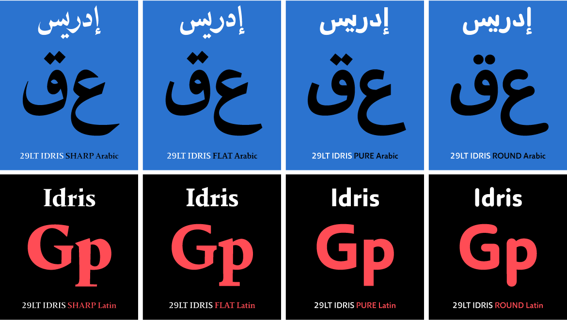
In the Arabic set, the purpose of creating these two additional versions is to explore the extent to which the boundary between calligraphy and simplified typography can be pushed without compromising the composition of the Naskh typographic structure. Specifically, the challenge is to create a Neo Naskh typeface that maintains the concept of horizontal and cascading configurations while avoiding becoming a simplified Mastari Naskh. In contrast, in the Latin set, the Pure becomes the humanist sans of the Flat serif set, while the Round gives the Pure a round and friendly appearance.
The Origin
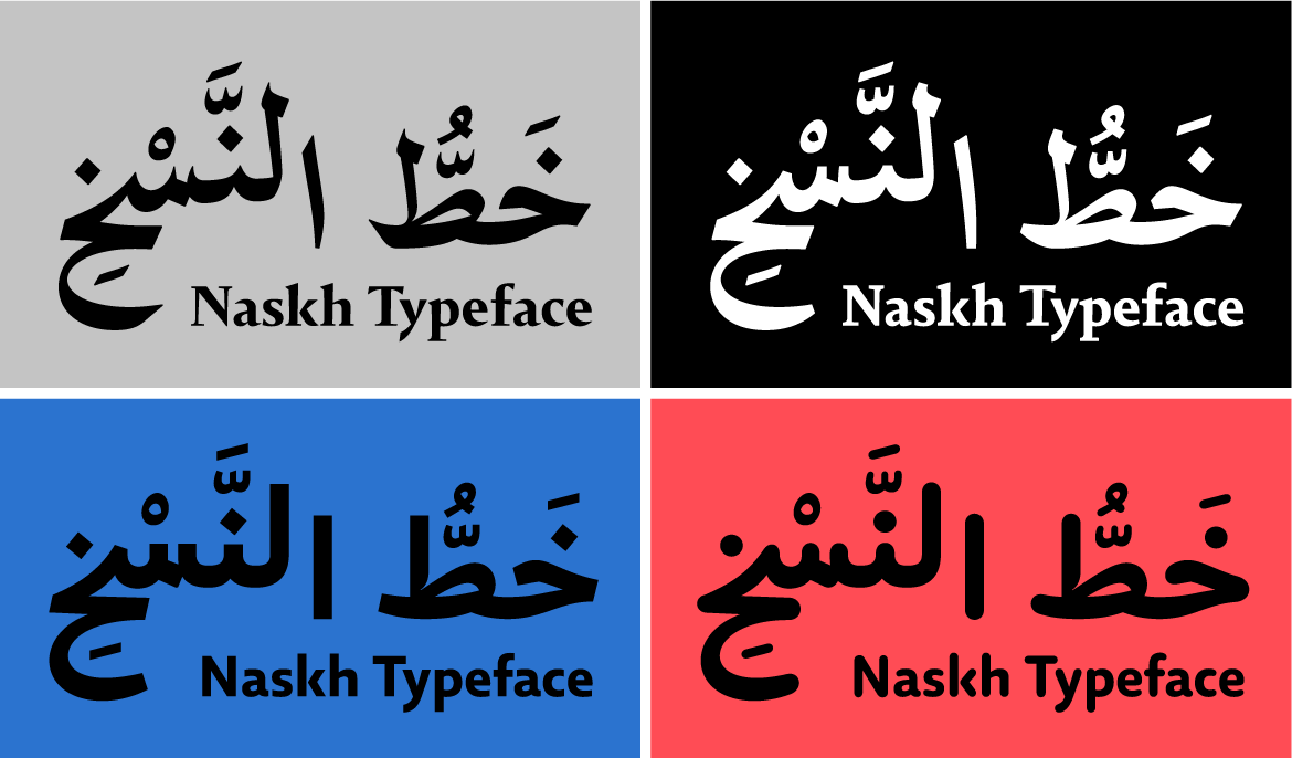
This type system originated from an extensive search and discovery of the Berthold Arabisch Halbfett Nr. 49 typeface, created in the 1950s. For more details about the revival of this typeface and the development of the 29LT Idris Naskh type system, refer to the previous article on this topic. Additionally, you can watch Pascal Zoghbi’s talk at Typographics 2023 at Cooper Union, New York, USA, where he shares an intriguing account of the research findings and process.
The Design Aspects of 29LT Idris Pure and Round
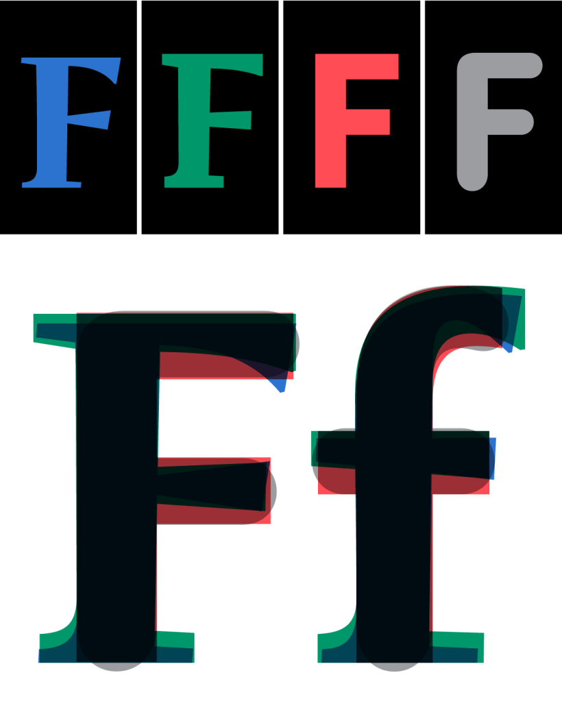
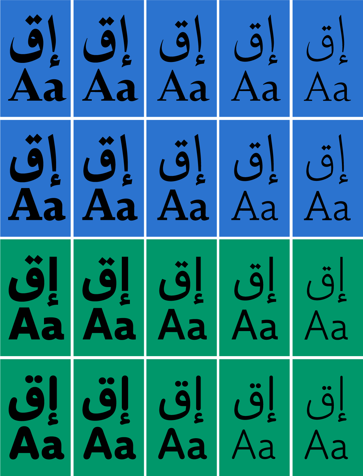
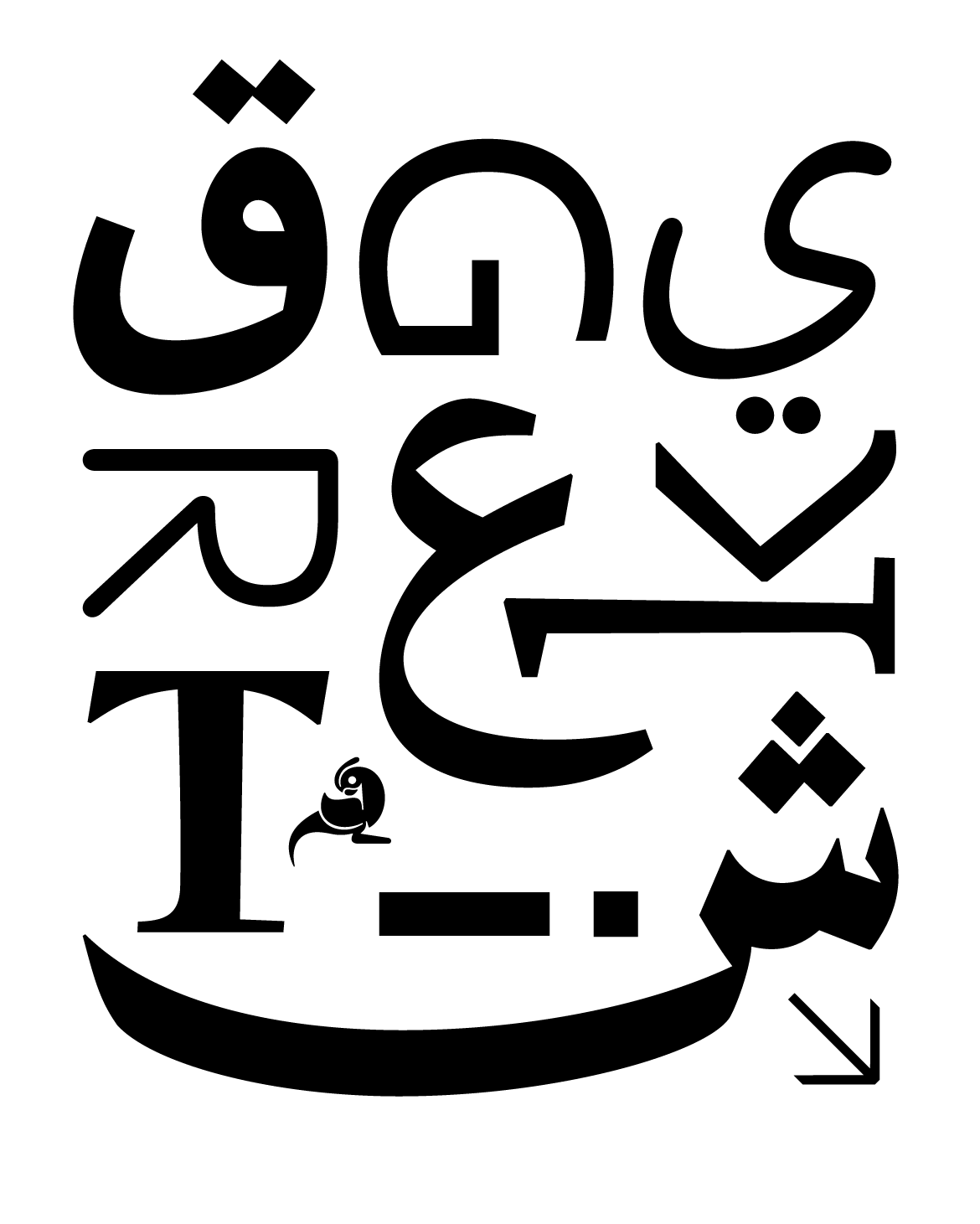
The Pure typeface retained its skeletal structure but underwent significant design changes compared to the Sharp and Flat styles. Letter outlines were simplified into a pure conceptual form, removing stylistic elements and focusing on essential structure. In the Arabic set, initial calligraphic nabras were removed, and in Latin glyphs, serifs were eliminated. All vertical stems were straightened, and the Arabic left slant and Latin flared stems were replaced by straight vertical stems. The Arabic baseline slant was removed, and the 2° upward baseline slant was adjusted to 0°.
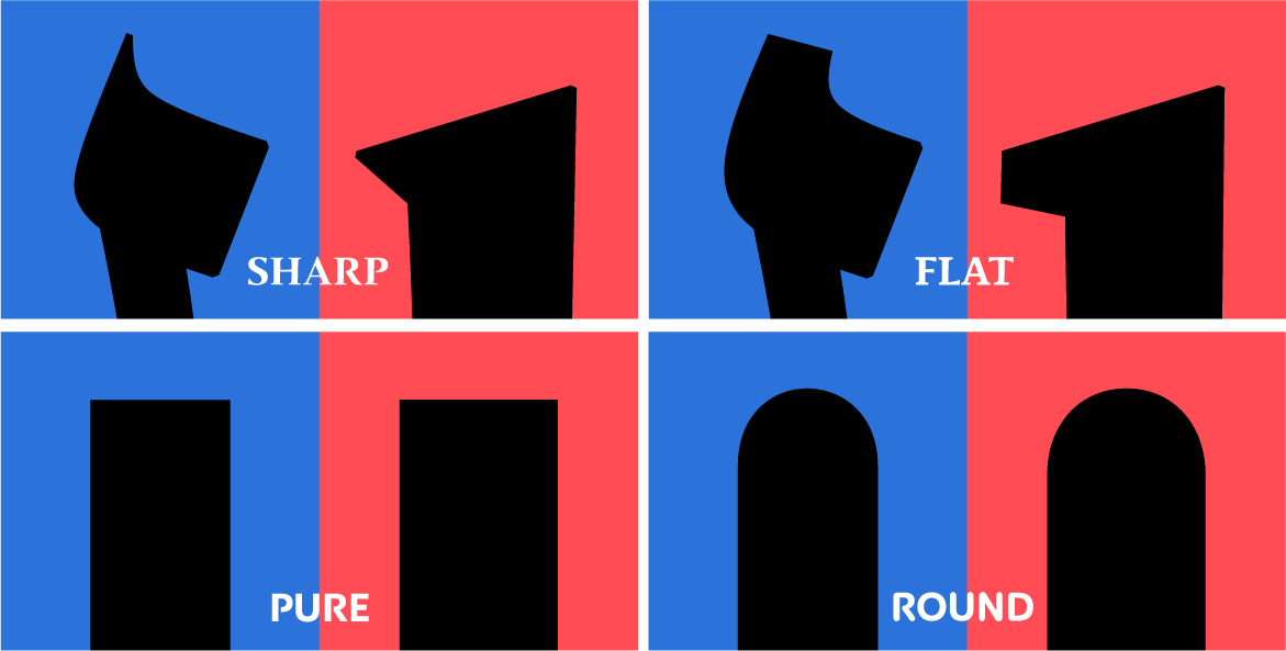
Contrast was minimized, and terminal sharpness was flattened, creating hybrid outlines between humanistic and geometric structures. This resulted in a neutral design prioritizing legibility and minimalism. The x-height was slightly raised in the Latin set, and some glyphs were widened.
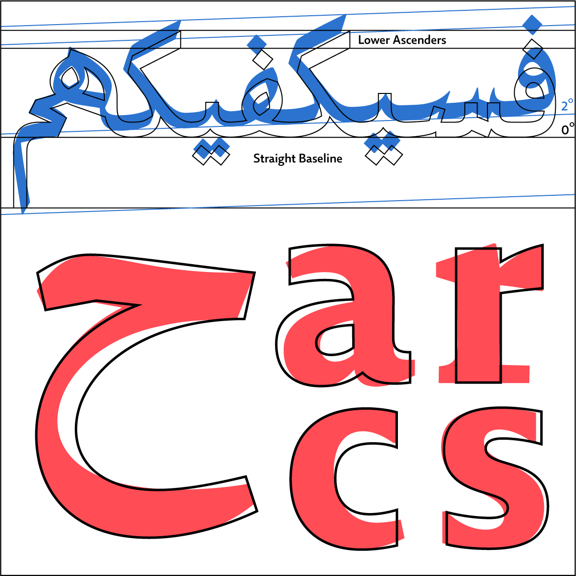
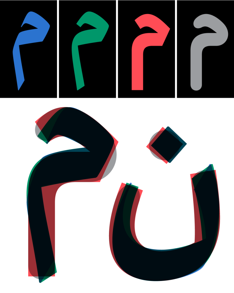
In the Arabic set, ascenders were lowered, and accents were repositioned closer to base forms, contributing to a shorter overall vertical height. Achieving ideal vertical height balance between Arabic and other scripts is challenging due to Arabic’s higher ascenders and lower descenders. Vocalized Arabic text requires looser leading, affecting Latin text’s vertical measurements. A typesetter using bi-script fonts must set appropriate leading for each script to ensure consistent text texture or color. By default, in bi-script Arabic and Latin typefaces, vertical matrices are based on Arabic heights, potentially leading to loose Latin script leading. Tighter leading might be needed for Latin script to match Latin fonts.
The Application of the Latest Arabic Type Technology
Despite the simplification of the design, the advanced typographic logic of the 29LT Idris Naskh is preserved in both the Pure and Round versions. These versions maintain the sophisticated contextual alternates structure, contextual anchors functionality, and contextual kerning application (what we name Elevation Kerning). The article on Sharp and Flat styles provides a comprehensive explanation, which you can refer to for more information. The only aspect that is removed in the Pure and Round versions is the slanted baseline logic and the curved upward kashida extension. This is because the 2° slant was eliminated, and a flat kashida was adopted instead.
The Variable Fonts
In the variable font version of the Idris type system, while the default Weight axis remains consistent across all four styles, the Pure and Round styles eliminate the Contrast axis, and the Extension axis is expanded into two separate axes: Swash and Kashida. This division of the Extension axis provides the type setter with greater control over a certain Arabic text extension, particularly during text justification.
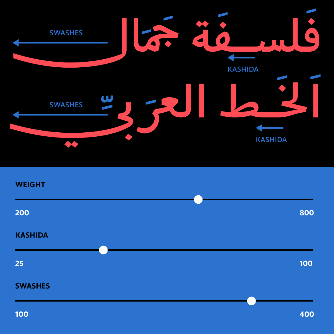
While working on the Pure and Round version, our main goal was to seamlessly combine both styles within a single font file. To achieve this, we introduced a Round axis to the variable font, with the aim of enabling typographers to effortlessly switch between the Pure and Round styles including all the intermediate rounded options in-between the extremes. However, after conducting numerous trials and exploring the most effective method to implement the interpolation shift between the Pure and Round terminals, we found that a humanist design, like Idris, often resulted in outline glitches and broken curves. While this concept might be suitable for more geometric or simplified grotesque typefaces, it was evident that it wouldn’t work for Idris. Consequently, we decided to abandon the Round axis concept and separate the Pure and Round fonts into distinct, standalone fonts. This decision ensured clean and proper round curves for the Round styles, without compromising the outline quality if we had adopted the joint Pure and Round concept with the Round Axis.
Conclusion
The inclusion of the Pure and Round styles makes the Idris type family one of the most extensive Neo Naskh type systems created to date. Beyond exploring the boundaries of design concepts applied to the Naskh calligraphic system, these fonts integrate the latest type design technology within the OpenType framework. This makes them a versatile design tool for Arabic typographers, enhancing the typographic quality of their contemporary projects.
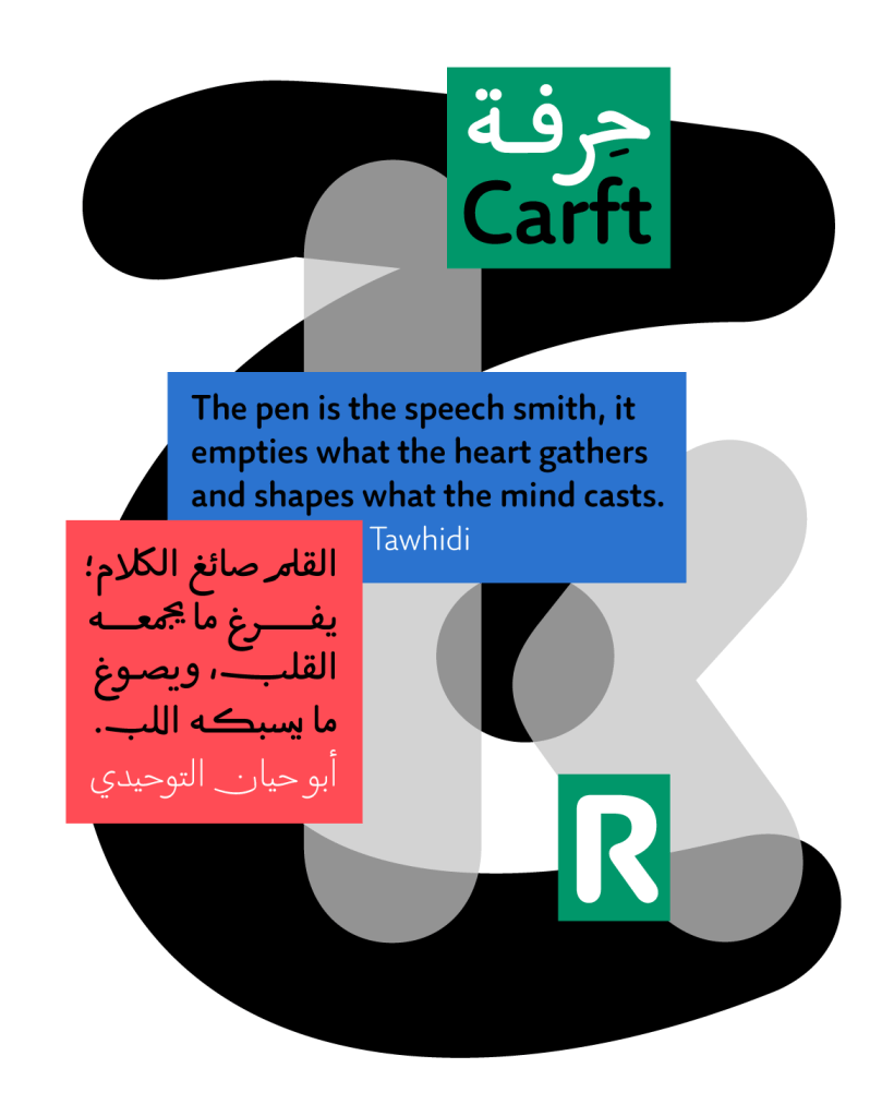
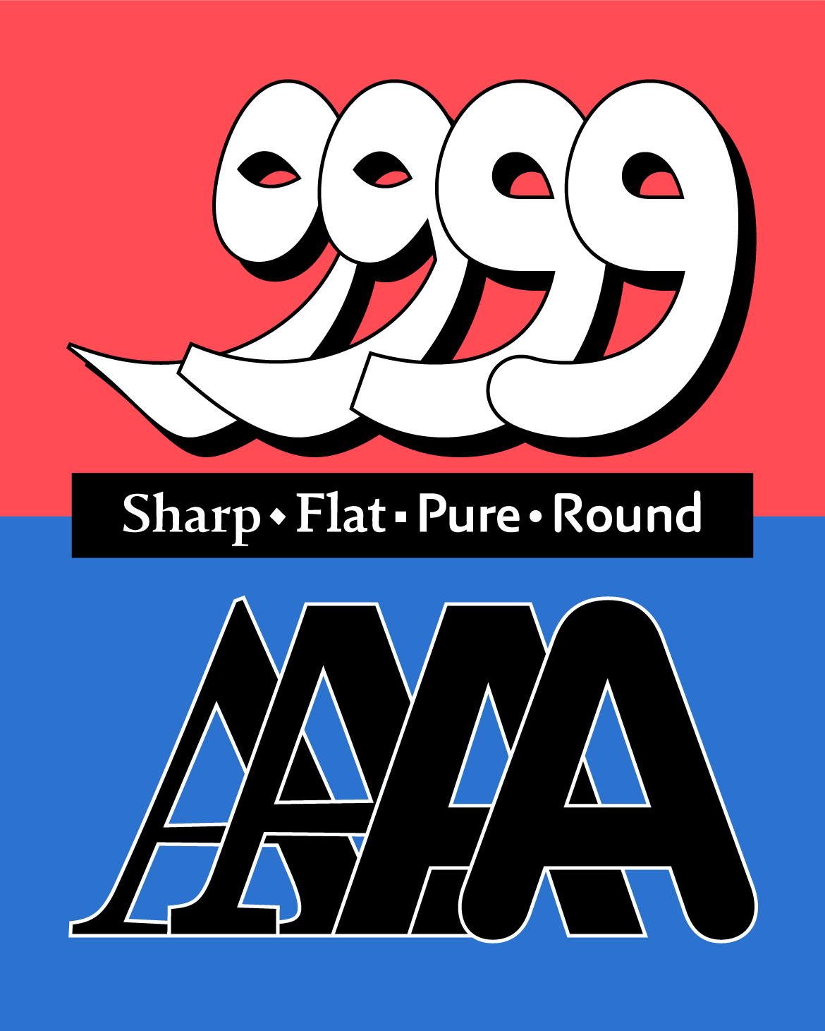
Finally, naming the styles as Sharp, Flat, Pure, and Round instead of opting for the conventional Western typographic categorization (Serif, Sans, Slab, etc.) is an attempt to establish new typographic terms that are suitable for global scripts and extend beyond the Latin script system. This approach prioritizes the creation of new terms over the Western categorization and aims to define more neutral terms that can apply to any script, irrespective of its specific typographic characteristics.
29LT Idris Specimens
Check out www.29LT.com to download the type specimen and get full information about each typeface.
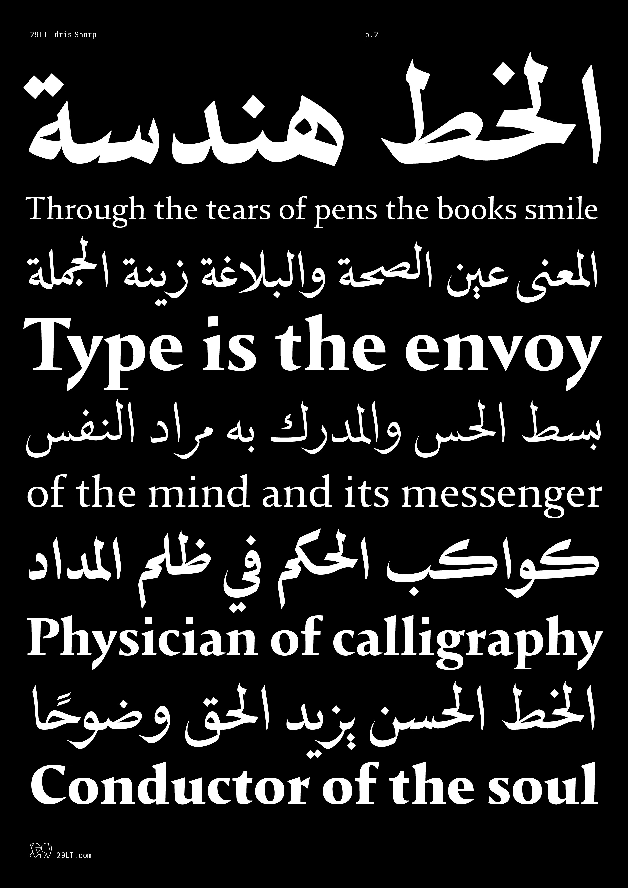
29LT Idris Sharp Type Specimen


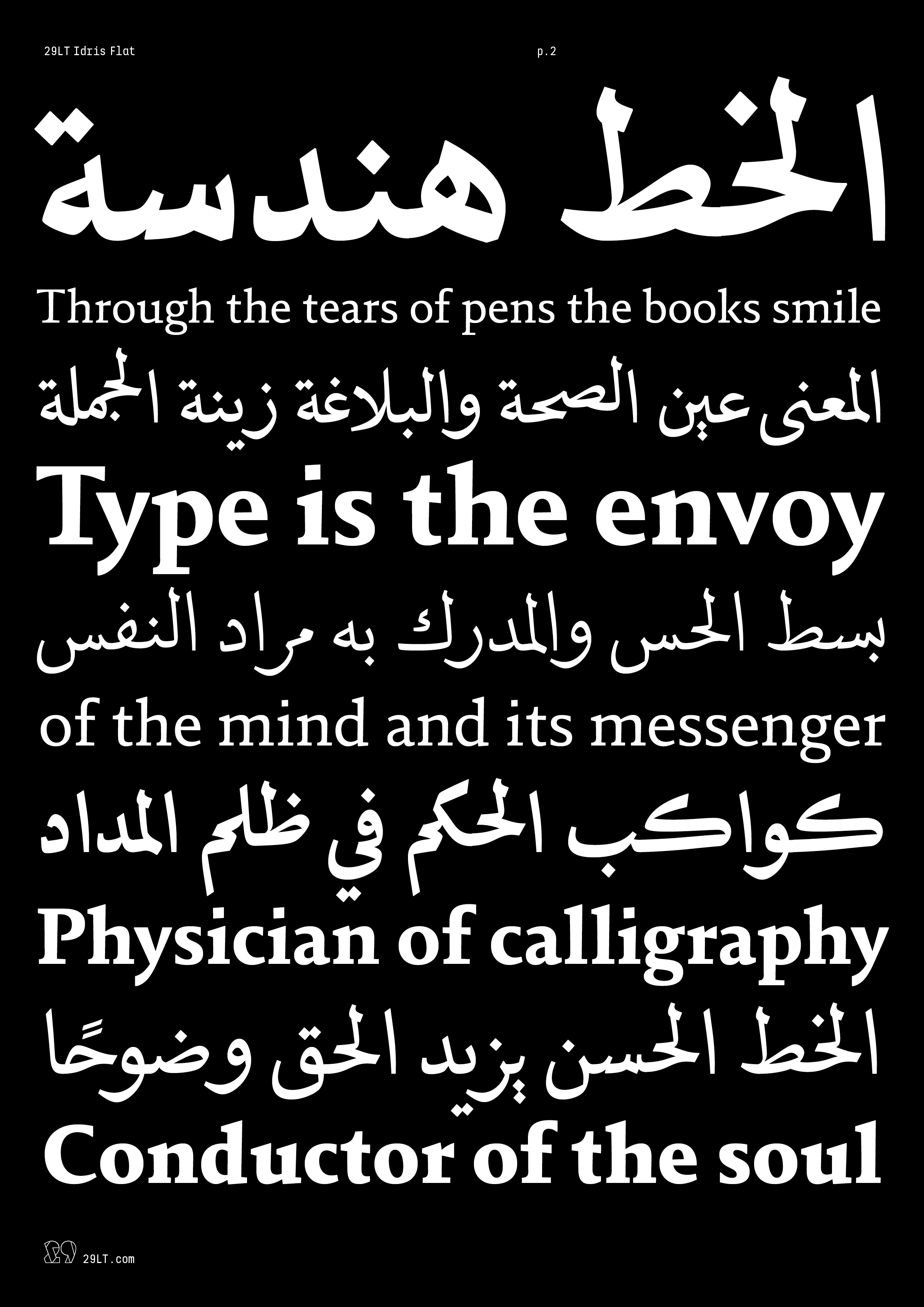
29LT Idris Flat Type Specimen


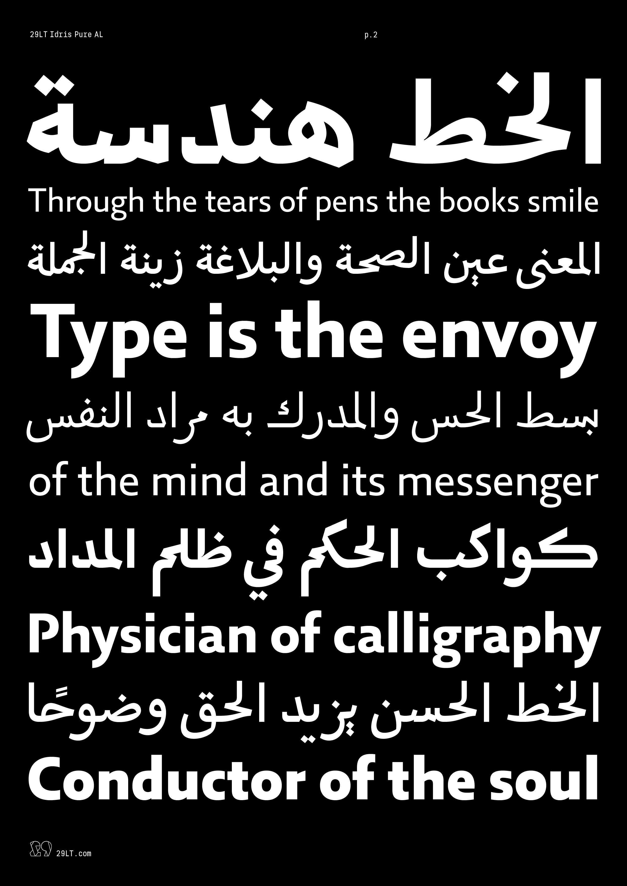
29LT Idris Pure Type Specimen
29LT Idris Round Type Specimen