NEW TYPOGRAPHIC TECHNOLOGY
In our rapidly evolving digital landscape, typography stands as the cornerstone of everything. Fonts are increasingly becoming the primary element of numerous digital projects. We are transitioning from static typography to dynamic type solutions. More and more digital visual communication projects are increasingly relying on typographic solutions rather than solely visual ones, as was the norm in the past. Typography is becoming more accessible and adaptable in digital projects compared to its limited and rigid nature a few years ago. Fonts have always been the foundation of print applications, and now they are excelling in screen applications with the advent of web OpenType fonts and variable fonts.

29LT uses new technology to create variable fonts for flexible typography and to improve the digital representation of our contemporary fonts that are inspired by traditional calligraphic styles.
SO MUCH MORE
With variable fonts, our creative selves have more room, more movement.

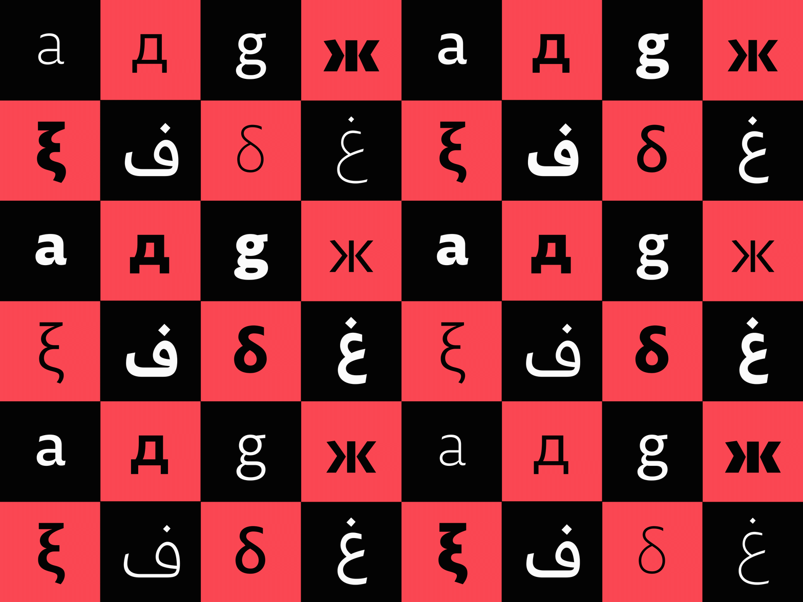
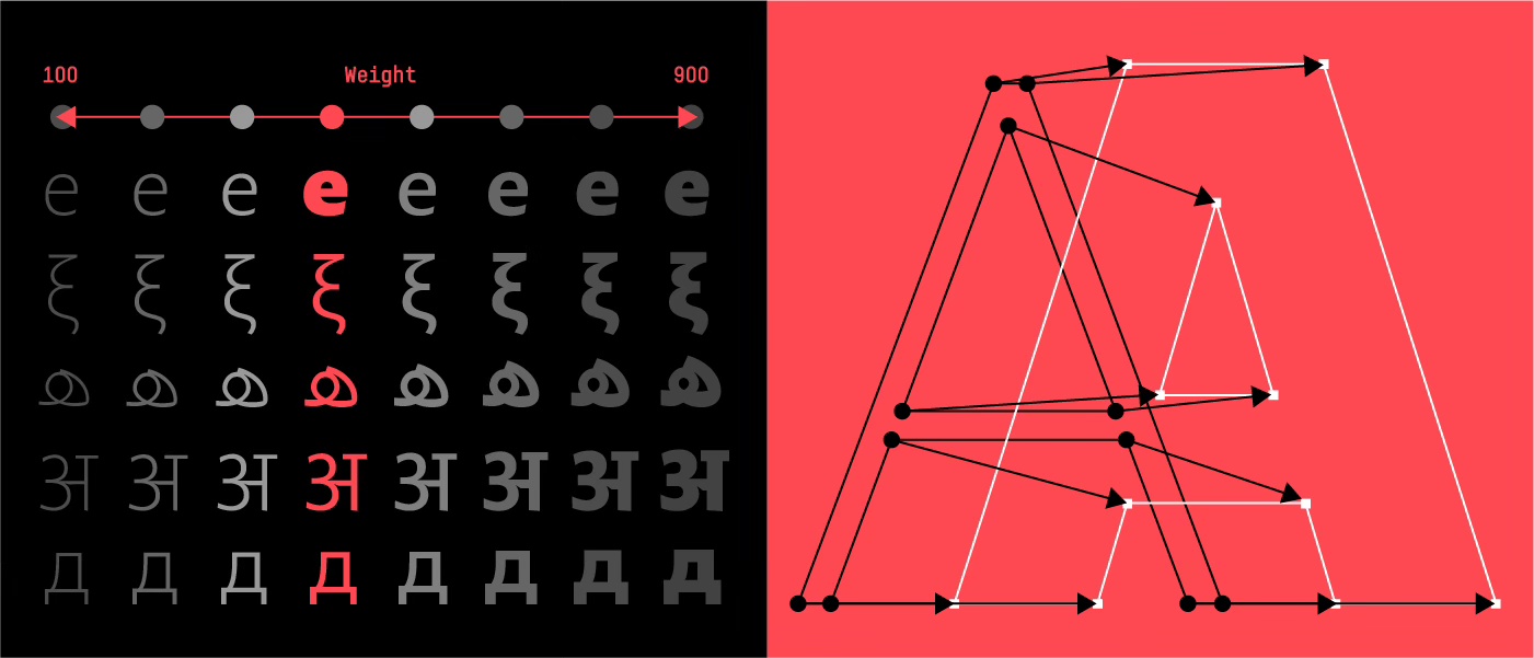
One file can now do what many files had to do separately: it contains a whole type family, if not a whole super family. Whereas before, each standard (or static) font was accommodated in one file, and each file is one style of the typeface. Now everything is opened up. One compressed TrueType or WOFF2 (Web OpenFont Format 2) file has a whole family of fonts in a versatile design space, including all the styles in itself and everything in between.
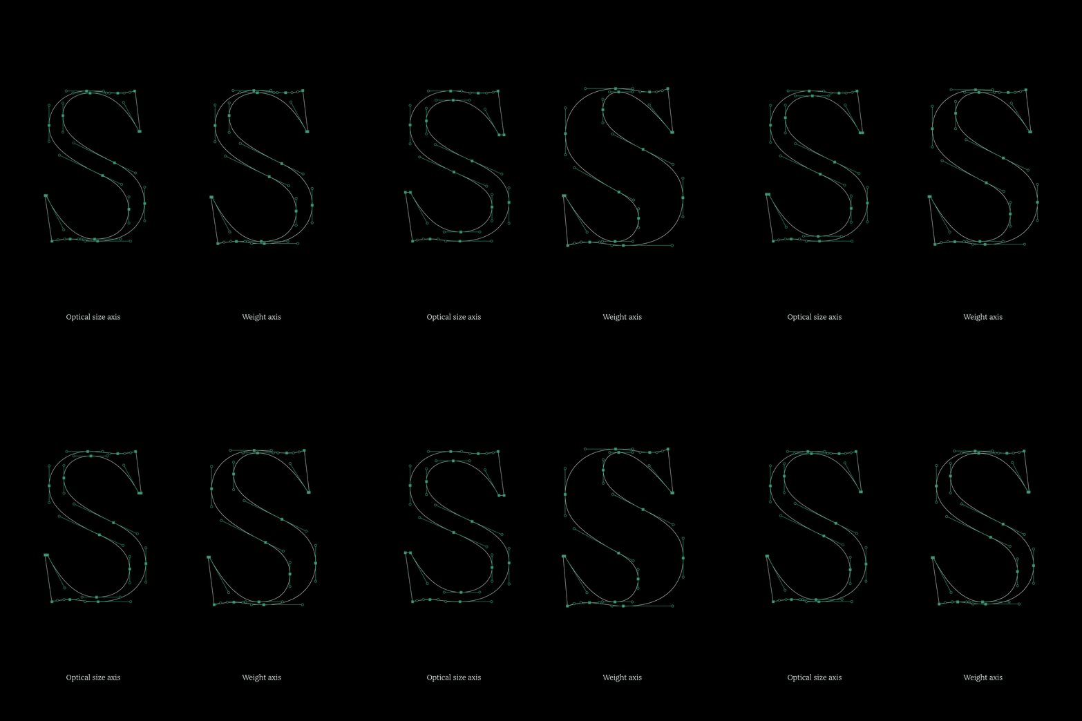
Some of the 29LT variable fonts adhere to traditional typographic conventions, such as utilizing registered axes like Width, Weight, and Optical Size axes. Conversely, other 29LT fonts aim to introduce a novel typographic tool to users, incorporating custom axes like Extension or Contrast axes, for example. While the registered axes follow established typographic standards, the custom axes provide additional functionality to the typefaces and strive to replicate the characteristics of calligraphic fonts they are inspired by. For instance, the fonts 29LT Bukra, Zarid, and Zawi belong to the first category, while the fonts 29LT Idris, Ada, and Okaso belong to the second category.
DESIGN SPACE—WIGGLE ROOM
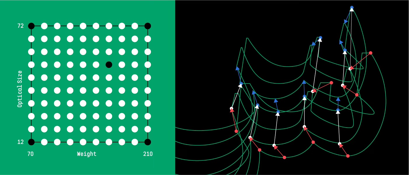
The design space defines the boundaries within which a font can function. Typefaces like 29LT Zarid and 29LT Zawi have a single weight axis, while 29LT Bukra and 29LT Okaso have two axes: Weight + Width and Weight + Stretch, respectively. 29LT Idris has the more complex design space with three axes: Weight + Contrast + Extension. The type designer creates the design space based on the concept of the typeface. While the weight axis might be a constant for all variable fonts, the other axes are dependent on the design and functional requirement of each type system.
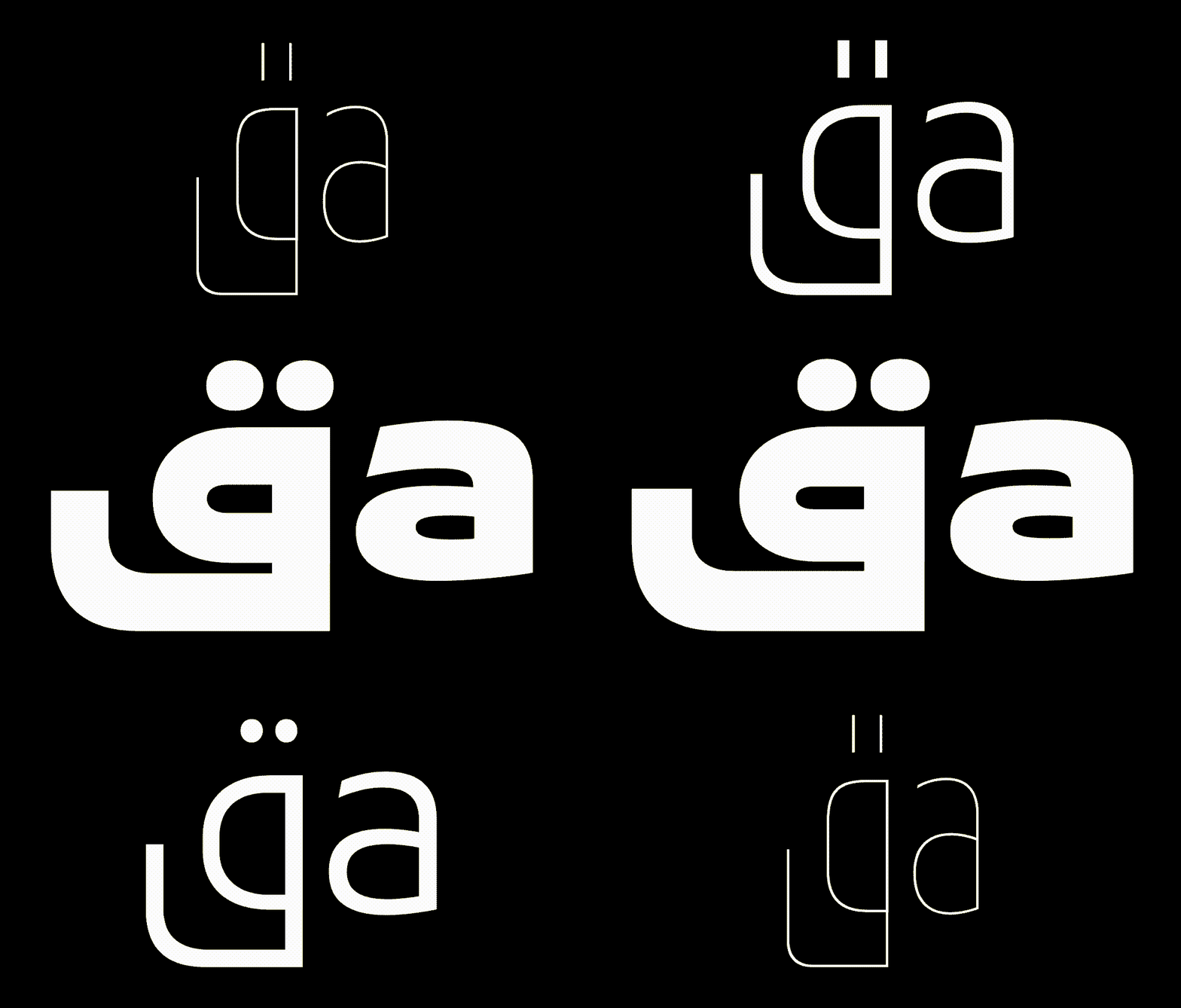
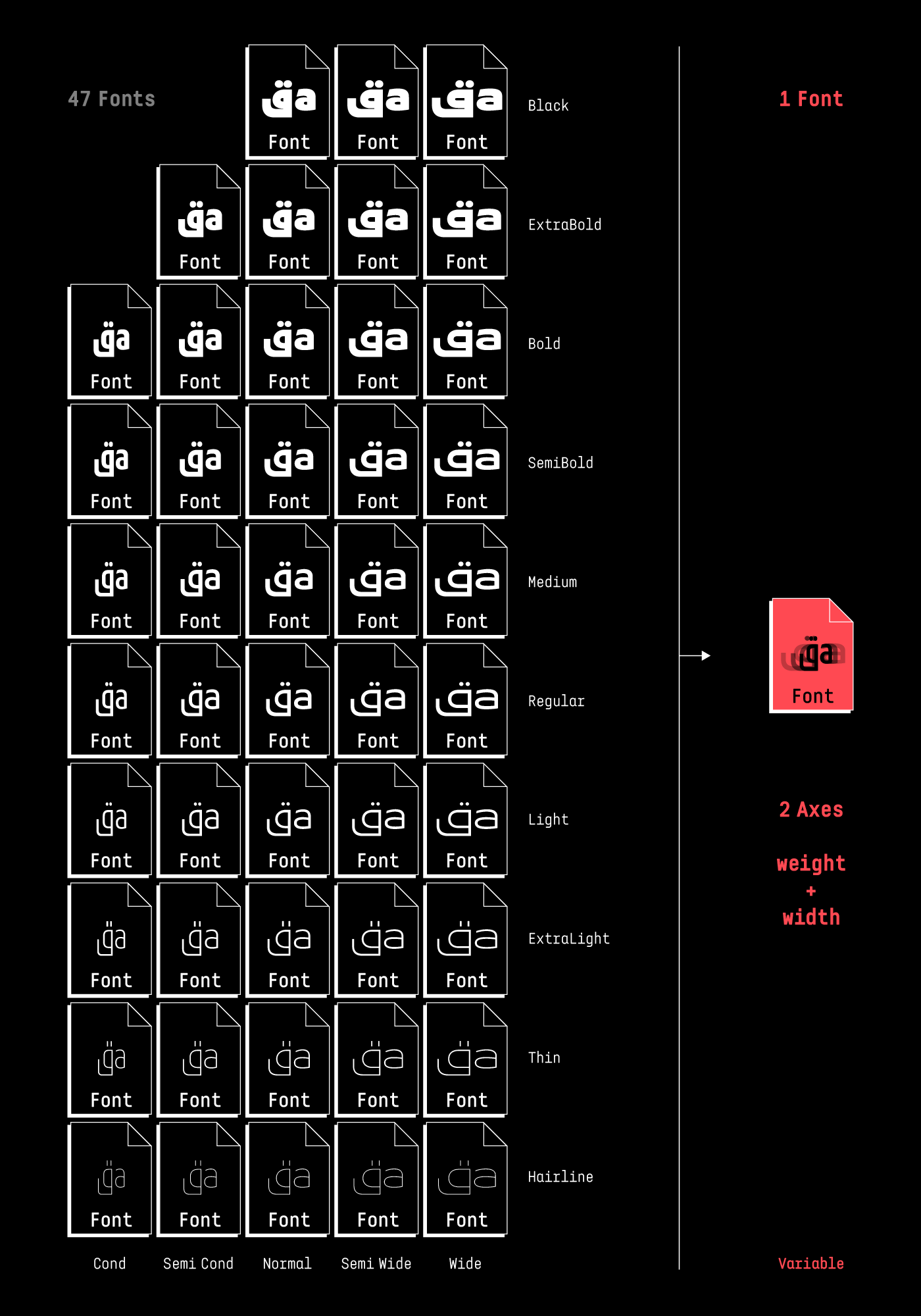
In the 29LT Bukra typeface, the design concept revolves around exploring the extremes of weight and width in a geometric typography inspired by the Modern Kufic calligraphy style. Since the letters are geometrically constructed, they can be compressed or expanded without distortion. The variable font compiles all 47 fonts into a single font.
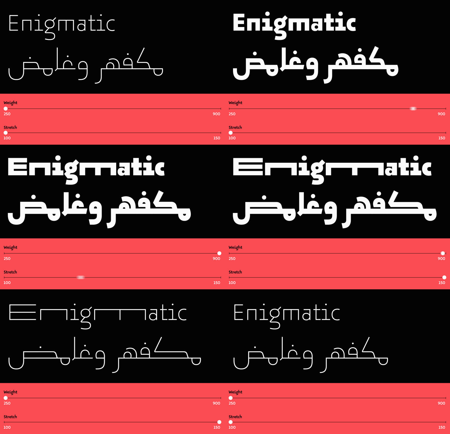
While 29LT Okaso is geometric, it’s not based on the Modern Kufic script but on the vernacular Andalusian Kufic style found in the Aljamiado manuscripts. (You can learn more about the Aljamaido research and the Okaso + Oskura type projects here.) This typeface, inspired by the manuscripts, introduced the Stretch axis, which allows letters to expand horizontally and elongate on the baseline. The concept was adapted from the Arabic character set to the Latin counterpart, and some Latin letters were chosen to stretch, similar to the Arabic ones. The stretch axes enable a new way of justifying text beyond the extension of the baseline in Arabic, the addition of kashidas, or the adjustment of spacing and the use of hyphenations in Latin.
Moving on from geometric styles, we opted for the 29LT Idris variable font axes to represent the Naskh cursive style. Our aim was to offer a contemporary typographer a traditional calligrapher’s tool for arranging Arabic text. The Contrast axis provides the typeface with a classic sharp look (high contrast letterforms) or a contemporary flat shape (low contrast letterforms). The Extension axis allows the user to gradually expand the cups or elongate the baseline in a calligraphic manner, mimicking the spontaneous expansion of cups or elongation of the baseline that an Arab calligrapher would make while writing to justifying the space in set text.

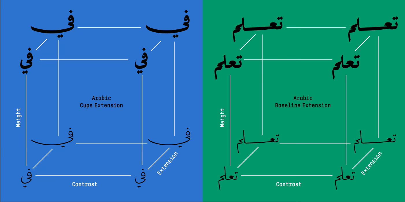
Now, users, designers, and developers can precisely control these axes as they desire. Each slider possesses its own minimum and maximum values, as well as default settings. When a specific set of values is chosen across all axes, an “instance” is created, akin to a unique font with predefined values. Hundreds of these instances can be generated from a single variable font. The greater the number of axes and the range they provide, the higher the multiplicative number of instances that can be rendered.
VARIABLE FONTS ON THE WEB
Web fonts evolved from limited system fonts to embedded WOFF files, and now support variable fonts for more diverse typography.
No longer do we have to install and load many font files into our browser. Just one. And that means less to manage and maintain. This brings us a system improvement too: with at least a 70% reduction in file size, there is less lag-time between loading and displaying. This saving in bandwidth improves web performance.
Responsive websites were introduced some years back and now they are standard. A responsive website changes dynamically between different screen resolutions to insure the most appropriate layout/design and the most legible information. Now fonts can be responsive too. A developer can inform a variable font to change weight, width, optical size, etc. with the change of the screen dimension insuring text hierarchy and legibility.
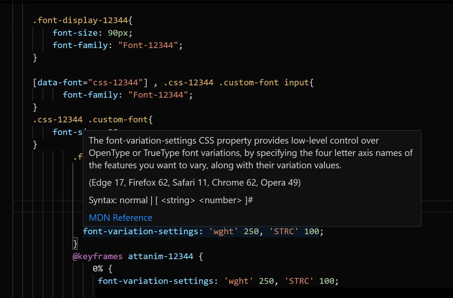
The use of variable fonts on the web requires CSS and sometimes JavaScript coding. Most professional web developers know these two languages, and it is fairly easy for a developer to learn how to manipulate variable fonts in websites to give the esthetical and functional requests of the web designer. Look online for several articles and tutorials explaining the usage of variable fonts on the web and which CSS settings should be implemented in the website coding.
A typographic animation can be an example of an aesthetical application, requiring few lines of CSS and a small variable font file size of few KB, and being interactive and even editable. This drastically reduces the upload and display time of a certain animation in comparison to the same animation done in a video format, which might be 10 or even 100 times the size and is not interactive nor editable.
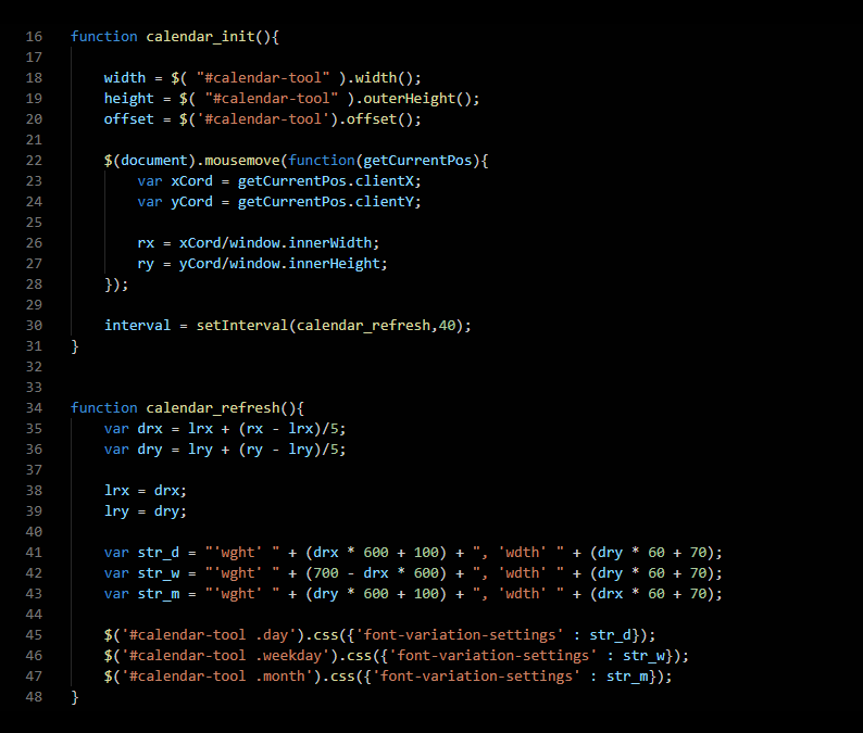
Here is an example for the 29LT website: a calendar animation where the weight and width of the months, days, and date change as the mouse moves from top to bottom, from left to right. We use 29LT Bukra Variable for this.
A functional application of variable fonts can be simply linked to a certain design aspect, or applied to improve legibility or help screen viewing accessibility. Using different sensors, variable fonts can adjust to motion, sound, light, etc. besides the basic digital mouse movement.
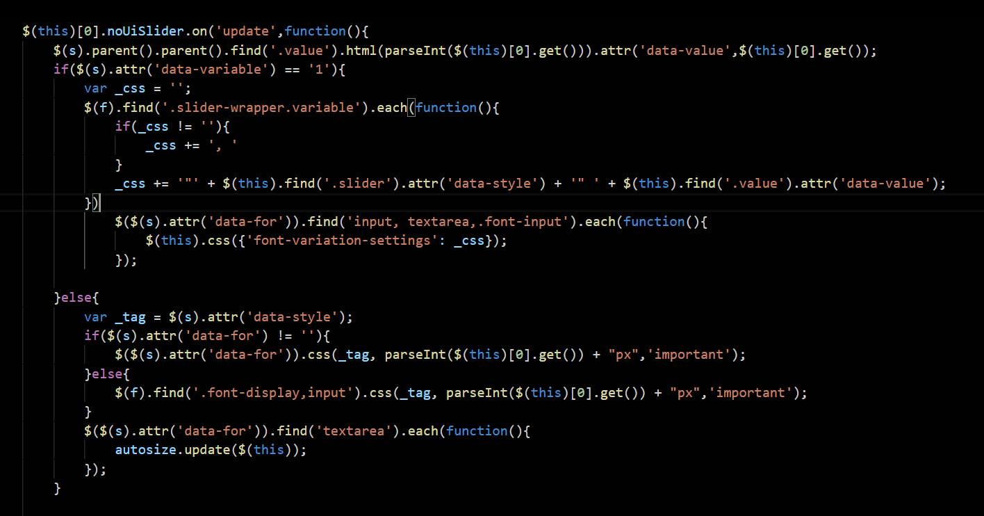
Below is a simple example from the 29LT Okaso typeface webpage. The weight and stretch axes can be accessed by the browser while type edit is possible.
We can encounter so many other examples of variable fonts in action on the web.
VARIABLE FONTS ON DESKTOP APPS
In a desktop app, selecting a standard typeface and clicking on its drop-down menu reveals all the styles present in it, and each style can be selected separately and worked with. With variable fonts, additionally to the drop-down menu showcasing all the preset “named instances,” a variable font icon appears to the right of the styles menu. Clicking on the icon will reveal the sliders for every axis present in this typeface. The sliders can be dragged to the left and right to find the appropriate instance. The values can fall on existing preset styles or be custom, meaning that they are between preset styles. Depending on each variable font, different sliders will appear with different sliding values.
YouTube has several tutorial videos explaining the usage of variable fonts in different desktop applications.
Below are two screengrabs from Adobe InDesign showcasing some of the 29LT variable fonts in action.
While the major web browsers (Chrome, Safari, Firefox, Edge, and Opera) support variable fonts, at the time of writing this article, very few desktop apps support variable fonts. And with the ones that do, some bugs are encountered; for example, spacing and kerning don’t perform perfectly in Adobe desktop apps, like InDesign and Illustrator, as they do on web browsers. For the Arabic script, we don’t recommend using accented text since it might overlap with the base letters.
Before publishing any printed work using existing variable fonts, check for bugs and try to remove them by refraining from using a certain aspect of the font or the script you are typesetting in.
Check this link to see which web and desktop apps do or don’t support variable fonts:
https://v-fonts.com/support
CONCLUSION—ONE FOR ALL
With Variable fonts, we return to the big one: choice. We can choose one font family to suit a range of purposes within our project. Crunchier or grittier for headlines, with something slightly lighter and more dynamic for body text or copy. All contained within the one font.
