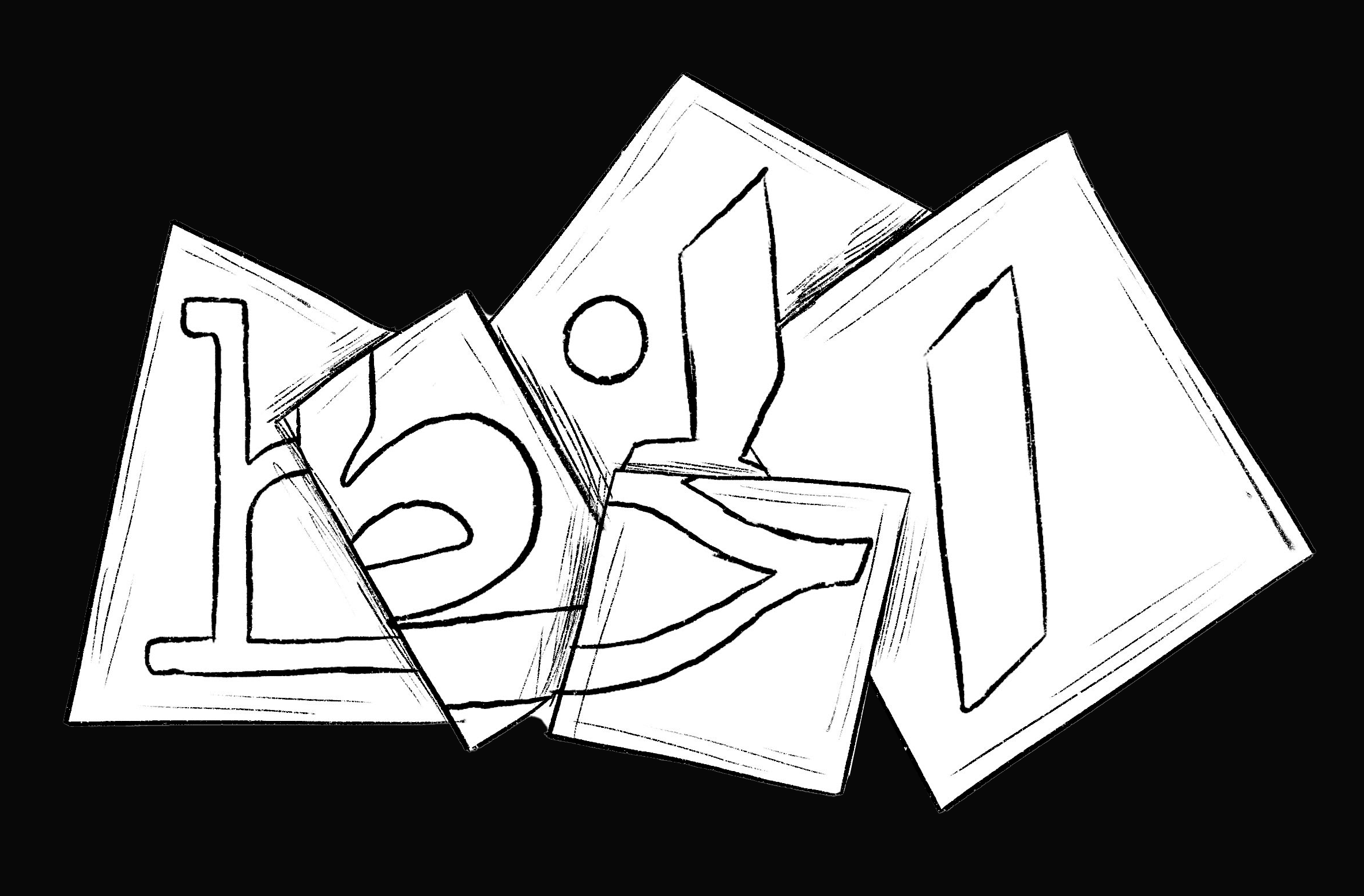
How my passion for Arabic letters turned into a global career in Arabic type design
First published on Majarra Insights , on February 17, 2024.
Arabic translation is present after the English text.
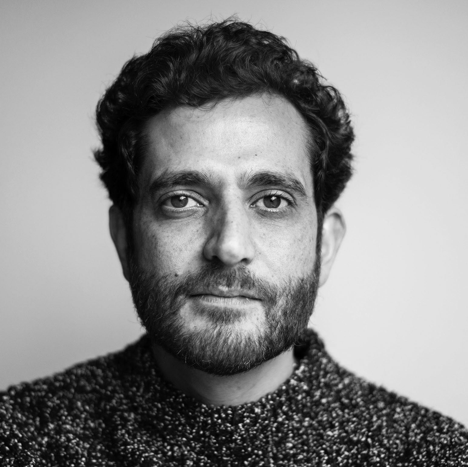
We read thousands of words every day on the internet, on social media, and through articles, like this one. Each is written in a different font. Have you ever wondered how these fonts came to life? From an idea to a written type design used across multiple platforms around the world. Pascal Zoghbi, a global type designer, and Majarra‘s logo designer, takes us on an exciting journey today on how he started, what inspires him, and the future of this industry in the Arab World.
Inked with passion: Embarking on a journey of Arabic calligraphy
Prior to enrollment at the university, my knowledge of Arabic type design was limited. However, my general interest in the arts led me to pursue a degree in Design department in Notre Dame University (NDU) in Lebanon. There, I had the privilege to attend a class taught by the poet and writer Said Akl, whose enthusiasm for the Arabic language, his lectures on the role of the Lebanese in the development of Arabic calligraphy, and his approach to Arabic calligraphy from a historical and philosophical perspective inspired me to specialize in Arabic type design. I can argue that his lectures were the defining moment that prompted me to choose this specialization out of other design departments.
From that moment on, I embarked on a journey of the acquisition of knowledge and scholarly inquiry into the history of Arabic calligraphy. I attended classes in Lebanon to deepen my academic knowledge and gain practical experience in the field of Arabic calligraphy. Subsequently, I decided to pursue a master’s studies in type design (MD) at The Royal Academy of Arts (KABK) in the Netherlands, since it is renowned for the interest of its typographers and type designers in fonts design and development.
The unexpected irony is in the fact that my childhood lacked any apparent indications that I would take this path. Quite the contrary, my handwriting was very bad, and my proficiency in Arabic was poor since I experienced serious reading and writing challenges that might be linked to mild dyslexia. But now, I consider this experience of suffering as another moment that, in one way or another, led to my specialization in Arabic calligraphy.
Since then, I have had a unique vision for the shapes of Arabic letters, which I imagine them flowing onto the page like music or ballet. I was captivated by the beauty of Arabic calligraphy. From that moment on, I have constantly been sketching new letterforms and playing with the outlines of Arabic graphic images. For me, letters are not just ink on paper; rather, I perceive them as individuals with their own spirit and personality.
An early start in an unexplored field: A passion-driven adventure
When I first considered a career in Arabic type design at the turn of the millennium, the field of Arabic type design was completely different than it is today, for the number of people actively engaged in this field could have been counted on one hand, despite the obvious lack of modern Arabic fonts. In 2000, during my early stage of the type design career and the presence of QuarkXPress program, there were only professional fonts, while the rest were arbitrarily generated. It was the moment when I realized that we need more Arabic fonts.
My university graduation project, entitled “كوما (coma),” which means “a deep state of unconsciousness”, addressed the reasons for the lack of designers and the gap between the wealth of fonts in Arab history and the dearth of fonts in modern history.
During 2005, I decided to study type design at The Royal Academy of Arts in The Hague, Netherlands. Upon my return to Lebanon in 2008, I typically began applying the design principles I studied there to Arabic typography. I began receiving requests to design fonts for Arab magazines, newspapers, and museums, so I founded my company, 29Letters Type Foundry S.L. (29LT) for designing Arabic fonts.
My first fonts: A background
As part of my university graduation project, the first font I designed, “Massira“, drew inspiration from the graffiti produced by protestors, in Lebanon during 2005, who used spray paint, chalk, and broad pens. The first commercial font was designed in collaboration with the Khatt Foundation in Amsterdam, where I worked with the famous Dutch designer Martin Majoor or to design an Arabic font for one of his Latin fonts. In Beirut, I designed my first fonts for Emarat Al Youm Newspaper, Ibn Battuta Mall, the new Terminal 3 Abu Dhabi Airport, the Museum of Islamic Art (MIA), the Arab Museum of Modern Art (Mathaf) in Doha, and other fonts for both international and local institutions.
Unveiling the process of Arabic font design
The creation of a new font, where it transforms from an idea to one of the options on the user’s list, includes numerous design and technical processes, including research, study, and programming. It typically takes several months or even years to design a font.
I normally design two types of fonts: those designed to meet client preferences where we follow general principles during the design process, and those stemming from my personal interests.
Let me use Emaratalyoum Newspaper as an example of the first type. The newspaper requested a new main font with a clear and modern touch compared to the traditional headline fonts that were mostly used in all other newspapers. I researched previous and current Arab newspapers in the region and examined the archive of the handwritten titles of newspapers that were published during the 1970s and 1980s, and even modern newspapers. The outcome was a main font design for Naskh Mastari with simplified pen strokes and low contrast, making it very easy to spot and read among other newspaper titles on the shelf or within the newspaper itself.
The second type includes the fonts I designed out of personal interest, such as the Massira font, for which I researched graffiti and handwriting during demonstrations in 2005. There are also two fonts that I recently designed, Okaso and Oskura, as I spent two years studying the Aljamiado or Ajamiya, a language derived from Castilian and Arabic in which Spanish manuscripts were written, but in Arabic calligraphy, during the return of the Arabs from Andalusia to Africa.
Type Design: A creative art or a technical industry?
I do not consider font design to be a form of art or creative work; rather, I place it within the fields of technology and digital media. This statement does not refute the fact that it is a work based on creativity, thus distinguishing it from preceding works. However, creativity is the starting point, followed by research, analytical, and technical tasks related to digital drawing and even writing codes. For example, the Ada font, which I recently designed, took months to come to light. After designing the font, I spent a long time on technical tasks such as coding and writing codes, during which I used the latest technologies.
Arabic calligraphy: A treasure of the Arab region
Upon deciding to specialize in Arabic type design, I understood that we were in the presence of a treasure that makes each of us proud to be Arab.
Our long heritage reflects the status of Arabic type design, its evolution, and diversity across time, exemplified by the emergence of Kufic fonts during the early Islamic conquests, which exhibited variations in form between Eastern, Abbasid, Kufic, and Moroccan, followed by the Naskh, Ruq’ah, Diwani, and Thuluth fonts in conjunction with the Ottoman Empire, then the Persian font. Unlike the West, our focus in the Arab World has always been on the line rather than the image. As a result, individuals engaged in the study of history will experience a sense of pride in their Arab identity, recognizing it as a source of strength that warrants emphasis.
A promising field: The potentials of Arabic type design
The Arabic type design industry is now experiencing a revival in terms of educational resources and training opportunities for designers, as well as increased demand and job opportunities. Regarding the provision of educational resources, I recall that upon commencing my career, I conducted extensive research to find information, the majority of which was only available in books. The absence of dedicated software for Arabic type design necessitated the utilization of Latin type design applications as a workaround. Currently, advancements in technology have significantly facilitated the tasks of both professionals and amateurs alike. Moreover, a wide range of courses, educational programs, and electronic resources have become accessible to individuals from all walks of life.
In terms of market demand, the Arabic type design industry is recently witnessing an expansion in relation to three categories: Firstly, international companies that establish branches in the Middle East require Arabic fonts to complement their existing Latin company fonts; secondly, local Arab companies that are expanding globally seek fonts and corporate identities, particularly in the GCC countries where the startup sector is rapidly growing to meet market demands; and lastly, global electronic platforms that aim to establish a worldwide presence and therefore require Arabic fonts.
It is evident that we are now on the right path since there is a noticeable increase in the interest in Arabic type design. For example, there are calligraphers and designers who use Arabic calligraphy in the arts based on Arab history, such as Hurufiyya or Lettrism. In this regard, one can find Arabic letters adorning decorative pieces, paintings, and covers. Iraqi calligraphers, such as Hassan Massoudy and Wissam Shawkat are now considered renowned designers.
In recent years, there has been a remarkable trend towards imitating Western culture and distancing oneself from Arab heritage. However, a current resurgence is noticed in terms of embracing Arab identity, accompanied by a sense of pride in all aspects associated with it, exemplified by a growing appreciation for classic Arabic music and a revival of historical Arabic fonts.
In this context, I would like to showcase Majarra as an exceptional example. I had the pleasure of collaborating with Majarra on crafting its visual identity, fueled by its inspiring vision for producing genuine Arabic content. Majarra distinguished itself from other companies by prioritizing the development of an identity in the Arabic language, in contrast to the conventional approach of first establishing an English identity and afterward adapting it to Arabic.
Undoubtedly, my journey thus far would not have been possible if I had not realized that my knowledge of the Arabic letters is the secret to my distinction. The rich diversity inherent in Arabic type design empowers designers to craft contemporary and distinctive designs. Now, it is awe-inspiring that after 15 years of immersing myself in the realm of type design, I continue to embark on my learning journey in this captivating field.
كيف قادني الشغف بالأحرف العربية إلى بناء مسيرة عالمية في تصميم الخطوط العربية
نقرأ جميعاً آلاف الكلمات يومياً عبر الكتب واللافتات ومنصات التواصل الاجتماعي والمقالات، مثل هذا المقال، وكلٌ منها مكتوب بخط مختلف. هل تساءلت يوماً عن رحلة تصميم هذا الخط بداية من كونه فكرة وحتى خروجه كخط مقروء؟ يأخذنا اليوم مصمم الخطوط العربية، ومصمم شعار مجرة، باسكال زغبي، في جولة ممتعة لنتعرف كيف بدأت رحلته كمصمم خطوط، وكيف تتم عملية تصميم الخطوط، ومستقبل هذه الصناعة أمام الشباب العربي.
ولادة الشغف بالأحرف العربية
لم أكن أعرف كثيراً عن الخط العربي قبل التحاقي بالجامعة، وإنما كنت مهمتماً بالفنون بشكل عام، ما دفعني للالتحاق بكلية الفنون الجميلة بجامعة سيدة اللويزة في لبنان. وهناك كنت محظوظاً بحضوري صفاً دراسياً للشاعر والكاتب سعيد عقل، إذ ألهمني شغفه باللغة العربية، وحديثه بفخر عن دور اللبنانيين في تطوير الخط العربي، وتطرقه إلى الكتابة العربية من منظور تاريخي وفلسفي، لدرجة إنني أعتبر أن تلك المحاضرات هي اللحظة المحورية التي دفعتني إلى التخصص في تصميم الخط العربي من ضمن أقسام التصميم الكثيرة
منذ تلك اللحظة، بدأت رحلة التعلم والبحث في تاريخ الخط العربي، وحضرت صفوفاً في لبنان لمعرفة المزيد عن هذا المجال، وعملت في وظائف تتضمن الطباعة العربية، حتى قررت تحضير رسالة الماجستير في تصميم الخط في الأكاديمية الملكية للفنون في هولندا، لأنها واحدة من الدول المعروفة باهتمام فنانيها وخطاطيها بتصميم الخطوط وتطويرها
المفارقة التي تفاجئ البعض، إن طفولتي لم تشمل لحظات تشير إلى أنني سأسلك هذا المسار، بل على العكس تماماً، كان خطي سيئاً للغاية، ولم أكن جيداً في اللغة العربية، وإنما كنت أرسب بها كثيراً، ولا سيما وإني كنت أعاني من عسر القراءة. لكنني أنظر الآن إلى هذه المعاناة باعتبارها لحظة أخرى كانت سبباً بشكل أو بآخر في تخصصي بالخط العربي
تملكني منذ ذلك الحين رؤية خاصة لأشكال الأحرف العربية التي أراها تتدفق على الصفحة مثل الموسيقى أو رقص الباليه. لقد تعلقت بجمال النص العربي، ومنذ ذلك الحين، أرسم دائمًا أشكالًا جديدة للحروف وألعب بالخطوط العريضة للصور الرسومية العربية. فالأحرف ليست فقط حبراً على ورق في نظري، وإنما أراهم كأفراد لديهم روحهم الخاصة وشخصيتهم
بداية مبكرة في مجال لم يتطرق له الكثيرون: مغامرة يقودها الشغف
في بداية الألفية، كان مجال تصميم الخط العربي مختلفاً تماماً عما هو عليه الآن، إذ كان عدد من يعملون في هذا التخصص حينما فكرت في العمل به يحصون على أصابع اليد، على الرغم من النقص الواضح في الخطوط العربية الحديثة حينها. ففي عام 2000، عندما بدأت العمل في مجال التصميم بشكل عام، وكنا نعمل على برنامج QuarkXPress، كانت هناك نحو 4 خطوط جيدة فقط، والبقية مصممة بشكل عشوائي، فأيقنت أننا بحاجة إلى المزيد من الخطوط العربية
أتذكر أنني أسميت مشروع تخرجي من الجامعة “كوما” (coma)، أي غيبوبة، إذ كنت أسلط الضوء خلاله على أسباب قلة المصممين، والفجوة بين التاريخ العربي المليء بأنواع كثيرة من الخطوط والتاريخ الحديث الذي لا يضم خطوطاً كثيراً
في 2005، قررت دراسة تصميم الخط بجامعة رويال أكاديمي في لاهاي بهولندا، وهناك درست مبادئ التصميم بشكل عام، وبدأت في تطبيقها على الخط العربي حينما عدت إلى لبنان مرة أخرى في 2008، عندما بدأت أتلقى طلبات لتصميم خطوط لمجلات وصحف ومتاحف عربية، وبدأت شركتي ٢٩حرف (29letters) والمعروفة بـ (29LT) لتصميم الخطوط العربية
كواليس خروج الخطوط الأولى
أول خط صممته كان ضمن مشروع تخرجي من الجامعة، وهو خط مسيرة (Massira)، الذي استوحيته من جرافيتي المتظاهرين في لبنان عام 2005 بالبخاخ والطبشور والأقلام العريضة
أمام الخط التجاري الأول كان بالتعاون مع مؤسسة خط فاونديشن (Khatt Foundation) بأمستردام، إذ عملت مع المصمم الهولندي الشهير مارتن مايور، وصممت خطاً عربياً لواحد من خطوطه اللاتينية
وفي بيروت، كانت أول خطوطي لمجلة الإمارات اليوم، ومول بن بطوطة، ومطار أبوظبي الجديد، ومتحف الفن الإسلامي والفن الحديث بالدوحة. وشرعت في تطوير خطوط خاصة لـ (29LT)، وصممت خطوطاً للمؤسسات الدولية والمحلية على السواء
رحلة خروج الخط العربي
قبل أن يخرج الخط الجديد إلى النور، ويتحوّل من مجرد فكرة إلى خيار ضمن قائمة الخيارات للمستخدم، فإن مراحل كثيرة فنية وتقنية، مثل البحث والدراسة والبرمجة، تسبق هذا الأمر. إذ يأخذ تصميم الخط أحياناً شهور وسنوات
هناك نوعين من الخطوط التي أصممها، الأول يكون بطلب من العميل، وحينها يكون هناك أفكار عامة نسير وفقاً لها أثناء التصميم، والآخر يكون نابعاً من اهتماماتي الخاصة
سآخذ جريدة الإمارات اليوم مثالاً على النوع الأول، إذ طلبوا خطاً رئيسياً جديداً مع إحساس واضح ومعاصر له مقارنة بخطوط العناوين التقليدية التي كانت تستخدم في الغالب في جميع الصحف الأخرى. حينها بدأت بالبحث في الصحف العربية في المنطقة سواء القديمة أو الحالية، فبحثت في العناوين المكتوبة بخط اليد للصحف القديمة التي كانت تصدر خلال السبعينيات والثمانينيات، وحتى الصحف الحديث.
كانت النتيجة هي تصميم خط رئيسي لـ Naskh Mastari بضربات قلم مبسطة وتباين منخفض ما يجعل من السهل جداً اكتشافه وقراءته من بين عناوين الصحف الأخرى على الرف أو داخل الصحيفة نفسها
أما النوع الثاني فهو الخطوط التي صممتها بدافع من اهتمامي الشخصي، مثل خط (Masskra) الذي بحثت خلال تصميمي له عن الجرافيتي وخط اليد أثناء التظاهرات عبر التاريخ. وكذلك هناك خطان صممتهما حديثاً بعنوان (Okaso) و (Oskura)، إذ أجريت بحثاً استغرق قرابة العامين عن لغة الألخميادو أو العجمية – وهي لغة مشتقة من القشتالية والعربية كتبت بها مخطوطات إسبانية لكن بالخط العربي في أثناء رجوع العرب من الأندلس إلى إفريقيا
الخط كفن إبداعي أم صناعة تقنية؟
لا أرى تصميم الخط يندرج تحت مسمى الفن أو العمل الإبداعي، وإنما أميل إلى رؤيته ضمن مجالات التكنولوجيا والإعلام الرقمي. هذا لا ينفي أنه عمل قائم على الإبداع، الذي يجعله جديداً عما سبقه، غير أن الإبداع يأتي كنقطة للانطلاق تليها مهام بحثية وتحليلية ومهام تقنية تتعلق بالرسم الرقمي وحتى كتابة الأكواد. فعلى سبيل المثال، أخذ خط أدا Ada، الذي صممته مؤخراً، شهوراً للخروج إلى النور، فبعد تصميم الخط، استغرقت وقتاً طويلاً في المهام التقنية مثل الترميز وكتابة الأكواد، واستخدمت خلاله أحدث التقنيات
الخط العربي: كنز من كنوز المنطقة العربية
حينما قررت التخصص في تصميم الخط العربي، عرفت أننا أمام كنز يجعل كل منّا فخور بكونه عربي، لدينا تراث عريق عبر التاريخ يعكس مكانة الخط العربي، وتطورّه، وتنوعه وفقاً للفترات الزمنية، مثل الخطوط الكوفية التي ظهرت في بداية الفتوحات الإسلامية وتنوعت بين كوفي شرقي وعباسي ومغربي، ثم خطوط النسخ والرقعة والديواني والثلث مع العثمانيين، ثم الفارسي، وهكذا. فلطالما كان التركيز لدينا في المنطقة العربية على الخط أكثر من الصورة عكس الغرب. لذلك، سيشعر كل من يبحث في التاريخ بالفخر لكونه عربي، بل وسيدرك كيف يجب أن عروبته هي نقطة من نقاط القوة التي يجب أن يبرزها
مجال واعد: فرص تصميم الخط العربي
تتمتع صناعة تصميم الخط العربي الآن بانتعاشة سواء من ناحية إتاحة الموارد التعليمية وفرص تأهيل المصممين، أو من ناحية زيادة الطلب وتوفير فرص العمل. فمن ناحية إتاحة الموارد التعليمية، اتذكر حينما بدأت العمل، كنت أقوم بالكثير من البحث لأصل إلى المعلومات، والتي كان أغلبها متاحاً في الكتب فقط. ولم تكن هناك برامج للخط العربي، وإنما كنا نضطر إلى القيام بحيلة في برامج الخطوط اللاتينية. أما الآن، فقد سهلت التكنولوجيا الأمر كثيراً على المحترفين والهواة في الوقت ذاته، وباتت هناك الكثير من الدورات والبرامج التعليمية والمصادر الإلكترونية المتاحة للجميع
ومن ناحية الطلب في السوق، فتشهد صناعة تصميم الخطوط العربية توسعاً مؤخراً يتعلق بثلاث فئات، وهي: الشركات العالمية التي تفتح فروعاً في الشرق الأوسط وتحتاج إلى خطوط عربية مصاحبة لخطوط الشركات اللاتينية الخاصة بها، والشركات العربية المحلية التي تتوسع عالمياً وتحتاج إلى خط وهوية مؤسسية، ولا سيّما دول مجلس التعاون الخليجي التي تشهد نمواً سريعاً في قطاع الشركات الناشئة لتلبية احتياجات السوق المتزايدة، والمنصات العالمية الإلكترونية التي تريد أن تتواجد عالمياً
أرى أننا نسير الآن في الطريق الصحيح، إذ ينمو الاهتمام بالخط العربي مجدداً، فعلى سبيل المثال، هناك خطاطين ومصممين يستخدمون الخط العربي في الفنون استناداً إلى التاريخ العربي، مثل الحروفية أو Lettrism، فنجد الأحرف العربية تزين قطع الديكور، واللوحات، والأغلفة. وهناك خطاطون صاروا فنانين معروفين مثل الخطاطين العراقين حسن مسعودي ووسام شوكت
نتذكر أن السنوات الماضية، كانت هناك حركة لتقليد الغرب والتنصل من كل ما هو عربي، أم الآن فألاحظ العودة إلى الهوية العربية مرة أخرى، والاعتزاز بكل ما يخصها مثل الحنين إلى الموسيقى العربية القديمة، وإعادة إنتاج الخطوط العربية التاريخية
وأذكر هنا مثالاً لمنصة مجرة، وهي من المنصات التي سعدت بالعمل معها على الهوية البصرية الخاصة بها، ولا سيّما وأنها تملك رؤية ملهمة تخص إنتاج محتوى عربي أصيل. إذ كانت مجرة من الشركات القليلة التي قررت العمل على هوية باللغة العربية، بخلاف الدارج وهو العمل على خلق هوية إنجليزية ثم العمل على نسخة عربية مناسبة لها
لا أرى تصميم الخط يندرج تحت مسمى الفن أو العمل الإبداعي، وإنما أميل إلى رؤيته ضمن مجالات التكنولوجيا والإعلام الرقمي. هذا لا ينفي أنه عمل قائم على الإبداع، الذي يجعله جديداً عما سبقه، غير أن الإبداع يأتي كنقطة للانطلاق تليها مهام بحثية وتحليلية ومهام تقنية تتعلق بالرسم الرقمي وحتى كتابة الأكواد
في الحقيقة، ما كنت لأصل إلى ما وصلت إليه لو لم أدرك إن معرفتني بالأحرف العربية هي سر تميزي، خاصة أن هذا التنوع يسمح للمصممين بابتكار تصاميم معاصرة ومميزة. والآن بعد مضي 15 عام على عملي في تصميم الخطوط، لا أزال أتعلم عن الخط العربي أشياء جديدة، أنه أمر يبعث على الجنون
