
Last August in Beirut, I had the opportunity to meet with Camille Khattar Hedrick, the daughter of Nasri Khattar, the creator of a library of fonts based on Unified Arabic.

Pascal Zoghbi: Hello Camille, it’s very nice to meet with you.
Camille Khattar Hedrick: It’s a pleasure to be here today.
PZ: So, what brings you to Lebanon?
CKH: This is my second of many visits. I am organizing my father’s documents so as to make his designs available to the public.
PZ: How did your father come to create Unified Arabic? Did he ever tell you, or did he ever document his creative process?
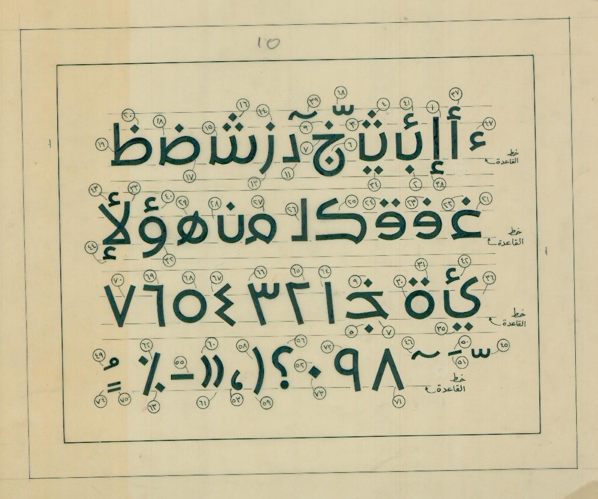
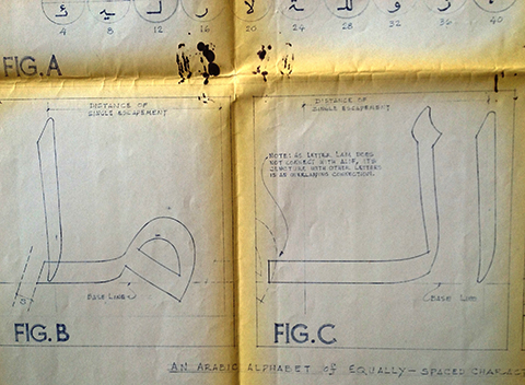
CKH: Just recently, I came across one of his writings called “How ‘Unified’ Arabic Came About.” In the early 1930s, after receiving his first degree in business from the American University of Beirut, and before traveling to the U.S. to attend the Yale School of Architecture, he taught a class in Arabic typing. This was the first time he had seen an Arabic typewriter and found it to be a “complicated” machine with an intricate keyboard. Each letter had several variant shapes, which meant that the keyboard had more than one key for each letter.
In his writings, my father used an analogy in English to illustrate his point. He wrote, “If you were, for example, to type on [the Arabic typewriter] a word like ‘banana,’ you would have to use three different keys to type the a’s and two different keys to type the n’s, with some shifting in between.”
During the typing class, one of the first words he typed was “ahlan-wa-sahlan,” meaning “welcome.” Doing so, he made a mistake, since he used the same key to type the two variant h’s appearing in this word. The mistake, however, led him to make a discovery: He realized that that the word was still perfectly legible in spite of the typing mistake. This was his breakthrough: The various shapes of each letter could be “unified” and standardized into one unique design and still be legible.

PZ: That’s truly amazing. Having come to this realization, what were his next steps?
CKH: He immediately became determined to simplify the Arabic typewriter as well as Arabic type. He drew hundreds – if not thousands – of sketches of each letter formation. He didn’t stop until he reached the desired effect of legibility for each letterform.


PZ: How long did it take him to have the unified alphabet ready to commercialize?
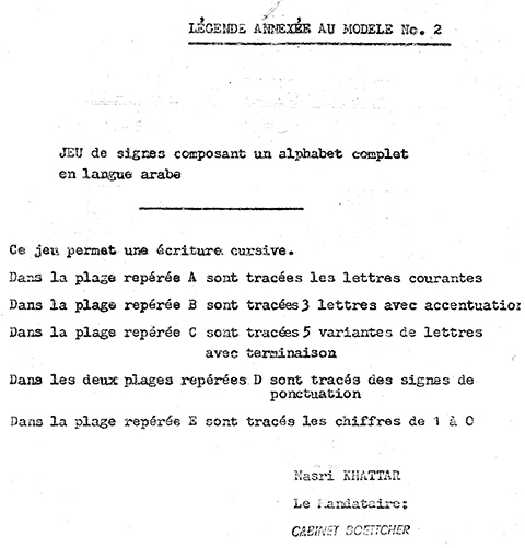
CKH: You’ll note that he filed his first patent on October 3, 1947, and that the patent was issued on April 4, 1950.
However, I have found correspondence between him and the patent attorney of the typewriter company, Remington Rand, dated April 15, 1935. He was already on his way although he was only 24 years old!

PZ: Your father is known in books on the history of typography as the first person to suggest the idea of detached Arabic script and the unified glyph shape for each letter. But, from the drawings and documentation I’m seeing now in front of me, it is amazing to notice that Khattar’s thinking later evolved toward designing more traditional Arabic type. Tell me about that.

CKH: Yes, he worked for over 35 years on a variety of different font styles. In the 1970s, with the advent of the word processor, he knew he had to prepare for the computer age, and that the typewriter would soon be obsolete. About that time, I was working for a computer company called Digital Equipment Corporation, and, at my dad’s request, I made an appointment with their Arabic department. Before my eyes, a Lebanese programmer demonstrated how the computer was able to automatically create the glyphs. The age of the typewriter was over. It was a very sad day for me, and I wasn’t looking forward to telling my dad about it.
I’ll never forget the look of amazement he gave me when I explained it to him. He said nothing, but I could tell that his mind was already racing with new ideas. He hadn’t given up.
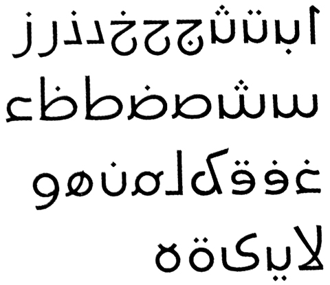
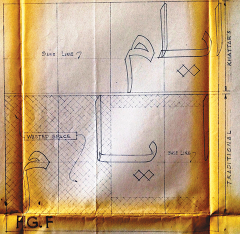
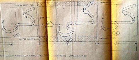
So he designed other fonts much closer in appearance to the traditional characters while at the same time greatly simplified. He felt that these later designs were closer to what readers were used to seeing yet without detecting anything different about them. In 1978, he took out a patent for his UA Kufic font. Here is an example:

PZ: Your father was a pragmatic person who was trying to find solutions for the Arabic script amid limited typesetting technologies. What is even more interesting is noticing that he did not stop at the idea of detached Unified Arabic type, as I previously believed, but rather embarked on designing more standard fonts based on the traditional Arabic connecting script when he noticed that technology was changing from the typewriter to the computer. He grasped the limitations that were present as typewriter technology became obsolete and a newer advanced technology was emerging to allow for more detailed and standard Arabic fonts.

Nowadays, some designers are still inspired or influenced by Khattar’s Unified Arabic type, and they are creating detached display fonts or designing Arabic logos with detached letters. On the contrary, the sad story is that some still consider that the future of Arabic script is to be detached, when the pioneer of detached Arabic type himself knew – as far back as the 70s – that the technology was evolving and catching up with the needs and requirements of Arabic script.
Detached Arabic fonts will always be considered as a revolutionary approach for designing, typesetting, and reading of the Arabic script. We will be seeing this approached used again and again in the coming years, mostly from young graphic designers with radical attitudes. The Unified Arabic type concept will always be unique even though it will never be adopted as a new, universal approach for writing and reading Arabic.

CKH: Perhaps we could meet again to continue this discussion?
PZ: Yes, next time we meet, let’s analyze other UA drawings to decide on digitization. Let me know when you’ll be in town again.
